
A brand style guide, also called brand guidelines or a brand manual, is a material that outlines the visual and verbal elements that collectively define a brand’s identity.
But how to create a brand style guide? And, more importantly, how do you create one that serves as a reference to ensure brand consistency and cohesiveness?
Here’s a comprehensive how-to-create-a-brand-style-guide tutorial you can use to shape your brand’s identity into a harmonious symphony of colors, fonts, imagery, and messaging.
Let’s go to the drawing board!
Step 1: Define Your Brand Identity

Before creating a style guide, you need a clear understanding of your brand identity. This includes your brand’s mission, values, target audience, and personality. Consider your brand’s unique selling points and the emotions you want it to evoke.
If your brand was a person, what would it be like? Is it playful or serious, modern or traditional, innovative or dependable? Defining your brand’s personality traits will help guide the tone of your communication and design choices.
Step 2: Gather Existing Brand Assets
Note: If creating a brand style guide template from scratch, proceed to Step 3.
If you already have existing brand assets and want to organize or fine-tune your branding kit, you need to revisit the materials you already have. Collect all existing brand assets such as logos, color schemes, text style choices, imagery, and other visual elements your brand uses.
As you review these assets, analyze which reflects the brand identity you set in Step 1 and which doesn’t. Let the elements that you retained guide you as you go through the next steps.
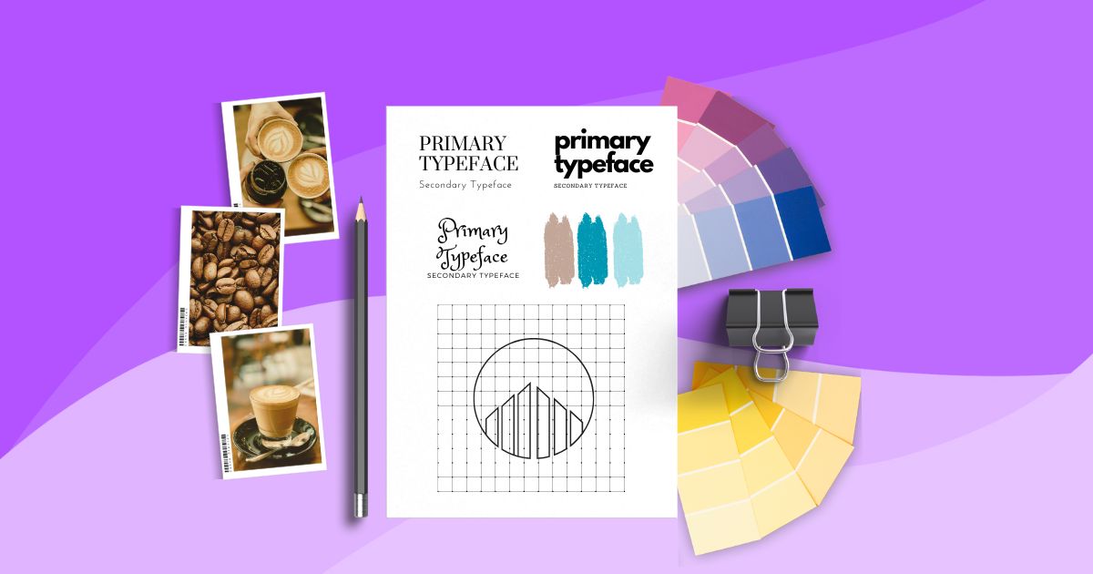
Step 3: Choose Fonts and Typography
Typography plays a pivotal role in conveying your brand’s personality and message. Selecting appropriate fonts and establishing consistent guidelines ensures that your brand’s written content is not only legible but also aligned with your branding.
In typography, primary and secondary typefaces are two distinct fonts chosen to be used consistently across a brand’s visual materials. They work together to create a balanced and harmonious typographic system that reinforces the brand’s identity and message.
- Primary Typeface. This is the main font that represents the brand’s core personality and values. It’s typically used for prominent elements such as headlines, titles, and other important text.
- Secondary Typeface. The secondary typeface complements the primary typeface. It must work well alongside the primary font, offering variation and contrast in style often used for body text and other secondary elements.
It also pays to review fonts usually used within your industry. For instance, you may want to look at coffee shop fonts for a cafe branding style guide.
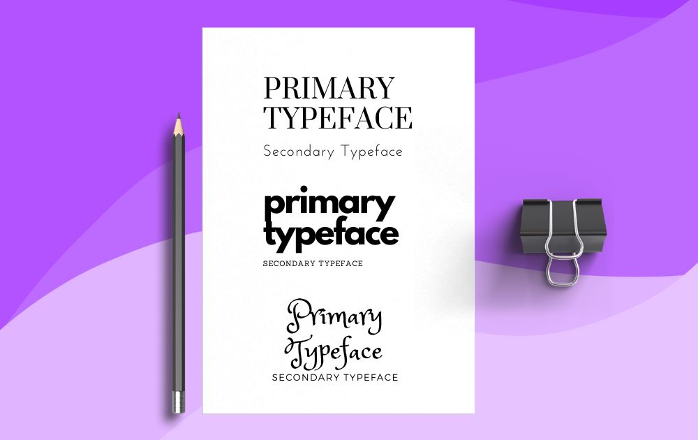
Step 4: Define Color Palette
Color is a powerful tool in brand communication, evoking emotions, setting moods, and creating instant recognition. Defining a color palette in your brand style guide ensures that your brand’s visual identity remains cohesive and easily recognizable across various platforms.
Here are the colors that you need to define for your brand:
- Primary Brand Color. Select a dominant color that embodies your brand’s essence. This color is often used for key assets such as logos, headlines, and major design components.
- Secondary Colors. Choose a set of secondary colors that complement the primary color. These colors add depth to your palette and can be used for backgrounds, accents, and other design elements.
- Neutral Colors. Include neutral colors such as grays, whites, or blacks. These colors are often used for backgrounds, text, and other foundational design elements.
Consider color psychology when picking your brand colors. Various colors evoke specific emotions and perceptions, so ensure your color choices align with your brand’s message and personality.
Don’t know where to start? Here are a few AI UI generator tools that can help you pick a color palette:
Step 5: Design the Logo Usage Guidelines
Your brand’s logo is a visual cornerstone. It goes without saying that guidelines surrounding its usage should be an essential part of how to create a brand style guide. Doing so ensures consistent and accurate representation across all materials and platforms.
Here are the things you need to define for logo usage:
- Clear Space. Define the minimum clear space around your logo that must be free of other design elements. This ensures your logo stands out and maintains visibility.
- Minimum Size. Specify the smallest size at which your logo should be used to maintain legibility and visual impact. This prevents the logo from being scaled down too much, affecting its quality.
- Color Variations. Detail different color variations of your logo, if applicable. These variations might include full color, one color (black or white), and reverse (light logo on dark background, and vice versa). You can also include neutral colors that can be used as logo backgrounds, just as Starbucks did on their logo guidelines.
Step 6: Create Imagery Guidelines
Visual content, including imagery, is a powerful way to convey your brand’s message and evoke emotions. Therefore, no how-to-create-a-style-guide tutorial is complete without this element.
Here are the factors to consider in this step:
- Imagery Styles. Are you using professional photography, illustrations, or a combination of both? Define the tone—whether it’s candid, polished, abstract, etc.—that should be reflected in your visual content.
- Content Themes. Identify recurring themes or subjects that your brand’s imagery should focus on. These themes contribute to a unified visual narrative, whether nature, tech, people, or specific objects.
- Photography Guidelines. If using photography, outline guidelines for factors such as lighting, composition, depth of field, and angles. This ensures a consistent look and feel in all photographs.
- Color Treatment. Specify any color treatments, filters, or effects that should be consistently applied to images to align with your brand’s visual style. This prevents images from looking disjointed or inconsistent.
And there you have it! Your ultimate guide on how to create a brand style guide.
As you may have noticed, crafting a comprehensive brand style guide requires a deep understanding of design principles. Given its intricate nature, it’s a task best left in the hands of professional designers.
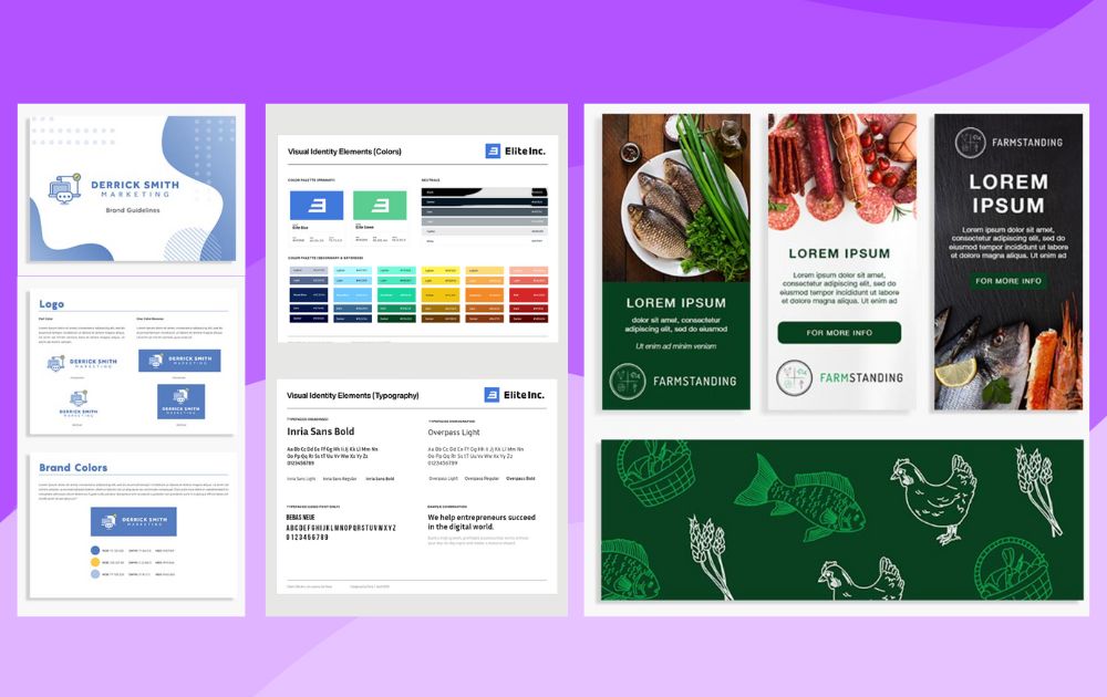
If you need help with yours, Penji can help! Here are brand style guide examples we’ve done for past clients:
Sign up now and have your brand style guide done by the world’s top 2% talent.
About the author

Carla Deña
Carla is a journalist and content writer who produces stories for both digital and legacy media. She is passionate about creativity, innovation, and helping small businesses explore solutions that drive growth and social impact.


