

TLDR: Color psychology shapes how audiences perceive your brand. Penji’s brand design services provide expert support to create balanced, impactful color palettes.
What goes into building a brand color palette that makes an impact?
In this article, we’ll explore the art and science of putting together hues and tones that bring the brand identity forward.
We’ll also discuss the steps in creating a color palette and review superb examples you can copy (fun fact: our expert Penji designers made them!) or use them to inspire your own rebranding services project.
Let’s dive right in!
Defining Your Brand Color Personality
A memorable brand color palette is anchored on audience perception. That said, Brand color psychology plays a key role in choosing your brand’s colors since different hues evoke different emotions. For example, blue can inspire trust and calm, while red triggers energy and passion.
That said, understanding color theory in graphic design can also enhance your palette selection. By learning how colors interact with each other, you can create harmony in your palette and bring your brand identity forward.
Steps to Create a Memorable Brand Color Palette

Image Licensed by Penji
Step 1: Start with a primary color.
Whether you’re using a brand color palette generator or starting from scratch, begin by choosing a primary brand color. This color should reflect your brand identity, as it will be the foundation of your palette.
Step 2: Add complementary secondary colors.
Once you’ve locked in your primary color, add depth to your visual identity with secondary colors. That said, you can use these secondary colors for accents and to highlight different aspects of your brand messaging.
PRO TIP: If you’re clueless about how to pick your secondary colors, you can use the color-palette-from-image approach. Google images that feature your primary color and pick one that reflects your brand’s vision. You can then use a color picker tool to pinpoint secondary colors for the image.
Step 3: Include neutral or accent colors for balance.
Last but not least, pick your neutral or accent colors. These tones (such as grays, beiges, or off-whites) create balance and ensure that your palette doesn’t overwhelm. To ensure consistency, document your decisions in a brand style guide.
PRO TIP: Sometimes, graphic designers will include your neutral colors with the secondary colors. After all, both play a role in balancing and supporting primary colors.
Brilliant Brand Color Palette Examples
Here are a few color palette examples you can copy, taken from actual designs by our expert designers here at Penji:
1. Bold Corporate Elegance

Image Licensed by Penji
- Primary Color: Magenta
- Secondary Color: Deep Purple
- Neutral Color: White
This brand color palette is bold and contemporary, giving off a confident, energetic, and forward-thinking feel. The primary and secondary brand colors create a striking visual impact, positioning the brand as modern and innovative. The neutral color, meanwhile, offers a plain canvas that prevents the palette from overwhelming the viewer.
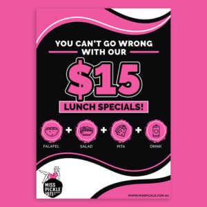
2. Playful Summer Scoops

Image Licensed by Penji
- Primary Color: Baby Pink
- Secondary Colors: Gold, Turquoise Blue, Coral
- Neutral Colors: Creamy Beige.
The overall feel of this brand identity color palette is playful, fresh, and lighthearted. As seen in the image, the color combo offers a carefree summer vibe, which works very well for an ice cream brand. Aside from invoking summer feels, the palette also looks youthful and fun.
3. Empowered Growth Palette

Image Licensed by Penji
- Primary Color: Fuchsia Pink
- Secondary Colors: Olive Green, Lavender, Soft Orange
- Neutral Colors: Off-white
This palette feels both uplifting and thoughtful. For one, bold fuchsia brings a sense of strength, while the olive green and lavender add a soothing balance. As a result, the colors project self-reflection, creativity, and growth, helping to build brand recognition for a company focused on well-being.
4. Industrial Strength

Image Licensed by Penji
- Primary Color: Black
- Secondary Color: Yellow Gold
- Neutral Colors: Gray, White
This website shows one of the brand color palette examples that exude strength and reliability. That said, the values that it reflects make it very fitting for industrial sectors. The dominant black and gray offer a no-nonsense vibe, while the gold accents introduce a sense of high value and trust.
5. Fresh Financial Simplicity

Image Licensed by Penji
- Primary Color: Caribbean Green
- Secondary Colors: Light Aqua, Peach Orange
- Neutral Color: White
This palette uses color symbolism to create a fresh, modern, and approachable vibe. That said, the color combo provides a fantastic palette for educational or financial services that aim to demystify complex topics. The teal and mint green suggest trust and growth, while the peach orange adds a personal, welcoming touch.
6. Creative Startup Success

Image Licensed by Penji
- Primary Color: Sky Blue
- Secondary Colors: Coral Red, Golden Yellow
- Neutral Colors: White
This palette is a good display of how to use the color wheel. The color combo features a version of the primary colors (blue, red, yellow), offering a look that reflects energy and creativity. The colors offer the right balance between professional and friendly, making it a great choice for startups or entrepreneurs.
7. Refined Professionalism in Real Estate
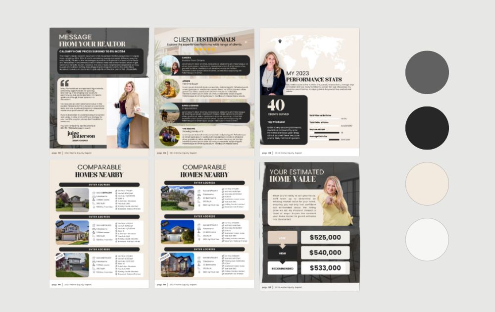
Image Licensed by Penji
- Primary Color: Dark Gray
- Secondary Colors: Black, Beige
- Neutral Colors: Off-White
This brand color palette conveys a sense of luxury and trustworthiness, proving that even non-vibrant brand colors can work well. The mix of dark gray and black represents stability and authority, while the beige and off-white introduce warmth and approachability. Perfect for rebranding services in the real estate sector.
8. Dynamic Growth and Strategy

Image Licensed by Penji
- Primary Color: Teal Blue
- Secondary Color: Bright Orange
- Neutral Colors: White
This color combo features color contrast, which is an important component of the elements of design principles. With red-orange and blue-green on opposite sides of the color wheel, the palette feels dynamic, energizing, and action-oriented.
Get a professional brand color palette from Penji’s design experts! View a demo today and learn how you can have unlimited graphic design at a flat monthly rate.
Unlimited designs with on-point color palettes
Leave your design tasks to the world’s top designers


Elevate Your Brand Today
Choosing the right colors is just the first step. To truly stand out, you need to apply them consistently across every touchpoint of your business.
Ready to transform your visual identity? Whether you need design as a service for ongoing social media needs or a one-off project, Penji has you covered. Get a professional brand color palette from Penji’s design experts!
View a demo today and learn how you can have unlimited graphic design at a flat monthly rate.
Frequently Asked Questions (FAQs)
Why is a brand color palette important?
It defines your visual identity, enhances recognition, and uses color psychology to influence how your audience feels about your business.
How do I choose the right brand design services?
Look for brand design services that offer flexibility, speed, and a portfolio that matches your aesthetic goals.
Can I change my brand colors later?
Yes, but frequent changes can confuse your audience. If you do change, consider using professional rebranding services to ensure a smooth transition.
About the author

Carla Deña
Carla is a journalist and content writer who produces stories for both digital and legacy media. She is passionate about creativity, innovation, and helping small businesses explore solutions that drive growth and social impact.


