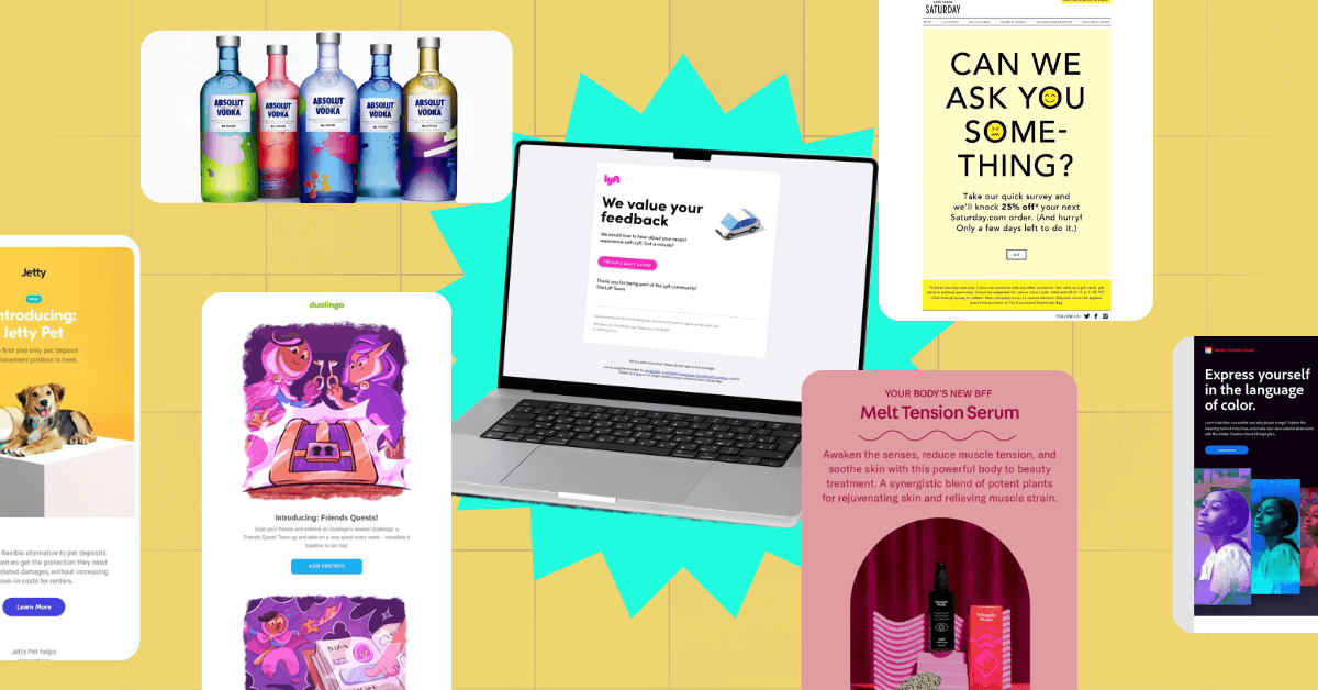
With a whopping 4.73 billion projected email users across the globe come 2026, email marketing is one of the most effective strategies you can use right now. Craft the best email designs with the following brands as email template inspiration.
Table of Contents
- Vibrant Colors
- Interactive Emails
- Custom Illustrations
- Animation
- Floating Products
- Color Gradients
- Geometric Shapes
- Unique Icons as Pointers
- Plenty of White Space
- The Use of Multiple Dimensions
- Why Email Design Matters
- Types of Email Design
- Key Features of Email Design
- Examples of the Best Email Designs from Penji
1. Vibrant Colors
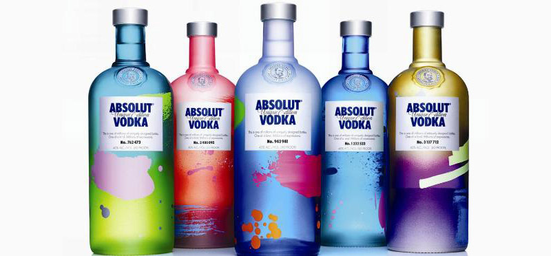
Using vibrant colors is an excellent way to start the year. After the many issues the world has dealt with in the past few years, it’s about time we celebrate life with brightness, joy, and happiness! This is what Absolut has been doing and will probably continue doing: filling the world with beautiful colors:
With colors influencing how we feel and think, careful planning for your brand’s colors is a must. You need to consider your brand’s personality and create color schemes that follow trends without making your brand look gaudy.
2. Interactive Emails
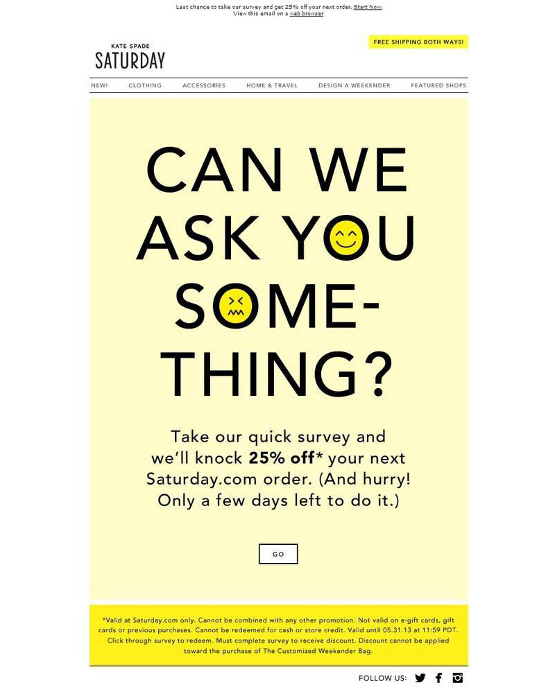
Having billions of email users can also be a downside to any email marketing strategy. More users mean more senders, and because of this, people tend to discard emails that they find useless. An interactive email design, just like this one from Kate Spade, may just be your ticket to get more recipients to read your messages.
There are plenty of ways to do this; some are as simple as adding a link to your store. You can add hover or rollover effects, playable games, or surveys. You may also want to add sounds, videos, or animations to make your emails more engaging.
3. Custom Illustrations
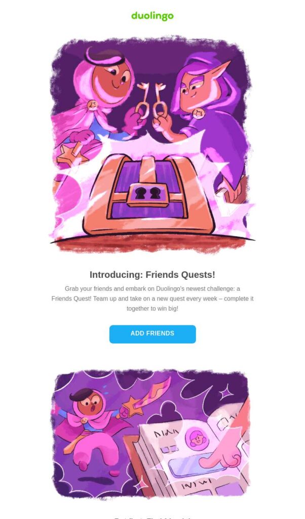
If you want to get the attention of your email recipients, why not use custom illustrations instead of the usual photographs? These can do more than mere pictures can, as language-learning app, Duolingo has proven. Illustrations can convey abstract concepts that can be hard to do with words or images. And with emails having limited space, illustrations can help you prove a point with the bare minimum.
If you think illustrations can be hard to find, look no further. Penji has some of the most talented illustrators you’ll find anywhere. Click on this link to see how we can transform your email templates into something magical.
4. Animation
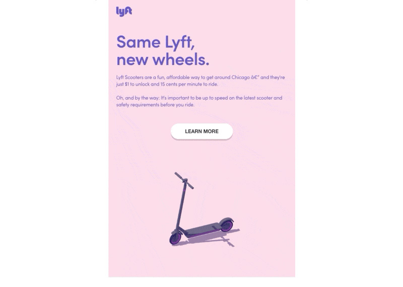
Forget about static email designs and start the new year with highly engaging animations. These are sure to pique the interest of your email recipients as they are fun and captivating. It doesn’t have to be a big production number, a blinking CTA or an arrow leading to it will do just fine.
You may also want to use simple animation to showcase your products or services. Animation will help you show how to use a product or what the insides of it look like. The example above from Lyft shows an animated scooter moving about the email.
5. Floating Products
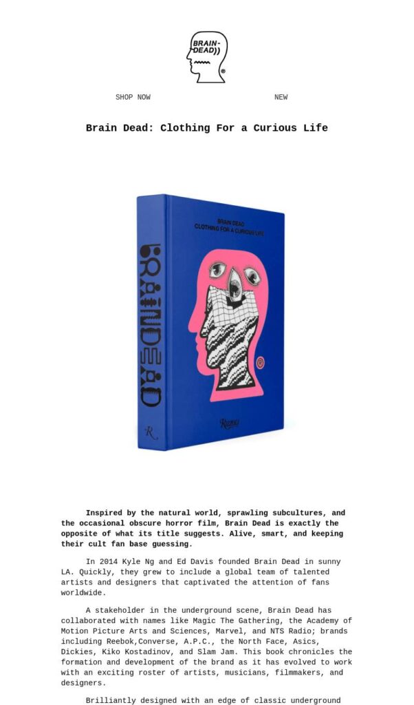
To give emphasis on a brand’s products, make them float in your email design, similar to what Brain Dead did. This will place them right in front of the readers’ eyes so much so they won’t miss them. Make sure to enlarge the photos of your products and put all other elements on the side or around.
You can also minimize the text content and let your product do all the talking for you. This is sure to impact the email and make them look twice before discarding the email. When done right, this could be the best email design you can do for your business.
6. Color Gradients
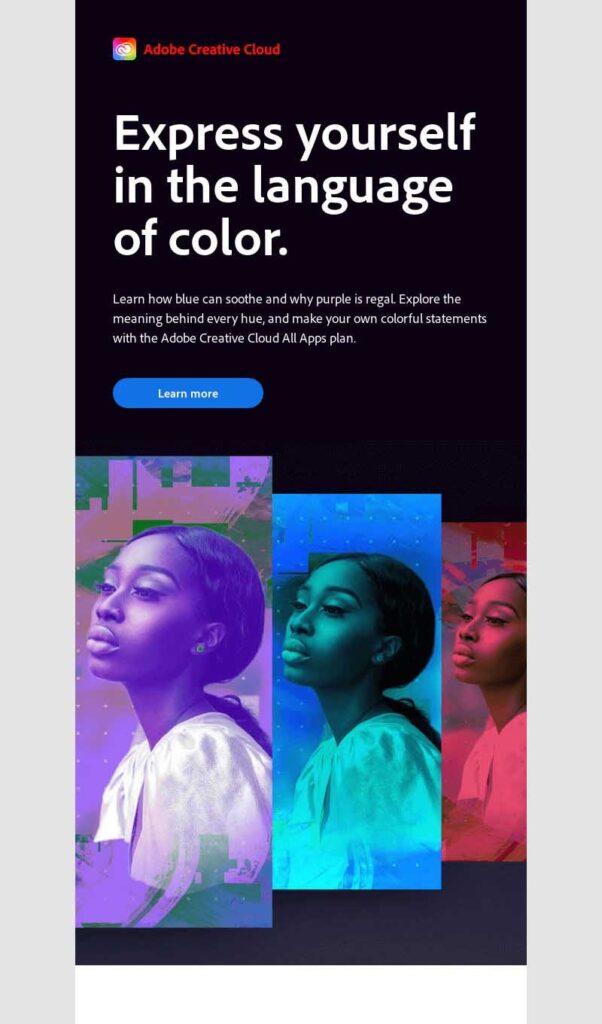
This best email design trend may have been around before, but in 2025, it is expected to grow even bigger. Using color gradients is a surefire way of ramping up your email designing efforts. Not only is it eye-catching, but it can also accentuate your product. If you want to float your products, add a color gradient to complete the picture, as what Adobe Creative Cloud did.
Gone are the days when email templates use flat colors, as this can be boring and outdated. If you are hesitant to use bright colors for your emails, this may be your way of following the trend without making your brand look cheap.
7. Geometric Shapes
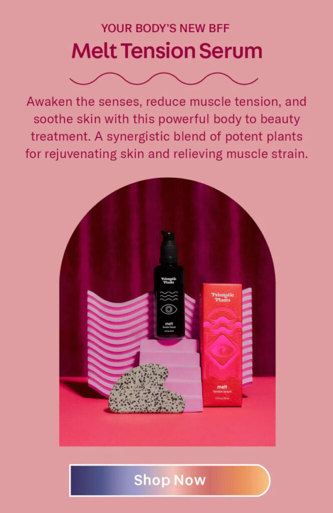
Get the boring squares and rectangles out the window and start using fun and quirky geometric shapes. They are a great way to catch attention, add aesthetics, and make your emails more engaging. You can use them on the header section or as background designs, similar to this design from Prismatic Plants.
Again, if you think this strategy won’t fit your brand personality, you can still use them and follow the trend. Go for subtle shapes and muted colors while placing them in the background so as not to look overpowering.
8. Unique Icons as Pointers
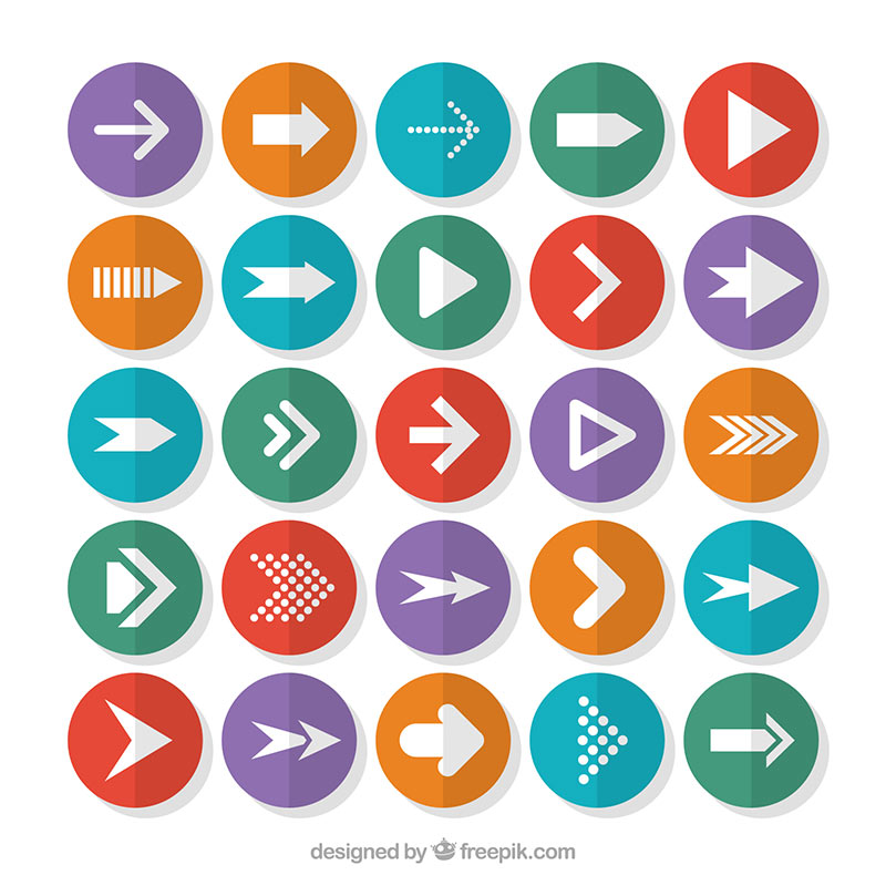
For an interactive email to work, you’ll be needing pointers to tell readers where to look next. This can also be a great alternative to the common bullet points or numbering in your email body. And to make your brand truly stand out, don’t just use any icon, customize them.
Doing so will give your readers a better experience by showing them what to do next. It can also be an excellent way to support your content and make the email design more memorable.
9. Plenty of White Space
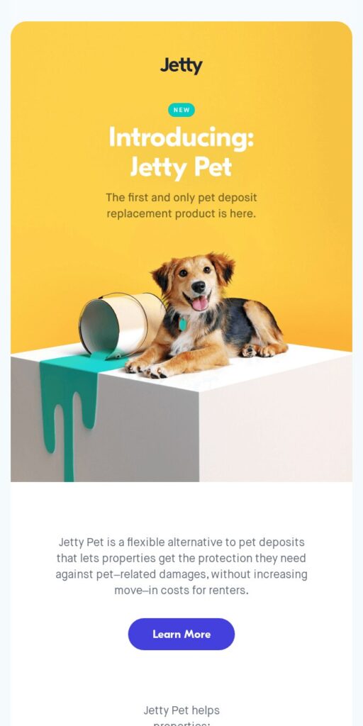
While this is a design must-have and not simply a trend, using a lot of white space in your emails will be a trend in the coming year. This is the best way to make your emails clutter-free and devoid of distractions. Therefore, take a leaf out of Jetty Pet’s book and give your product or service the attention it deserves.
To do this, you need to minimize your text to place the highlight in your product. This way, you’re giving the email more readability which is crucial in getting your message across.
10. The Use of Multiple Dimensions
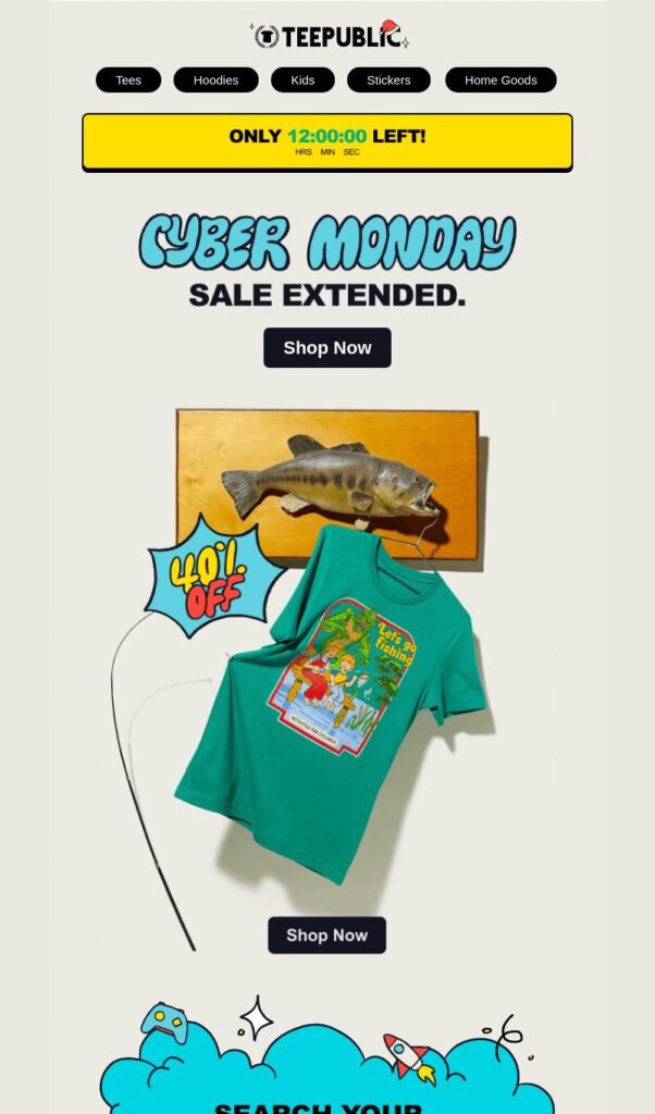
If animation is not your cup of tea, you can still send email designs that follow the trends, like this one from Teepublic. Combine static images with illustrations, such as 3D products placed side by side with illustrations of users. This takes the user experience to the next level and shows a high level of creativity for your brand.
By showing your recipients that your business follows trends, you’re telling them that you’re a brand that keeps up with the times. This will resonate with them and is great for building trust and connection.
Why Email Design Matters
Playing a crucial role in your email marketing campaigns, a well-crafted email design can capture attention. It enhances readability, boosts engagement, and increases conversions. Today’s inboxes are bombarded daily, all the more reason to make yours stand out. In addition, strong email templates build credibility, reinforce branding, and improve the overall user experience. These are more than enough to have your recipients take action.
Types of Email Design
Depending on your goals and objectives, email template design varies. You need to determine the purpose of your campaign and the message you want to convey. Below are the most common types of email designs:
- Promotional Emails: Created to promote sales, discounts, or when launching a new product.
- Newsletters: These are the emails you regularly send to update your customers about your business, feature news, invite them to read your blogs or provide industry insights.
- Transactional Emails: These are the automated emails triggered by user actions, like order confirmations or password resets.
- Welcome Emails: These introduce new subscribers to your brand and set the tone for future communication.
- Even Invites: These are designed to invite and encourage recipients to attend your events, webinars, conferences, and others.
- Survey and Feedback Emails: These emails are sent to collect customer insights to improve your products or services.
Key Features of Email Design
The best email design should include the following elements:
- Compelling Subject Line: This is the first thing your recipient will see, so it should instantly grab their attention and encourage them to open it.
- Responsive Layout: Ensure your email template is mobile-friendly and adapts to different screen sizes.
- Branding Consistency: You should always be using your brand colors, logos, and fonts to reinforce your brand identity.
- Clear Calls-to-Action (CTA): These will guide your users to your desired action, whether to buy or sign up.
- Engaging Visuals: Add attention-grabbing images, GIFs, or even videos to add appeal to your email designs.
- Minimalist Design: Use clean, uncluttered layouts to improve readability and user experience.
- Personalization: Use your recipients’ names, preferences, or past interactions to craft a tailored experience.
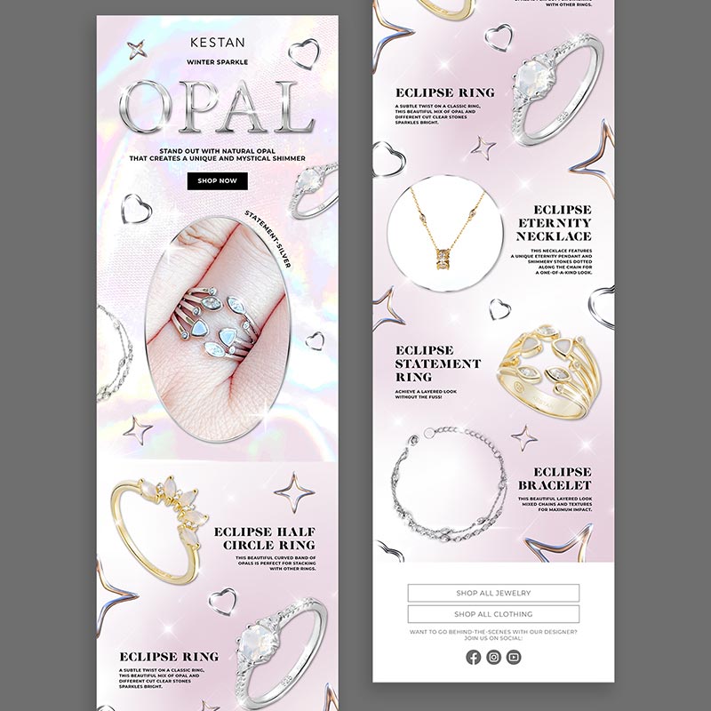
Examples of the Best Email Designs from Penji
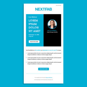
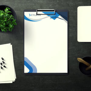
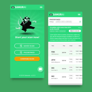
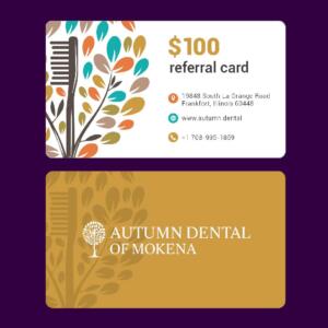
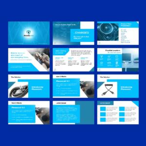
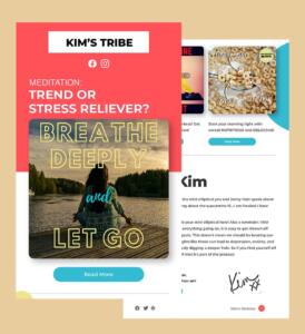
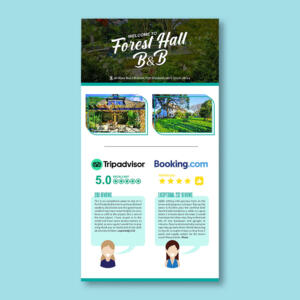
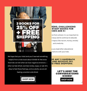
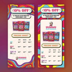
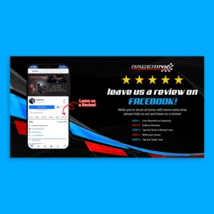
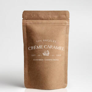
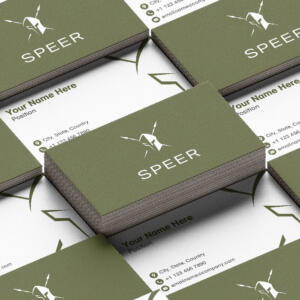
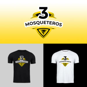
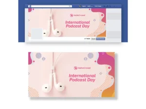
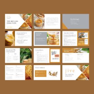
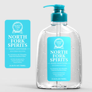
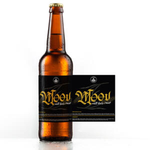
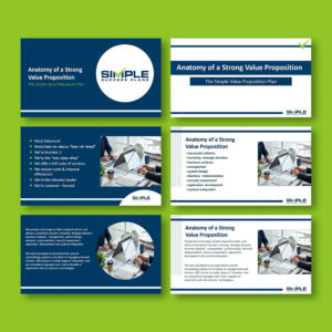
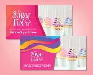
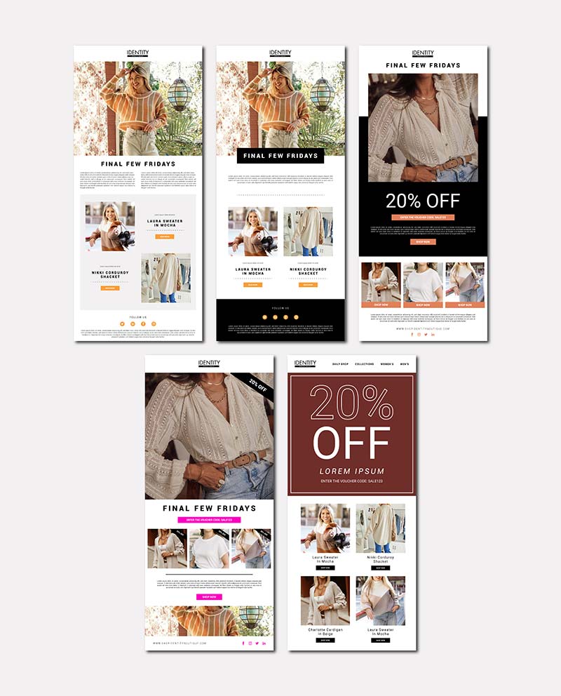
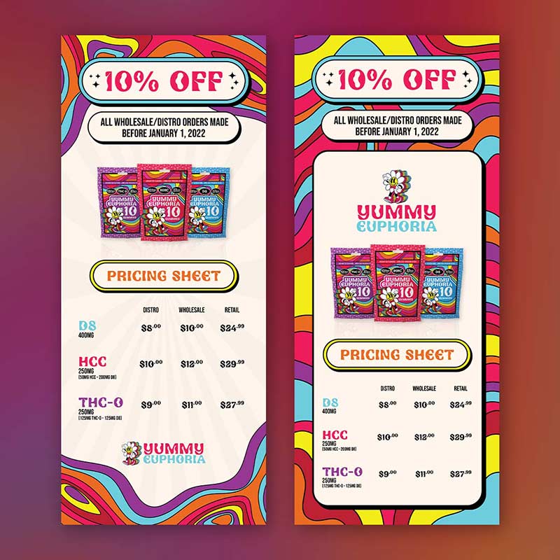
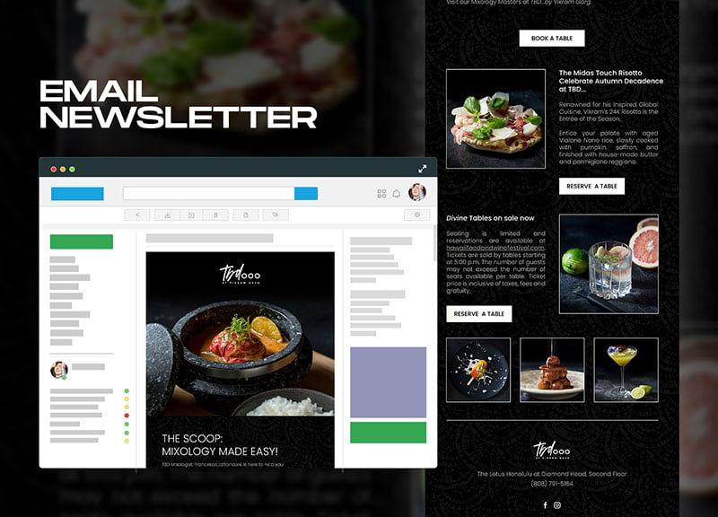
Below are a few of the best email deesign examples from our talented designers at Penji:
Final Thoughts
These best email design trends for 2025 will continue evolving and help you stay ahead of the curve. Whether you’re looking to create a simple, easy-to-read email or a more complex, interactive design, these trends will help you create a successful email that resonates with your audience. By staying up-to-date on the latest design trends, you can ensure that your emails will stand out in the inbox and be more effective for your business.
If you need help getting all these trends done, you can always count on Penji. Click on this link to learn how we can help you create email designs relevant for the new year and beyond.
About the author

Celeste Zosimo
Celeste is a former traditional animator and now an SEO content writer specializing in graphic design and marketing topics. When she's not writing or ranking her articles, she's being bossed around by her cat and two dogs.
Table of Contents
- 1. Vibrant Colors
- 2. Interactive Emails
- 3. Custom Illustrations
- 4. Animation
- 5. Floating Products
- 6. Color Gradients
- 7. Geometric Shapes
- 8. Unique Icons as Pointers
- 9. Plenty of White Space
- 10. The Use of Multiple Dimensions
- Why Email Design Matters
- Types of Email Design
- Key Features of Email Design
- Examples of the Best Email Designs from Penji
- Final Thoughts

