


You may not know it, but consulting companies exist in almost all industries and countries. This makes branding for one a real challenge. Here are ten of the best consulting logos you can get inspiration from if you want to show your credibility.
To give you some design ideas, we chose some of the best consulting logos in the industry below. And We’ll also show you five consulting logos our talented Penji designers created to show you how we do it. If you want to know more about us, watch our demo video here. Better still, get your consulting logos today by subscribing to any of our plans. Use the code INSPIRESB15 to get a 15% discount!
1. Accenture

A technology consulting firm, Accenture, has a logo that’s on the list of the most expensive in the world. With a $100,000,000 price tag, it is a beautifully-designed logo worth every penny. It is a wordmark logo, which features its brand name as its main element.
It is written in lowercase letters to emphasize the company’s openness and availability. The “greater than” symbol on top was added to show the company’s forward movement. And to show Accenture’s aim to always strive for excellence, black was chosen as the font color.
Consulting logos that add credibility to your brand
Unique consulting logos in 1-2 days


2. The Bridgespan Group
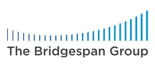
A quick look at The Bridgespan Group logo tells you that the image is that of a bridge. It is composed of lines that simulate a hanging bridge with equal gaps but different thicknesses. This may be to show its reliability while proudly displaying the group’s flexibility and adaptability.
The logo uses blue as its primary color, which exactly fits the brand. Blue connotes stability, calmness, and order, among many other positive traits. This is essential when you’re in an industry that requires you to project your most professional and solid image.
3. L.E.K. Consulting
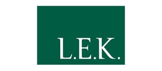
Founded in 1983, L.E.K. Consulting’s list of services includes corporate strategy, mergers and acquisitions, and operations. The company’s logo is a square with its brand name on it. Its sheer simplicity gives it that professional and reliable personality crucial in this industry.
Green is synonymous with growth, life, health, and new beginnings. It is also associated with progress and prosperity, making it an excellent choice for this management consulting firm. L.E.K. has a solid presence in financial services, consumer products, healthcare, energy, life sciences, and many others.
4. Boston Consulting Group
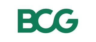
A thought leader in the consulting industry, Boston Consulting Group (BCG) is known for its innovative approaches to strategy. Its logo says this clearly. Its initial letters are merged into one element, giving the impression of a tight, strong, and stable image.
Like L.E.K., this consulting company uses green on its logo. Again, it shows traits we usually associate with growth, energy, harmony, and many others. Overall, it has a design that’s easily recognizable and suits the brand well.
5. McKinsey & Company
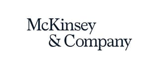
Touted as the most valued brand in the consulting industry, McKinsey & Company needs no introduction. Even in the branding department, this company has one of the best consulting logos. It is its brand name: simple, elegant, and professional.
This proves that logos don’t need too many decorative elements to make them effective. In this case, the saying “less is more” works perfectly. This logo comes in black and blue versions, both appropriate color choices as these connote competence and efficiency.
6. Deloitte Consulting
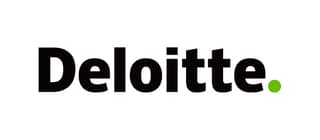
Another top consulting company, Deloitte, is a trusted name in the industry. And as such, it has a logo that matches its excellent reputation. It uses the brand name with a small dot on the lower right side.
The brand name is in blue, while the dot is in green. According to its website, this small green dot symbolizes the company’s transition period and its “unity and a shared purpose for people around the world.” If you want to know what a logo that suits its brand perfectly looks like, this is it.
7. AlixPartners
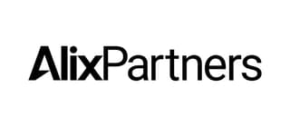
Having provided services to well-established firms such as GM, Enron, and Kmart, AlixPartners is considered a pillar in the industry. Its logo suitably represents the brand. It is well-designed as it gives it a professional and reliable feel. Many of the best consulting logos are minimalist, and it’s no coincidence – They get straight to the point.
The logo’s primary color is black, but it has versions in green, as you can see on their website. It uses two types of font styles that complement each other quite well. The letter A has a bit of customization done on it to give the logo a unique look.
8. Insight Sourcing Group
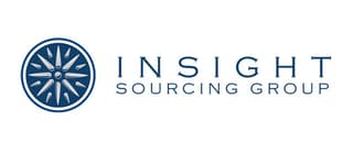
A relatively new company in the industry, Insight Sourcing Group was founded in 2002. While it is younger than most on this list, it hasn’t stopped it from sporting a logo worth noting. Aside from the brand name, the logo also has a circle with a starburst image.
This logo uses blue and gray and a typeface that is as robust as the image the company projects. It is reminiscent of a typeface most commonly found on stone engravings, giving it a solid and dependable feel.
9. Mercer
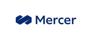
One of the world’s biggest consulting firms, Mercer shows its larger-than-life status with one of the best consulting logos. It consists of two hexagons that are merged to form a figure eight. The logo has undergone revisions, and it has dropped its colorful image and used a single color.
The hexagons are streamlined, with only the color blue from the previous one with various shades of it. This made the logo more professional looking without too many distractions. It shows the company’s commitment to success, growth, and reliability.
10. Wavestone
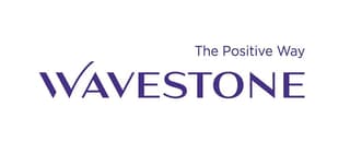
A newcomer in the industry, Wavestone is one of the fastest-growing consulting firms in the world. Because of this, a logo design should show this company’s sudden shot to fame while still looking serious and professional. And that’s precisely what they did.
The logo is a wordmark with the company’s tagline, “The Positive Way.” It is an example of simplicity with only a part of the letter W extending upwards towards the sky. This may be symbolic as the company’s thrust upward is noteworthy in the industry.
How Penji Does the Best Consulting Logos
The consulting industry may be one of the most complex niches to design a logo for. It is a serious industry and should always look professional, but each company is totally unique. We asked our Penji designers to create some to serve as inspiration, and here’s what they came up with:
1. Consultorship

A consulting firm that we created, Consultorship, has a logo design in the shape of a headset. If you want to show your clients that you mean business and that you’re always ready to listen, this is a good inspiration. The font style expresses the company’s serious intent, sincerity, and efficiency. The color represents determination, creativity, and success, among many other excellent traits.
2. Consultual
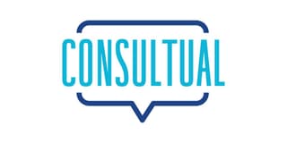
Reaching out to your customers is essential to any business, especially in a consultancy firm. This Consultual logo shows listening is a necessary skill by using a speech balloon as a big part of it. The brand name is encased in a huge balloon to show clients they matter. The color choice is worth noting. Blue is the color we most associate with stability, success, professionalism, and many other traits we want to see in a consulting firm.
3. Cogic
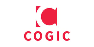
A blend of the words consulting and logic resulted in Cogic. Consultancy clients would want to hire the most brilliant company on the block. A great business logo design should show all the company’s positive traits, from its brand name right down to its logo. This one is an excellent example of a well-crafted logo that will give instant recognizability to its company.
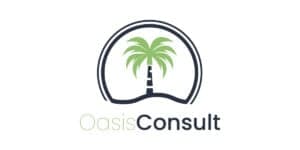
4. Oasis Consult

The list of the best consulting logos above shows that most of them use a wordmark. In the case of Oasis Consult, the designer decided to think out of the box and add illustrations to it. It has a palm tree, which is very helpful for customer recall. The color choices of green and black suit the brand perfectly.
5. Hire Advisors
Using green as the logo’s primary color, Hire Advisors evokes feelings of freshness, youth, and vitality. The logo merged the letters H and A and was cleverly designed. It is placed inside a square shape that would look great on letterheads, business cards, and other marketing materials. The font combination also shows forward movement, innovation, and class.
Why Partner Up with Penji?
If you’re looking for the best consulting logo for your business, Penji is your best design partner. Our team of exceptional graphic designers can create logos for every type of business. And the fun doesn’t stop there. Your subscription allows you to send requests for any other visual assets you need. That’s unlimited designs for a flat monthly fee – Check out all of our graphic design services here.


