Does an arrow speak to your brand’s identity? The arrow represents can signify forward movement, success, and innovation. Subway, Accenture, and Amazon are notable companies using this iconic symbol in their logos. And do you want an arrow in yours too? Here are ten Penji-made arrow logo ideas for inspiration. Plus, watch a demo video on how to get designs for your brand!
1. Arrowstone Accounting

Arrowstone Accounting logo has three components: a slanted bar graph, letter A, and an upward arrow. The image underscores the company’s mission to assist businesses in attaining their financial goals. So, the logo communicates the firm’s myriad of services, such as helping companies to stay financially organized and tax compliant and preparing them for business growth. This example manifests that it is possible to relay your brand’s mission and vision through a well-designed logo.
2. Upbound Marketing

Let’s examine the next arrow logo. In this design, the blue arrow is concealed by the “U” initials inside a rounded square background. Upbound Marketing’s iconic logo shows that you must execute the design in a way that fuels curiosity from the target audience. Another notable design element is the color scheme used which is visually appealing and personalized.
3. Peak Management

Our next example has a subtle design with just square shapes arranged to form an upward arrow. But if you look at it differently, you’ll see an image of a house. This logo means they want to help their clients or talents succeed in a welcoming and caring home or agency. In terms of color, the blue gradient arrow and the black fonts stand out in the white background.
4. North Tour + Travels

If you’re building a company in the tourism sector, it’s better to bookmark this logo design. Your business needs a logo that strongly promotes your image and makes a lasting impression on your potential clients. This design features lines and an arrowhead that looks like an airplane icon. The combination of these two essential elements builds a personalized branding identity.
5. Uppley Studios
The brand logo’s attractive design used simple elements, particularly the typeface and color. This one is worth considering if you’re looking for a timeless logo design. Aside from its simple appearance, the logo is also perfect for any type of branding materials such as flyers and brochures, crew uniforms, billboards, signages, and many more.
6. Target Realty
The combination of lines and arrows forms a geometric image of houses. The natural, earth-toned colors also convey a clear message about the products and services offered by a company. Again, color plays a significant role in creating a solid company logo. If your business belongs to the real estate sector, this simple arrow logo is a good design idea.
7. Gear Up Sports Wear

Calling all health, fitness, and sports-related businesses out there. This sporty arrow logo will indeed motivate you to plan your new logo design. The arrow background of the icon highlights the set of lines that resembles a running track and a letter “G” towards its end. Since the design has a unique personality, it will likely attract more customers.
8. Redhood Archery
The simpler, the better! That is what we can say while looking at this logo. But despite being a straightforward design showing an arrowhead icon above the brand name, we can call it a complete brand logo. Versatile logos like this build more awareness and trust among new and prospective clients. But you need to bear this in mind while designing a logo. It would be best if you created a cohesive brand to market.
9. Recharge Wellness

This beautiful wellness hub logo is one of the best on this list. The woman doing a yoga pose is a practical element of the emblem. Behind the icon is an arrow shape background. Apart from its perfect layout, the toned-down color exudes a relaxing feel of the overall logo design. Indeed, the Recharge Wellness is an exemplary presentation of an arrow logo.
10. Birchway Digital Solutions
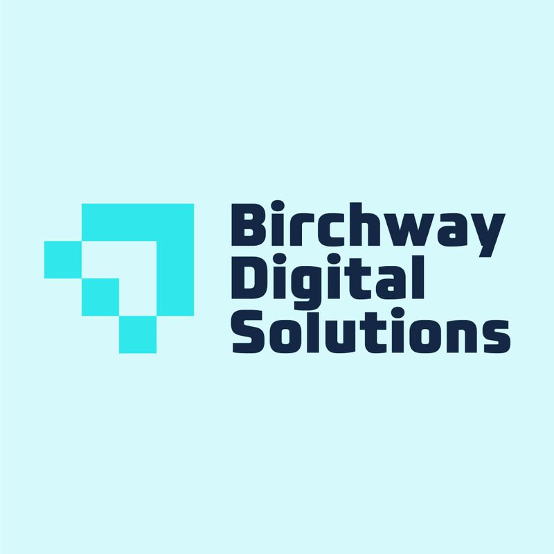
You can’t see the arrow component in the logo at first glance. Looking closely at the image, you will notice an arrow pointing towards the right. The design communicates reliable and stable digital solutions to its clients. Both the symbol and the letter marks are positioned in a balanced fashion to maximize the space. When creating a logo, it is worthwhile to consider the proper way of putting all the elements together to help bring a positive first impression to the target audience.
Brand recognition is the ultimate benefit of logo design.
Before we end this blog, let’s review some of the most crucial points in logo design, according to graphic design experts.
- Make a lasting impression. Visually appealing images are the key to retaining something in our memory.
- Stand out from the crowd, or in the business owner’s point of view, from the competitors. Your logo design should be unique and authentic.
- Convey your mission statement. Patterns, accents, and colors evoke human emotion.
It seems easy to create a logo from scratch using a logo maker. However, you have to consider rules and principles to make a remarkable, memorable, and unique logo. Fortunately, a designer can make things easier! It starts by subscribing to Penji here. You can depend on Penji for your branding identity and so much more when you sign up.
However, you can get a one-time design by requesting one in our Marketplace! Get your new logo here.
About the author

Rowena Zaballa
With a background as a former government employee specializing in urban planning, Rowena transitioned into the world of blogging and SEO content writing. As a passionate storyteller, she uses her expertise to craft engaging and informative content for various audiences.

