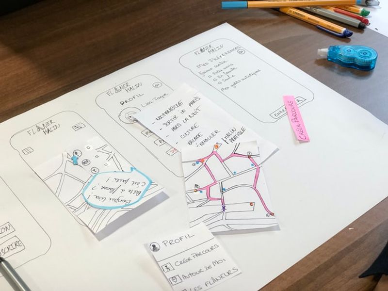
When designing apps, you should not only work on visual appeal. While it is important to consider the color, theme, lines, illustrations, and typography, all of these will not matter if you have a bad app UX design. UX or User Experience refers to how users feel while using your app. Do they find it easy? Was it complicated? Were they able to find answers to their questions?
To illustrate it better, imagine yourself going to a physical store seeing cluttered clothing racks and salespeople who are not knowledgeable about the products. Chances are, you will leave the store empty-handed and you might not even return, right?
The same goes for apps. If the user did not have a great experience and was not able to see what they need, you will lose potential business. And that’s why UX design is important. It improves the overall experience and it aims to increase the conversion rate. This is complicated for rookies so you have to choose a good team that could work on your app’s design.
At Penji, we design apps according to your market. This is so we can provide them with the best experience that could foster business growth. We help small and medium-sized enterprises with our cost-efficient packages. Our clients do not only get outstanding app UX designs from us, we provide unlimited graphic design services for a fixed fee every month. Do not miss this chance of working with the pros and sign up now.
Let’s now go back to the secrets of app UX design.
1. Reduce Cognitive Load
To have a successful app, one must understand what a cognitive load is and how it affects the overall app UX design. Cognitive load simply refers to the amount of mental resources one uses to decipher or to complete a specific task.
In terms of apps, it has to be designed where users do not have to think a lot about how to use it. Instead, the layout, texts, icons, and even colors should be a giveaway and must show an intuitive design. It means that in just a quick glance, people will know how to navigate through your app.
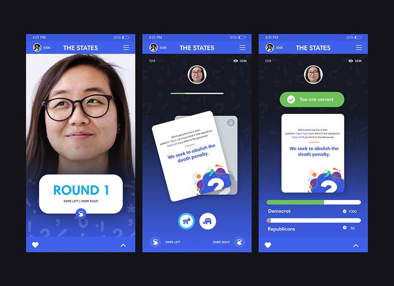
Here’s an example of a good design where the instructions are clear. It uses icons and even gestures to aid the user.
2. Improve Onboarding Experience

Your user’s onboarding experience is a determining factor if they will continue or uninstall your app. A common thing we’ve seen in older apps is that they require to fill out forms at the onset. Believe it or not, asking information right away can be a turnoff. You might want to delay this task for now and just ask them if there are more features to unlock.
If you wish to improve the onboarding experience and you require them to sign in, allow them to use their existing accounts such as Gmail or Facebook. In just one click, they will be able to make an account and they can start enjoying your app’s full features.
Skype uses this technique. Instead of asking its user to create new login credentials, you can use your Microsoft account. This proves to be effective considering the number of users Skype has globally.
3. Apply Functional Minimalism
Another app UX secret is the use of functional minimalism. But before you decide on designing your app using only neutral colors, let us clarify some things with you. When we say functional minimalism, this is not the same with aesthetic minimalism where we think about black, white, or straight lines.
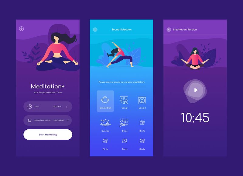
The concept means that most, if not all, the elements you use in your app have a purpose. The meditation app we have here is a good sample. If you want to use bold colors, that’s ok as long as you know the right contrast. This is where experts like the Penji team can help you. We want to build an app that speaks a lot about your brand. Yet, it is organized, crisp, and clean, perfect for mobile phone usage.
4. Practice Functional Consistency
When building an app, it is apparent that design consistency is a must. But what most people do not know is that there are different facets of design consistency.
We have the visual consistency that refers to buttons, typefaces, images, and even labels found in your app. We also have the external consistency wherein your app must be akin to your general branding. If you have an existing website, the app must be cohesive and follow some of the design principles. Consider the theme and color scheme for this one.
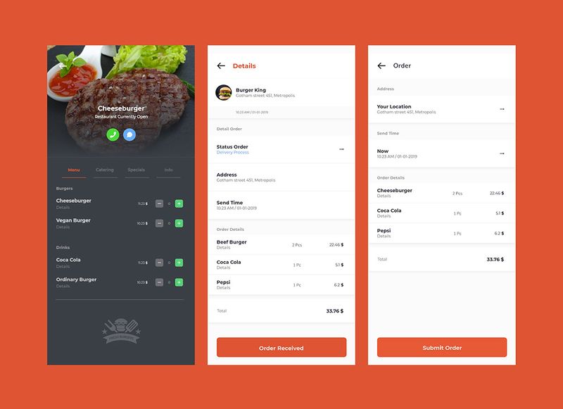
But for an app UX design, what matters most is the functional consistency wherein the interactive elements are the same on every page. Just take a look at this example. For a restaurant app, there should be one process for ordering. This is regardless of what food or beverage they wish to get.
5. Use Familiar Functions
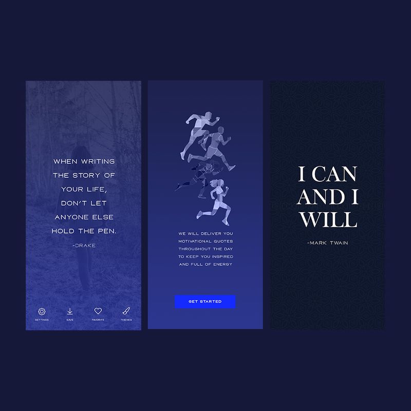
If you must know, there are around 8.9 million apps around the world. And according to research, there are more or less 60 to 90 apps installed on a smartphone. With that said, we can assume that most people have a general idea of what an app should look like. They are familiar with several features and screens, and would likely appreciate an app that has similar functions. Remember what we said about cognitive load? The concept could be applied here as well. Take advantage of this principle when creating your app UX design.
How many times have you seen an app screen saying ‘Get Started’ like in our example? We understand that it can be tempting to use unique terms to stand out. But that could be risky for someone who’s just starting to build an app. Save the jargon for now.
6. Progressive Disclosure
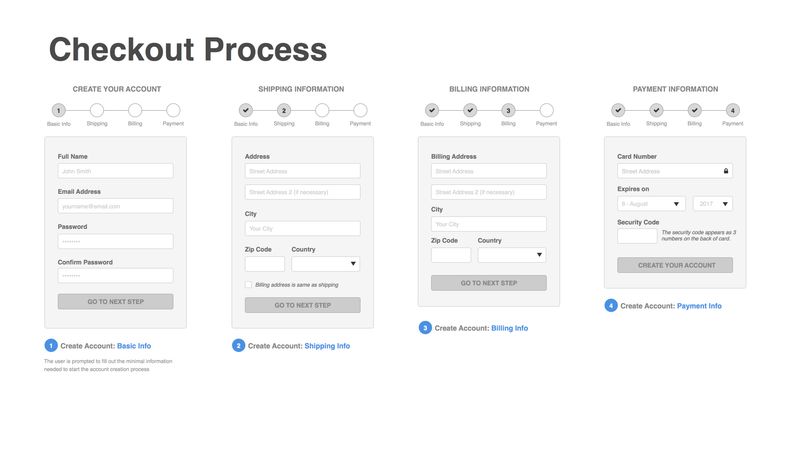
As much as we want our apps to be extremely simple, there are features that are more complex. But the solution is to break the tasks into smaller subtasks. This technique or what we call progressive disclosure will make it look less overwhelming for the users.
It is commonly seen from most eCommerce’s checkout process. Instead of providing all the instructions on one page, they divided it into smaller chunks and allocated separate pages for it.
7. Identify Repetitive Tasks
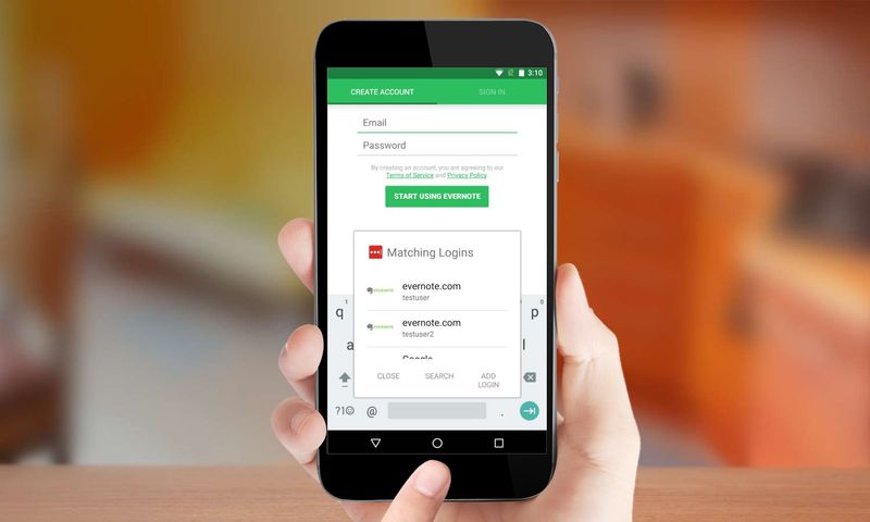
If you can automate tasks in your app, then use that. For example, maximize auto-fill forms so that the user does not have to type in their information all over again. If you have captured some of these from your sign up process, then just automatically transfer the details.
And since we are already talking about forms, make it short and simple. Again, longer ones can lead to more ‘uninstalls’.
8. Use Input Masks
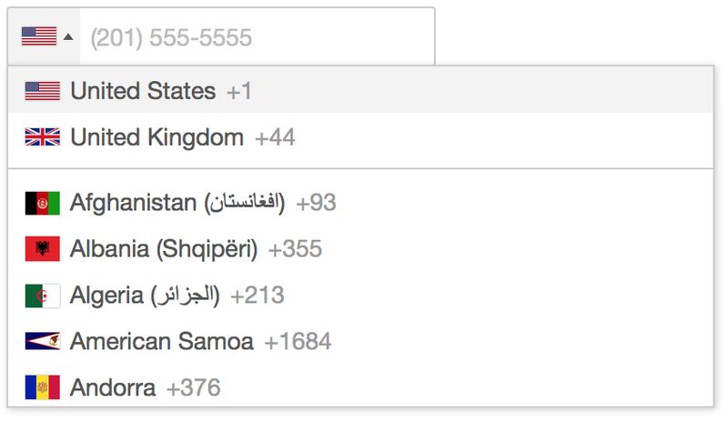
Are you familiar with input mask? This is also another crucial element for app UX design. It’s a feature where you are guided on the format when completing forms or fields. In hindsight, you might think that this is useless. But ask yourself, how many times have you encoded wrong phone numbers, credit card number, or zip code? Probably a lot, right? The input mask can help you avoid such minimal errors and can improve the overall experience.
9. Validate Customer Information
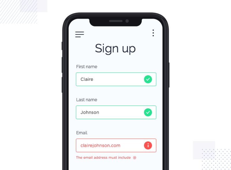
You wouldn’t want your user to click the ‘next’ button only to find out that they have missed other information. A simple workaround is to prompt your user right away. Changing the field color and adding supporting texts are more effective than just placing an asterisk (*).
10. Increase Accessibility

Lastly, remember that not all users have the same abilities. Some might need additional features to fully enjoy your app. For example, we have people who are color blind. In this case, you shouldn’t design your app where instructions are based on colors. Instead, use icons or add texts. Others are using more advanced technology such as voice control. If this is appropriate for your app, then go ahead and include this feature as well.
Spotify uses voice control whenever you want to request a song. It’s also ideal if you want to use your app, hands-free.
Final Thoughts
The apps we use today make our lives simpler. However, building a good app UX design is the complete opposite of simple. It’s complex and follows several design principles. If you plan to create one, we recommend getting help from the experts.
The Penji team consists of professional UX designers that can guide you on the latest app design trends. We help startup companies by providing them the best apps through our affordable design packages. Check our plans right now and sign up here.
About the author

Barbara Anne Isla
BA Isla is a Content Writer and also an Events Host. She left the corporate world to do what she loves and to spend more time with her amazing kids. She hopes to bring valuable change to society with her words.


