
Having a great cover photo for your Facebook group can help make a strong first impression, attract potential members, and communicate your purpose and values. It can also make your group look more professional and trustworthy while creating a sense of community among existing members.
Here are ten tips to follow to create a Facebook group cover photo that gets attention:
Leverage Your Company Mascot
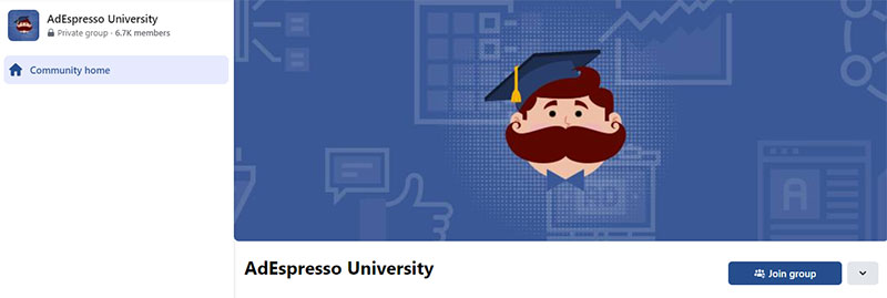
Claiming to be the largest Facebook group dedicated to Facebook and Google advertising, AdEspresso University’s cover photo is worth looking into. They incorporated their company mascot into the design, which is a good strategy for creating a memorable and recognizable brand image.
Placing the mascot in the center draws attention to it and makes it a focal point for the group. This can be particularly effective if the mascot is already well-known or has a strong visual identity. In this case, they had their mascot, with its exaggerated mustache, wear a mortarboard commonly associated with graduation ceremonies.
Tell Your Group’s Amazing Story

A collage of photos can be an effective storytelling tool for Facebook group covers. Wandering Moms does this with aplomb. It is effective in telling their story and communicating the group’s focus on family travel. It features real photos of moms and their children in different destinations and situations, efficiently conveying the excitement and adventure of family travel.
This is a great way to showcase a variety of different experiences and perspectives within the group. Also, this can be particularly appealing to potential members who are looking for inspiration or guidance for their own family trips.
Impress with Stunning Photography
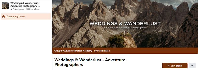
Impress potential members and make existing ones proud to be a part of your community with stunning photographs. Weddings & Wanderlust – Adventure Photographers’ Facebook group cover photo features an image of a bride and groom standing atop a steep cliff with large mountains in the background. It wonderfully showcases a beautiful and adventurous location for a destination wedding.
The image oozes a sense of drama and awe, which can be visually striking and memorable for potential members of the group. Overall, a cover photo that features an attractive and unique location can be a powerful way to communicate the group’s focus and values.
Showcase Your Works
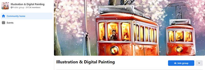
One approach to a great Facebook group cover photo is to choose work that represents your style and aesthetic. Illustration & Digital Painting will never run out of photos to use for its covers. The goal is to create a design that is visually engaging, representative of your works, and communicates your skills and expertise to potential members of your group.
Incorporating elements that relate to your field or industry can be effective. In this instance, the group members are illustrators and painters, thus featuring the work of one of its members.
Less is More
The saying “less is more” in design is a principle that suggests that simplicity and minimalism can often be more effective and powerful than complexity and clutter. When designing a Facebook group cover photo, applying this principle can have several benefits:
Clarity
A simple and clean cover photo can be easier to understand and process at a glance, which is important for capturing the attention of potential members who may only be briefly browsing your group.
Focus
By limiting the number of elements in your cover photo, you can direct the viewer’s attention to the most important visual elements or messages that you want to communicate.
Memorable
A clear and distinctive image or message is more likely to stick in the viewer’s memory than a cluttered or confusing image.
Versatility
A simple and clean design can be more versatile and adaptable to different devices and screen sizes. A complex or busy design may not look as good or be as readable on smaller screens, which can be a disadvantage when many users access Facebook on mobile devices.
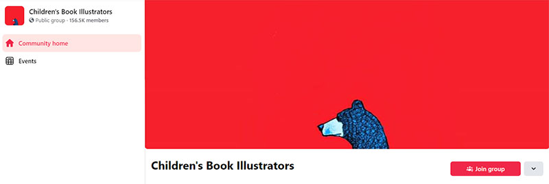
A good example of a Facebook group cover photo that embraces minimalism is the group Children’s Book Illustrators. It features a head of a bear at the bottom of a bright red background and nothing more. It is both eye-catching and endearing.
Overall, by using a less is more approach to designing your Facebook group cover photo, you can create a stronger and more effective visual message. Additionally, it will better capture the attention and interest of potential members.
Make Your Viewers Think

The Facebook group What’s Your Plan B? has a cover photo that is designed to make viewers think and reflect. It features a road stretching into the distance, with a car driving away from the viewer. It suggests a theme of exploring alternative paths and options when facing a dead end or unexpected obstacles.
The image is intriguing and mysterious yet thought-provoking and memorable. It is great in inspiring viewers to join the group to learn more and participate in discussions about alternative paths and plans.
Use Striking Art and Vibrant Colors
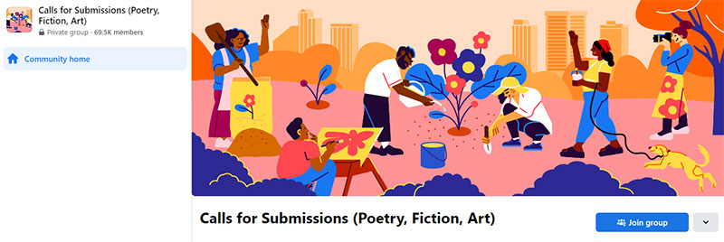
One way to make your Facebook group cover photo stand out is to use striking art and bright colors. This is what Calls for Submissions (Poetry, Fiction, Art) has done in its cover art. It features an illustrated scene of artists, writers, and photographers gathered together. The illustration is done in a colorful and cartoony style, with bold outlines and vivid hues.
The cover photo has an inclusive and welcoming effect that’s perfect for a group looking for submissions. The use of bright colors and a playful illustration style adds to the friendly and approachable tone of the group. It offers an encouraging feel for viewers to join and participate in the creative opportunities and discussions offered by the group.
Final Thoughts
Designing an effective Facebook group cover photo is crucial for building an engaging online community. By following the outlined tips, you can capture potential members’ attention, communicate your group’s focus and values, and encourage engagement.
If you need help designing your group’s Facebook cover image, Penji is here for you. Watch our demo video here to learn how. Or you can start the design process now by clicking on this link.
About the author

Celeste Zosimo
Celeste is a former traditional animator and now an SEO content writer specializing in graphic design and marketing topics. When she's not writing or ranking her articles, she's being bossed around by her cat and two dogs.


