
Acting on instinct, bibliophiles read the book blurb at the back to gauge whether a book is worth their time not. Unfortunately, an array of books on a store’s shelf isn’t displayed with their backs first. It’s usually the front book cover that draws attention. But how do you make readers grab your book and crack it open? Here are twelve book cover trends you should consider in 2024.
1. Minimalism
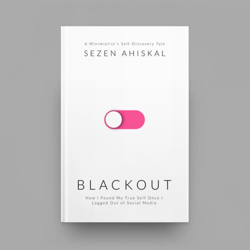
With thousands of books published yearly, you want your print book or eBook covers to cut through the noise. Although some authors and marketers think that bold designs make the cut, sticking to minimalist covers equally does the job. A modern book cover design belongs to the umbrella of minimalist graphic design.
These designs are uncomplicated, with bold typography and minimal colors. It could be why readers pick your book out of all the bright and bold designs.
Pro Tip: One way to make your minimalist book cover design stand out is to ensure you include bold typography. However, make sure you choose one that also reflects the content of your book.
2. Maximalism

One of the most popular book cover trends for 2024 is maximalism. It maintains balance when stacked against minimalist cover designs. Maximalist designs feature bold and outrageous designs and font combinations that attract readers. A maximalist book cover design not only entertains at first glance but also tells a lot about your book.
That said, it’s crucial to work with professional graphic designers to make complex designs an eye candy and not an eye sore. The idea behind maximalism is “more is more.” Sticking to more colors, illustrations, textures, and cool fonts is critical to making this design work.
Pro Tip: Create a sense of coordinated chaos that still communicates what your book is about.
3. Bold typography

Bold typography was born out of minimalism. The difference lies in other complementary design elements. Amidst the book cover design noise, your typography must stick out like a sore thumb. When done correctly, these are impossible to neglect, especially when the appropriate fonts are displayed.
Bold typography doesn’t only provide high readability, but it also creates an organized structure. It gives you room to play around with a small canvas. Many book cover designers include bold fonts for emphasis and visual hierarchy.
Pro Tip: Think of book cover ideas that create a balance between typography and graphics. If you’re banking on bold typography, make sure it steals the limelight but doesn’t overwhelm the entire composition.
4. Silhouettes
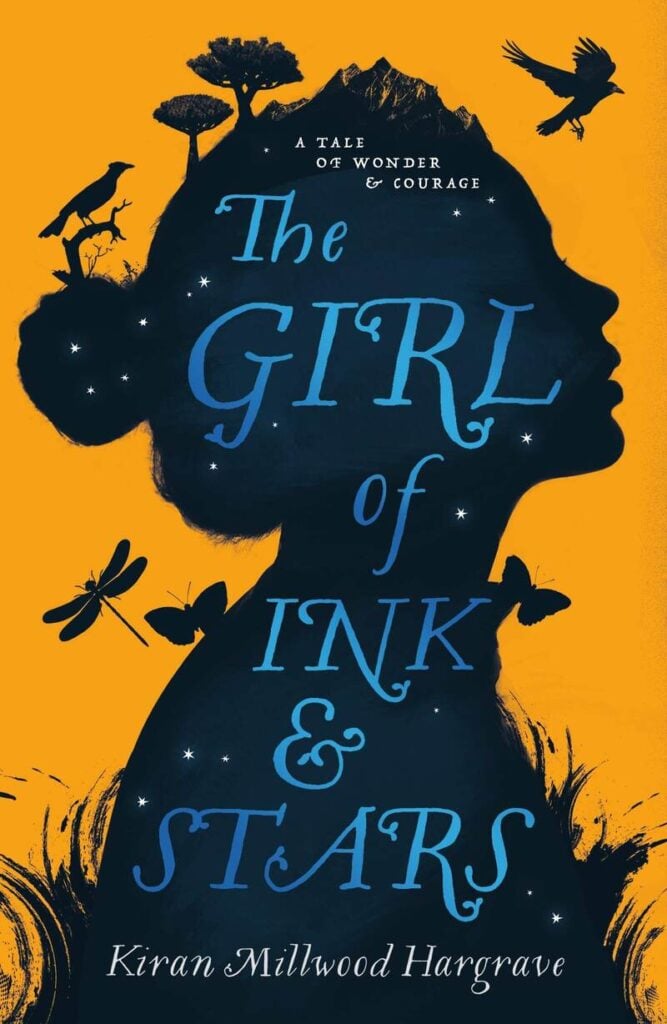
Adding a silhouette is the best book cover art that transcends years of design creation. It’s simple yet creates a mysterious effect that attracts readers. This style allows authors and printers to showcase the story’s protagonist without revealing too much. Including a silhouette on your book cover builds up the featured character immediately.
Moreover, silhouettes can achieve minimalism and leave a more powerful impression. They raise questions about the book’s characters and plot in readers’ minds.
Pro Tip: Allow silhouettes that create a decluttered book cover design. Stick to modern silhouette styles, emphasizing other elements, especially the book title.
5. Illustrations
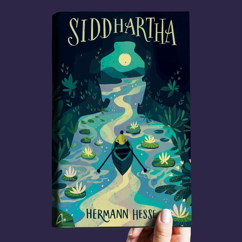
Illustrations are excellent book cover ideas because they allow designers to customize according to the book’s story. These graphics are playful, and flexible and capture a story exceptionally well. Illustrations are also versatile enough to use in any book genre. Whether it’s fiction, fantasy, history, action, adventure, horror, romance, or sci-fi, illustrations capture the story’s essence.
Additionally, illustrations are suitable with any other book cover design style, provided they’re appropriately used. Plus, many up-and-coming authors can use stock illustrations if they’re working on a tight budget.
Pro Tip: Work with experts to create custom illustrations for your book cover. These images must portray the author’s style and the book’s content.
6. Real-life photos
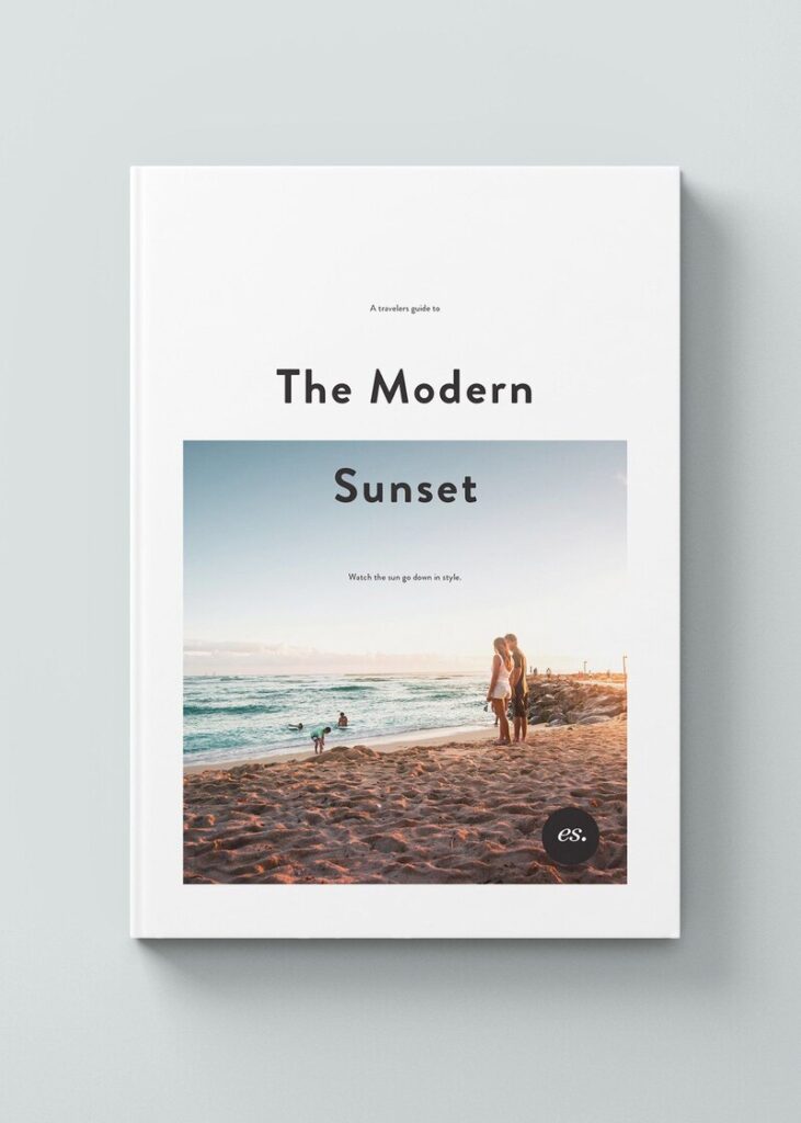
The best book cover designs connect with readers on a more personal level. And one way to pique interest is to include real-life photos. These images are appropriate, especially for non-fiction books.
Real photography is one of the book cover trends that will stay for years because of its authenticity. You may also explore photorealism to keep your book cover design interesting. Another thing to consider is to stick to nature and the outdoors when choosing this book cover design style.
Pro Tip: Ensure your photographs are high-quality, ensuring the photos help tell your book’s story.
7. New retro

Vintage aesthetics never go out of style because it creates a sense of familiarity. It induces nostalgia that can tug at readers’ heartstrings. This could be your selling point when making your book cover designs stand out.
New retro book cover designs are full of life, despite the archaic influences. It pertains to past influences while integrating modern styles and culture.
Pro Tip: Include modern design elements on your new retro book cover design. However, choose fonts and design components relevant to your book’s story, as this style could confuse readers when misused.
8. Grids
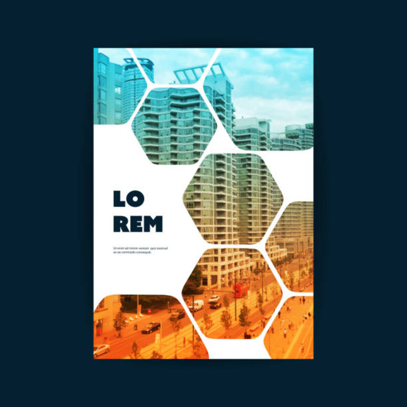
Grids create visual interest by maintaining balance. Using grids requires an excellent eye to ensure both typography and graphics pop. Grids could drown other design elements, especially your book title. That said, make sure you use legible and equally bold typography for bolder graphics.
Grids on book cover designs keep many components orderly and aligned, even in asymmetrical designs.
Pro Tip: The key to achieving coherent grids on book cover designs is prioritizing balance between all elements.
9. Symbolism
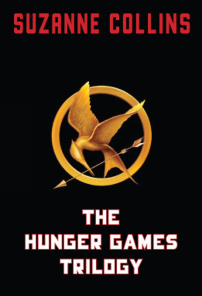
The Mockingjay is a symbol of defiance in the Hunger Games novel. It draws its significance from its intriguing origins. Born out of a failed Capitol project intended to spy on the rebellious districts, the bird serves as a lasting reminder of the Capitol’s defeat and the unwavering resistance of the districts. It’s a symbolic affront to the Capitol, as described by Katniss. Initially, the Mockingjay pin given to Katniss by Madge is emblematic of this resistance. As the narrative unfolds, the birds take on a new role as symbols of a unique form of defiance. The Hunger Games book cover design showcases this depiction.
Pro Tip: Use symbols that depict the book’s storyline, gist, or main character.
10. Pop art
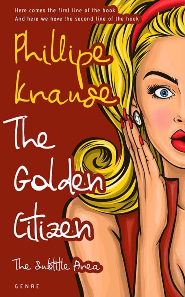
Pop art is known for its vibrant colors, bold contrasts, and visually striking compositions. Applying this style to book covers instantly grabs the attention of potential readers, making the book stand out on shelves or online platforms. Pop art, which emerged in the mid-20th century, has a modern and trendy appeal. Infusing a book cover with pop art elements can make the design feel fresh, relevant, and appealing to a contemporary audience.
Pro Tip: Make your pop art bold and recognizable to ensure the cover remains visually impactful, even in reduced sizes.
11. Abstract
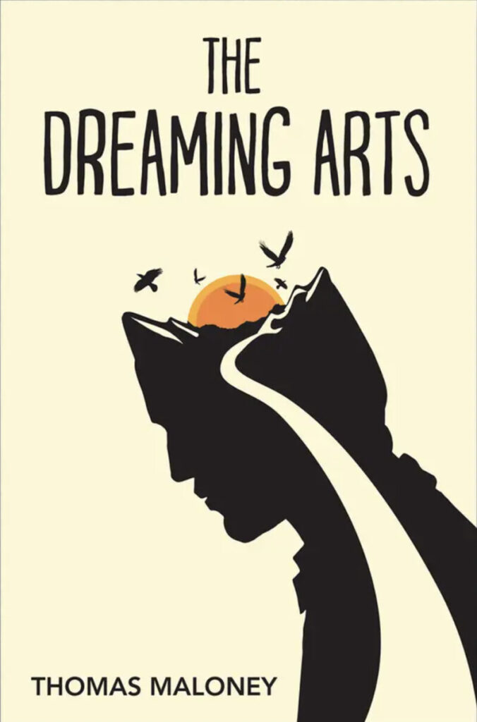
Using abstract design on book covers offers a range of benefits, contributing to a book’s visual appeal and marketability. Abstract designs are open to interpretation, allowing readers to form their impressions about the book’s content. This versatility makes abstract covers suitable for various genres and subjects. Abstract designs often have a timeless quality, making them less likely to feel dated. This can contribute to the book’s longevity and sustained appeal. These designs can attract a broad audience, as they don’t limit the book to a specific genre or demographic.
Pro Tip: Cater to diverse readers by using abstract designs for versatility.
12. Editorial

Editorial designs often exude a sense of authority and seriousness, making them suitable for scholarly, academic, or serious books. This design choice signals to readers that the content is well-researched and substantial. Non-fiction genres like history, biography, philosophy, and academic works often benefit from editorial design. It complements the informational and factual nature of the content. Editorial designs typically feature sophisticated and well-crafted typography.
Pro Tip: Don’t neglect attention to typography to enhance the book cover’s overall aesthetic appeal and convey professionalism.
Conclusion
Book cover design trends guide authors, marketers, and printers in putting together the most compelling book covers. However, relying on these trends alone means you’re not experimenting with other creative ways to be distinct. Reading a book takes money and time, so readers carefully select books they want to indulge in.
Make your book cover designs pop by working with professional graphic designers. Penji’s expert designers know how to invoke particular emotions within your target readers. By using appropriate fonts, colors, art, and design styles, your book cover could instill dramatic appeal.
Try requesting your first book cover design through Penji’s custom design platform. Sign up for a 30-day money-back guarantee or get this 25 percent discount on your first month by using the promo code GETPENJI25!


