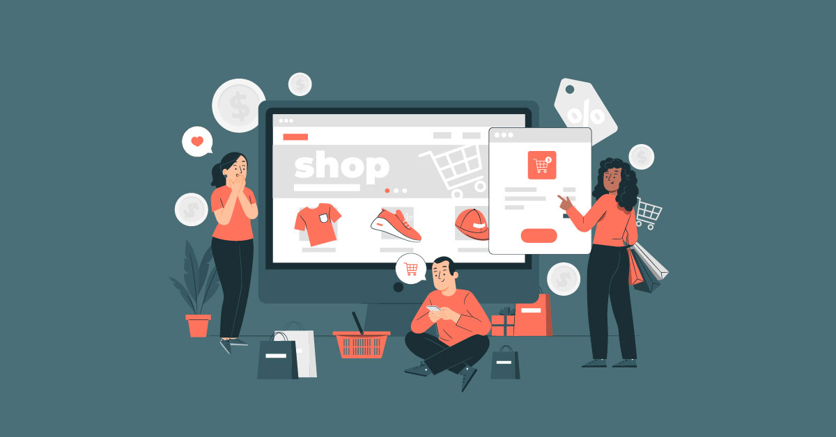
As you gear up to your brand new online store, you need to ready your website for launch. But before it’s up and running, did you check visuals and copy? And are you satisfied with your website’s design? If you’re still reluctant to press the publish button on your site builder and your website design needs more work, here are ten eCommerce website ideas to turn visitors into customers.
1. Reimagine the Split-Screen
A split-screen landing page layout is one of the most popular eCommerce website ideas for design. Nowadays, the split-screen landing page has a new look. You can add an outline to your landing page to emphasize the grid look.
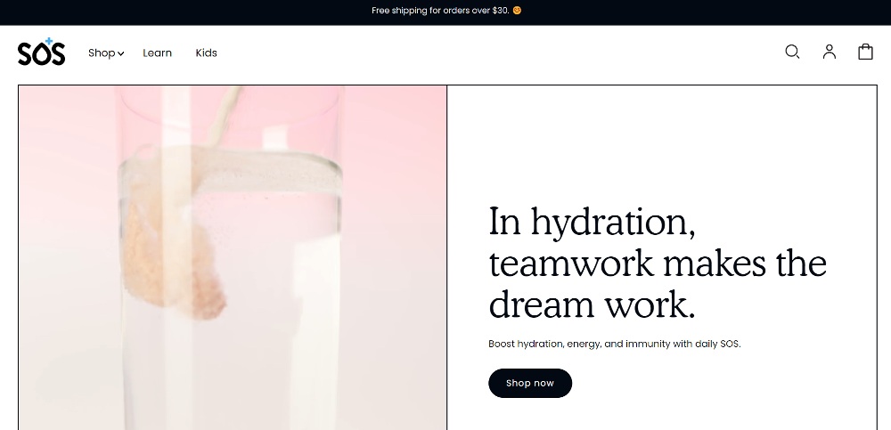
Here’s an example from SOS’s website. They use a video on one side and keep the text on the other. It’s an excellent way of introducing and presenting the product and persuading the visitor to browse their products too.
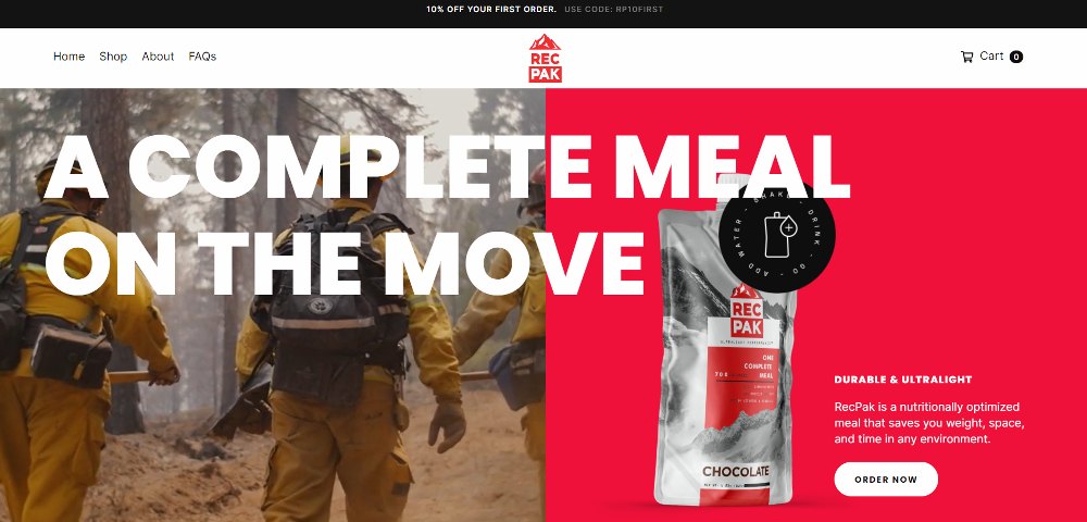
A similar example comes from Recpak. They use a video on the left but combine text and image on the right. If you visit their website, the video shows visitors who can benefit from using their products, such as hikers and surfers.
2. Apply Text Only Above the Fold
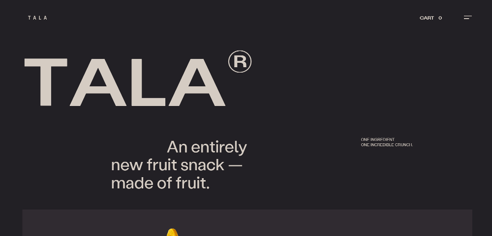
Images are the norm on any landing page. After all, you want to show or entice visitors with your product. But here’s one website design idea to test out: a text-only above the fold landing page design.
Here’s one example from Tala showing us that a text-only above the fold landing page design can work. Web copy and design work hand-in-hand to engage visitors and encourage them to take action. Typography and text placement play a big role in a text-only above the fold landing page design.
3. Go with Neutrals
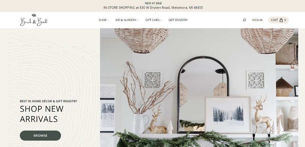
Neutrals are a classic and timeless look for any website design. You can’t go wrong with neutral, especially if you want to achieve a boho or rustic style. Check out this website design for Birch and Bind. And if you’re going to keep that vibe on your landing page, make sure you use a hero photo showing neutral colors too.
4. Make it Colorful
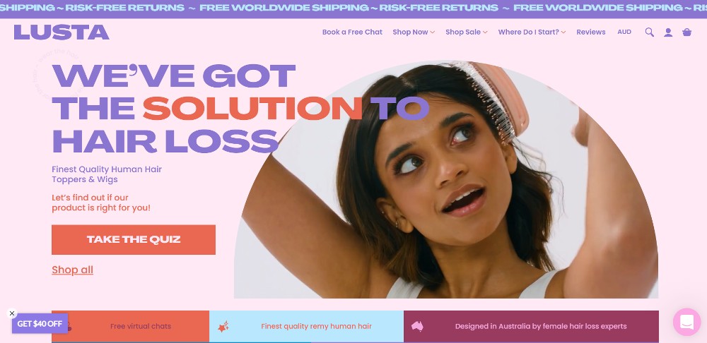
If you are not a fan of neutrals, you can make your eCommerce website colorful with vibrant or pastel motifs. Vibrant or pastel colors can add a certain brightness and liveliness to your site. Even if you want to go crazy with colors, using specific palettes can create consistency and cohesiveness across all pages. If you want to try this website idea, here’s Lusta’s website to serve as inspiration.
They combine pastel and bright colors that work well together. It’s best to use one main color and make it work with other colors in the palette.
5. Use a Ticker
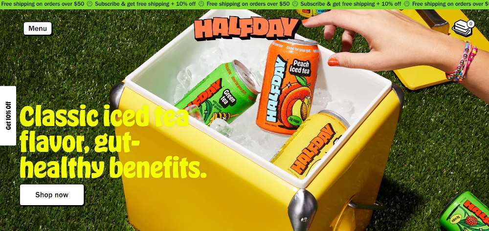
Tickers have become a popular feature on many modern websites. And you’ll see it in many eCommerce website ideas or trends. Motion and animation are recent website trends, and many websites want to get on in the action. Tickers are a great alternative to static reminders, such as “free shipping” or product availability. Here’s an example from Halfday Iced Tea.
It would be great if the ticker background color were part of your website’s overall color palette. This will create harmony and won’t overwhelm the visitor. Plus, make sure that the text you use is readable or part of the font family you’re using on your website.
6. Rearrange the Navigation or Header
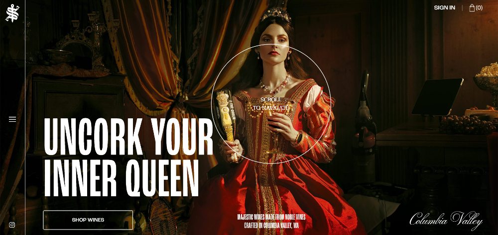
The navigation or header on any website is usually at the top. It has a more functional purpose than an aesthetic one, considering that the navigation or header will help you browse different pages. But check out this one underutilized eCommerce website idea.
Here’s the website for Sword and Scepter. Although you can still see the Sign in and Cart buttons at the top, the hamburger menu is on the left side of the site. Having the side navigation helps in putting the spotlight on the hero image. Plus, instead of adding a solid background to the navigation/header, make it transparent and use minimalist icons.
7. Go Big

Go all out and make an impact in a big way by using bigger pictures or fonts. Take a look at this example from Filayyyy. They didn’t hold back using the big fonts, and you will focus on the landing page because of it.

Here’s another example of “going big” on your website. Instead of using big fonts, use a bigger picture of your products, like this one from Flyers. Your eyes will be drawn to the cocktail cans, making you want to take a sip of their drinks.
8. Use Illustrations
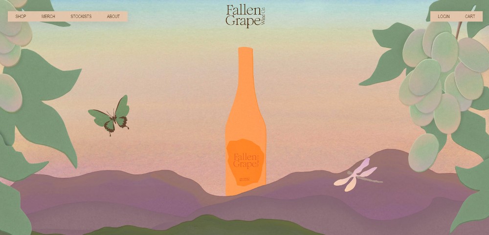
Illustrations are still trendy for many websites. But based on some eCommerce website design ideas, that usually isn’t the case. You want to showcase your product on your landing page. However, you can use illustrations like this one for Fallen Grape. It’s another take on making the product enticing to the audience. Plus, it’s a way to show your creativity too.
9. Place CTA Buttons Somewhere Else
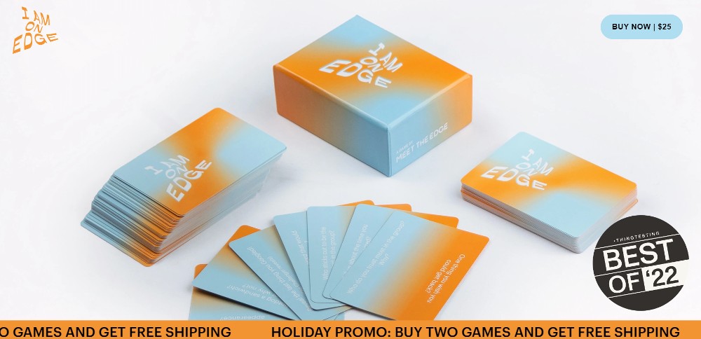
Call to action (CTA) buttons are usually found on the bottom left or right or in the middle of the landing page. But why not try something new with the CTA by placing it somewhere else? Here’s an example from I Am On Edge. The CTA was added on the upper right of the page to showcase the game better on the photo.
10. Use Blobs Instead of Shapes
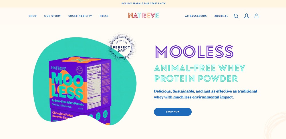
Circles and squares are commonly seen on many websites as background images for products. But blobs are great alternatives to these shapes. You don’t see them often, and they will put a unique touch on your website design. Take a look at Natreve’s website design here. Instead of placing the photo against the cream background adding a green blob helps emphasize the product.
How Penji Can Help with Your eCommerce Website
When designing your eCommerce website, you don’t have to stick to conventional web design practices. Make your website even more engaging and let visitors stay for long with a unique eCommerce website design. And if any of these eCommerce website ideas speak to you and you want to try it out for your website, but have no experience in designing, don’t fret! Penji is here to help you with your website design.
For $699/mo, you can get unlimited web designs, illustrations, and other graphics for your eCommerce site! And if you want to get in on this, you can subscribe here!
About the author

Katrina Pascual
Katrina is a content writer specializing in graphic design, marketing, social media, and technology. In her spare time, she writes monthly personal blogs to practice her craft.
Table of Contents
- 1. Reimagine the Split-Screen
- 2. Apply Text Only Above the Fold
- 3. Go with Neutrals
- 4. Make it Colorful
- 5. Use a Ticker
- 6. Rearrange the Navigation or Header
- 7. Go Big
- 8. Use Illustrations
- 9. Place CTA Buttons Somewhere Else
- 10. Use Blobs Instead of Shapes
- How Penji Can Help with Your eCommerce Website


