Your lawn care business deserves recognition, even if you’re competing with industry juggernauts. That said, you need a logo to stand out from the crowd. And if you’re looking for inspiration, we have ten lawn care logo examples. But if you’re itching to get one soon, Penji offers one-off designs too! Check out our pricing page here!
1. The Grove Lawn Care Services
The first thing you need to think about when designing a logo is that it should tell customers about your business nature. This logo designed for The Grove lawn Care Services does that beautifully. In it is an illustration of a tree with lots and lots of leaves to show what they do.
Green is an excellent color choice, along with brown, to signify land and nature. However, this does not mean you can’t use any other color. You can always use whatever color as long as it represents your brand.
2. TLC Total Lawn Care
Another must you need to know is that your lawn care logo should be unique. It’s your identifying asset, so it’s imperative that you don’t share a logo with anybody else. This TLC Total Lawn Care logo is a great example of this.
It uses custom illustrations that ensure the brand has a one-of-a-kind logo. Not only that, it is lively, eye-catching, and genuinely attention-grabbing.
3. Simply Green Lawn Care
This vibrant logo for Simply Green Lawn Care is an excellent example of dynamic design. It is reminiscent of a sports logo, thanks to the same movement, energy, and liveliness it gives off. It uses green and brown, but the addition of electric blue adds a youthful glow to the design.
The grass on the upper part of the logo and the land at the bottom beautifully depict the company’s business nature. The fonts the designer used also show dynamism and life, which perfectly aligns with the overall design.
4. Lawn Solutions

This logo for Lawn Solutions fits the brand well as it uses abstract lines that clearly depict a lawn care business. On it are icons of grass and a lawn with eye-catching colors added with the typical greens and browns. The yellow and orange add warmth and a touch of friendliness to the design.
This lawn care logo uses a very basic font type. This is done with the purpose of giving balance to the details that the logo already has. A complex font will make the logo look cluttered.
5. The Green Yard
A rule of thumb that logo designers follow is that the ideal logo should only have two or three colors. This is to avoid confusion and make the logo flexible and versatile. The Green Yard logo is an excellent example of this. It only uses green, but to make a distinction, it uses two different shades of it.
The symbols of a fence, trees, and a house tell us a story about the brand. It has a friendly vibe, which is perfect as many of its customers would be homeowners, not big companies.
6. The YardGuards
Taking care of lawns isn’t a small feat. You need to be tough and careful at the same time. To show The YardGuards’ robust brand personality, the designer chose a fast-paced logo design. The slanted fonts show speed and movement, while the bright colors project an innovative image.
The addition of the grass at the back clarifies the company’s nature of business. The lawn care logo has a touch of metallic shown in the brand name. Thus, giving it a contemporary feel.
7. Mow Bros Lawn Care

Taking inspiration from Mario Brothers, this logo design for Mow Bros Lawn Care uses a gardener symbol riding a lawnmower. The logo uses green as its primary color and a splash of yellow and white here and there. The Mario-esque character is cute and adds a touch of humor to the design.
The font type is big and bold, perfectly matching the brand’s personality. Again, notice that they are simple typefaces only as an ornate one would not work with the overall design.
8. Clean Cut Lawn Care and Landscaping
With icons to symbolize the tools of the trade, this logo created for Clean Cut Lawn Care and Landscaping is a head-turner. The hand and grass symbols are excellent in depicting the brand’s identity. While it has the typical green for its color, the addition of blue gives the design a refreshing take.
And as the logo has quite a few details in it, it’s only natural to use a very basic font type.
9. Muller’s Lawn Works
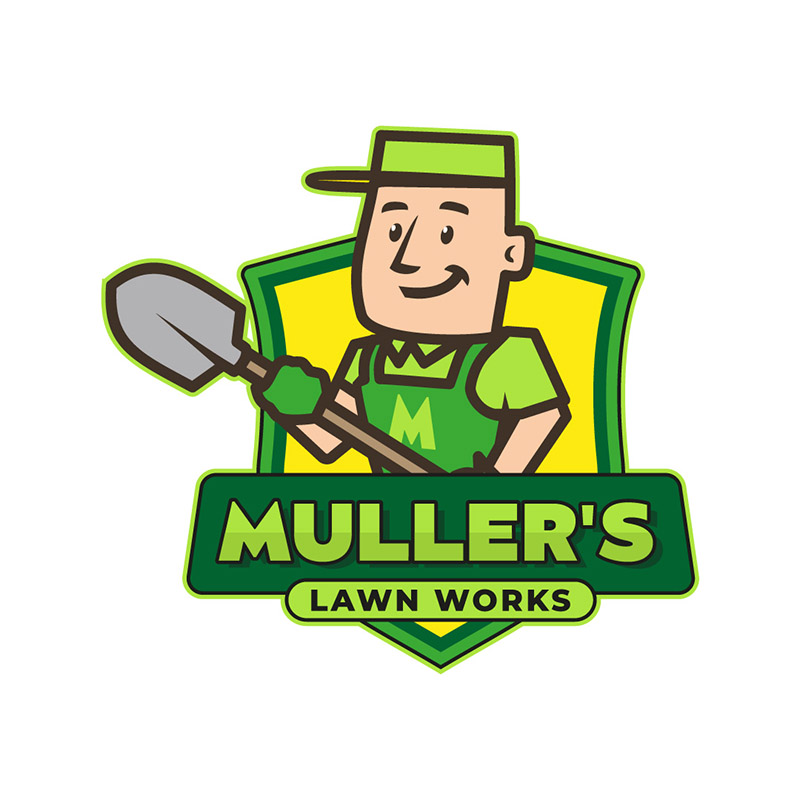
Custom illustrations, when used in portraits and caricatures, are the ultimate in making your logo stand out. This logo for Muller’s Lawn Works is a perfect example of this. In it, we see a lawn worker in uniform, holding a shovel. It is perky in a professional way that can be endearing to customers.
The design is unique and remarkable at differentiation, even if it uses the usual greens and yellows. If you want a lawn care logo such as this one, illustrations are the way to go.
10. Prograss Lawn Care & Landscaping

The symbols of the sun and some grass explain what Prograss Lawn Care & Landscaping is all about. These design elements give the design a professional yet, friendly touch to it. The brand name may have also been inspired by the word progress which makes it a fitting choice.
This lawn care logo would look good on any surface you place it on. This is a huge consideration when designing one. If you want more tips, continue reading below.
Lawn Care Logo Designing Tips
Designing logos for the lawn care industry isn’t so different from other niches. You must show your brand personality: authoritativeness, trustworthiness, reliability, and many others. Avoid using too many details, as this can distract viewers. Most importantly, keep simplicity in mind, as the best logos are those that are the simplest.
Final Thoughts
There’s a reason customers reach out to lawn care businesses instead of doing it themselves. They know to leave it to the experts. Just like that, you can leave the expert logo designing to us while you work on beautifying your customer’s lawns. And if you want to try what Penji has to offer, book a demo here. But if it’s a logo you only need, don’t worry; Penji also offers one-off designs for any brand assets you’ll need! Check our new Marketplace here!
About the author

Celeste Zosimo
Celeste is a former traditional animator and now an SEO content writer specializing in graphic design and marketing topics. When she's not writing or ranking her articles, she's being bossed around by her cat and two dogs.
Table of Contents
- 1. The Grove Lawn Care Services
- 2. TLC Total Lawn Care
- 3. Simply Green Lawn Care
- 4. Lawn Solutions
- 5. The Green Yard
- 6. The YardGuards
- 7. Mow Bros Lawn Care
- 8. Clean Cut Lawn Care and Landscaping
- 9. Muller’s Lawn Works
- 10. Prograss Lawn Care & Landscaping
- Lawn Care Logo Designing Tips
- Final Thoughts

