
The music industry is filled with talented musicians and artists. It can be tricky to stand out, especially if there are well-known names in the industry. But if you or your orchestra want to rise to fame in the music industry, a logo is necessary. Aside from musical notes, how else can you make a music logo? Check out what our designers created here! Plus, watch a demo video on requesting a logo with Penji!
1. Know the Meaning Behind Colors
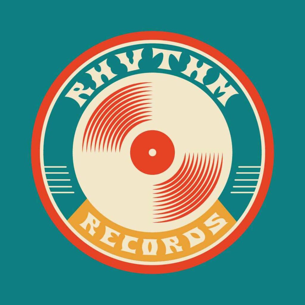
It’s helpful to have basic knowledge of colors before using them in your design. A logo’s color can increase the brand’s value if chosen wisely. Based on The Psychology of Colors in Marketing, specific color combinations have their own effects on consumers. Businesses can frequently sway their target market by making the right color choices.
For instance, this music label’s logo design used the colors blue, red, and orange. Orange is connected to happiness and optimism, while red stimulates nerve impulses, and blue is said to promote trust in your brand. Together, they can support portraying a positive and reliable image.
2. Let Go of the Image
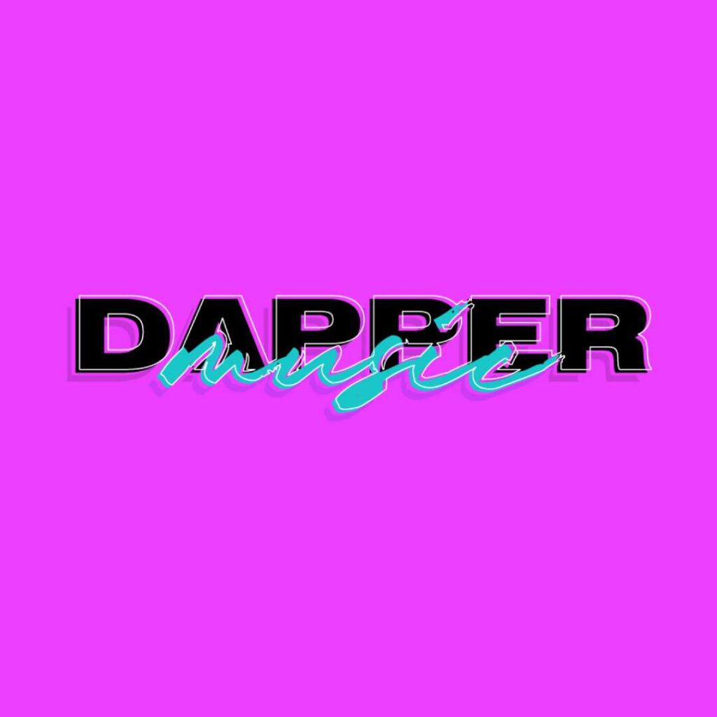
You don’t always need images to create your logo. Sometimes, the right combination of fonts is enough to represent what your brand stands for. This music logo for dapper music is an excellent example of what is called a wordmark logo or font-based logo. To achieve a crisp and clean appearance, it does without the typical use of shapes and images and instead concentrates on the company’s name.
Other classic yet memorable wordmark logo designs include Coca-Cola, The New York Times, Fila, IBM, and FedEx.
Hit the right notes with a music logo
Get one in 1 to 2 days!
3. Experiment with Tradition

Your logo can still stand out from the crowd while following current branding basics. If you want to use musical notes in your design, you must differentiate your music logo from the competition. Many recording labels have used musical notes as their logo symbol. Use color blending and image combos as needed to achieve a distinctive look. It will make you stand out above the rest of your rivals.
4. There’s Strength in Balance
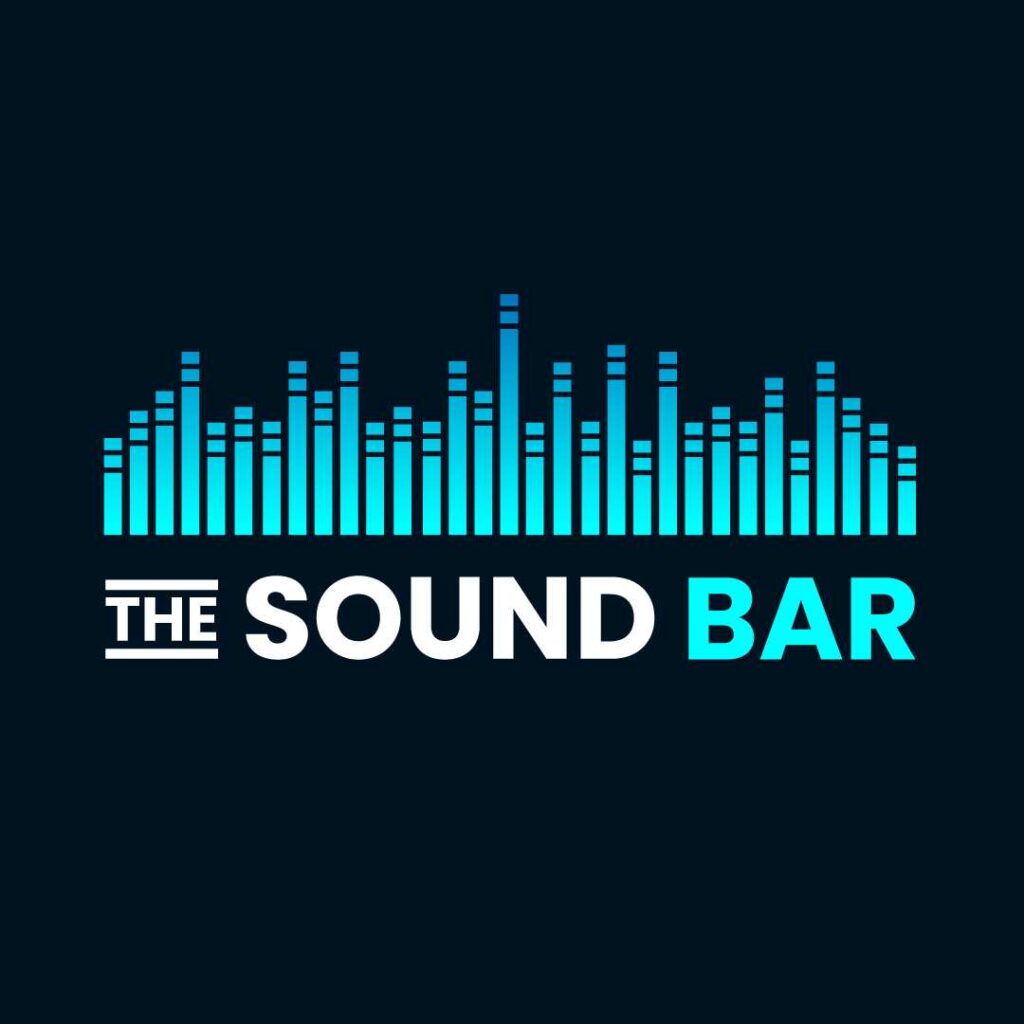
Customers can tell that your company will last just by looking at your logo. When a design is balanced, it communicates a sense of strength and solidity. It takes careful planning to combine positive and negative space in compositions so that no one element dominates the others, and everything comes together to create a cohesive union. As in this music logo design for The Sound Bar, make sure your logo appears roughly the same look on either side if you cut it in half.
5. Simple is Impactful
A logo does not always need complicated patterns and color combinations to be effective. The simple ones, more often than not, have a more significant effect and recall.
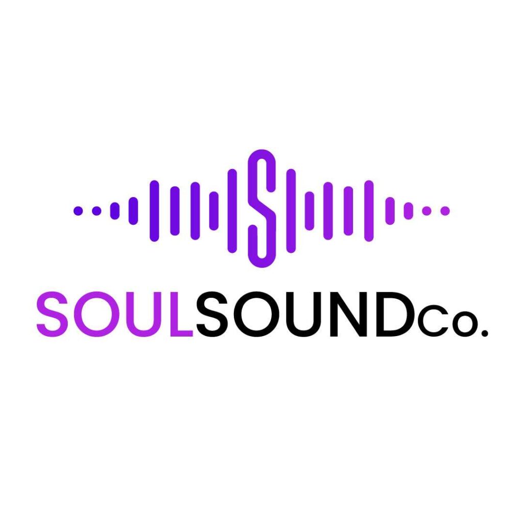
Look at this simple yet impactful logo for Soul Sound Co. The execution of an infinity logo resembling an “S” together with sound waves is minimal yet well-thought-out. And even though the colors used are limited, it still gives the right amount of energy to the brand.
6. Consider What’s Obvious
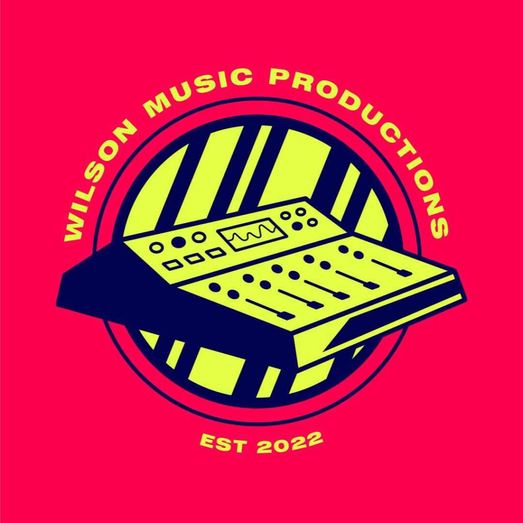
Suppose you’re not into complicated symbolism or hidden images. In such cases, you might want to go the obvious route to create an impression, just like this funky cube logo for Wilson’s Music Productions that used an audio mixer’s image to establish its brand.
And just because you went literal doesn’t mean your logo lacks depth. Take the Apple company’s logo, for example. Behind the literal representation, there is a story anchored to the logo that is far more complex than one can imagine.
7. Embed an Image inside Another

Experimenting with figures and forms can introduce you to many logo design options you may not have previously thought of. A fun and engaging way to interest your audience is to embed a hidden image within another image, and it excites their mind and makes them remember your brand.
WePlay’s music logo is a brilliant example of this strategy. It appears to be an odd “W” at first, but closer examination uncovers the second image of a play button in the center, and rotating the image also yields the letter “E.”
8. Create Some Movement

Another way of thinking outside the box regarding your music logo is adding movement to the design. A sense of motion always draws more attention than a plain image, whether you use animation effects on your logo or simply an illustration that suggests action. Take a look at this Spin Media music logo. It creates an impact by creating a semblance of motion.
9. Let Your Imagination Run Wild
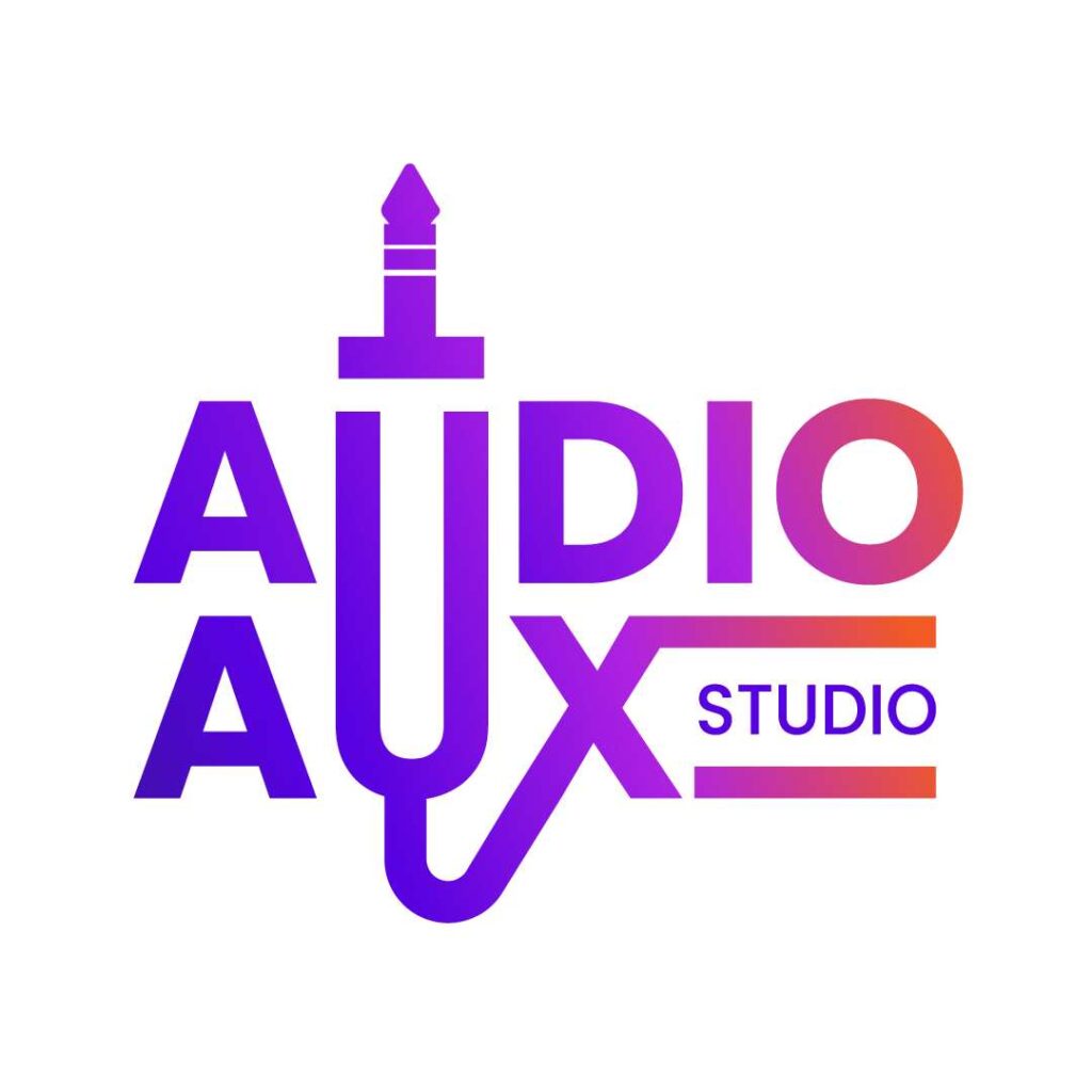
When you free your mind and let your imagination run wild, your creativity will soar. Forget about tradition and rules; sometimes, we are meant to break them. Like how this logo used the audio jack silhouette as the letter U for both “Audio” and “Aux” in this music logo for Audio Aux Studio. This design highlights what the company offers and exudes positive energy that encourages consumers to learn more about the brand.
10. Subtlety is Quality
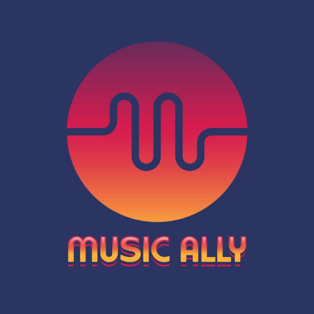
Your logo doesn’t have to state everything overtly. A brilliant way to wow and entice your audience and give the overall message a richer quality is to incorporate underlying layers of meaning into the design. For instance, the logo of this record label almost looks like sound waves. Closer examination reveals that it also forms the letter “M” and resembles a heartbeat monitor, which can represent either life or energy.
What makes a good music logo
A good music logo is one that people remember. That means it should make a strong visual impact, and it should resonate with your audience on an emotional level. It should also be relevant to your brand and be something that you’re proud to display.
With that in mind, here are some things to look for in a good music logo:
- Versatility. A good logo should be able to fit in any design format, from social media header images to t-shirts. It should also be easy to scale down or change color if you need to fit it into a certain space.
- Simple but effective design. A complex logo might be visually striking, but it won’t be quick to understand. That could lead to people missing the message behind your logo, and that’s not what you want.
- Resonance. Your music logo should have a connection to your brand as a whole. If it doesn’t make sense when paired with your name, you might have a problem.
- Visual impact. Of course, a great music logo should also look good. You don’t need to be the most talented artist in the world to make a logo, but you do need to put in the effort and have a clear idea of what you want.
Want a rocking music logo but don’t know where to start? Penji can help. Let us take charge of the creativity department so you can focus on orchestrating all the other aspects of your business.
Subscribe now and get 15% off with a voucher code: LOGODESIGN15! But if you’re not ready to commit, check out the Marketplace here for one-off designs for you or your organization.
About the author

Carla Deña
Carla is a journalist and content writer who produces stories for both digital and legacy media. She is passionate about creativity, innovation, and helping small businesses explore solutions that drive growth and social impact.
Table of Contents
- 1. Know the Meaning Behind Colors
- 2. Let Go of the Image
- 3. Experiment with Tradition
- 4. There’s Strength in Balance
- 5. Simple is Impactful
- 6. Consider What’s Obvious
- 7. Embed an Image inside Another
- 8. Create Some Movement
- 9. Let Your Imagination Run Wild
- 10. Subtlety is Quality
- What makes a good music logo


