A barber logo must say a lot about your brand. It must offer an excellent first impression to your audience so it becomes memorable. And being in this industry, you need a trendy and stylish logo to stand out from the competition. If you need inspiration for a logo, here are ten barber logo ideas created by our excellent Penji designers! Plus, watch this demo to see what Penji can do for your brand!
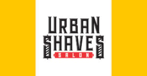
1. Urban Shaves Salon
First on this list is this simple barber logo for Urban Shaves Salon. The font is a stylized typeface that looks masculine and fit for a barbershop. The two letters (S) at both ends feature slanted horizontal lines that resemble a rustic barber shop window or barber’s pole.
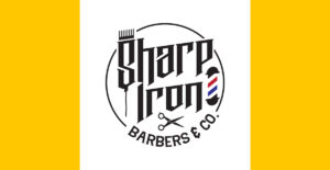
2. Sharp Iron Barbers & Co.
This is an excellent example of a unified barber emblem contained in a circle logo. Although you’ll see many design elements on this logo, the circle keeps every detail together. The structure is also well-thought-out, prioritizing design elements that matter most. The simple icons that depict a barbershop make this logo interesting, especially the barber’s pole.
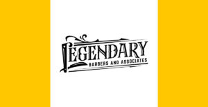
3. Legendary Barbers and Associates
Here’s another simple logo design for your barbershop business that will look good on any marketing and branding assets. The compact logo design is apt for your business cards, websites, billboards, flyers, signage, and more. The font choice is apt for a business that caters to the male demographic. Overall, the typography design in this logo is commendable.
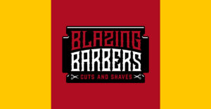
4. Blazing Barbers Cut & Shave
The font reminds you of the Wild Wild West, with its bold and symbolic appeal. This barbershop’s branding also emanates from this logo, showing a vintage style. The red and white color combination is an excellent contrast to keep this logo visually interesting. Plus, the two small scissors at both ends are also there for top-of-mind awareness.
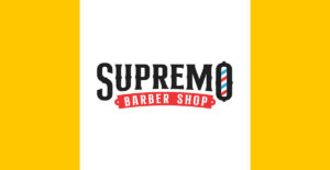
5. Supremo Barbershop
Most of the barbershop logos you’ll find on this list don a rustic and bold font style, and this one is no exception. Although more straightforward in style, the Supremo Barbershop logo is legible even when resized to smaller or bigger sizes. Also, the barber’s pole with red, white, and blue colors is representative of a barbershop. However, the designer put a twist by placing the barber’s pole’s colors inside the letter “O.”
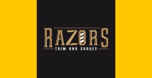
6. Razors Trim and Shaves
One of the most exciting fonts on this list, Razors Trim and Shaves, shows off a robot-like font style. The overall logo design dons beautiful typography with a perfect font combination. Plus, the calming color is quite different from the black-colored ones on this list.
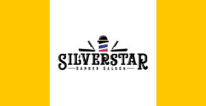
7. Silverstar Barber Saloon
Here’s another barber logo that reminds you of cowboy boots and hats in the Wild Wild West, even the name Silverstar is apt for a Wild West town! Silverstar Barber Saloon features a combination of fonts and icons that symbolize a barbershop business. For one, the old-fashioned folding beard trimmers are the most notable icons in this design. The trimmers are then accompanied by the barber’s pole in the middle, which contributes to a cohesive design.
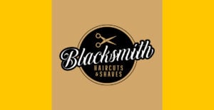
8. Blacksmith Haircuts & Shaves
Blacksmith Haircuts & Shaves gives off a sophisticated yet welcoming appeal. This barber logo design is one that you must emulate if you like a more feminine touch to your branding. The script font across the circle stands out the most and is the show’s star. The other supporting design elements are also beautifully structured in an organized and functional way.
9. Mohican Barbers
When creating your company logo, you must make it understandable for your target audience. A company logo must tell viewers what your company is all about immediately. This creates an instant connection, especially within your target market. This Mohican Barbers logo design is one such example. Due to the large scissor that replaces the letter “A” in Mohican, viewers will know it’s a barbershop. Although it’s oversized, the scissor is not intrusive or overwhelming.
10. Red & Blue Stripes & Cuts
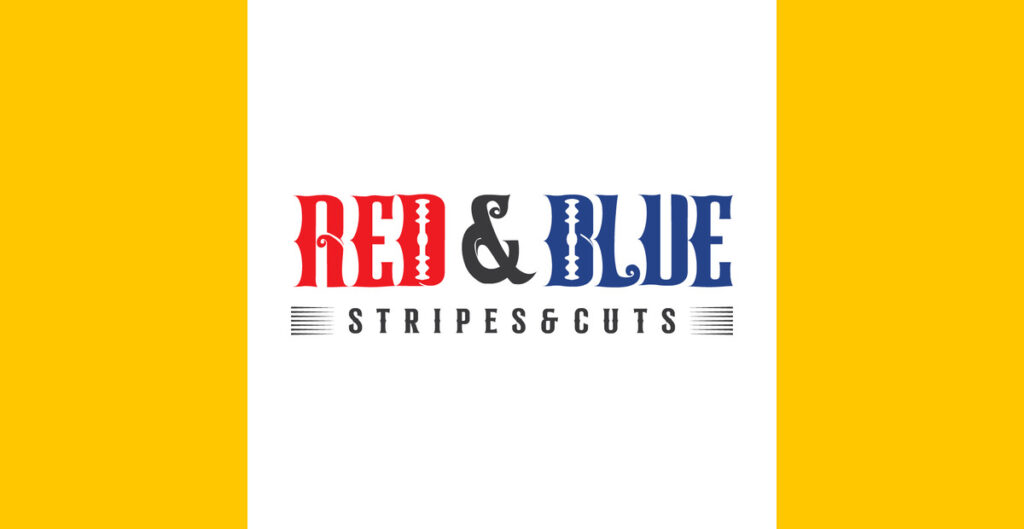
Instead of featuring the barber’s pole’s colors, this barbershop made the colors the brand’s names! As you know, the barber’s poles’ red, blue, and white stripes are connected to bloodletting in the past. This brand shows off history in its name by including these colors and old-fashioned razor blades.
What Makes a Good Barber Logo
Any professional logo designer worth their salt knows that five elements make up a good barber logo. And these are:
Unique
First, the logo must be a cut above the rest and stand out. It mustn’t remind audiences of other barbershop logos. However, it must be the only barbershop logo that pops into mind whenever people want to get a haircut.
Memorable
Once you achieve an innovative design unlike any other, your logo becomes memorable. However, other factors that make logos memorable are the subtle design elements that stick to viewers’ minds. These elements could be the barber’s poles, scissors, trimmers, razors, and more.
Relevant
Of course, any company logo in any industry must consist of relevant elements that tie to their branding or niche. For instance, you can’t include a bread icon on your barbershop logo because that would make the design component irrelevant.
Simple
Another factor that makes up a good barber logo is simplicity. The fewer the design elements, the more comprehensible the logo. This prevents your logo from becoming too complex to the point that it confuses people.
Scalable
A scalable logo means that the logo looks good on any marketing and branding collateral, regardless of size. You can resize the logo to make it smaller or bigger, and the quality stays the same.
Where to Get Your First Barbershop Logo
Don’t open your barbershop without a logo. Here at Penji, we can help you get one before you launch or if you need a redesign! Get unlimited designs, revisions, and more when you sign up for Penji today!
But if this is a one-time project, don’t worry. Our Marketplace is now open for your requests! Click here to get one-off designs!
About the author
Table of Contents
- 1. Urban Shaves Salon
- 2. Sharp Iron Barbers & Co.
- 3. Legendary Barbers and Associates
- 4. Blazing Barbers Cut & Shave
- 5. Supremo Barbershop
- 6. Razors Trim and Shaves
- 7. Silverstar Barber Saloon
- 8. Blacksmith Haircuts & Shaves
- 9. Mohican Barbers
- 10. Red & Blue Stripes & Cuts
- What Makes a Good Barber Logo
- Where to Get Your First Barbershop Logo

