

Monogram logos are excellent choices if you’re looking for a stand-alone symbol to represent your brand. Monogram logos display the first initials of your brand name, which means you’ll have letters as company logos. However, some brands can also opt to create a letter logo for the first letter only of the brand’s name. And in this article, we’re going to explore some letter C logo designs suitable for any business.
These 30 super cool logos were carefully created and chosen by expert logo designers from Penji. If you want us to make your letter C logo, scroll down until the bottom for a special limited offer.
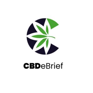
1. CBDeBrief

In color psychology, green symbolizes freshness, organic, nature, or health. And for a CBD brand, this color is appropriate to show how CBD products help exponentially add endocannabinoids to the human body. As with any other business selling marijuana-related products, the marijuana flower is used in the logo. It’s displayed in the middle of the letter C, with five of its leaves cutting through the C’s curvature. Negative space also surrounds the leaves, highlighting both the letter C and the flower even more.
Fantastic C logos perfect for your brand
Get your C logos in 1 to 2 days from professional graphic designers
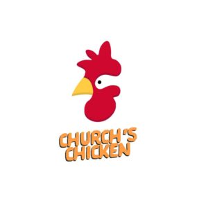


2. Church’s Chicken

Company logos that don hidden meanings through white space give their designs visual interest. The most famous logos have hidden meanings, such as FedEx with the arrow in between the letters, Toblerone with the hidden bear in the mountains, or Baskin Robbins with the number 31 in between, representing how many ice cream flavors they offer.
In this example, the letter C logo is hidden in the chicken’s face, where the eye is. The bright and yellow colors are great stimulators for hunger, apt for this chicken fast-food chain.
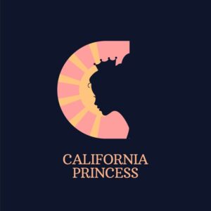
3. California Princess
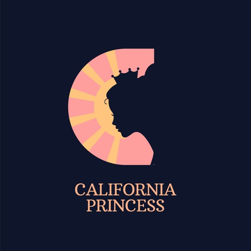
The California Princess logo is a feminine design that suits brands that cater to the female demographic. The chosen colors are also suitable for its feminine branding. Plus, the princess is creatively integrated into the letter C logo design through negative space. The princess dons a crown with yellow rays that emphasize its presence in the logo design. Overall, the letter C logo is eye-catching and one of a kind.
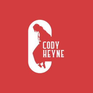
4. Cody Heyne
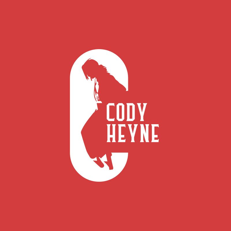
For logos that carry names that start with the letter C, this is a stunning example of form and function. Cody Heyne, a consultancy company, represents the person through the man standing in the white letter C encompassing the design. It highlights the brand’s name by showcasing the letter C symbol and the man alone.
5. Closing Queens
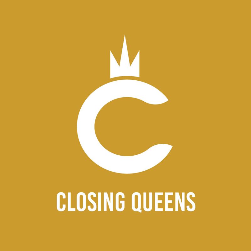
Simplicity is one of the most vital elements in logo design. And this example dons a simple and uncomplicated design. The Closing Queens logo dons a straightforward letter C to show the first initial of the brand name. To represent the “Queens” text, the designer places a crown on top of the logo that resembles a queen’s head. Although the overall design might be missing any embellishments, it’s enough to convey the brand’s offer and message.
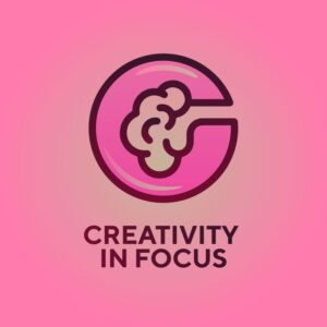
6. Creativity in Focus
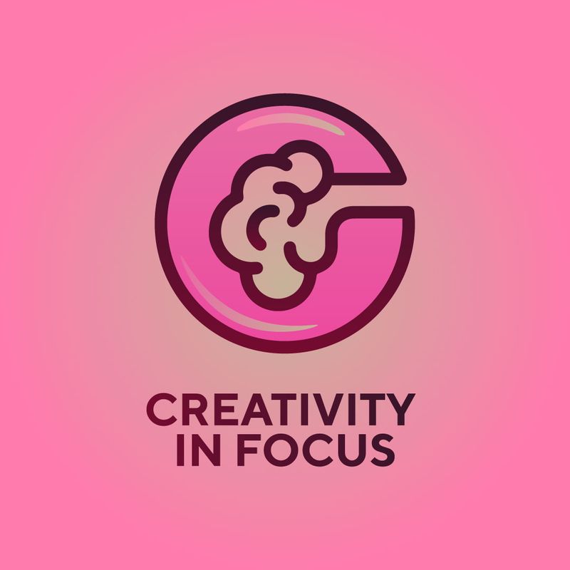
Company logos must be able to instill recall within the target audience. This means that consumers must remember minor or significant aspects of the design and the brand in general. That said, companies select relevant icons and symbols, just like in this example. It shows the letter C logo for the brand name’s initial letter. But in the middle of the letter, you’ll see a brain, which is the symbol apt for thinking and creativity.
7. Capex Pay
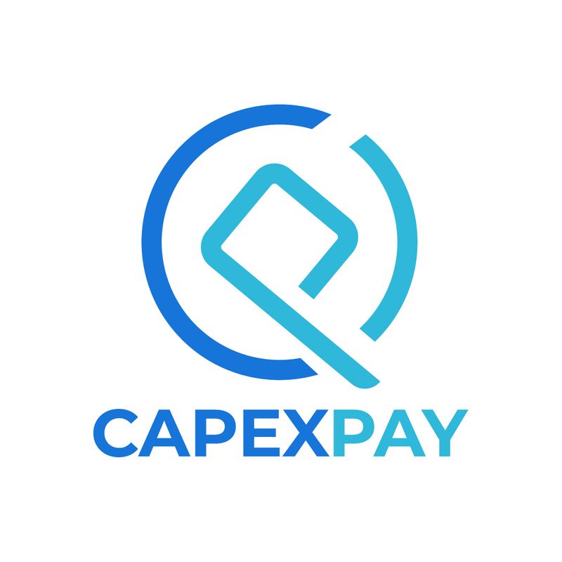
This is an excellent example of a monogram logo that banks on simplicity. Capex Pay’s logo showcases the brand’s letter with style and continuity. You’ll see that the letter C is shown in a different and darker blue color, coupled with the letter P with a teal color. The same color also gels together both letters by enclosing them in a circle to form cohesion. The slanted letter P is also a nice twist to give it structure instead of lining everything on the same level.
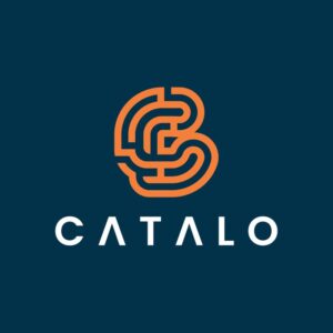
8. Catalo
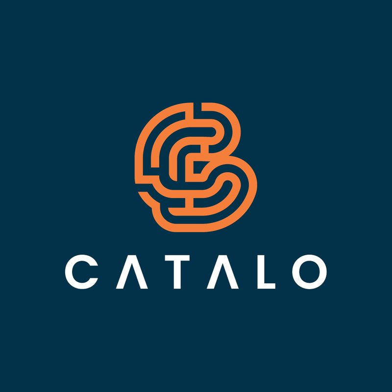
At first glance, you’ll notice that this letter C logo is a bit complex. However, once you grasp the entirety of the design, you’ll see that the letter C in the logo stands out, even with the maze-like design that seems to complicate it. You’ll comprehend the design through the outside curves that come together on the right side to form the letter C. This company logo fits modern and elegant brands in any industry.
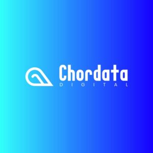
9. Chordata Digital
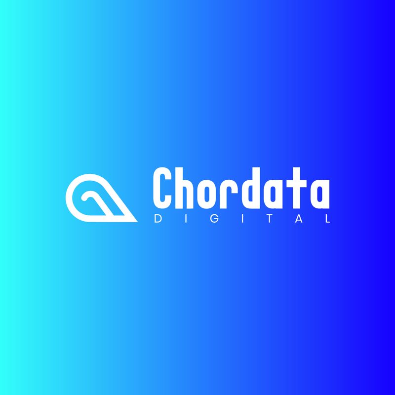
The symbol accompanying Chordata Digital’s brand name may seem like a teardrop. However, the design is well-thought-out by integrating the two letters into the teardrop-like design. If you look at it closely, you’ll notice that the letter C occupies the left side of the symbol. Then if you turn the symbol sideways, the letter D comes alive. This is a prime example of a simple yet complete letter logo design. Finally, the font combination for both texts is also commendable due to its bold and light contrast.
10. CMM
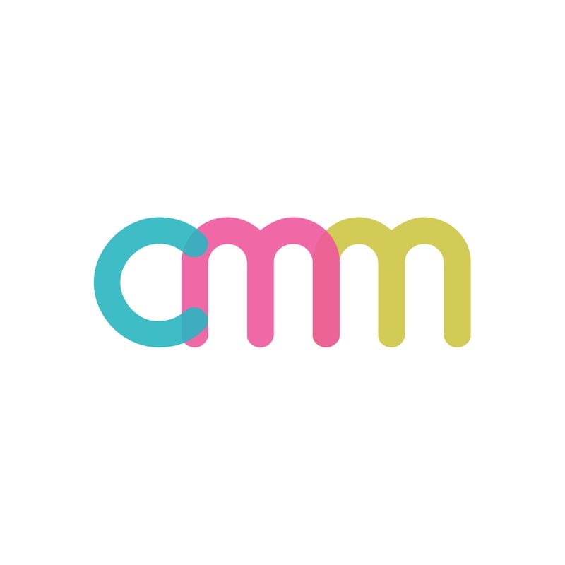
Whether this brand is for the retail or entertainment business, this monogram logo is an excellent match for both industries and other industries with a more casual and playful branding. The bright colors emanate a welcoming and friendly vibe, which appeals to appropriate target audiences. Plus, the letters are interconnected with each other, which displays design coherence.
11. Clean Living Store
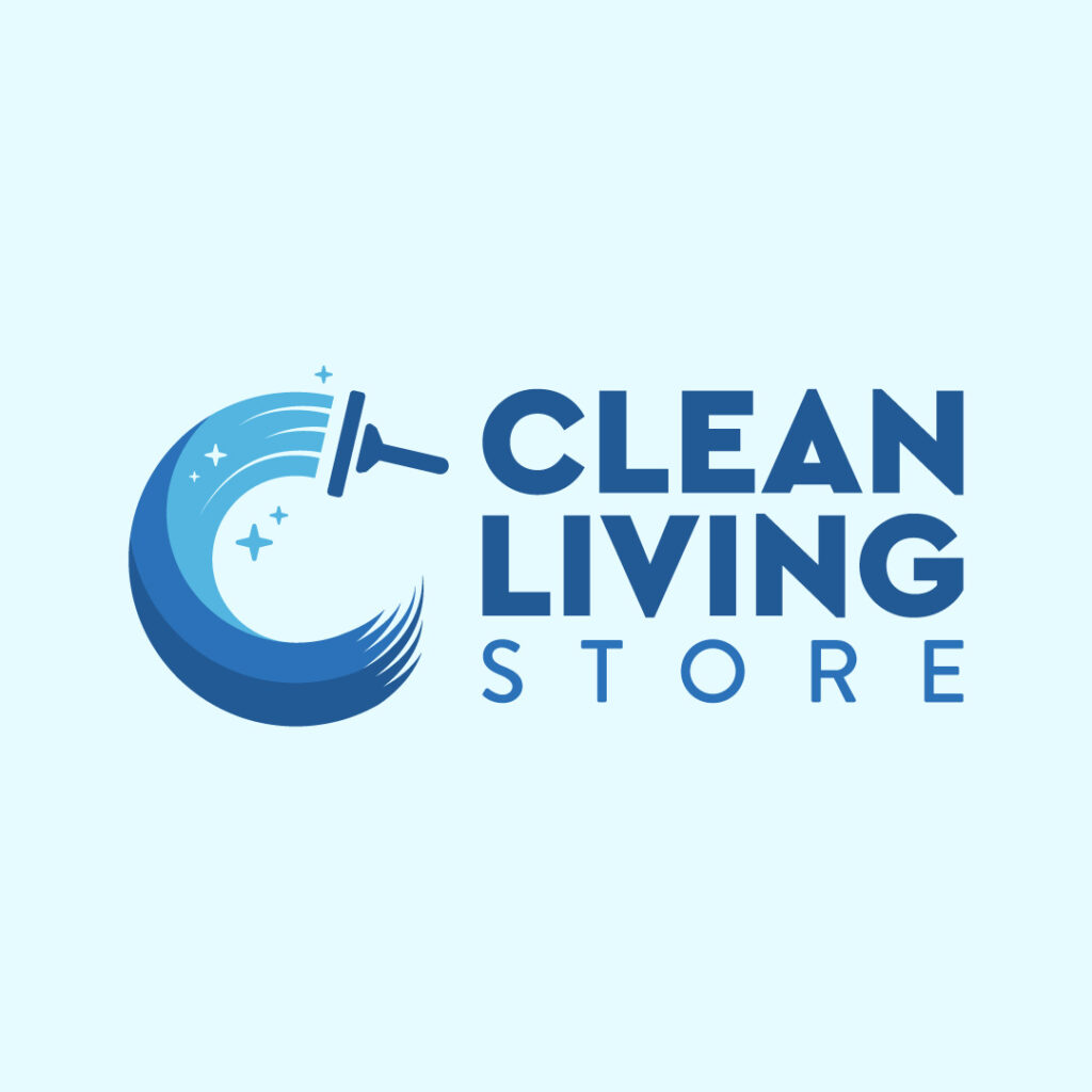
The beautiful icon that dons curves of different colors keeps your eyes hooked on this logo design. A window wiper also finishes the design to keep it relevant to the company’s offerings. The bold font paired with the light-faced font makes for a clean logo.
12. Chance Investments
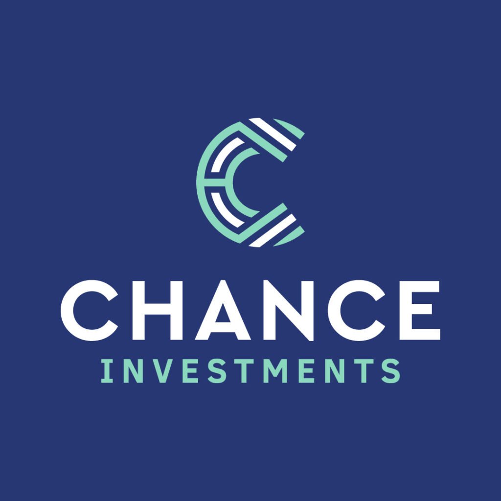
Chance Investments banks on a modern take for a financial institution logo. It features a C logo design with contrasting white lines that make up the whole ensemble. The white and teal color combination offers a soothing and welcoming atmosphere that brings patrons through the door.
13. Comet Matrix

Comet Matrix is a tech company that sells gadgets, and mobile phones and offers repair services as well. You can see how the company prioritized innovation when it created its logo. A slightly abstract comet accompanies the brand name and divides the focus between text and illustration. Overall, this tech logo is simple yet offers technical design elements.
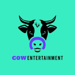
14. Cow Entertainment
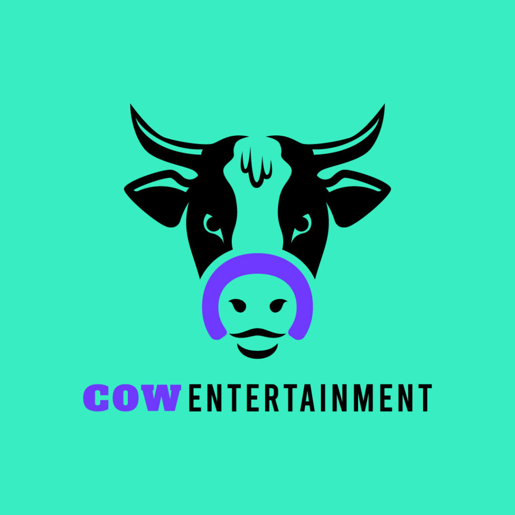
Cow Entertainment is a film company that offers video and filmmaking services. The logo design is a literal image of the brand name. The most interesting part is the letter C which is part of the cow’s snout. Moreover, purple is a good contrast against the black text and illustration.
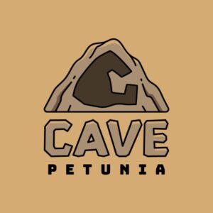
15. Cave Petunia
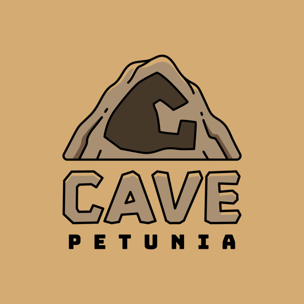
In logo design, integrating bits and pieces of icons or symbols representing your company is recommended. Offering adventure and trekking services, Cave Petunia keeps its logo design lighthearted. The cave looks strong and proud, while the letter C stays in the middle.
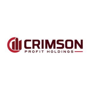
16. Crimson Profit Holdings
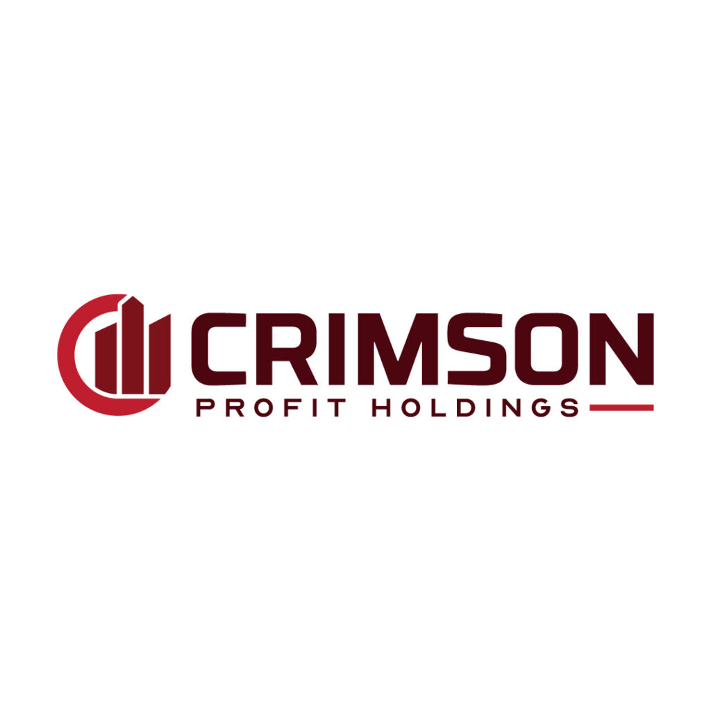
Companies that deal with people’s finances should exude credibility to instill trust within their target audiences. And Crimson Profit Holdings does this easily by creating a neat, modern, and respectable logo. The overall design emanates authority, which reassures prospects their finances are safe with Crimson.
17. Corridor Corner
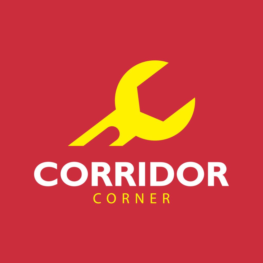
Corridor Corner has a team of auto mechanics that repair cars in a jiffy. The company’s logo design is simple yet has all the makings of a good and memorable logo. A bright yellow wrench sits pretty above the brand name. The white text also breaks the monotony of the yellow icon and text.
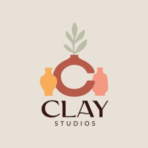
18. Clay Studios

This logo design from Clay Studios exudes nothing but exquisite appeal. The image of a clay pot with a plant seemingly standing loud and proud is eye-catching. It also features two other small pots that don various colors. Moreover, the font style is elegant and clean, complementing the neat design.
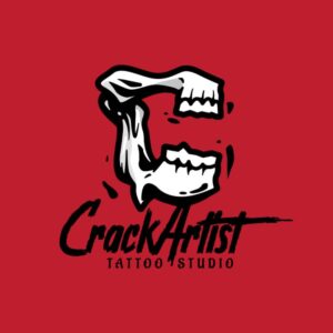
19. CrackArtist Tattoo Studio
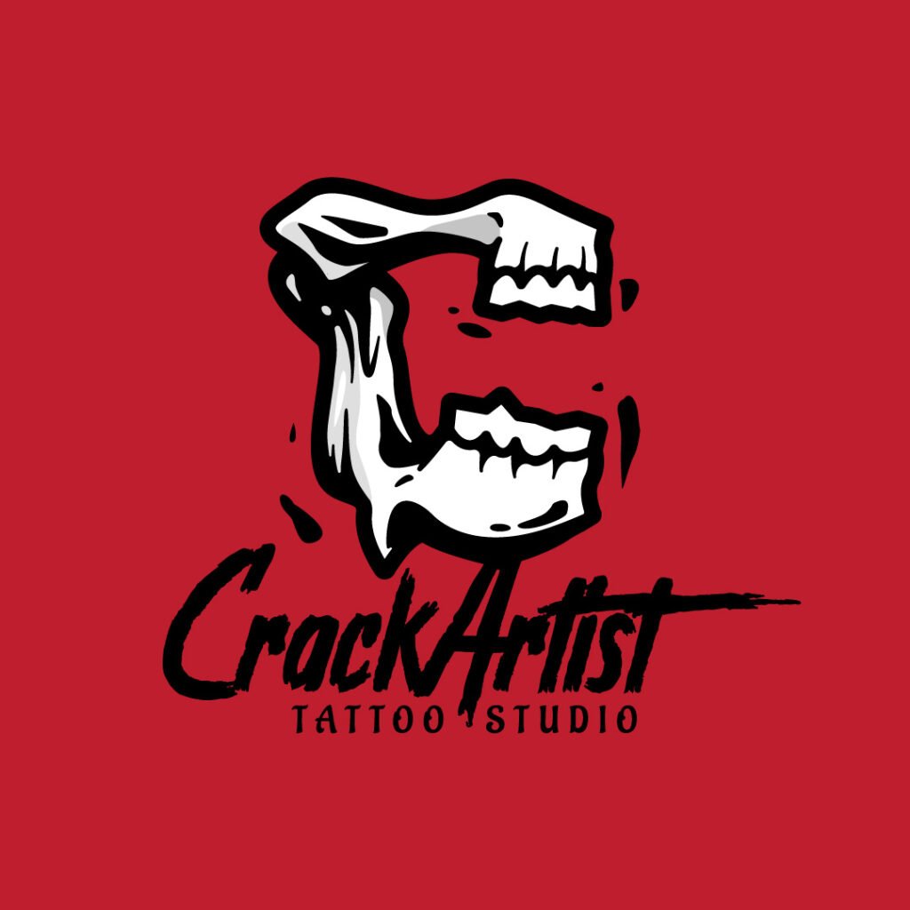
When you first set your eyes on this logo, you’ll get a rebellious and street vibe from the overall design. The jaw part of the skull is an apt icon to represent a tattoo company. The stylized font is another way to reinforce creativity, especially in this niche.
20. CastleRock Records
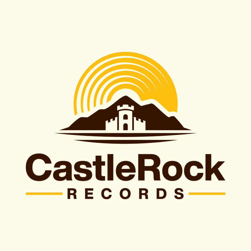
This recording company incorporates storytelling in its logo. The image of a mountain, with the castle and the sun rising on the horizon, paints a picture of the company’s location. Moreover, the structure in this logo design is clean and simple, leading the eyes from the most prominent element down to the least.
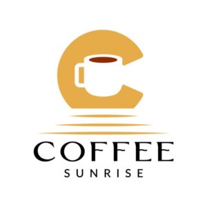
21. Coffee Sunrise

For a cafe shop like Coffee Sunrise, creating a simple and unique company logo is enough to make consumers take a second look. This logo design involves negative space to instill visual interest. You can see the letter C with a coffee mug in the middle. It also doubles as a sun rising on the horizon.
22. Candid Camera Studios

Candid Camera Studios offers photography services for professional or personal projects. Its logo design is straightforward, relying on a camera icon to represent the brand. The contacts and lens mirror also double as the letter C to signify the brand name’s initial letter.
23. Cinnabonbon
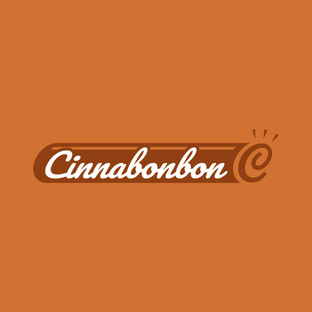
If you’re serving sweet treats and desserts to your consumers, ensure your food logo communicates this immediately. Whether you bank on abstract illustrations or an accurate product drawing, your logo must appeal to consumers this way. Cinnabonbon, a company that sells tasty cinnamon rolls, does just that. At the end of the stunning script font lies an abstract cinnamon roll to tie the design together.
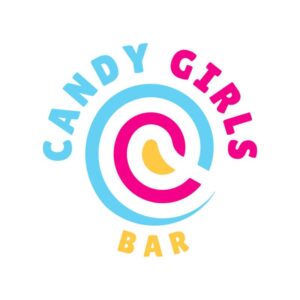
24. Candy Girls Bar

From the looks of this logo design, you can tell that it caters to the younger demographic. The vibrant colors make this logo warm and inviting to the right audience. The tasty swirls will remind you of sweet candy lollipops.
25. ChargeItUP

This small charging station business will instantly impart top-of-mind awareness to its target audience. Imagine walking into a mall with an empty battery. This image of a mobile phone battery will immediately hook the eyes. Unsurprisingly, this logo design will be memorable to the brand’s prospects.
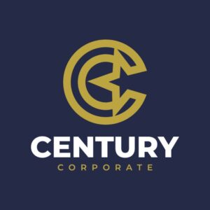
26. Century Corporate
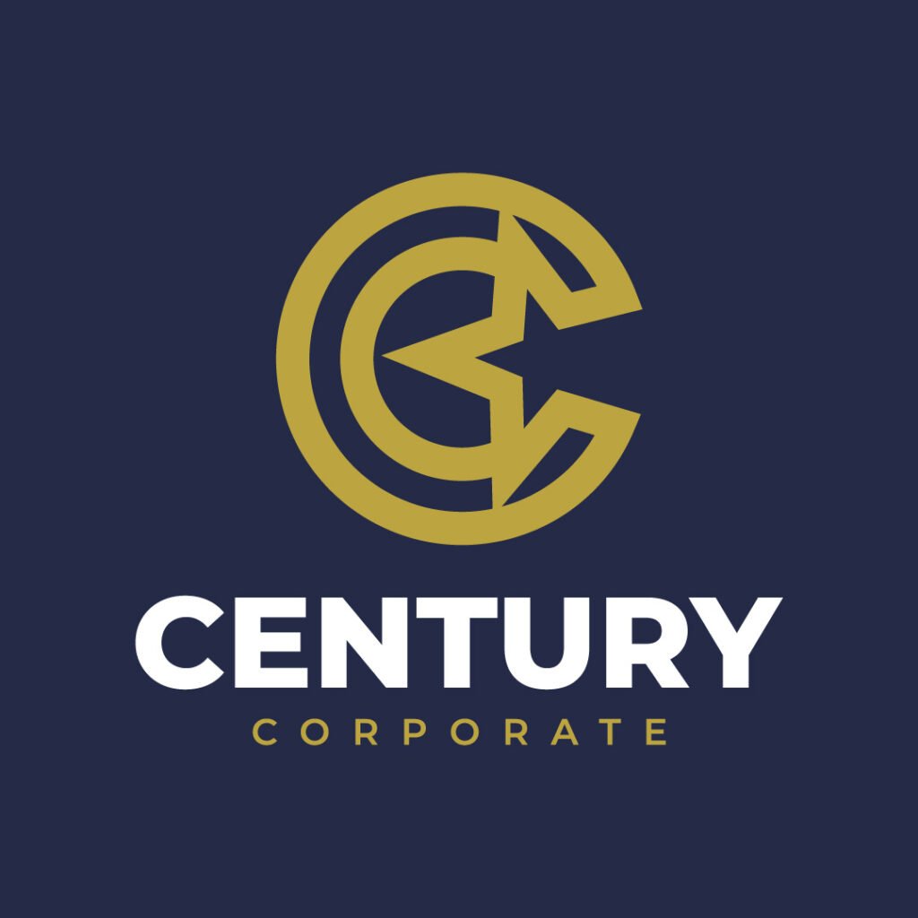
Century Corporate is a digital marketing company that works with marketers, entrepreneurs, bloggers, and students. When you focus on this logo, you’ll notice the letter C and the star in the middle. Overall, this design is suitable for a creative digital marketing company.
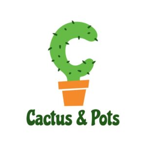
27. Cactus & Pots

Any passerby with a green thumb will instantly take a second look at this logo design. The cactus is the most evident design element on this logo, coupled with the beautiful typeface in green.
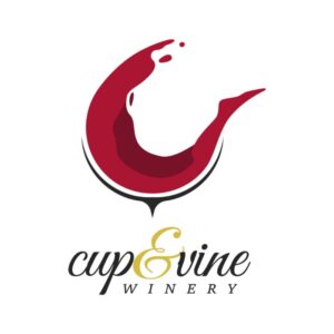
28. Cup & Vine Winery

Penji’s designer put a unique twist on this logo for a winery business. Instead of featuring a wine glass, the liquid almost seems as if it’s floating. You’ll notice subtle elements, like the glass’s base and the wine’s droplets. Overall, this logo screams sophistication from the font style to the imagery.
29. Car-For-Less Dealers
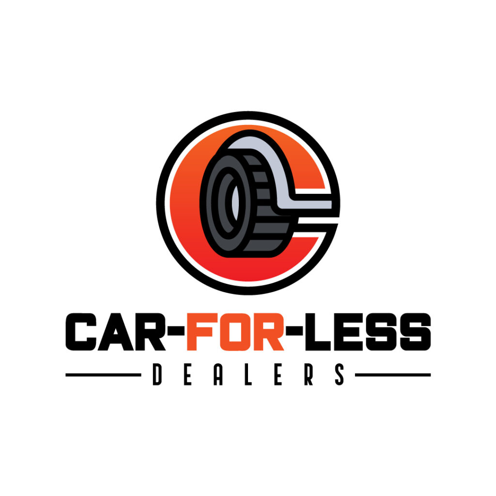
This car dealer shop will make it worth your while, as it clearly shows on its logo. You’ll notice several design elements that make up the beauty of the entire logo. The designer also made sure hierarchy keeps this logo design clean and well-thought-out.
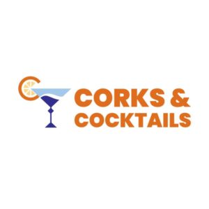
30. Corks & Cocktails
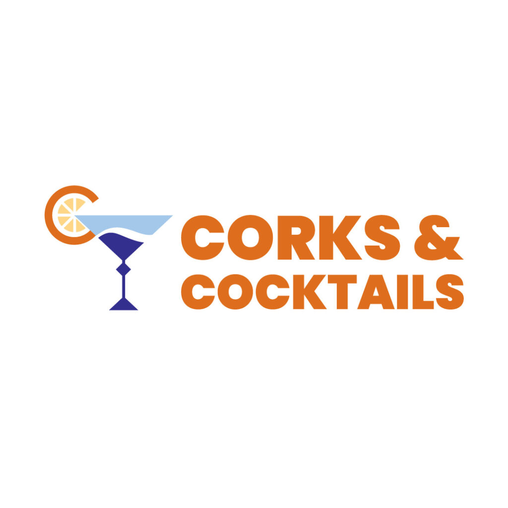
What better way to represent your bar than to feature a cocktail glass front and center? Corks & Cocktails’ logo is simple yet impactful. The vibrant orange color matches the fruit on the cocktail glass. The blue glass offers an excellent variety from the dominating orange color.
Conclusion
Letter C logos aren’t that complicated to create, especially if you seek the help of professional logo designers. We at Penji can help you craft the most high-quality and unique letter logos that convey your brand’s personality. You’ll get unlimited designs and revisions by paying a fixed monthly rate. Plus, you get access to our custom design platform, which will be the central hub for the design process and communication. Click this link if you’re ready to sign up for a special promo code.
Meanwhile, if you want to know how Penji’s design process works, you can sign up here and try the service for 15 days risk-free.
About the author

Table of Contents
- 1. CBDeBrief
- 2. Church’s Chicken
- 3. California Princess
- 4. Cody Heyne
- 5. Closing Queens
- 6. Creativity in Focus
- 7. Capex Pay
- 8. Catalo
- 9. Chordata Digital
- 10. CMM
- 11. Clean Living Store
- 12. Chance Investments
- 13. Comet Matrix
- 14. Cow Entertainment
- 15. Cave Petunia
- 16. Crimson Profit Holdings
- 17. Corridor Corner
- 18. Clay Studios
- 19. CrackArtist Tattoo Studio
- 20. CastleRock Records
- 21. Coffee Sunrise
- 22. Candid Camera Studios
- 23. Cinnabonbon
- 24. Candy Girls Bar
- 25. ChargeItUP
- 26. Century Corporate
- 27. Cactus & Pots
- 28. Cup & Vine Winery
- 29. Car-For-Less Dealers
- 30. Corks & Cocktails
- Conclusion


