Cool, hip, and rebellious. Those three words best describe graffiti art on public walls, subways, or billboards. Graffiti is one of the purest kinds of free-form art, where the artist shows off their style through unique graffiti letters. And because graffiti is a universal art form, brands have started to integrate graffiti lettering into their marketing campaigns. Not sure which graffiti style suits your brand? Maybe these 20 cool font examples can give you a headstart.
1. Smilen by Subectype & Orenari
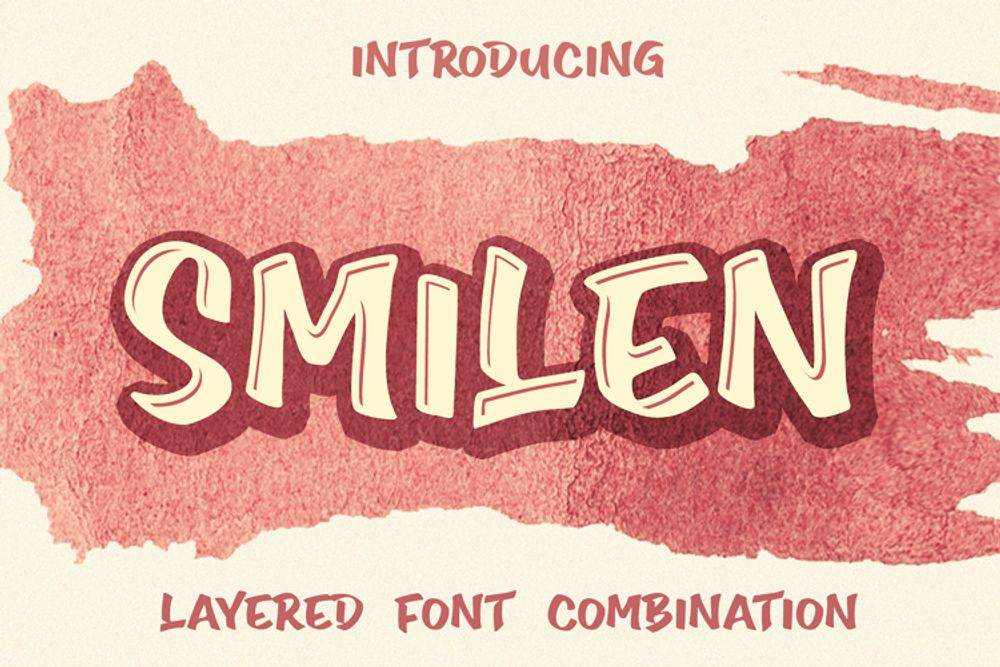
If you’re looking for graffiti letters that scream boldness and authority, Smilen is for you. The graffiti letter name fits the vibe it exudes because this font looks friendly with a touch of defiance. It’s thick enough for your marketing headings and readable for bigger ad spaces. Combine this font with a relatively thinner style, and it’ll look good overall.
2. Attack Graffiti by Wepfont
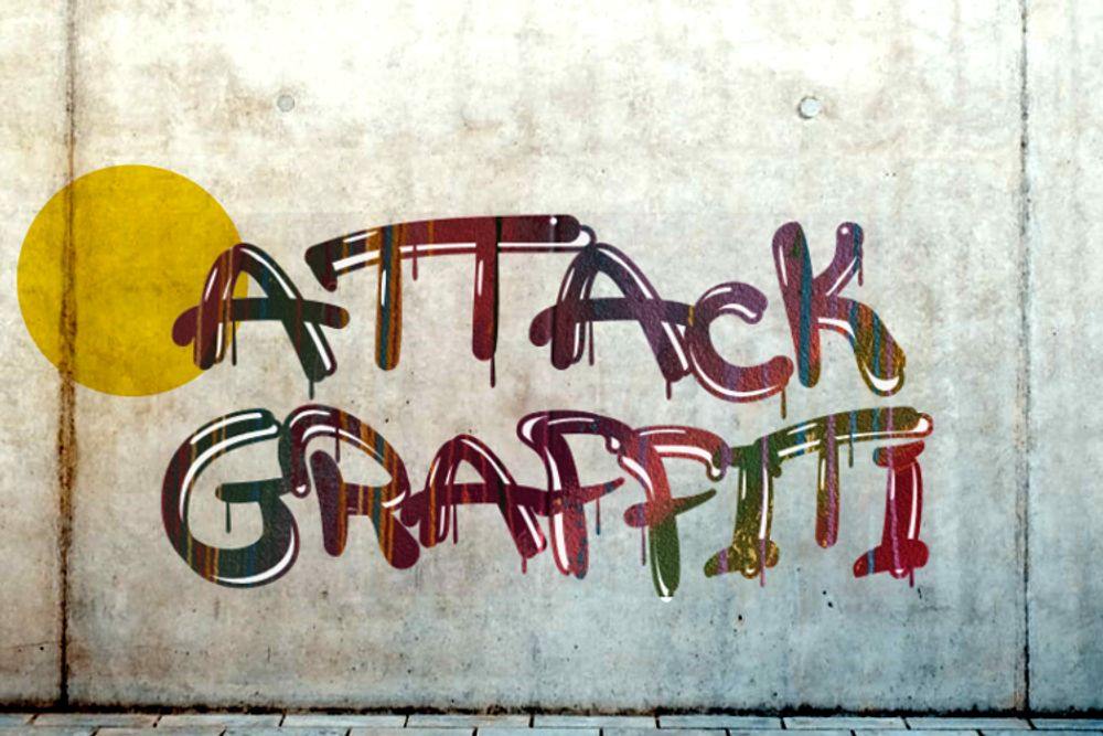
Graffiti art should be pure and raw, and the Attack Graffiti font is the closest you can get to achieving that rebellious nature from younger generations. Its soft edges imply that the artwork is subtle yet impactful. This graffiti letter looks like it’s been painted with some paint residue seemingly dripping down from each letter. This style gives your marketing campaigns life because it seems like there’s a lot of action behind this font creation.
3. Dripping Drops by Prioritype
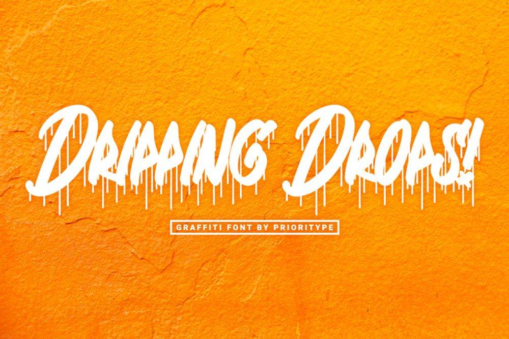
In graffiti art, a term called “tagging” or “tag” refers to what style, design, or graffiti letters artists repeatedly mark to claim territory. This is typically a one-colored signature of graffiti artists. Most artists would include decorative elements such as arrows, splashes, stars, or drips to make their pseudonyms more daring. And Dripping Drops is an example of a style with lots of decorative drips. As you can see, this design represents paint. That’s usually how graffiti is done on murals. However, this might not be too legible on longer text, so use appropriately.
4. Nightfate by SiPanji
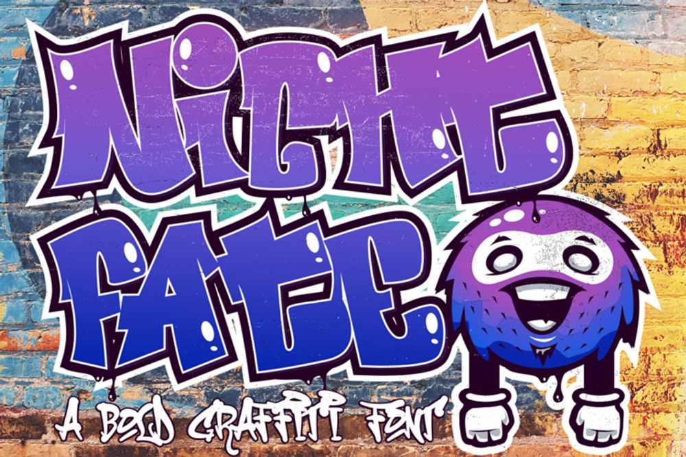
This is a simple example of a graffiti font that you can use for your branding and marketing campaigns. It’s thick and bold, giving your ad designs more oomph. The top and bottom parts of the letters are asymmetrical, providing a more informal look. The style is then decorated with a bubble on one of the corners to give each letter a shiny and polished appearance. This graffiti font might not be too legible when viewed from a distance, so be wary of using this for long texts and paragraphs.
5. Kortz by Vztype
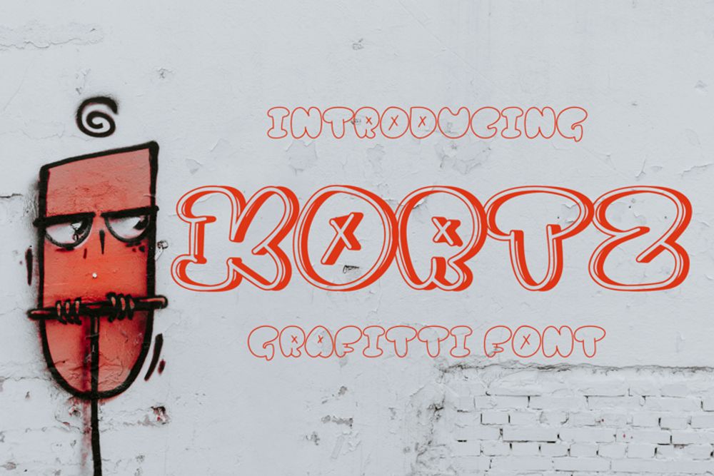
Kortz belongs to the “bubble” style of graffiti lettering. Bubble graffiti letters look like they’ve been blown with air, making the letters’ edges soft and round. Unlike the other cool fonts, this style doesn’t leave ample room for experimentation and variation. Due to its edges, the letters are closed off with no area for decorative elements such as splashes or arrows. However, drippings or cross marks, seen in this example, are possible in some letters.
6. Tratags by Prioritype
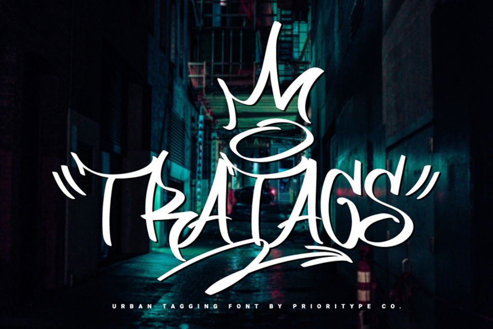
Tratags is one of the most artistic and original graffiti letters on this list. This graffiti font belongs to the hand style category, where graffiti artists are given enough room for creativity and variation. The random strokes and curves add up to the uniqueness of this graffiti font example. Also, you can see a lot of fun and decorative components in this style, such as a crown, halo, an arrow, and quotation marks. The quotation marks add a bit of balance to a formed design. Businesses can use this font for their merchandise and other print marketing materials.
7. Rademos by StringLabs
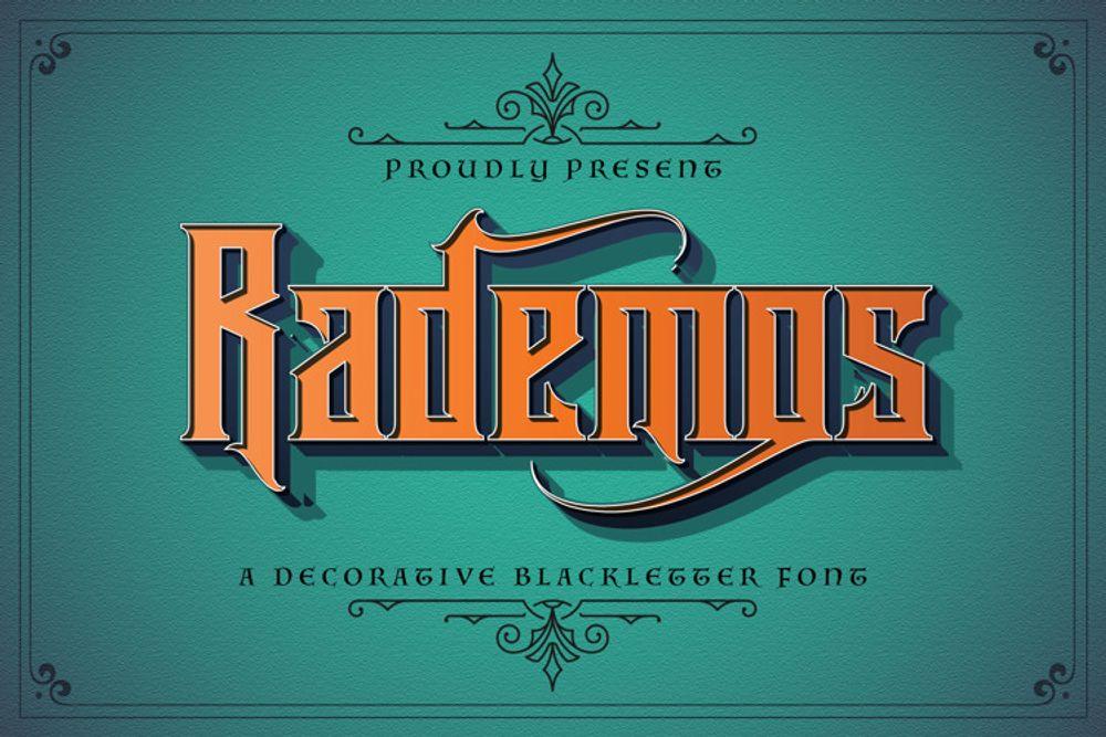
If you’re looking for graffiti letters that offer a more masculine and powerful look, then the Rademos graffiti font will fit your style. It showcases straight lines and pointy edges that make your text more authoritative. Brands that cater to a male audience can use this graffiti font style to amp up their branding or marketing collaterals.
8. Backbones by Tigade Std
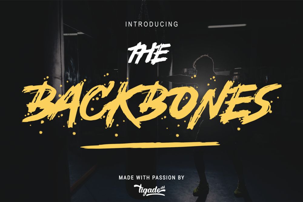
This graffiti letter example exudes a playful atmosphere with its hand-brushed style and casual appeal. I can see this graffiti on posters or flyers for concerts, workshops, expos, or esports affairs. The small dots that surround the text also tie the entire graffiti lettering together.
9. Dirty Lizard by SiPanji
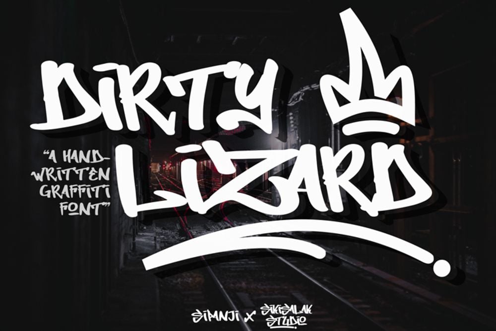
Graffiti has a long history. It’s an art form that is synonymous with people’s rebellious nature without an opportunity for expression. Most of the graffiti work we see on walls and public surfaces today is illegal, though some are also commissioned. But there is an underlying story or significance of every graffiti artwork in public spaces. Most artists use sprays to tag graffiti, and the Dirty Lizard is the best example of a handwritten graffiti font style. It’s original and stripped of the other decorative lines and curves, leaving it in its basic graffiti form.
10. Another Tag by Wepfont
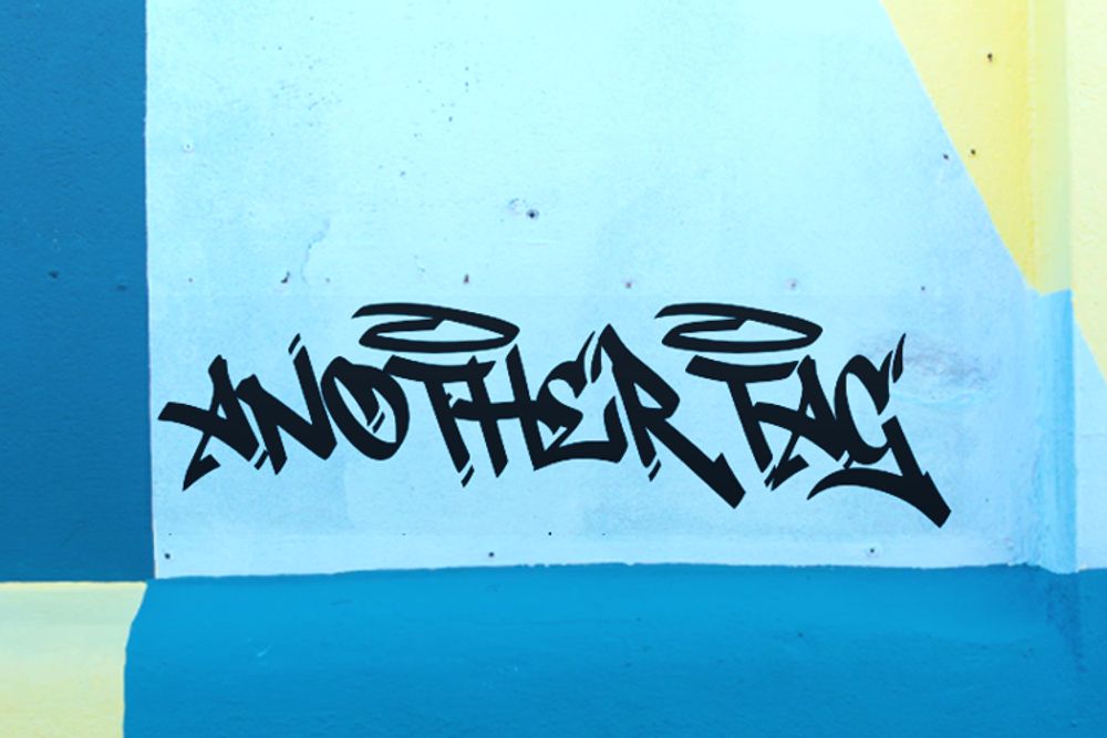
Here’s one of the coolest graffiti letters that should work on any branding and marketing design. It’s a clean-hand style graffiti lettering that’s simple yet offers many creative elements. The extended lines in some of the letters give the design balance and style. Plus, the halo adds a nice touch to the overall ensemble. This font style is perfect for headings and even short paragraphs on your marketing materials.
11. Mwd Graff by Prioritype
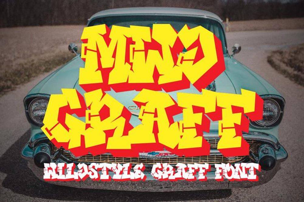
If you’re trying to achieve a bit of machismo in your branding or marketing campaigns, then the Mwd Graff font is the best choice. It looks substantial and bold with lettering shadows that can be good with contrasting colors. In this example, the yellow is backed by the red design shadowing that encapsulates the entire look. Be careful of using this on smaller materials as it might not be too legible to some viewers. This style can be good for doing Blockbuster graffiti projects covering a large area.
12. The Overcook by ArendxStudio
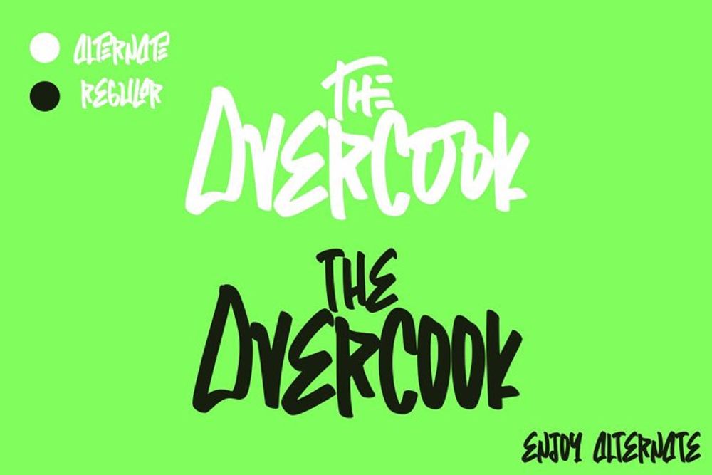
One of the handwritten graffiti letters that’s simple and straightforward is the Overcook by ArendxStudio. Some letters come in their own unique form, such as the letters “E,” “O,” and “A.” This graffiti font style can be well-suited for your marketing design headings or titles. Choose a bright color against a contrasting background and pair this lettering with a compelling graphic design, and you’re good to go.
13. Bombardies by Figuree
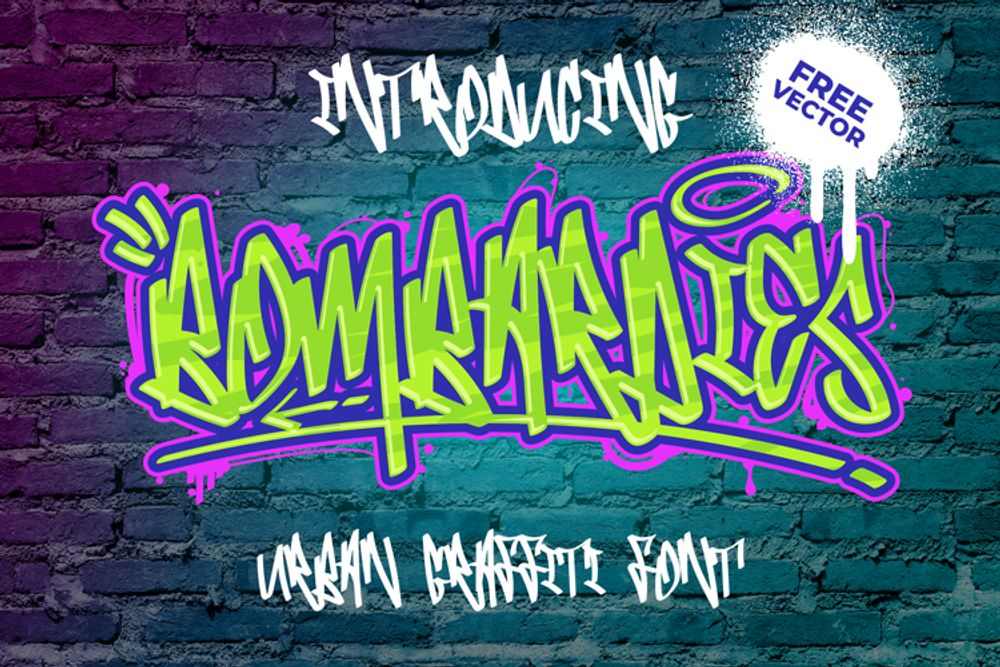
Bombardies is a marriage between handwritten and semi-wildstyle graffiti. From a distance, viewers might not catch the message instantly. However, every letter will fall into place once the placement, colors, and material finally settle. It also has several style elements, such as quotation marks and a halo. In this example, three vivid colors make the overall lettering pop, perfect for darker background colors.
14. Throwupz by Mans Greback
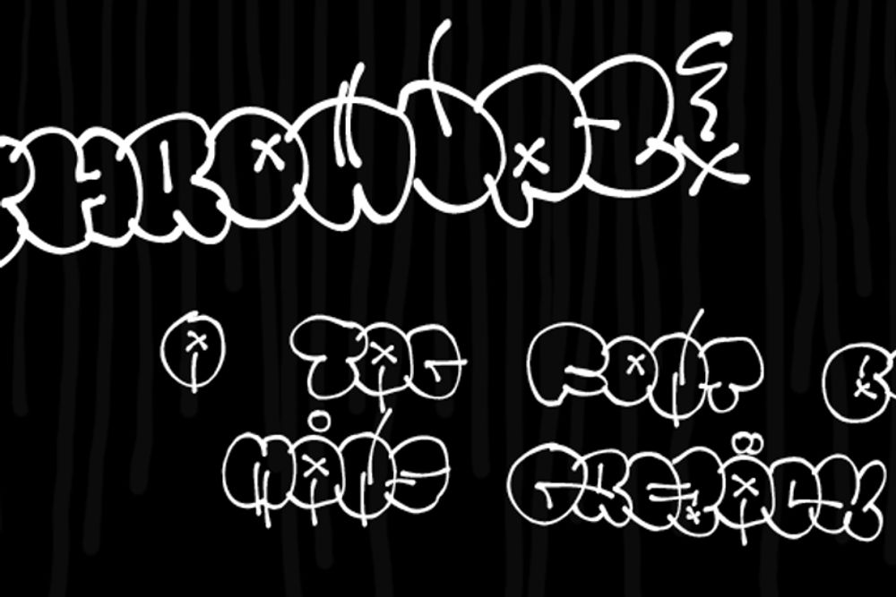
Throwupz is another type of graffiti style similar to “tagging.” As mentioned, tagging is typically done with one-colored signatures of graffiti artists. On the other hand, a throwup generally is done with various colors in bubble-style writing. The Throwupz font is an example of, guess what, a throwup graffiti style. It’s also combined with different decorative elements such as cross marks, lines, and halos. To make each letter stand out, try incorporating another color for the outlines to distinguish each bubble-like letter.
15. WildStyle Font by RasOne FTA
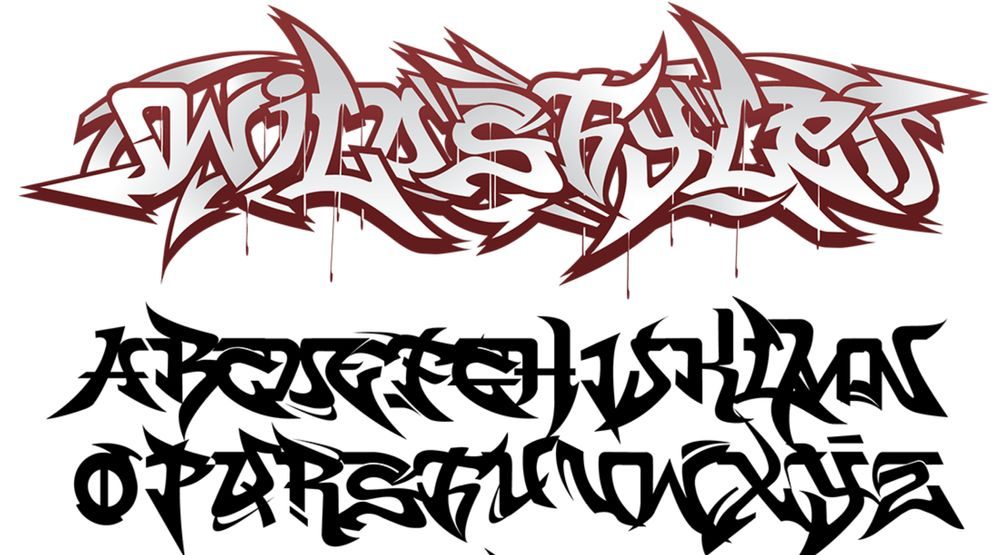
The WildStyle font can be classified as a wildstyle graffiti form. A wildstyle graffiti style is more complex with interlocked letters, spikes, arrows, and other decorative components. More often than not, viewers won’t be able to spell out the letters one by one due to their complexity. You’d have to look closely to figure out the text in this graffiti style. But that’s the beauty of graffiti, the conceptual clarity, and rawness that seem too hard to decipher.
16. The Bold Street Font by PutraCetol Studio
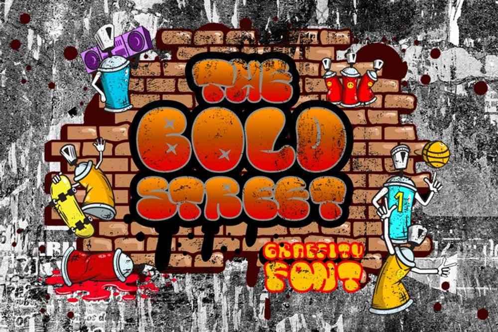
Graffiti letters like the Bold Street Font are perfect for use in both small and big marketing materials like flyers or even business cards. The playful nature of this graffiti font gives your brand a youthful and modern feel. It’s super bold in bubble style with contrasting outlines embracing the entire lettering design. It’s cool, hip, and screams street art.
17. Samdwoz Font by BalevgraphStudio
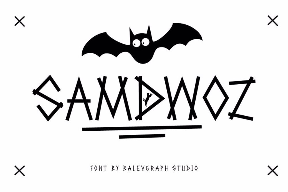
Compared to all the graffiti letter examples on this list, the Samdwoz style is undeniably the thinnest and the simplest. This style has a bareness that best represents random graffiti murals done illegally by graffiti artists. Brands and marketers can use this font style on almost anything because it’s versatile and neutral.
18. Brushlie Font by Abo Daniel
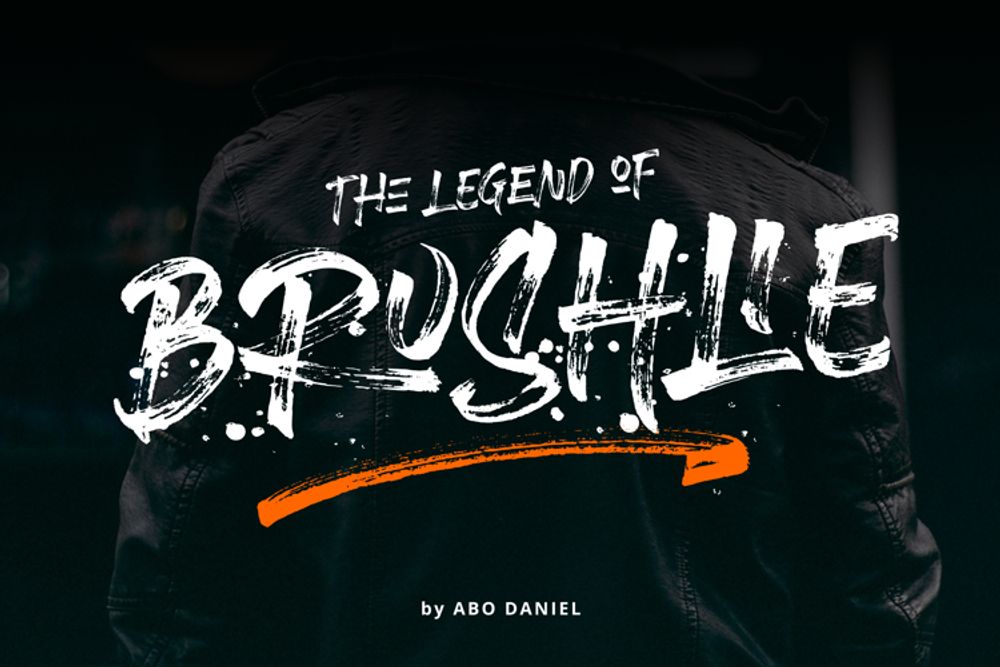
Here’s a washed effect on a graffiti font style. The Brushlie looks like it’s been painted fresh on a public wall or subway. The faded element gives the letters a more raw and original look. It symbolizes freedom of expression through street art. This font is best for your visual digital assets like social media posts and websites.
19. Ruthless Wreckin One by Mans Greback
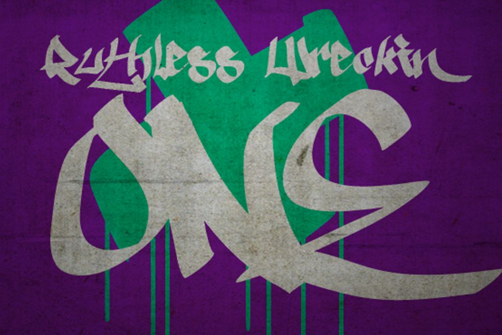
Another cool and hip graffiti lettering style is the Ruthless Wreckin One by Mans Greback. It looks like everything you expect from a graffiti font style — uncommon but distinct characteristics that remind you of street art movement and language. It’s also perfect for your branding and marketing campaigns’ headings or content.
20. Bowings Font by Blankids
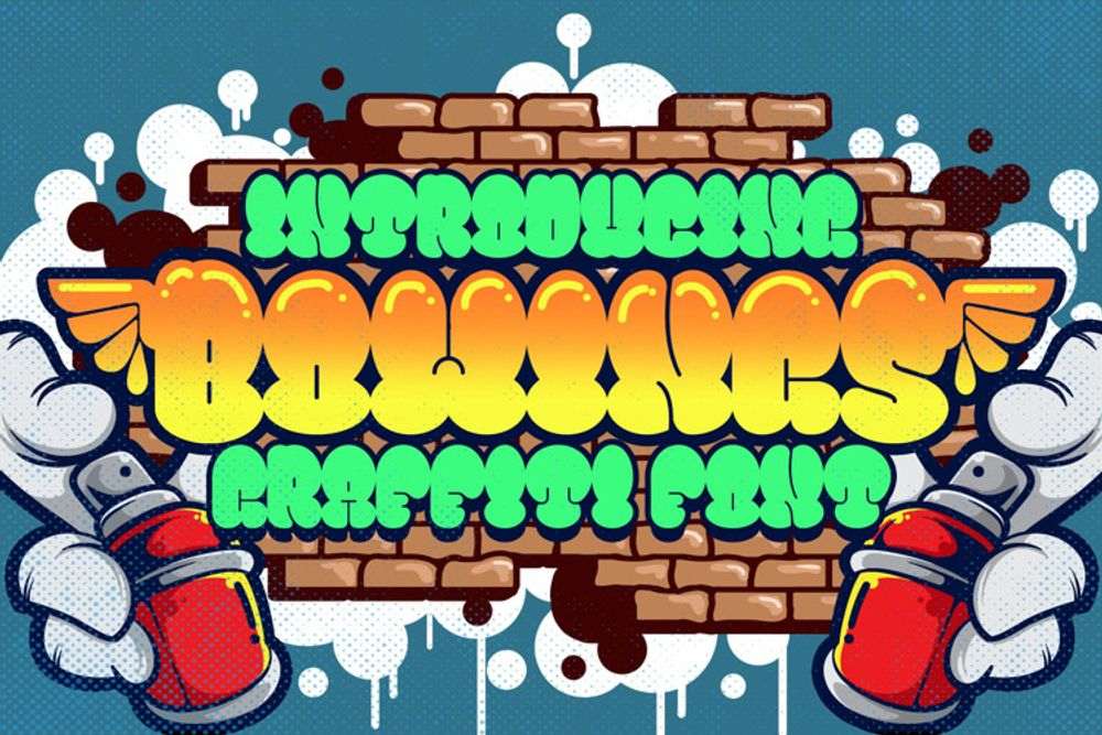
The Bowings Font is one of the cutest graffiti letters on this list. It’s bubble-style graffiti that is fatter at the top and thinner at the bottom. But it doesn’t lose its air-blown appearance. In this particular example, the letters are filled with gradient colors and style elements that make the upper part shine through.
Graffiti Logo Examples by Penji
1. Kewl Kulture Clothing
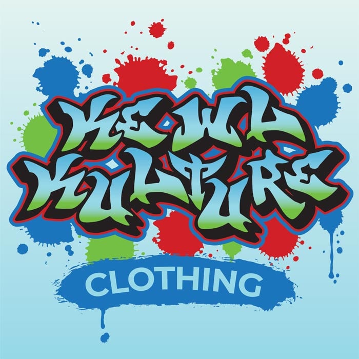
The logo for “Kewl Kulture Clothing” is a dynamic representation of urban style and street culture. It employs a graffiti-style font to spell the brand name, exuding a rebellious and edgy vibe. The letters in “Kewl Kulture” are stylized with sharp angles and vibrant colors, reminiscent of classic graffiti art. Each letter displays a unique, hand-painted quality, emphasizing the brand’s commitment to individuality and self-expression. The color palette is bold, featuring a mix of vivid hues, including electric blues, neon greens, and fiery reds. This logo embodies the essence of “Kewl Kulture Clothing,” a brand that celebrates urban fashion, self-confidence, and an unapologetic spirit.
2. Railgrab Art Studio
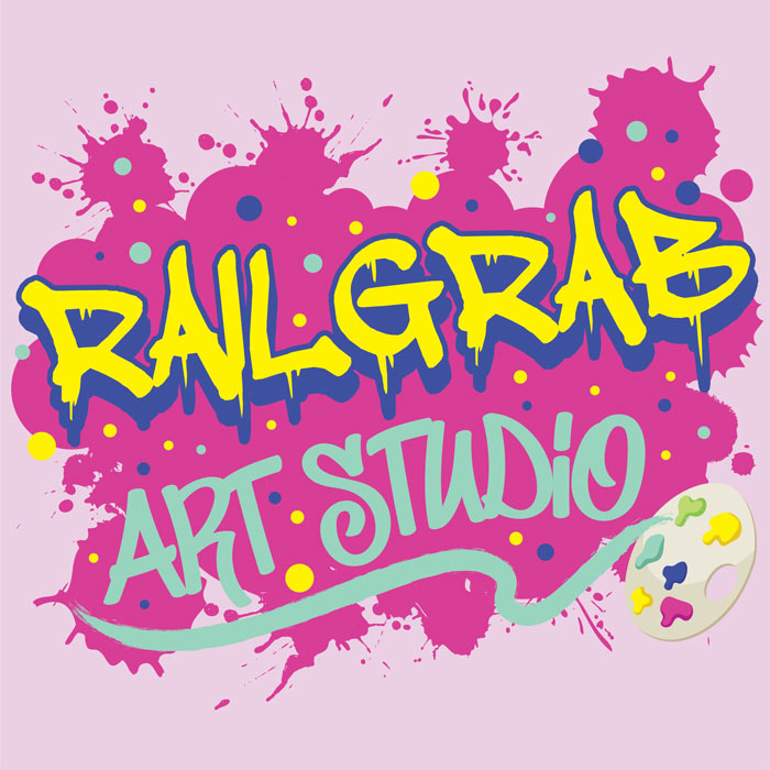
Depicting artistic creativity and urban flair, the Railgrab Art Studio exudes a calm tone. The primary element of the logo is the studio’s name, “Railgrab Art Studio,” prominently displayed in a graffiti-style font. The graffiti font is bold, free-flowing, and filled with vibrant colors, evoking the spirit of street art and self-expression. The “Railgrab” portion of the text appears to have been spray-painted, with drips of paint adding an authentic street art feel. The word “Art” is creatively integrated into the design, featuring a colorful paintbrush stroke that connects to a palette, symbolizing the studio’s commitment to various art forms.
3. Barbosa Recording Studio
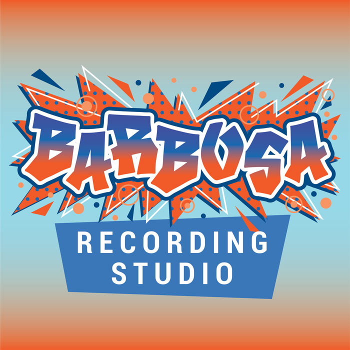
The Barbosa Recording Studio logo encapsulates a vibrant fusion of urban creativity and sonic excellence. Crafted in an eye-catching graffiti font, the studio’s name bursts with energy, emphasizing the bold and artistic nature of music production. The unique graffiti style incorporates sharp angles, dynamic strokes, and expressive loops, adding an edgy, street-smart flair to the brand. The letters are meticulously designed to exude an impression of movement, echoing the rhythmic flow of music. The color palette is a harmonious blend of deep blues and fiery oranges, signifying the depth of sound and the passion behind each recording. Surrounding the name is an abstract soundwave pattern, symbolizing the studio’s commitment to delivering top-notch audio quality.
4. Cloud 9 Sports
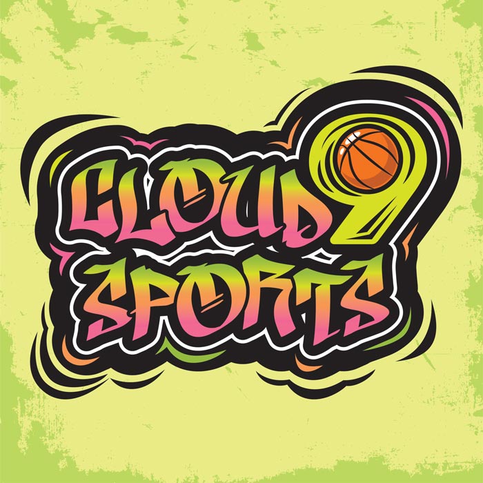
The logo for “Cloud 9 Sports,” a sports retail and goods store, embodies the energy and excitement of sports while showcasing a graffiti-inspired font. The brand name “Cloud 9 Sports” is rendered in bold, dynamic graffiti-style lettering, with vibrant colors that evoke the enthusiasm and vitality of sports. The use of sharp angles and intricate detailing within the font design reinforces the urban, edgy aesthetic associated with graffiti art. To add depth and a sense of motion, a stylized graffiti-style sports icon, such as a basketball, is integrated into the design.
5. Fin Tattoo
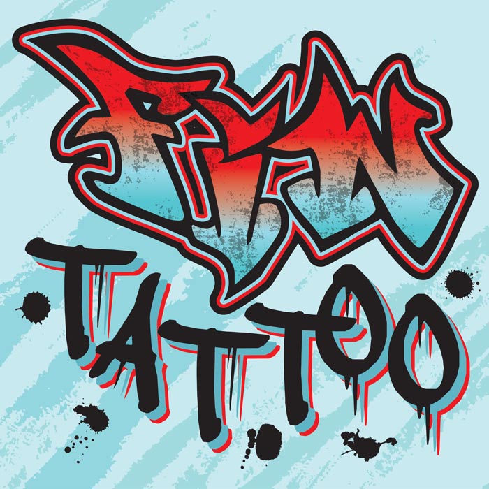
This graffiti logo design embodies an edgy and artistic essence, apt for a tattoo studio. The logo features the studio’s name rendered in bold, dynamic graffiti-style font. The “Fin” part of the name is designed with a sharp and sleek appearance, resembling a shark fin, signifying strength and precision. The text “Tattoo” shows swirling letters and ink splatter effects to symbolize the artistry of tattooing. The graffiti font is rich in texture, showcasing the studio’s urban and streetwise character. The color palette includes deep blacks, vibrant reds, and electric blues to create a captivating contrast. Overall, this graffiti-inspired logo represents the fusion of athleticism and creativity, appealing to those seeking unique and sporty tattoo designs.
Graffiti Letters: The Best and Most Affordable Solution
Most brands would prefer using font generators to find graffiti letters just like all these examples from Fontspace. Why? Because they’re free fonts and accessible. However, you can make your graffiti projects more authentic and original by letting experts do it.
Penji is an on-demand graphic design service that lets you request unlimited graffiti lettering projects and any marketing design your brand needs. You’ll not only get unlimited graphic designs, illustrations, and web designs, but you’ll also get unlimited revisions. Plus, you’ll get access to a custom design platform, which serves as your all-in-one design creation and team collaboration tool.
Enjoy all these features for relatively and surprisingly cheap monthly rates! Interested? Sign up now and get 15 percent off your first month. If you’re not happy, don’t worry. You’ll get your money back after a 30-day trial period. It’s a win-win situation, so what are you waiting for?
About the author
Table of Contents
- 1. Smilen by Subectype & Orenari
- 2. Attack Graffiti by Wepfont
- 3. Dripping Drops by Prioritype
- 4. Nightfate by SiPanji
- 5. Kortz by Vztype
- 6. Tratags by Prioritype
- 7. Rademos by StringLabs
- 8. Backbones by Tigade Std
- 9. Dirty Lizard by SiPanji
- 10. Another Tag by Wepfont
- 11. Mwd Graff by Prioritype
- 12. The Overcook by ArendxStudio
- 13. Bombardies by Figuree
- 14. Throwupz by Mans Greback
- 15. WildStyle Font by RasOne FTA
- 16. The Bold Street Font by PutraCetol Studio
- 17. Samdwoz Font by BalevgraphStudio
- 18. Brushlie Font by Abo Daniel
- 19. Ruthless Wreckin One by Mans Greback
- 20. Bowings Font by Blankids
- Graffiti Logo Examples by Penji
- 1. Kewl Kulture Clothing
- 2. Railgrab Art Studio
- 3. Barbosa Recording Studio
- 4. Cloud 9 Sports
- 5. Fin Tattoo
- Graffiti Letters: The Best and Most Affordable Solution


