
When it comes to presentations, every visual element counts – including the font style that you use. Here’s the lowdown on how to choose the right typeface and a cheat sheet containing some of the best PowerPoint font options to consider.
How to Choose the Best PowerPoint Font
Before we count down some of the best presentation fonts, here are a few tips on how to select the best one for your slide design.
Readability
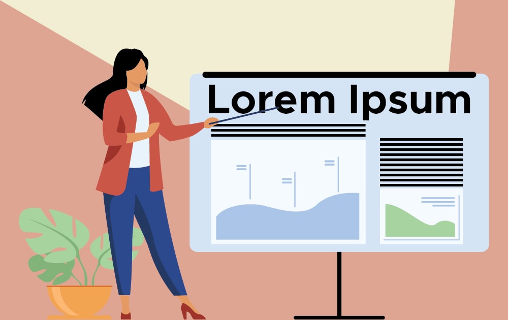
Whether you’re teaching a class, pitching an idea, or presenting your team’s performance, the ultimate goal of the slide is to get your message across. That said, readability must be the first factor to consider.
According to stats from Venngage, 84.3 percent of presenters said their slides were more visually focused rather than text-heavy. This is not surprising – after all, it’s easier to digest visuals rather than huge chunks of text. With that in mind, it’s crucial to make sure that whatever text you’re putting into your slides must be presented in bite-sized pieces packaged in an uncomplicated typeface.
The rule of thumb is to keep it simple. That means sticking to standard fonts that are easy to read, whether the audience is looking at the slide projected on a screen or through their computer screen.
Font Pairing

Though simple is best, you can also pair fonts if you want to add interest to your slides. After all, with so many best PowerPoint font options available, you may not want to limit yourself to just one choice. Keep in mind, however, that too much of a good thing can lead to bad design. Just limit yourself to two fonts (three at most), and you’ll be safe.
When it comes to pairing fonts, choose two styles that contrast but complement each other. If you’re at a loss at how to find the right match, choosing one serif and one sans serif font is always a wise step. Sites like Fontjoy, fontpair, and Typ.io can generate fonts that pair well.
Consistency

Your slide font must be consistent in two ways. First, it must be consistent throughout the whole deck. Don’t use one font set and change it halfway through the presentation.
Second, the font must be consistent with the PowerPoint slide design. For instance, if your design is sleek and minimalist, the font style should also look neat. On the other hand, if you’re using a vintage visual design, then a classy serif font would be appropriate. Finally, if your presentation exudes an air of fun and a lighthearted tone, choose fonts that are informal and playful as well.
25 Best PowerPoint Font Designs
Here are some of the best fonts for PowerPoint presentations.
1. Lato

This modern-looking font is one of the most popular sans serif fonts out there. And if you want to shake things up a bit, you can combine different weights (for instance, Lato Thin 100 plus Lato light 300) to create a more interesting visual.
2. Verdana
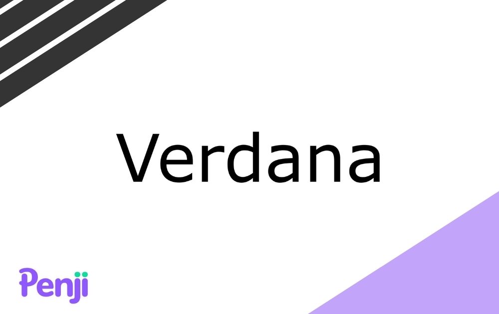
Next on the list is Verdana, a popular font style used in many digital and print designs. This is not only an excellent choice for slides but also for digital posters. After all, Mathew Carter designed it in 1996 for Microsoft. That means it’s optimized to look good on screen.
3. Roboto

Here’s another awesome sans serif font to use on slide designs. To do justice to this font, make sure that you apply the best font size for PowerPoint presentations – that’s a minimum of 24 points, according to the Association of Research Libraries.
4. Bentham
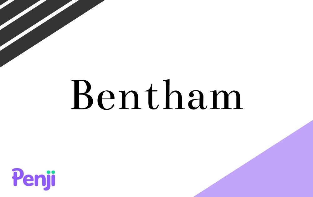
Because we try to avoid overly-ornate fonts for slide designs, this heavy serif font may be the most decorative yet orderly font you can get. You can use this font for headers, and it works best when used with a minimalist background. This serif font also leans towards a more formal presentation because of its traditional lines at the tips of the letters.
5. Calibri

Calibri replaced Arial as a standard font in Microsoft Office 2007. This proves the font’s credential as an effective, readable style for the screen.
6. Fira Sans
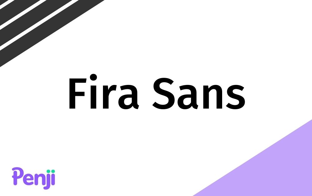
This option is one of the best PowerPoint fonts for teachers as it looks simple and vibrant at the same time. That said, you can add a bit of variation to your slides by using Fire Sans along with a neat serif font. This style can be great for headings and subheadings throughout your presentation.
7. Palatino
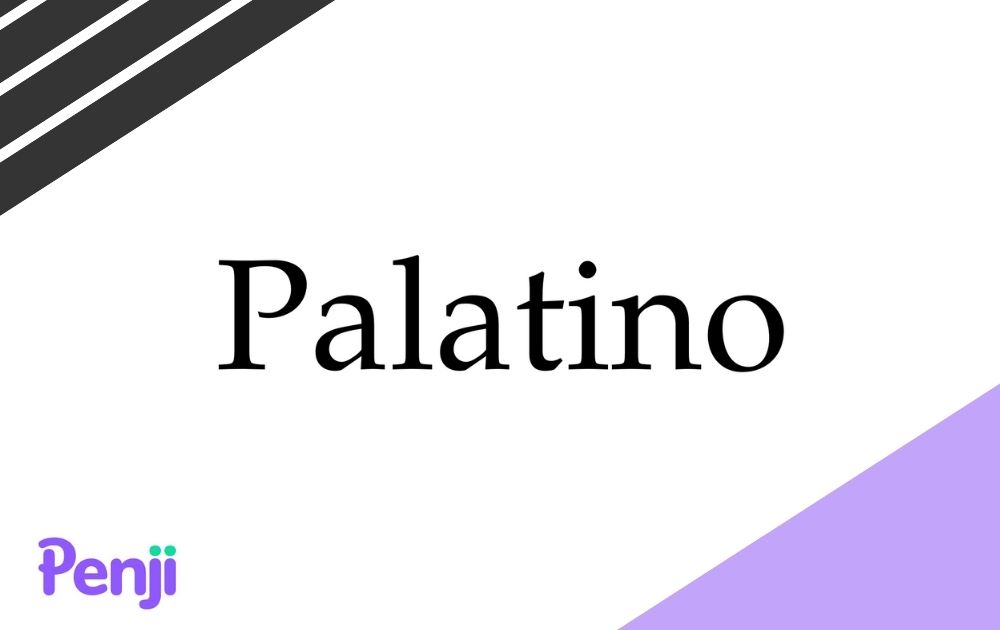
Though your audience will most likely be reading slides from the screen, that doesn’t rule out serif fonts altogether. For instance, this font makes for a good font that’s easy to read even at a distance.
8. Montserrat
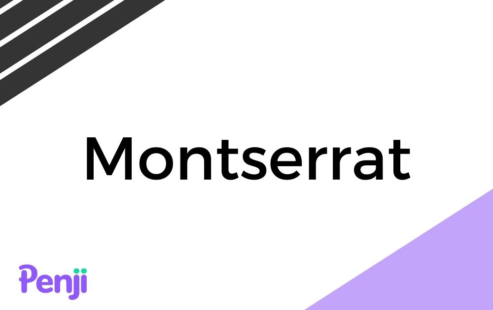
Due to its wide width, many designers turn to this font to use for headers. Bear in mind, though, that this comes in various weights, and switching to a lighter or heavier version can offer you a wider range of options.
9. Tahoma
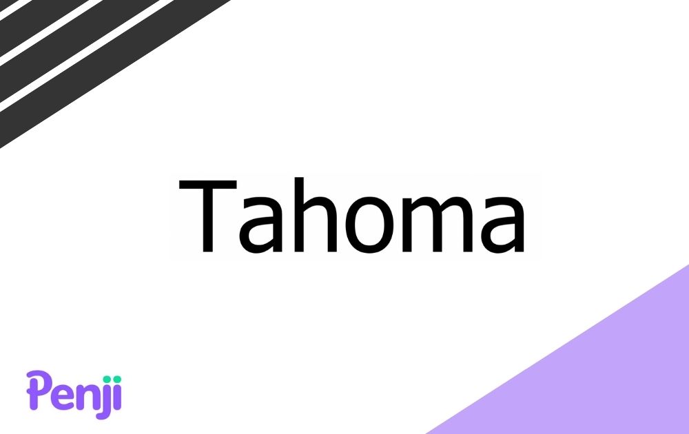
This font is another favorite among designers who needs a clear, straightforward font. Just like Verdana, this style offers clean lines but takes up less space.
10. Open Sans

Many website design templates use Open Sans because of its legibility. That said, it’s certainly one of the best PowerPoint font options that won’t strain the eyes, especially if you have no choice but to go text-heavy on your slides.
11. Poppins

Poppins offers the perfect mix of professional and casual. Its weight offers an air of authority, while the full, rounded curves provide a friendly look.
12. Georgia
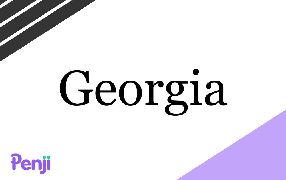
If you’re looking for something simple and elegant-looking, then Georgia should make your shortlist. Though it looks a lot similar to Times New Roman, Georgia is a bit wider, thus making it more readable.
13. Dosis
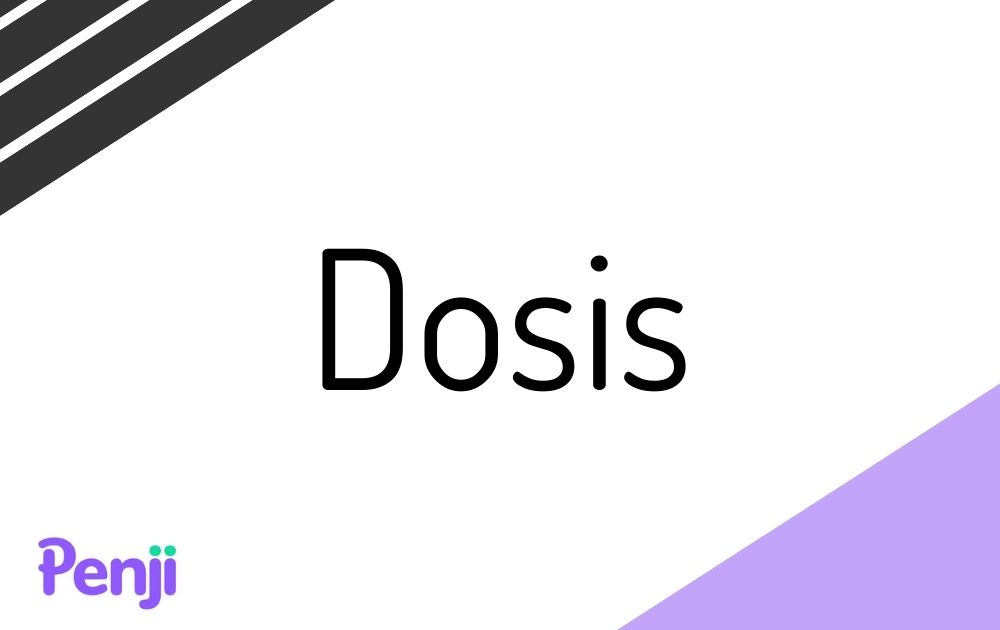
If you’re looking for a futuristic font that doesn’t look over-the-top, Dosis is a smart choice. This font features rounded edges coupled with thin lines, making it one of the best PowerPoint font options for the tech industry.
14. Gill Sans
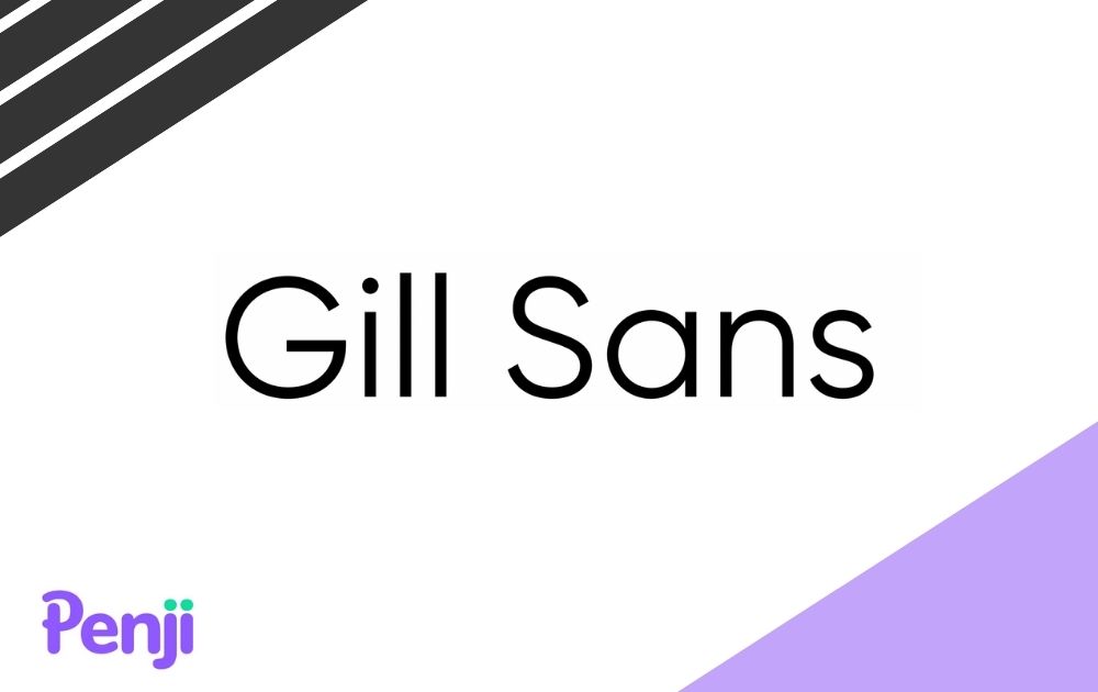
If you’re using a serif font for your body, then you may want to use a sans serif font like Gill Sans for your heading. Not only is it uncomplicated, but it also offers a classic appeal, thanks to its sleek curves.
15. Libre Baskerville
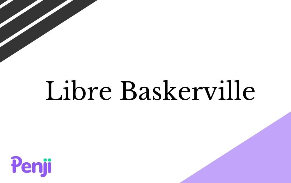
If you’re looking for more serif font styles, PowerPoint slide-ready Libre Baskerville is another good choice. Though many designers opt to use serif fonts for headers, this one is legible enough for body paragraphs.
16. Corbel
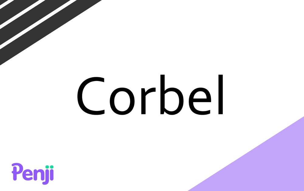
Next on our PowerPoint fonts list is Corbel, popular for being uncluttered. Not only does it look good on screen, but the ample spacing also makes it easy to read.
17. Abril Fatface
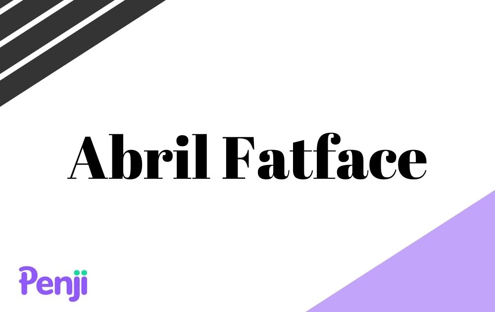
Though some may argue that Abril Fatface borders on a decorative font, this slab serif font looks great on a slide presentation. However, make sure that you limit its use to headings. In addition to that, pair it with a simple sans serif typeface or a thinner serif font.
18. Glacial Indifference
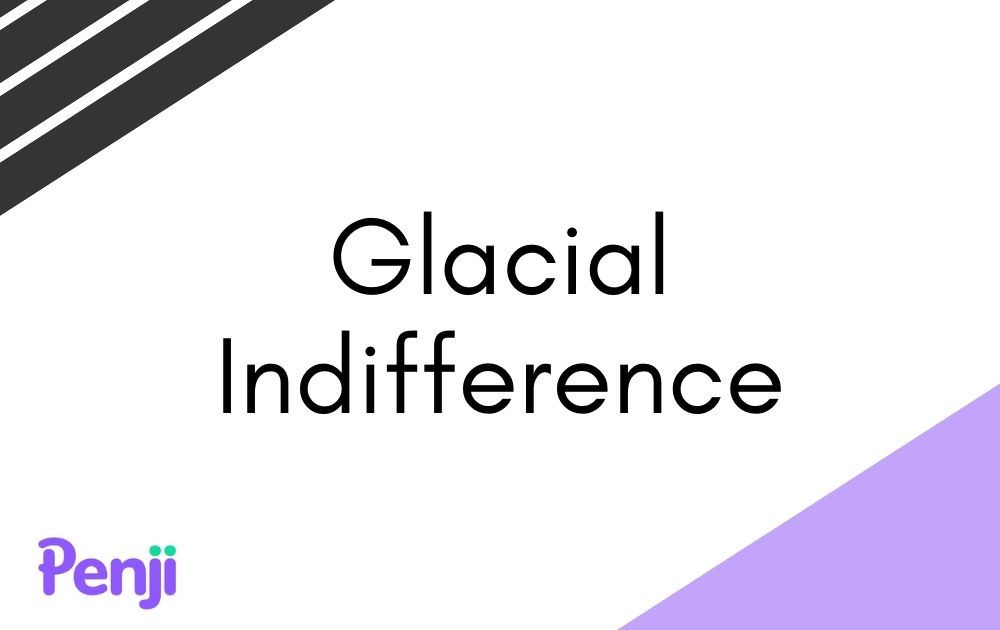
This option could be the best font for presentation slides with a graceful yet minimalist design. The thin, consistent lines, coupled with round shapes, makes for an art deco-inspired text.
19. Koho
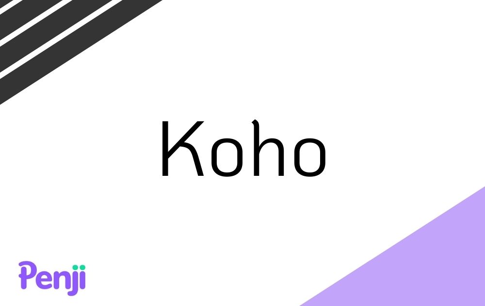
This font manages to look playful without looking overwhelming. If you need a font that projects energy and creativity while still within the bounds of professionalism, consider Koho for your slide design.
20. Helvetica
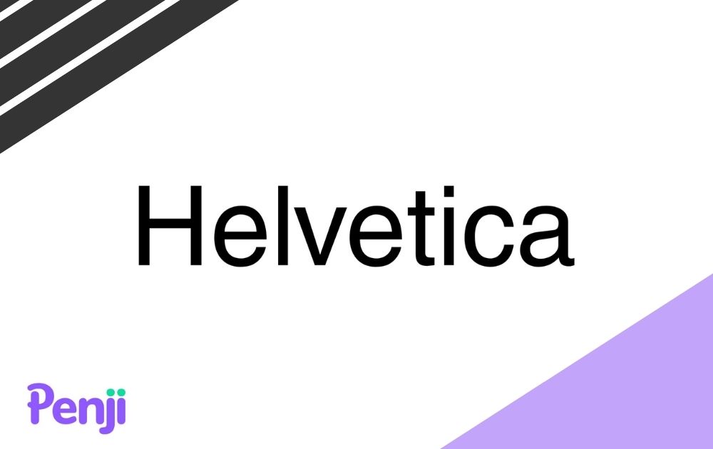
Skype, Panasonic, Jeep, Target, Nestle, and more – all these brands use Helvetica in their insignia, making it one of the best fonts for logos. That said, you can also count on this versatile font to make your slide design pop.
21. Garamond
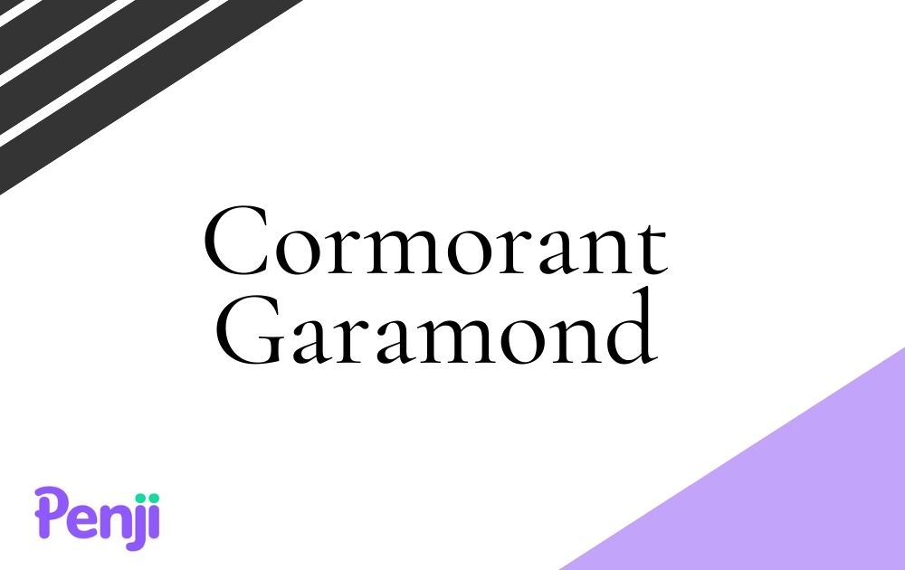
Garamond is another PowerPoint-safe font you can use if you’re looking for a serif option. Though it dates back to the 1500s and remains to be one of the oldest fonts around, it still passes modern-day aesthetics with flying colors. Plus, it’s even a designer-favorite font, making it one of the best fonts to use in powerpoints and other materials.
22. Kollektif

Here’s another sans serif font perfect for slide designs that require a straightforward font. Released in 2017, this font is a work of Dogu Kaya, a German designer popular for his sans-serif creations.
23. Blogger

Here’s another example that proves sans serif doesn’t need to mean boring. This typeface inspired by Dosis is usually used for website headlines, thus making it a good option for slide titles.
24. League Spartan

If you’re looking for a font that will make your headers look extra punchy, then League Spartan may be the choice for you. It’s uniform and minimalist, making it a surefire way to catch your audience’s attention. Pair this with a simpler and thinner font style and you’ll achieve an excellent structure on your presentation design.
25. Playfair Display
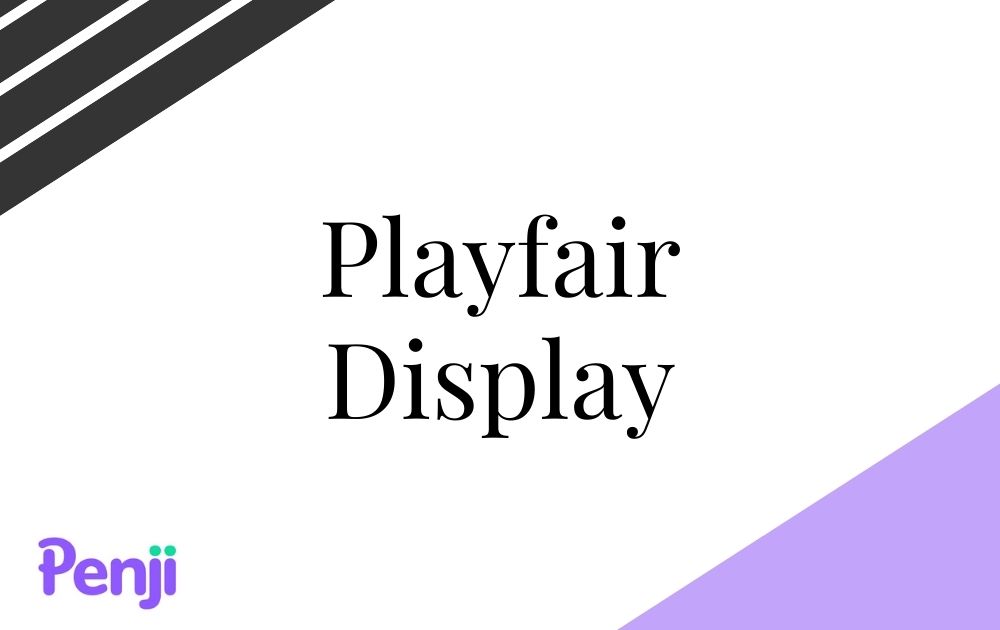
This option is a chic and classy font you can use for a wide range of industries – from cosmetics and furniture and everything else in between. However, make sure to limit the use of this font to titles, quotations, and headers.
Final Thoughts
In the end, it all boils down to which font best packages your content in a way that complements rather than competes for the audience’s attention. That said, keep your font style simple and consistent. Most of all, make sure that it advances your message forward and goes well with your slide background and color scheme.
If you want slides that work best for your presentation, consider getting customized PowerPoint slide design templates. That’s what we, at Penji, specialize in. By leaving the design heavy-lifting to us, you can focus more on preparing your content.
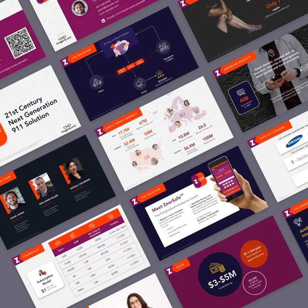
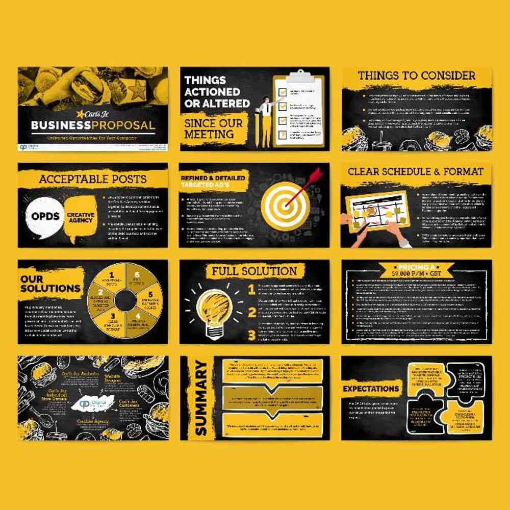
Here are some of the slide designs we’ve done in the past:

Sign up now to get 15% off your first month. The best part? You can try any of our packages risk-free for 15 days, so there’s nothing to lose.
About the author

Carla Deña
Carla is a journalist and content writer who produces stories for both digital and legacy media. She is passionate about creativity, innovation, and helping small businesses explore solutions that drive growth and social impact.
Table of Contents
- How to Choose the Best PowerPoint Font
- 25 Best PowerPoint Font Designs
- 1. Lato
- 2. Verdana
- 3. Roboto
- 4. Bentham
- 5. Calibri
- 6. Fira Sans
- 7. Palatino
- 8. Montserrat
- 9. Tahoma
- 10. Open Sans
- 11. Poppins
- 12. Georgia
- 13. Dosis
- 14. Gill Sans
- 15. Libre Baskerville
- 16. Corbel
- 17. Abril Fatface
- 18. Glacial Indifference
- 19. Koho
- 20. Helvetica
- 21. Garamond
- 22. Kollektif
- 23. Blogger
- 24. League Spartan
- 25. Playfair Display
- Final Thoughts


