
Marketers and entrepreneurs undeniably have a lot on their plate. And while companies can outsource their other needs, such as graphic design, some brands don’t have the budget to do that. And this means taking the DIY approach of doing your branding and marketing materials yourself. This includes business cards. And when you want a quick and simple solution, you can grab a Google docs business card template and go from there.
It’s easy editing a business card from Google docs. Even if you don’t have the creative chops to make it look pretty, the process is doable. Choose from the templates and edit the necessary elements and text to make the business card fit your branding. If you need more creative inspiration, here are 12 Google docs business card template examples.
1. Clean
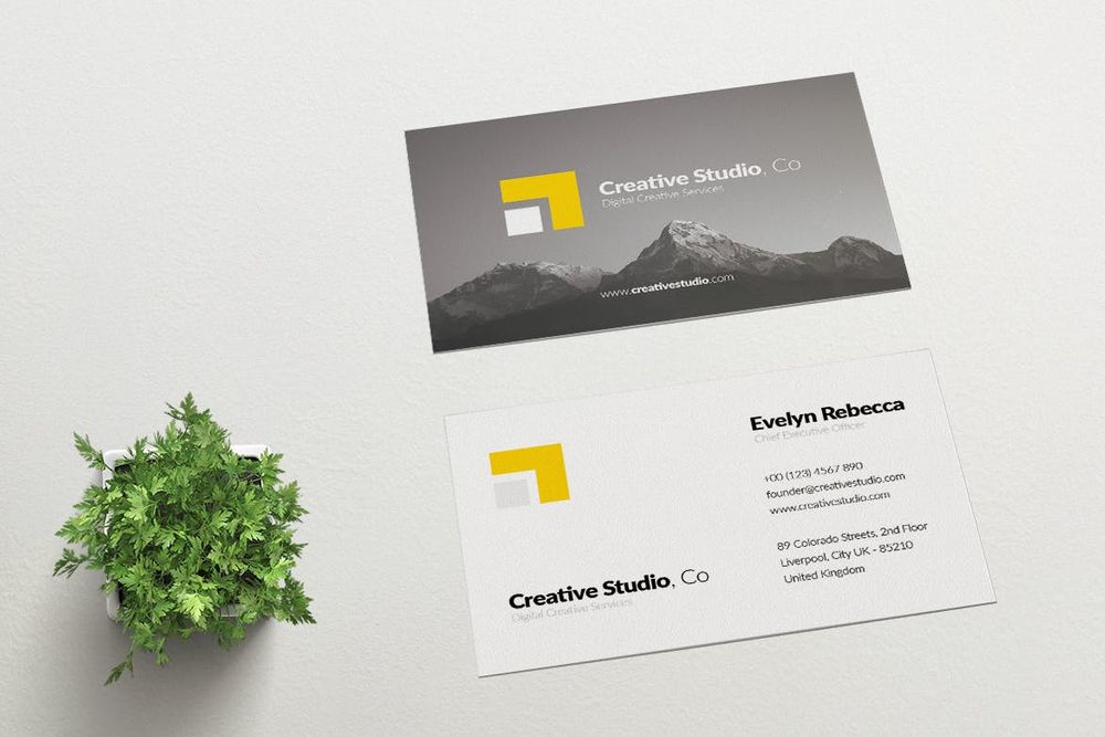
A clean business card design is perfect for companies with more serious branding. Clean visuals get rid of confusion and offer customers a straightforward approach. If you’re in the financial industry, this Google docs business card template will suit your style.
Perfect for: Young professionals, startup financial industries, etc.
2. Retro
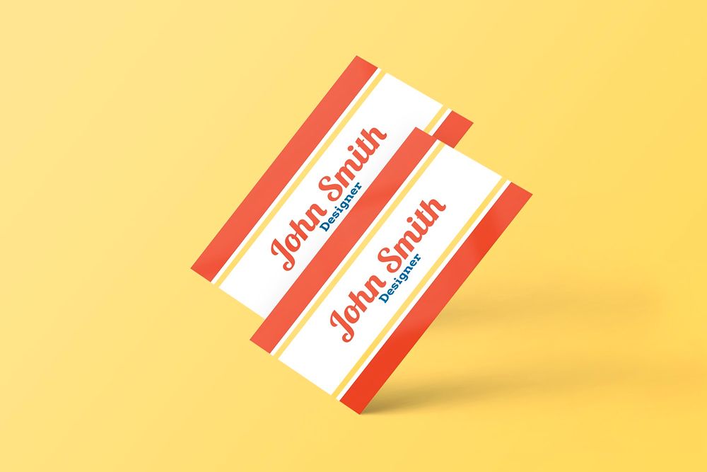
Vintage or retro style is making its way back into graphic design. Retro business card designs are playful and exciting. For instance, this retro business card example from Google docs is simple. However, the play on colors and lines emanate a different tone. This example is suitable for businesses such as diners or old record stores.
Perfect for: Bistros, mom-and-pop fast-food chains, record stores, etc.
3. Minimalist
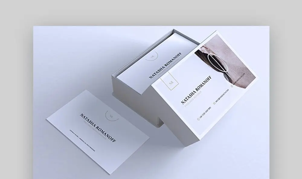
A minimalist business card is apt for modern brands. Minimalism means to rid your design of any unnecessary elements that don’t serve a purpose. And this one is a perfect example. Its all-white background looks excellent behind the large image of a woman with her earring. It looks simple yet classy, which is suitable for fashion brands and jewelers.
Perfect for: Interior designers, fashion retail brands, jewelry brands, etc.
4. Modern
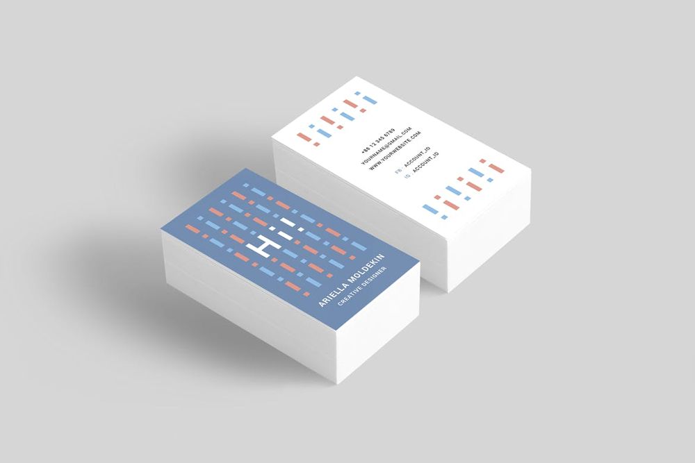
Many brands of today adapt the modern graphic design trend because it looks appealing and unconventional. Take this Google docs business card design, for example. First off, it’s not like the traditional horizontal business card layout. The vertical orientation already makes it unique. Plus, the different colors on both sides with a massive text that says, “HI,” on one side grabs attention.
Perfect for: Sportswear, streetwear retail stores, digital marketing agencies, etc.
5. Nature-inspired
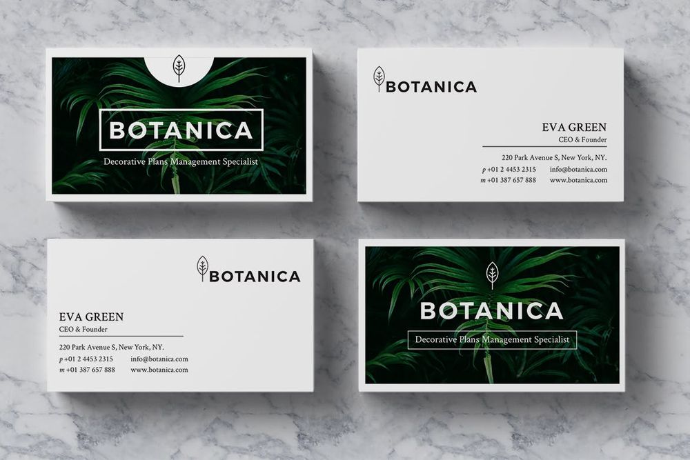
Most graphic design experts know the color psychology that goes into branding creation. Each color evokes a particular emotion that entrepreneurs and marketers aim for within their audience. This impact has a huge advantage when it comes to consumers’ purchasing behaviors. Here’s an example from a management specialist brand. The green color represents growth and nature, which is what managers want for their organizations.
Perfect for: Startups, health and fitness brands, consultancy services, etc.
6. Playful
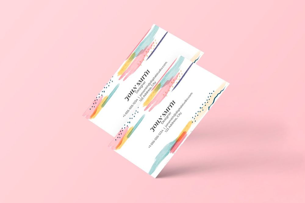
Young and hip brands would prefer to showcase their branding through their business card design. And one way to exude a hip brand identity is to don your business cards with playful, bright, or pastel colors. Here’s a Google docs business card template example. The watercolor style with various colors is eye-candy. The dots on top and at the bottom also add a nice touch, which emanates a good-natured tone.
Perfect for: Toy stores, children’s clothing brands, innovative companies, artists, etc.
7. Photograph
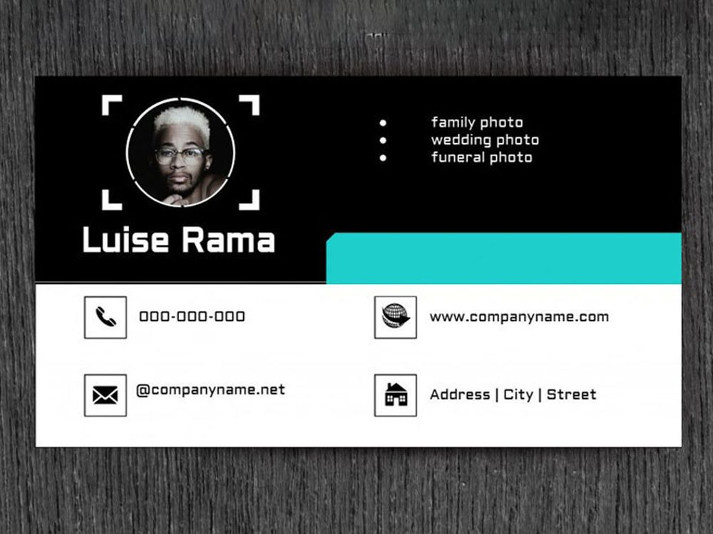
Using a photograph of the entrepreneur on a business card works only for some industries. This style is perfect for those sole entrepreneurs or professionals offering special skills such as photography, interior design, and whatnot. Check out this Google docs business card template example. The camera focus symbol around the picture is suitable for what the photographer offers.
Perfect for: Photographers, makeup artists, interior designers, graphic designers, etc.
8. Sophisticated
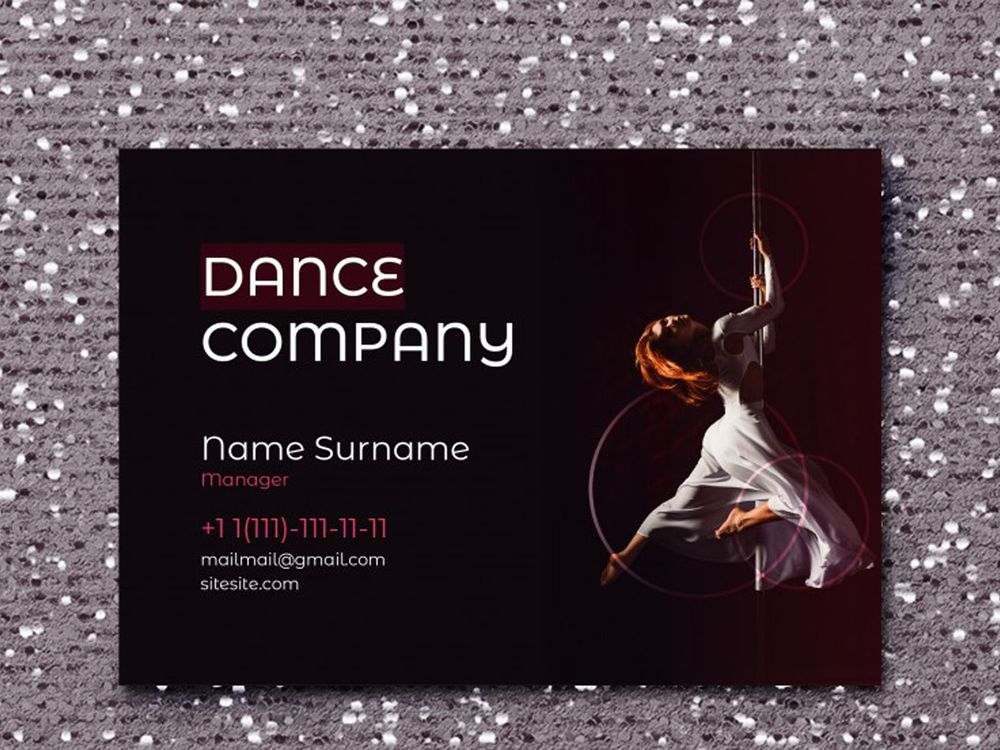
A beautiful elegant business card design gives off a respectable and formal branding. Some designs rely on black and grey colors for authority and class, just like this example. This business card for a dance company dons a black background. Also, the font choice is apt for the brand — not too formal and not too casual. The dancer on the right part is a perfect touch as well.
Perfect for: High-quality gadget stores, car manufacturer companies, financial institutions, etc.
9. Illustrative
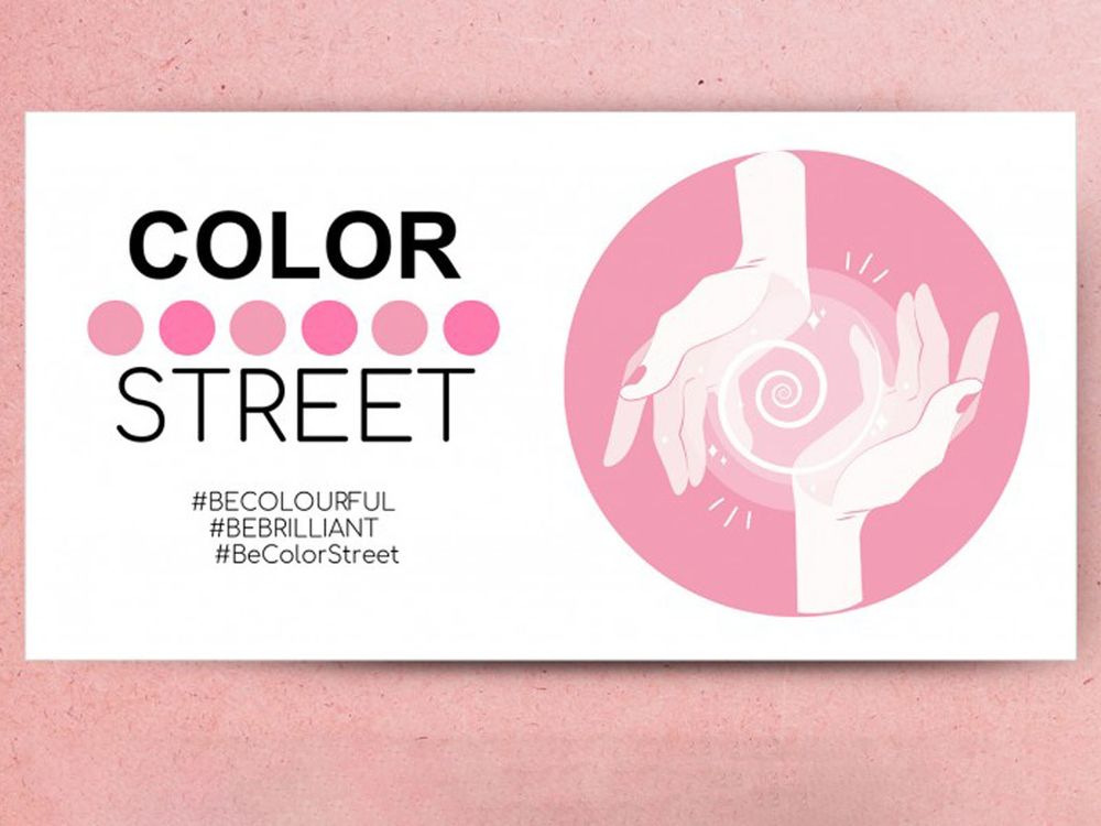
Business cards are necessary marketing materials for brands. You can go the straightforward route by letting your prospects determine what you’re offering right off the bat. You can do this by including illustrations, symbols, or icons that represent your products or services. Here’s a business card template from Google docs. It shows two hands seemingly cupping a spiral shape. The pink nails and overall pastel pink colors are fitting for the fashion brand Color Street.
Perfect for: Fashion brands, any industry, etc.
10. Feminine
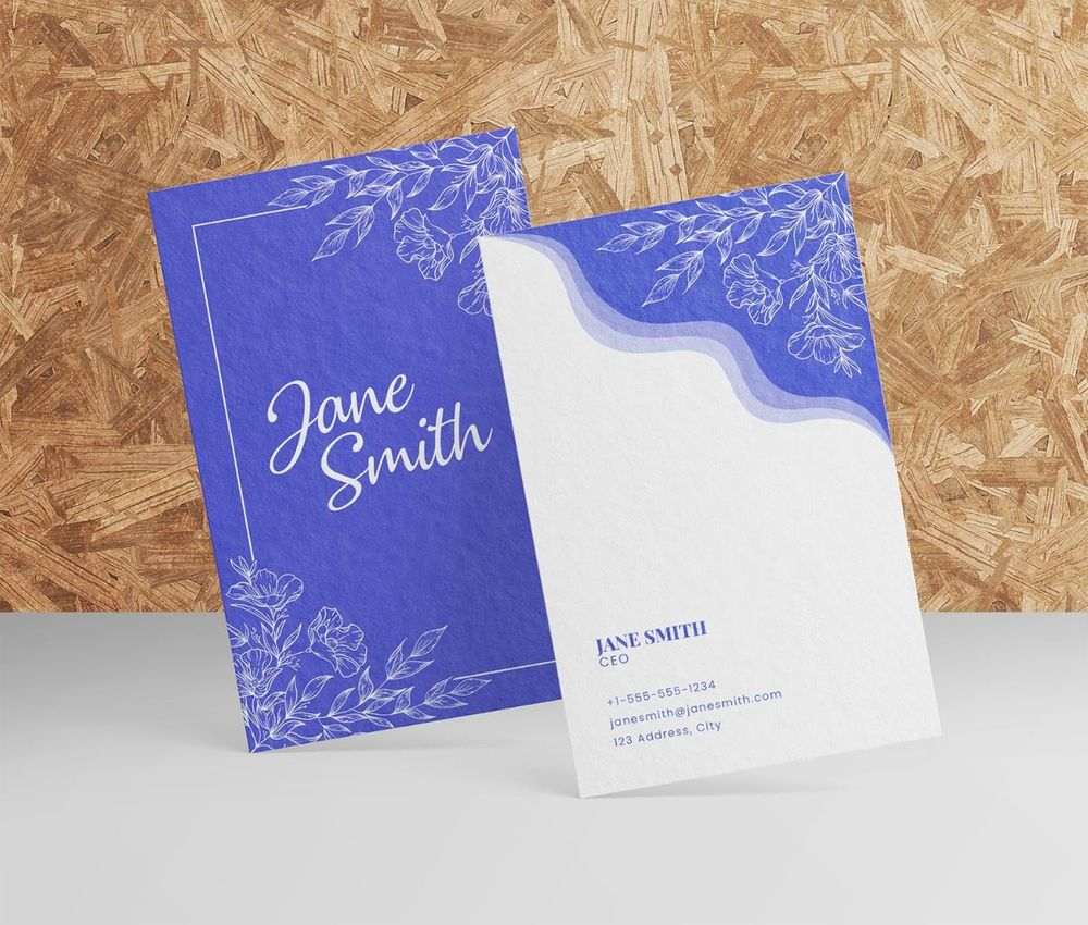
You can rely on feminine business card designs to better convey your brand personality to your target audience. A feminine business card design doesn’t have to have a burst of girly colors. Sometimes, adding simple feminine elements like the pencil-style flower illustrations on this example will suffice.
Perfect for: Events organizers, fashion designers, massage therapists, artists, etc.
11. Corporate
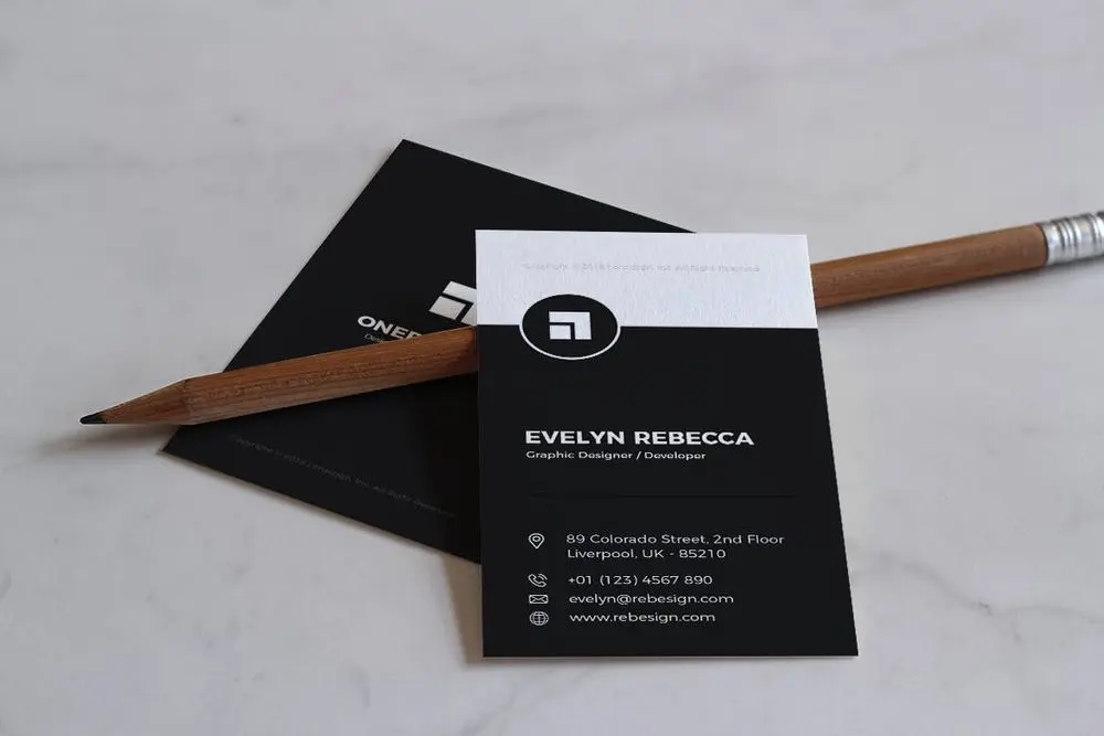
A corporate business card design is simple, elegant, and clean. This style should be used for companies that want to establish authority. Those brands that want to showcase a serious brand image should rely on corporate Google docs business card templates. Here’s an example with a black and white color combination. The logo is evident on top, and the white text underneath behind a black background makes the business name and contact information pop. Contrast is a business card design principle that most professional graphic designers use.
Perfect for: Educational institutions, banks, big corporate brands, etc.
12. Visual
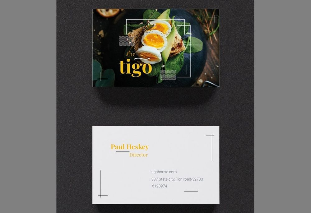
Flaunt your products on your business cards. The only way to promote your products first-hand is to include high-quality images on your business card. This is suitable for gadget stores and restaurants. Check out this Google docs business card template example. One side of the business card has the restaurant’s dish, and the other side contains the contact information.
Perfect for: Gadget stores, IT companies, restaurants, etc.


