The time for pumpkin carving, trick or treating, costume cladding, and merrymaking is almost here. For businesses, this means there is a huge window of opportunity. While the holiday season brings out the best of what any industry’s marketing sector has to offer, only a few companies pull Halloween marketing off entirely, or should I say — hauntingly.
Your business can be one of these companies when you work with Penji. We are a graphic design service that offers unlimited designs for a flat monthly rate. And as a Halloween gift to our readers, we’re giving away free downloadable character illustrations that are made for the holiday.
That said, what the brands below have achieved is no easy feat, and their Halloween designs are truly spellbinding or frightening. Let’s take a look at what they’ve done to get into this list.
15 Halloween Advertising Designs Examples
1. Chipotle
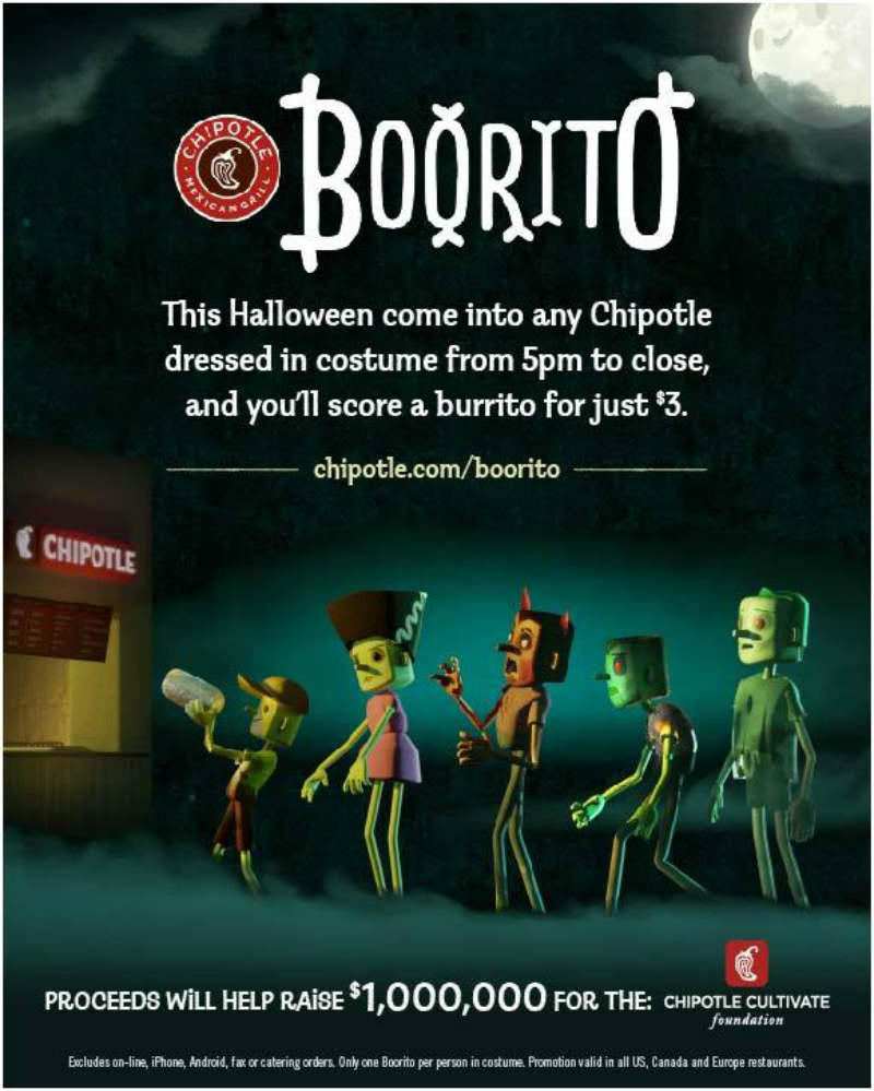
Chipotle wants to change how consumers see fast food chains by creating the Halloween marketing campaign, “Boorito.” By visiting any Chipotle store dressed in Halloween costumes, customers can purchase a burrito for only $3. But that’s not all. The proceeds will then go to the Chipotle Cultivate Foundation, an organization centered on sustainable food culture.
2. The Whiskey Exchange
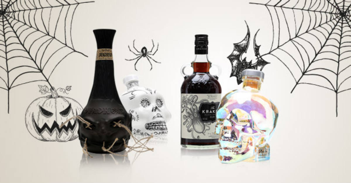
The Whiskey Exchange dolled up their homepage by welcoming Halloween partygoers with this beautiful Halloween ad design. Donning images of their super-spooky skulls, zombies, and pumpkins collection, any booze aficionado celebrating Halloween would surely dive right in.
3. Threadless
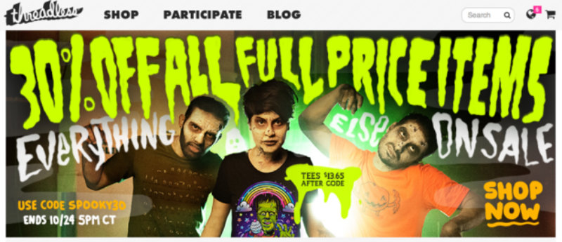
Threadless is an e-commerce platform by artists who cater to artistic minds as well. It’s an online community where products are printed and sold worldwide depending on the highest votes. The “30% Off All Full Price Items” offer on their website is irresistible and hauntingly captivating.
4. Heineken
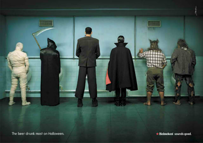
Heineken outsmarted other brewing companies through their well-played Halloween designs. And here, we’ve picked two that caught our attention. This one uses fun and humor — plain and simple.
5. Heineken
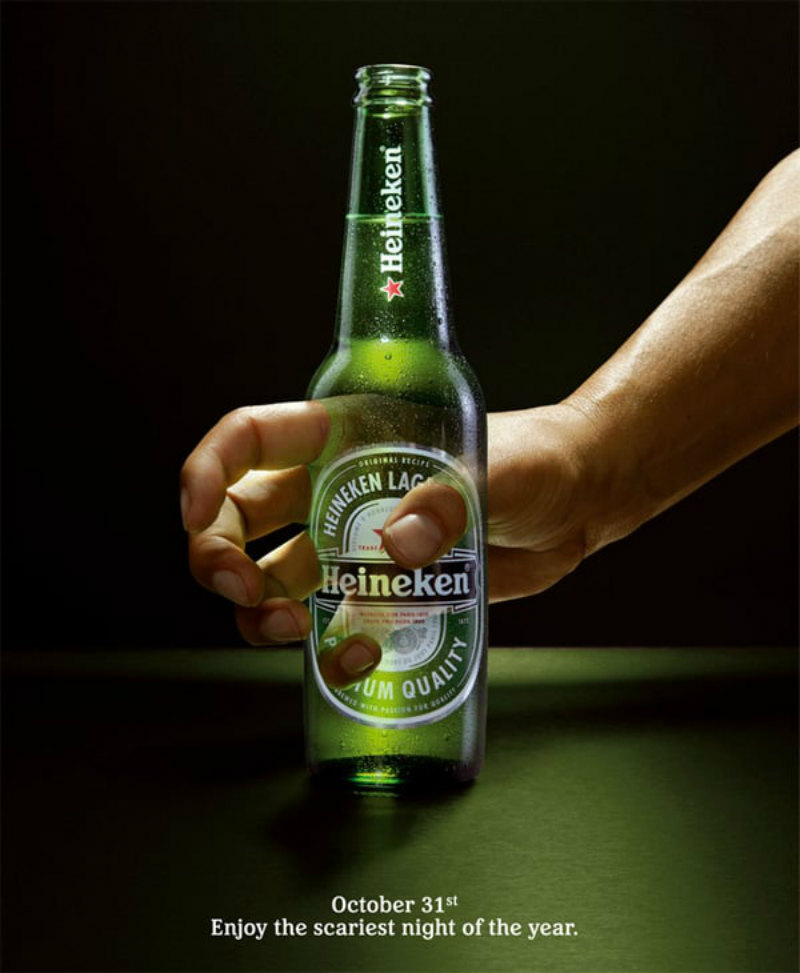
This is our second Heineken Halloween ad pick. While the first one uses humor, this one uses plain brilliance. We can’t help but laud the subtlety coupled with creativity. A thirsty ghost who can’t even enjoy a Heineken bottle, that’s downright the scariest thing that can happen to anyone if you ask me.
6. Honda

Although the exclamation marks need a bit of downplaying, any passersby will undoubtedly take a second look at this print advertisement. The Honda Fit Cavernous boasts 57 cubic feet of cargo space and 33 miles per gallon on the highway. Hence, the gazillion nocturnal flyers.
7. Pepsi
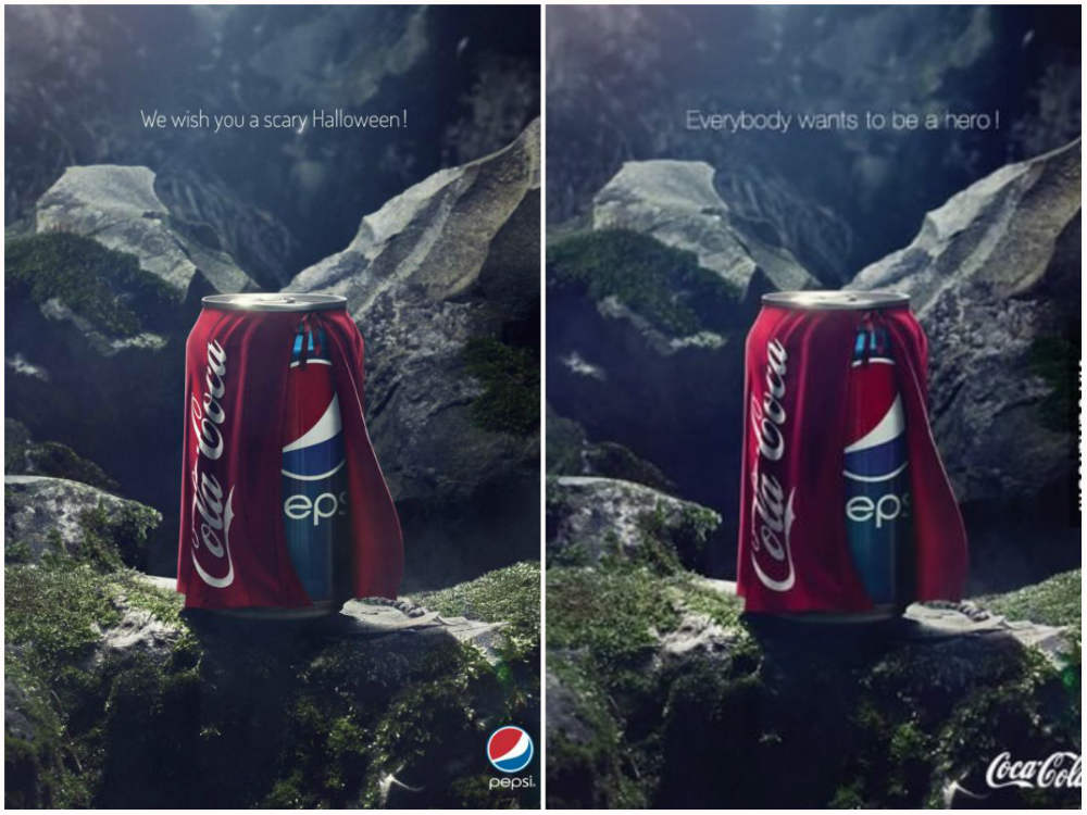
Pepsi’s Halloween ad emerges as the top dog in the world of cleverly amusing marketing. Pepsi wanted to show how scary it is to be “Coca Cola” this Halloween with the tagline “We wish you a scary Halloween!” But Coca Cola supporters fought back and tweaked the ad by saying, “Everybody wants to be a hero!” This will go down in history as the greatest advertising rebuttal from prominent rivals ever.
8. McDonald’s
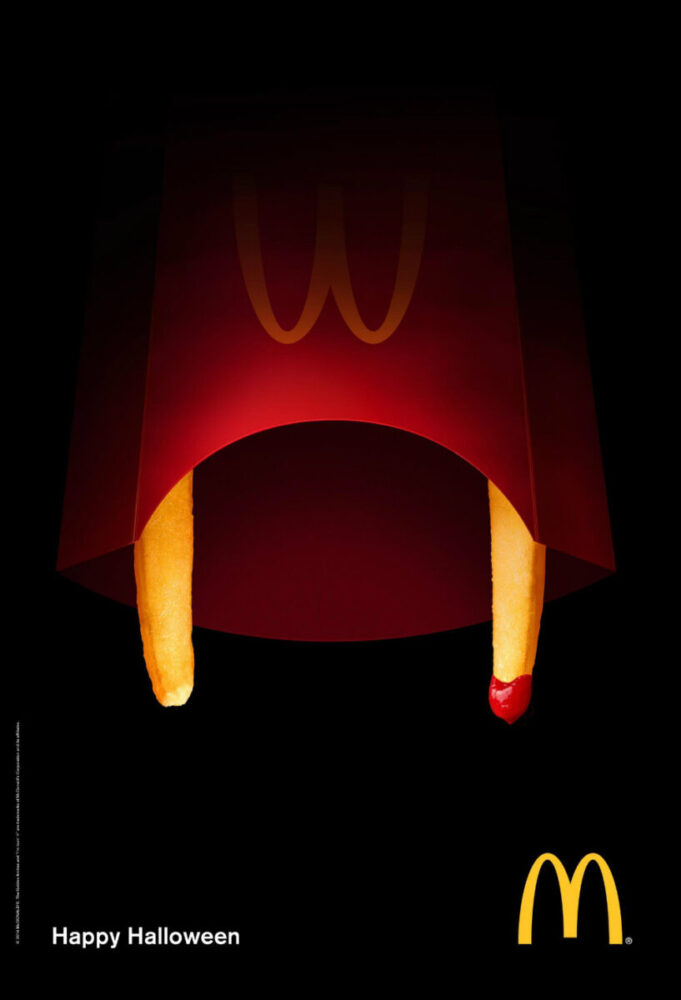
Boasting minimalistic cleverness, McDonald’s Halloween ad design is simply well-thought-out. Without any other Halloween elements, the multinational fast food tycoon used one of their bestselling products as their main Halloween attraction. There’s nothing like french fries as fangs and ketchup as blood combo — a pat on the back to McDonald’s graphic designer!
9. Heinz
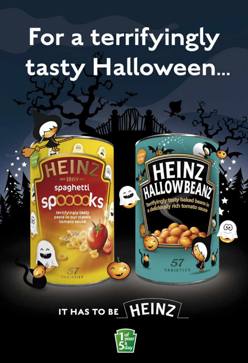
Heinz amped up their digital and packaging Halloween campaigns. They launched creepy limited-edition cans called “Hallowbeanz” and “Spaghetti Spooooks.” They even had a special Spooky Pasta Shapes product which contains pasta in the shape of spiders, bats, and cats! Plus, each seasonal can had a mystery code that grants customers a chance to win an online raffle draw. Like elaborate designs like this? Check out our portfolio to see the designs we’ve done for clients in the past.
10. Burger King
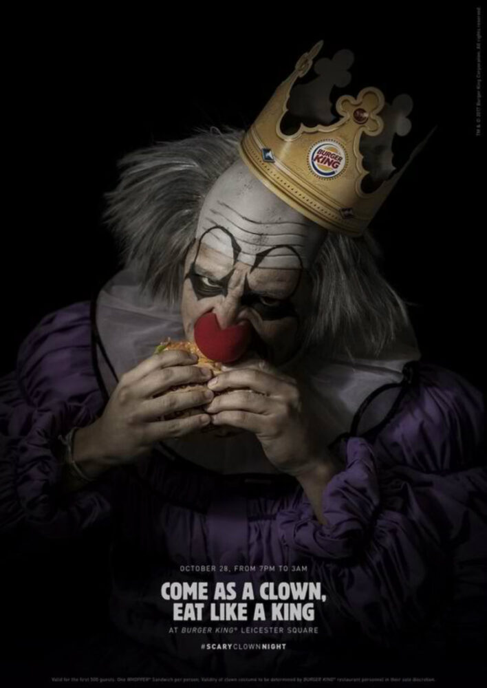
For anyone who hates the sight of clowns, he’ll either tear this poster into pieces or grab a whopper as revenge. The graphic design exudes ghastly power to reel customers to “Come as a clown, and eat like a king.” But wait till you see the video — be careful not to pee your pants though!
11. M&Ms
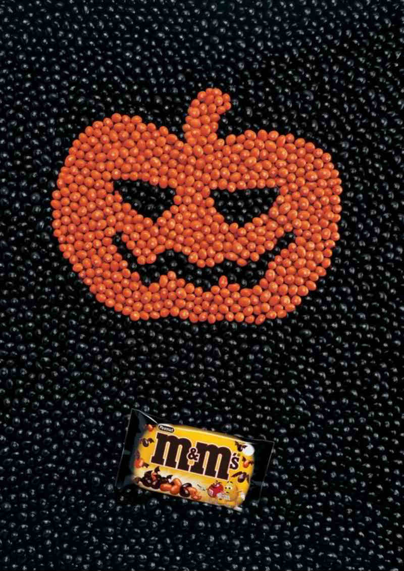
M&Ms always outdid others in terms of limited edition packaging designs. They did an uncomplicated yet clever Halloween advertisement by making use of the chocolate’s colors. An orange M&M pumpkin on a bed of black M&Ms featuring the special Halloween packaging design is crisp and eye-catching.
12. Snickers
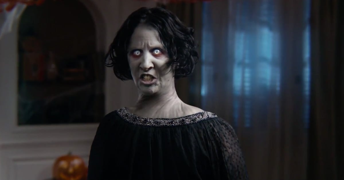
Chocolate and candy brands wouldn’t want to miss out on the Halloween festivities because Halloween is all about the candies, to begin with! And Snickers consistently delivers when it comes to Halloween designs and videos. The Spanish Halloween video ad is both smart and funny as well as the “Grocery Store Lady” video ad from 2010.
13. Starbucks
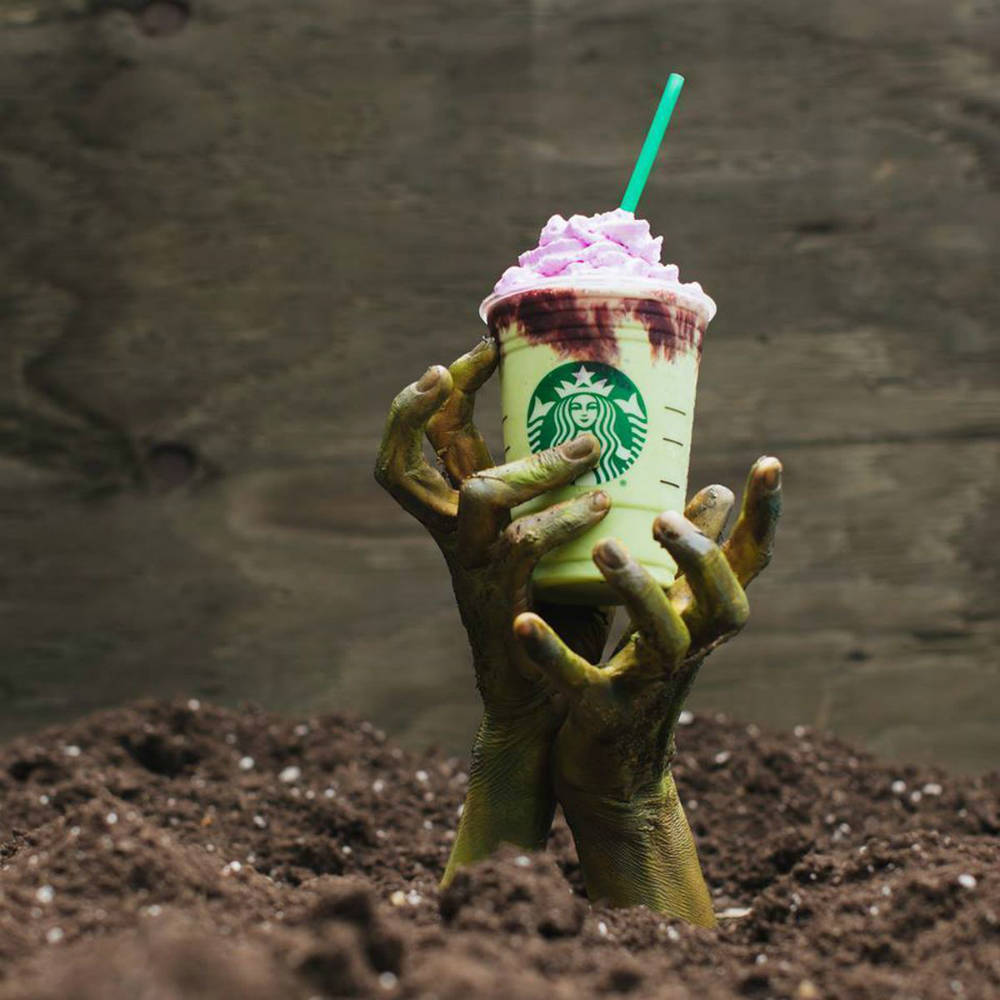
Starbucks released their Zombie Frappuccino, a limited edition frozen drink adorned with ghoulish colors akin to brains and zombies. But Starbucks’ social media Halloween campaign gives it an eerie twist. With zombie hands which seemed to have risen from the dead, the Zombie Frappuccino couldn’t have been promoted more fittingly.
14. Sanzer Hand Gel
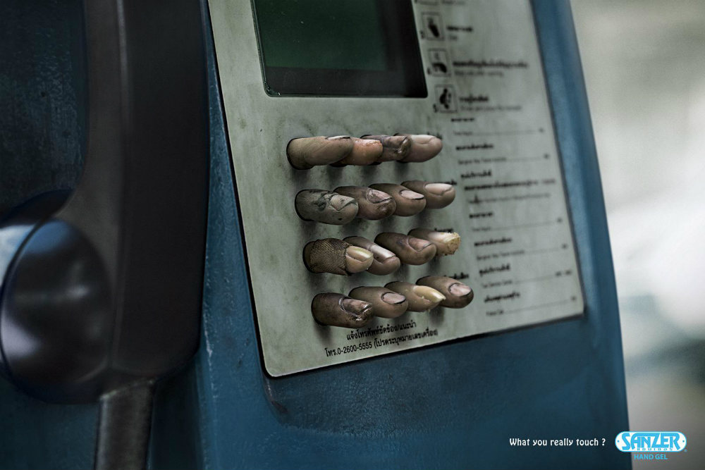
Sanzer is a company that manufactures hand sanitizing gels. Their print Halloween ad designs feature mundane public things that people grab or touch daily. They also put a brilliant tagline, “What you really touch?” to remind people to fend off germs daily. This advertising campaign is enough to make germophobes cringe.
15. Nestle
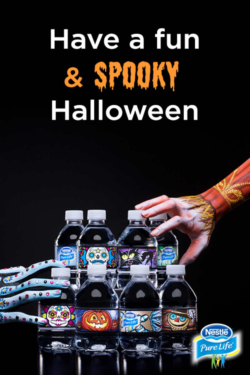
Nestle kept it simple and impactful by showcasing all their limited edition Halloween Share-A-Scare bottle designs. Donning a different spooky character each, these eight-ounce bottles are perfect for Halloween kiddy parties or just downing those trick-or-treat candies!
Requesting a Graphic Design from Penji
Feeling inspired enough? As seen from the examples above, visuals play a huge part in catching the audience’s attention.
Lucky for you, we’re here to offer high-quality professional designs created by the top 2 designers. And best of all, it only takes three easy steps to request a design from us.
1. Create the Project
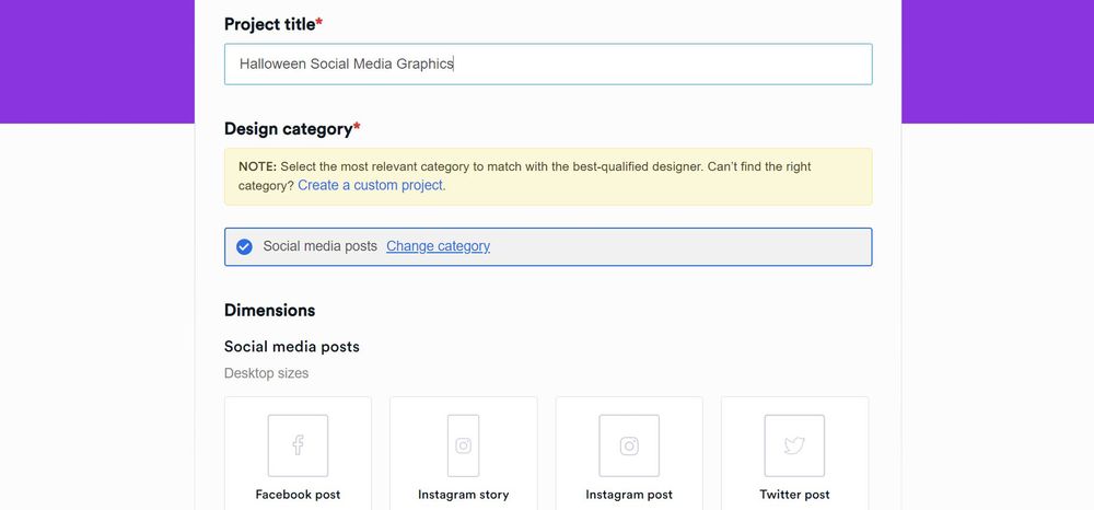
Go to the Penji dashboard, click New Project. Type in the title of the project. Then, select a project type from the categories. If the project that you need isn’t included in the list, you can select Custom Project. In the description box, put in as many details as you can about the project you need. Once done, click Create Project. It will be assigned to a designer who’ll get in touch with you if anything needs to be clarified.
2. Review and Revise
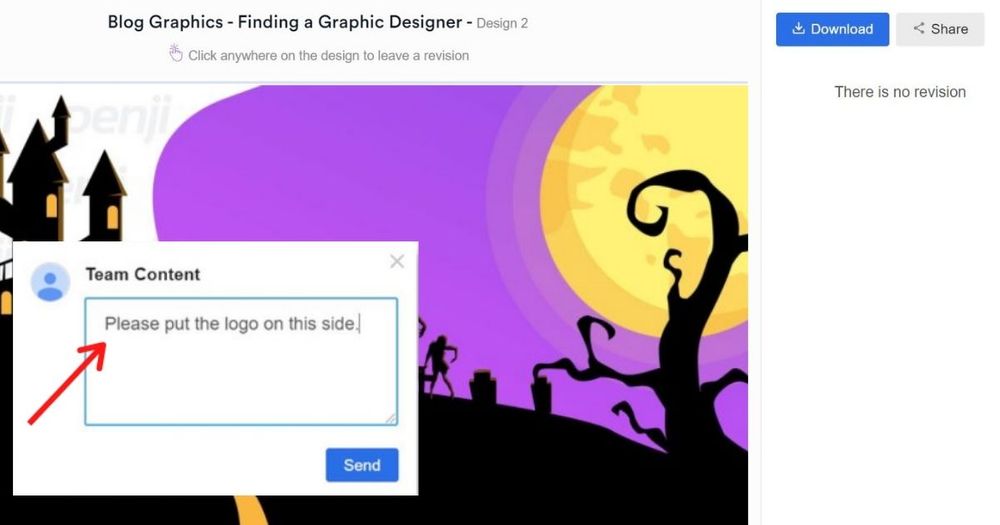
Within 24 to 48 hours, the assigned designer will submit a draft. Click on the file to view the design. If you need anything revised, click on that part and type in your comments. The design will be returned to the designer for revision.
3. Download
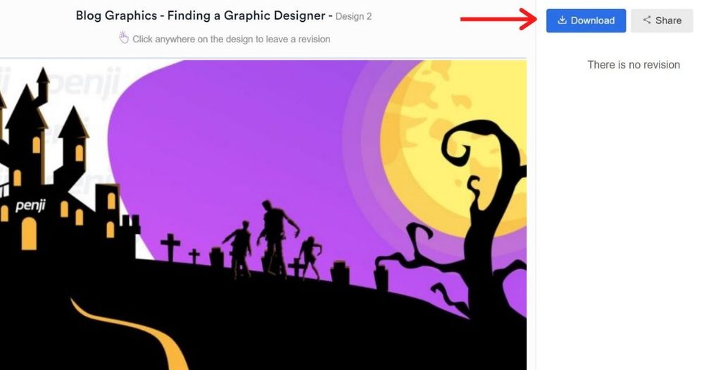
Once you’re happy with the design, click the Download button and it will automatically be saved to your computer.
Easy-peasy! Want to experience how it feels like to have a team of professional designers right by your side as you mount campaigns? Sign up today and get to try any of our packages 100 percent risk-free for 15 days.


