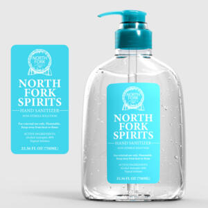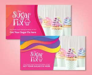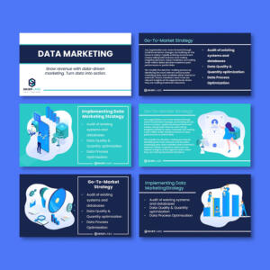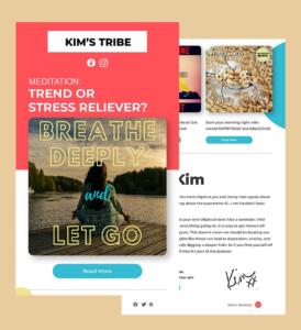
With a global graphic design services market valued at approximately $52 billion in 2024 and a projected growth rate of 3.5% by 2031, the demand for skilled graphic designers continues to soar. Whether you’re an aspiring designer or a seasoned professional looking to refine your skills, understanding the fundamental elements of graphic designing is essential.
In this article, we’ll delve into the essential building blocks of graphic design. We’ll also explore the principles of alignment, hierarchy, and balance, which help combine different elements to create a cohesive design.
Why the Elements of Graphic Design Matter for Everyone
When designers understand the elements of graphic designing, it helps them make better choices. They can create layouts that are easy to read, colors that match the mood, and images that tell a clear story. This makes their work stronger and more professional.
But it’s not just helpful for designers.
It also helps the viewer or customer. When a design is well-made, it’s easier for people to understand the message. They don’t have to think too hard or guess what something means. For example, if a flyer uses the right color and font, you’ll know right away if it’s for a fun event or a serious meeting. Good design saves people time and helps them trust the information they see.
The Essential Elements of Graphic Designing
Here are the detailed definitions of line, shape, color, space, texture, typography, and scale and how these elements contribute to making graphic design effective and memorable.
1. Line
The line is the first and most essential element of graphic designing. In drawing, it refers to a stroke of the pencil or pen, but in graphic design, a line is any two connected points. Lines can be continuous or broken, straight or curved, zigzagged or smooth, and more. They are more than just drawing outlines or separating contents. Lines can convey movement or group together your composition.
2. Shape
The next element of graphic design is shape, which can be organic, geometric, or abstract. Boundaries, including lines and color, define shapes, often used to highlight a portion of the page. Remember, everything is fundamentally a shape. Therefore, always consider how design elements form shapes and how these shapes interact with each other.
3. Color
Color is one of the most striking elements of graphic designing. It can be standalone, used as a background, or applied to other design elements like lines, shapes, typography, or textures. Color also creates a mood within the design and tells a story about the brand. In short, every color tells something unique, and combinations can enhance that impression further.
When deciding on your color scheme, consider using monochromatic shades, complementary colors, or triad colors. Sticking to cool or warm colors is also better than combining the two.
4. Space
Now, you must consider both positive and negative space while creating your project. This technique can be incredibly creative. Positive space can recede as the eye moves down the design, or negative space can draw attention to a background shape.
5. Texture
It might seem odd to think about texture when you can’t physically touch a digital design. However, websites and graphic design services rely on the look and impression of texture on the screen.
Visual texture adds depth, dimension, and interest to a design, even if it is purely digital. Additionally, techniques like gradients, patterns, and shadows can create the illusion of texture, making the design more engaging and attractive.
6. Typography
Words are important, but the style of the phrase is equally essential. When it comes to picking fonts, headers will usually call for a display typeface. These draw the most focus but are distracting and hard to read if used for blocks of text. This means that you should do the opposite for body copy and stick to serif or sans serif fonts since they’re easier to comprehend.
Whichever typeface you choose, make sure there are variations in a range of sizes, weights, and thicknesses. If you want to use small caps, for example, make sure the font offers this variation instead of committing the typography crime of simply reducing the size.
When mixing fonts, some experts warn you to stick to just two or three different styles, while others think you can be bolder with the range of types you use. The secret to mastering typography for graphic designers is choosing fonts with a shared characteristic to ensure your work is evident.
7. Scale
Playing with the scale and size of your objects, shapes, types, and other elements adds interest and emphasis. How boring would a symmetrical website with all similarly sized ingredients be? Very. However, the amount of variation will depend heavily on the content within. Subtle differences suit professional content, while bold ones prefer creative enterprises.
Integrating the Seven Elements
The next step is to understand how the elements of graphic designing relate to one another to create a balanced and coherent composition.
Alignment
It’s always a good idea to start your graphic design on a grid that’s got the margins and gutters already set up. It’s the foundational architecture of your piece and will give you the raw guidelines on which to arrange your work.
As you start to lay down the various design assets, make sure you align them to each other and the grid. Graphic design basics should never be underestimated. They can help your audience absorb the information you present and make it look more cohesive and professional.
Hierarchy
Using a visual hierarchy will give order to your design and help the viewer make sense of the content quickly. Instead of restoring to large fonts, which can come across as shouty, you can create a sense of hierarchy by adding little things to signal a difference.
Some simple ways to establish a visual hierarchy include:
- Scale. The eye is drawn to the biggest thing, so use this to your advantage and ensure that’s where you place the element you want your audience to look at first.
- Color and contrast. Use bright or contrasting colors for crucial information or muted colors for things you want viewers to consider secondary.
- Contrasting styles and shapes. Grab attention using a style or shape that feels very different from the rest of the design.
Balance
A surprising factor that can make or break a design is balance. There are three types of balance:
- Symmetrical, when everything is equally balanced. Humans tend to prefer symmetrical design, so this type of balance feels naturally pleasing.
- Asymmetrical is when the elements are of different sizes and shapes, but the design still feels balanced. It’s less comfortable for the user, which forces them to think twice about what they’re seeing, and you can hold their attention for longer.
- Radial, when the parts are arranged around a central point. This draws the viewer to the center of the image and works particularly well for icons and logos.
Conclusion
By mastering these elements and incorporating our tips, you’ll be well-equipped to create impactful designs. Remember, a cohesive design can elevate your brand and captivate your audience.
Ready to take your designs to the next level? Penji’s team of skilled designers can help. Explore our portfolio for inspiration, and watch our demo video to learn more about our unlimited graphic design services. Contact us today to get started!
About the author

Rowena Zaballa
With a background as a former government employee specializing in urban planning, Rowena transitioned into the world of blogging and SEO content writing. As a passionate storyteller, she uses her expertise to craft engaging and informative content for various audiences.


