![The Ultimate Guide to Interactive Graphic Design [Examples + Tips]](https://penji.co/wp-content/uploads/2025/04/The-Ultimate-Guide-to-Interactive-Graphic-Design-Examples-Tips.png)
With attention spans shrinking and the online content arena becoming more and more competitive by the minute, interactive graphic design is gold.
Not only does it encourage audience engagement, but it also builds brand trust and loyalty. Data from Linearity illustrates why interactive design is the present and future of branding:
- 85% of B2B marketers either plan to use or are using interactive graphics as part of their strategy.
- 93% of marketers say interactive content is more effective in educating buyers than static content.
- Buyers spend around 13 minutes engaging with interactive content, compared to the 8.5 minutes on static content.
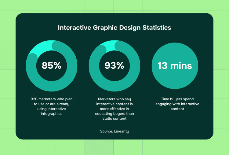
Interactive Graphic Design Statistics (Data source – Linearity)
In this blog, we’ll tackle what interactive graphic design is and look at a few examples. We’ll also discuss tips for creating effective interactive designs. Let’s dive right in!
What is Interactive Graphic Design?
It’s a question often asked by those who are unfamiliar: What do you mean by interactive design?
Interactive graphic design pertains to creating visual elements that respond to user actions. As a result, it enables a two-way interaction between the user and the content.
Unlike static designs, these assets provided by graphic design services involve elements like:
- Animations
- Clickable graphics and custom infographics
- Dynamic layouts that change based on user input
Imagine a static data image that springs to life as a GIF when clicked, revealing deeper insights that guide the user through complex info:
GIF by Penji
It goes without saying that these types of infographics capture attention and enhance the user experience. After all, the interaction factor can add more value to the content. That said, it’s a solid tool to include in any creative strategy.
What are the Characteristics of Interactive Design?

Here are the main factors that make a design interactive:
Responsiveness to User Actions
Firs tof all, this type of graphic design responds to user inputs like clicks, swipes, or hovers. As a result, it transforms the website visit into something that feels alive and intuitive.
For instance, hovering over a section could reveal hidden content, creating a more active experience.
Dynamic and Animated Elements
In addition, because people can interact with them, these graphics can present data more effectively. This is why brands use this type of content — after all, research reveals that it gets 52.6% higher engagement rates than static content.
Repurposing Content with Interactivity
One of the most significant benefits of this type of design is its flexibility. According to data cited by Forbes, 68% of marketers believe that interactive features helps breathe new life into existing content. These content types include blogs and articles, which can be turned into engaging, fresh pieces.
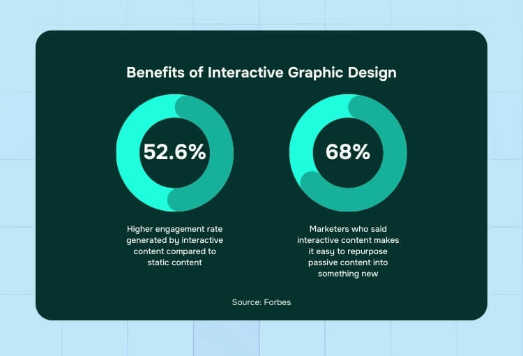
Interactive Graphic Design Examples
Here’s another commonly asked question to those new to the concept: What is an example of interactive design?
Let’s take a look at a few examples that show how interactive graphics make an impact.
1. World’s Biggest Data Breaches & Hacks (Information is Beautiful)
This infographic shows the largest data breaches, allowing users to explore each incident in detail. When a user hovers over each bubble, they can see specific info about the breach.
Screenshot from Information is Beautiful
A section below the main graphic, meanwhile, features data breaches by data sensitivity:
Screenshot from Information is Beautiful
The design uses elements that respond to user inputs. As a result, the data becomes easy to digest. Also, it helps users quickly grasp the scale and impact of each breach.
2. 270toWin – 2024 Presidential Election Interactive Map
This interactive map allowed users to simulate and predict the outcomes of the 2024 U.S. presidential elections. During its run, users could click on states to assign electoral votes to the candidate they support. After that, they could instantly see how changes affect the count.

Graphic embedded from 270toWin
The map is color-coded and updated in real-time before the elections. As a result, it offered an engaging way to explore various electoral scenarios.
3. Hungry Tech Giants: 15 Years of Acquisitions (Simply Business)
This web page shows the acquisition strategies of major tech brands over a 15-year span. As seen in the image below, users can explore data points per company and sector.
Screenshot from Simply Business
The design features elements that respond to user clicks to reveal detailed data tables. Added to that, it also has filter options to compare categories.
4. A Visual Introduction to Machine Learning (R2D3)
This graphic by R2D3 offers an engaging introduction to machine learning concepts.
Screenshot from R2D3
As users scroll through the page, moving elements show how decision trees function. That said, the design allows users to explore concepts and immerses users in the learning process.
Screenshot from R2D3
5. Gay Rights in the US, State by State (The Guardian)
This example provides an overview of gay rights across the US. For one, it details the legal status of various issues. These data include marriage, adoption, and discrimination on a state-by-state basis.
Screenshot from The Guardian
6. Diversity in Tech (Information is Beautiful)
Another example shows the diversity stats of major tech brands. For instance, users can explore data points that reveal the breakdown of workers by gender and ethnicity.
Screenshot from Information is Beautiful
As seen in the image, the design features charts that respond to user actions.
Tips for Creating Effective Interactive Graphic Designs

Here are a few tips to keep in mind when creating interactive graphic designs:
1. Prioritize User Experience (UX)
Always put the user first when you create your own infographics. To do so, ensure that your interactive elements enhance the overall experience and aren’t merely flashy visuals.
Simple user interactions—like hovering or clicking— can trigger helpful responses. That’s the heart of UX. Design shouldn’t just be pretty; it should anticipate the user’s needs. Make sure every interactive element serves a purpose and enhances navigation.
- Pro Tip: If it doesn’t make the experience smoother or more intuitive, reconsider the interaction.
2. Use Moving Visuals with a Purpose
Alongside UX, make sure that all moving visuals guide users through a journey. That said, don’t overload your design with too many moving parts, which can overwhelm users.
Remember: movement can highlight key areas, create emotional engagement, or show progress—just don’t go overboard. Subtlety often works best in interactive design.
- Pro Tip: Many graphic design services can help animate content strategically without overwhelming the user.
3. Keep It Mobile-Friendly
Recent data says half of internet users use mobile devices as opposed to desktop. With that number in mind, ensure that your designs work seamlessly across various screen sizes.
- Pro Tip: For interactive marketing assets like interactive digital brochures, make sure that tap targets are large enough, animations are smooth, and content is readable—even on a small screen.
4. Outsource to Experts
Don’t have the time or resources to create stunning interactive graphics? Subscribe to Penji’s unlimited graphic design service to bring your vision to life without the hassle.

The Bottom Line
Without a doubt, interactive graphic design is changing how brands engage with their audience. Businesses create immersive experiences that captivate and inform by using elements like animations, clickable graphics, and dynamic layouts.
But here’s the thing: too many moving parts and dynamic sections can overwhelm the viewer. Balancing the visual’s interactive parts and user experience is what professional graphic design services like Penji do best.
Visit our portfolio and discover why Penji is the preferred graphic design services provider by brands – from small businesses to mega corporations – across the globe.
View a quick demo today and get access to the world’s top 2% of designers who can help you boost engagement.
About the author

Carla Deña
Carla is a journalist and content writer who produces stories for both digital and legacy media. She is passionate about creativity, innovation, and helping small businesses explore solutions that drive growth and social impact.
Table of Contents
- What is Interactive Graphic Design?
- What are the Characteristics of Interactive Design?
- Responsiveness to User Actions
- Dynamic and Animated Elements
- Repurposing Content with Interactivity
- Interactive Graphic Design Examples
- 1. World’s Biggest Data Breaches & Hacks (Information is Beautiful)
- 2. 270toWin – 2024 Presidential Election Interactive Map
- 3. Hungry Tech Giants: 15 Years of Acquisitions (Simply Business)
- 4. A Visual Introduction to Machine Learning (R2D3)
- 5. Gay Rights in the US, State by State (The Guardian)
- 6. Diversity in Tech (Information is Beautiful)
- Tips for Creating Effective Interactive Graphic Designs
- The Bottom Line

