
Social media is an excellent tool for enhancing brand awareness and decision making. Many leads may discover brands via social media, and it’s a must that you nurture them on multiple platforms. That said, you want your leads to go to your website for sales. One way to do that is by creating a social media landing page to direct your followers to your website. But how do you make this landing page? Check out our tips below.
1. Add a CTA Above the Fold
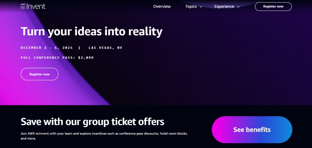
Many companies and brands publish ads to promote a new product, service, or event. One best practice of landing page designs is the call-to-action button or element. You want to make sure that your lead engages with the page and takes action as soon as they land. Here’s one example to consider.
AWS re:Invent advertised its 2024 conference on Facebook. Immediately, your eyes will turn to the big gradient button. It’s a great way to entice interested leads to understand how this event can benefit them in the long run. However, they can register and participate in the conference if they already know what this event entails.
2. Keep it Simple
Although landing pages are advertising tools, you don’t want to hard sell or overwhelm the visitor by adding way too many promotional elements into the design. You need to keep the landing page simple. Here are some ways to do that:
- Limit CTA buttons to two or three
- Stay consistent with your branding colors, fonts, and voice
- Stick to text and video or text and photo elements
- Add a form box above the fold
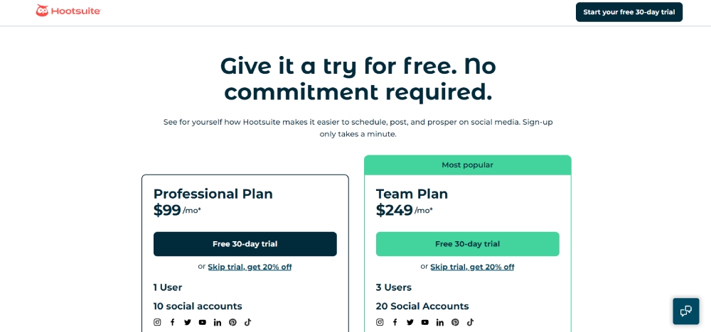
Here’s one example of a simple social media landing page by Hootsuite. This is the ideal landing page for leads in the consideration to decision stage of the marketing funnel. It will attract users interested in signing up for the social media management platform. It’s also unique because the landing page has the pricing for the platform, saving some users a scroll.
3. Create Interactive Experiences
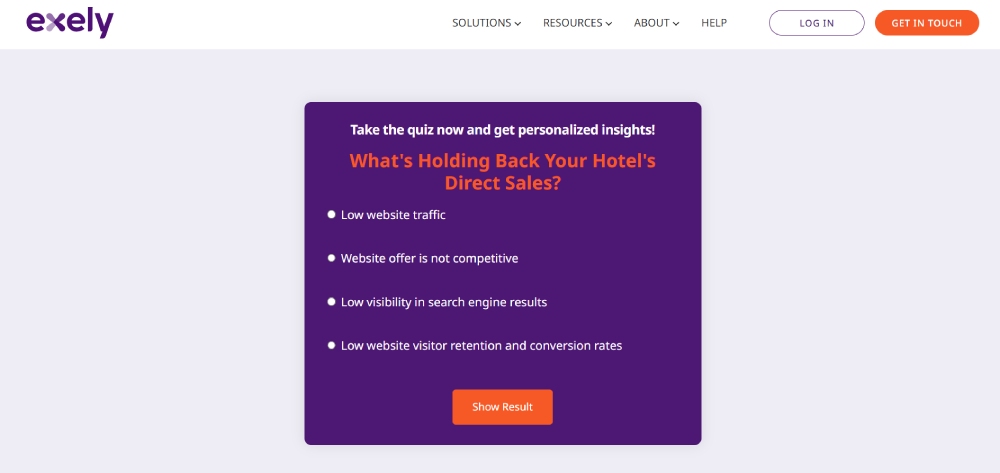
Some landing pages add forms above the fold. Other landing pages follow standard website design structures to attract and keep visitors on the site. Instead of the usual call-to-action elements like browse website or subscribe, make it interactive like letting users download an app or creating a quiz. Here’s a quiz type landing page created by Exely. Interested leads can answer the quiz. Once leads answer it, Exely provides recommendations on how to improve its sales by linking it to internal pages or another landing page to download resources.
4. Customize with a Link in Bio Tool
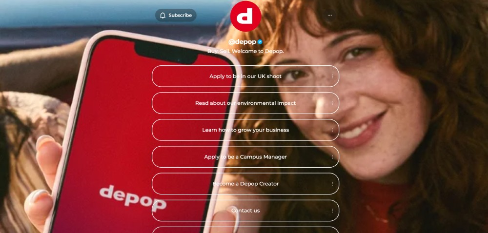
You don’t need to create an actual webpage as a landing page. Many businesses use a link in bio tool, which acts as the “landing page” where you can click various links that could lead you to their website. Some links would link to YouTube or other related links.
Some examples of these link in bio tools are:
- Carrd
- Linktree
- Omnilink
These tools let you customize your Carrd, Linktree, or Omnilink profiles, making branding consistent outside your website or social media profiles.
Check out this example from Depop. The brand personalized its Linktree profile and ensured that it was a verified profile. It has seven links, with some leading to the website and others as how-tos. This further legitimizes the brand, and its followers can trust Depop outside their website or social media accounts. Additionally, it included social media profiles, so that users can visit and follow its profiles.
5. Generate Leads Through Forms
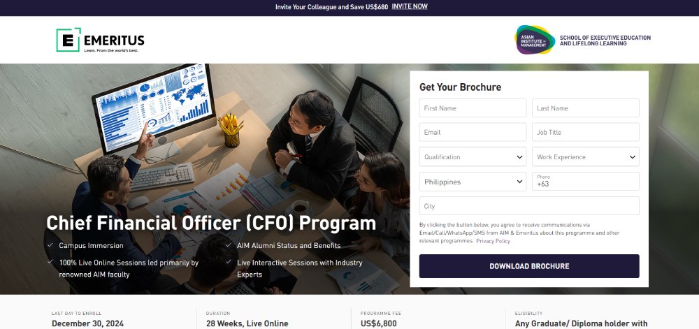
One of the objectives for creating a landing page is to generate leads. You don’t need to stick to the usual landing page structure, which should lead the potential customer to browse your website longer than they should. Immediately add a form that will let them download a freebie or sign up for an event.
Make sure that the form is at the top of the landing page. It would be great if it fits above the fold so you can allot space for other information below. However, if that’s not possible, that should also be fine.
Here’s how you can fit a form above the fold like this from AIM Emeritus. Your form could be as simple as this and still get the most of your customer’s data. Additionally, AIM provides some information about the program when you download the brochure. Plus, it also urges potential candidates to invite others to get a discount.
6. Feature a Hero Image or Video
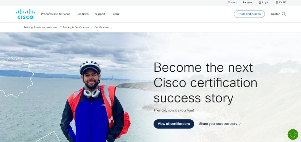
A landing page will be lacking if you don’t have a hero image or video to entice visitors to browse around your website. It’s advisable to use your promoted product as the hero image. For example, if you are a sunglasses brand, you need to feature your newest or best-selling pair of sunglasses. An alternative could be a video, which could also be engaging since you want people to see your product in motion.
On the other hand, services and events can be tricky. For services or events, videos can suffice. Alternatively, illustrations or stock images can be placeholder hero media. Here’s an example of a simple landing page from Cisco. Its landing page featured one of its former students who successfully earned a Cisco certification. It’s an excellent way of persuading potential students to sign up and get certified.
Final Thoughts
Social media is, if not the best, one of the best places to convert leads into customers. It’s no longer a place to browse and explore more about brands. It’s also an effective marketing tool to increase sales and retain a customer base. Your strategy should include adding a landing page to your social media profiles so that you get more visits and clicks to your site. Plus, you might get an uptick in sales.
And if you need a customized social media landing page, Penji is here to help you! Our web designers will create an engaging landing page that will convert leads into customers. You can request many landing page designs as you need. Plus, you can request other visuals for your website or social media pages. Penji is here for your design needs. And if you want to give Penji a shot, watch a demo here!
About the author

Katrina Pascual
Katrina is a content writer specializing in graphic design, marketing, social media, and technology. In her spare time, she writes monthly personal blogs to practice her craft.


