

TL;DR: Poor design quality, no clear goals, bad layout, slow load times, cluttered design, and many others make up this list of the most common mistakes you need to avoid when creating banner ads.
Website banners are some of the most effective ways to introduce your brand and get your message across to your target market. However, many businesses fail to create ones that grab their audience’s attention, engage them, and drive optimum results. This is why many entrepreneurs work with reliable banner design services. These companies will do the work for you, but it helps to know the following common mistakes you need to avoid:
1. Lacking Clear Goals

As with any endeavor you do for your brand, defining and setting clear goals is crucial. Think of it as driving without a destination—you’re going somewhere, but it’s highly likely that you’ll arrive at the right place. Goals give you a clear focus for your banner ad creation. When you know what you want to achieve, you can be sure that every element of your ad is aligned with your objectives.
In addition, setting clear goals helps measure the effectiveness of your campaign. It allows your designated ad design service to tailor your banner ads to resonate with your target audience, allocate your resources more efficiently, and save time, money, and effort.
Solve Your Design Dilemma for Good
Try Penji risk-free for 30 days & get all the banner ad designs you need


2. Poor Design Quality

A poorly designed banner ad can decrease user engagement, damage brand perception, and fail to communicate your message. A visually unappealing ad that is difficult to read or slow to load can make viewers ignore or dismiss your ad altogether, resulting in fewer clicks or, worse, no clicks at all.
In contrast, a well-designed banner ad grabs attention, conveys your message clearly, and enhances your brand image. If you’re DIYing your web banner designs, it may be time to turn to professional banner design services to do them for you. Watch our demo video to learn how you can work with our talented designers and leave the banner ad creation to them.
3. Too Much Text

Overloading your banner ad with text is a common mistake that can significantly diminish its effectiveness. When you add too much text to a limited space, chances are you’re cluttering the layout. This makes it difficult to read, which can overwhelm your viewers.
Excessive text can also make users struggle to decipher your message. To avoid falling into this mistake, use clear and concise language. You can also incorporate high-quality images or graphics to break up the text and add visual appeal.
4. Poor Placement

When you place your banner ad in inappropriate locations or at the wrong time, it is less likely to be seen, clicked on, or remembered by viewers. This can result in fewer impressions, lower click-through rates, and wasted ad spend. Also, placing your banner ad in a context irrelevant to the user’s intent may be seen as intrusive or annoying.
To determine where to place your banner ads, you must understand your audience’s demographics, interests, and online behaviors. This will allow you to identify the most relevant locations for your ads, the best websites or pages, and when your audience will most likely see them.
5. Ignoring Load Times

Another mistake you should avoid when creating banner ads is slow load times. This can significantly impact user experience, especially when attention spans are getting shorter and shorter each day. Slow load times can reduce user engagement as impatient users may move on to other content or websites, resulting in missed opportunities to reach and engage with them.
In these cases, your design-as-a-service can compress images to reduce the file size without sacrificing quality. They can also minimize the code in your banner ads to keep them simple and efficient. You can also use caching to store frequently accessed elements of your banner ads.
6. Using Too Many Colors

While colors can be powerful tools to attract attention, in some instances, using less is more. This is something any reliable graphic design service can tell you when designing banner ads. Too many colors can distract users and make it difficult to focus on your message. They can also give your banner ad a cheap or unprofessional appearance, damaging your reputation and reducing trust.
Choose a limited palette of two or three colors to use in your banner ad creation efforts. You can also use color contrast to make your message readable. Also, consider color psychology to understand the different impacts of colors. This allows you to use them strategically without overwhelming your viewers.
7. Weak Call to Action

One of the most important elements of a banner ad is the call to action. This is what will lead your viewers to your desired action, such as clicking a link, downloading a file, or making a purchase. A weak CTA has vague messaging, confuses viewers, lacks urgency, or has ineffective copy.
To create effective CTAs, be clear and concise by using words such as “now,” “limited time,” or “exclusive.” Use strong verbs like “buy,” “download,” or “sign up.” Additionally, place your CTA prominently in the ad.
8. Information Overload

Too much information on a banner ad not only clutters the design but also overwhelms the users. It reduces readability and, most of the time, hides the call to action. These can all contribute to the ad’s reduced chances of being seen, much less clicked on.
You can avoid this by keeping the layout simple, focusing on your key message, and excluding unnecessary information. Highlight the most essential details and tone down the less critical information.
9. Neglecting the Relevance of Fonts

Using the appropriate font can improve the readability and efficiency of your banner ads. It can also convey your desired message more effectively while creating a visually appealing design. Overly ornate fonts can make it challenging for readers. Remember, you only have a few seconds to get your message across.
Choose your fonts wisely; otherwise, you can miss out on opportunities for clicks and leads. When choosing fonts, opt for those that are easy to read and match the aesthetic and personality of your brand. Limit the number of fonts to use to avoid cluttering the space. If you’re still unsure, it’s best to consult your design-as-a-service.
10. Ignoring Mobile-Friendliness

According to statistics, by 2029, 75% of total ad spending on digital banner advertising will come from mobile. This is why ignoring mobile-friendliness is a critical mistake you need to avoid. It can frustrate users and cause them to leave a website or page without seeing your banner ad.
To avoid this mistake, ensure your banner ads are designed to adapt to different screen sizes and orientations. Optimizing your images can also help improve load times on mobile devices. You can also keep your text to a minimum and use clear fonts that are easy to read on small devices.
Creative, Viral, and Failed Banner Ad Examples
To give you an idea of what an effective banner ad looks like, we’ll show you a few of the good and the bad:
The Good:
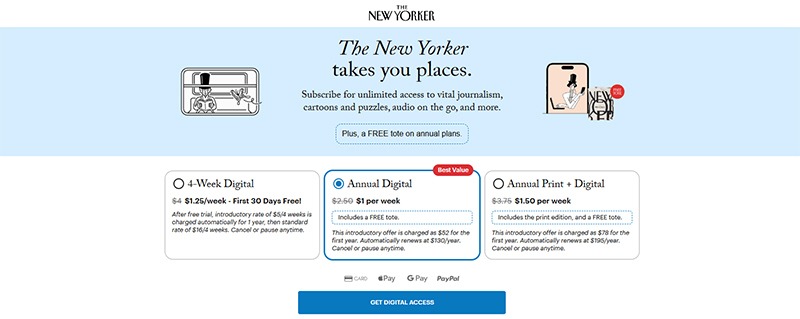
One of the best banner ads around is this one from The New Yorker. It includes an excellent combination of simplicity, a clear $1-per-week subscription offer, a free tote, and a plan you can cancel anytime. It has a minimalist design and layout that’s easy on the eyes. Its overall design gets the message across without overwhelming the reader:
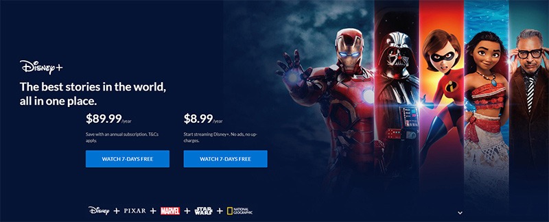
Another excellent example of an effective banner ad is this one from Disney. Its instant visual recognition and stacked value proposition capture attention in seconds. It features some of its most popular characters with plenty of negative space that highlights the message. If you want an example of a great hierarchical layout, this is it.
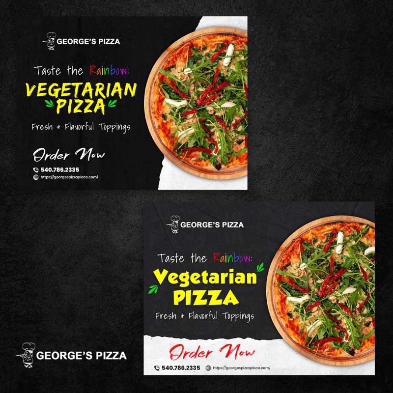
Now, for the not-so-good. As opposed to Disney’s banner ad above, this example is one that lacks a clear hierarchy. It is visually cluttered, with bright colors, multiple item images, and text blocks all fighting for the viewer’s attention.

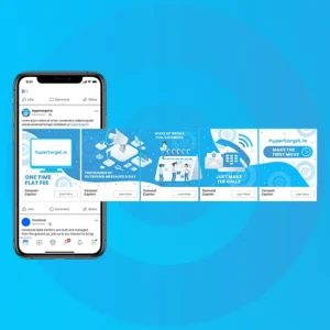
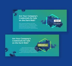
And, to help you avoid these mistakes, there’s Penji. Here are a few examples of what our team can do for you:

Final Thoughts
Banner ad creation is a serious task that you shouldn’t take lightly. It requires careful planning to ensure its effectiveness. If you find all these mistakes too mind-boggling, you can always count on professional banner design services to do them for you.
Work with Penji and leave the banner ad creation to our talented graphic designers. Click here to send your first request for a banner ad.
FAQs
While there is no specific time for this, it’s best if you aim for under 2 seconds.
A design-as-a-service business model offers unlimited design requests and revisions for flat-rate subscription fees. It is similar to many unlimited graphic design services, banner design services, or on-demand graphic design services.
Design-as-a-service offers predictable pricing, eliminates hiring issues, offers fast delivery times, and high-quality work, among many other benefits.
About the author

Celeste Zosimo
Celeste is a former traditional animator and now an SEO content writer specializing in graphic design and marketing topics. When she's not writing or ranking her articles, she's being bossed around by her cat and two dogs.
Table of Contents
- 1. Lacking Clear Goals
- 2. Poor Design Quality
- 3. Too Much Text
- 4. Poor Placement
- 5. Ignoring Load Times
- 6. Using Too Many Colors
- 7. Weak Call to Action
- 8. Information Overload
- 9. Neglecting the Relevance of Fonts
- 10. Ignoring Mobile-Friendliness
- Creative, Viral, and Failed Banner Ad Examples
- The Good:
- Final Thoughts
- FAQs


