
Whether you enjoy shopping for clothes or not, you’ve definitely come across a fashion advertisement that inspired you to make a purchase.
Each of us has unique aesthetic preferences and attractive qualities. One can be tempted by extravagant fabrics and daring patterns. Another person might favor simple styles with a large sale label next to them.
To draw in customers, fashion companies use a variety of tactics. The usage of billboards is one of these strategies. A billboard to a fashion company is like a blank canvas on which they may paint any kind of message. Let’s examine 15 brands that truly gave us a show.
15. H&M
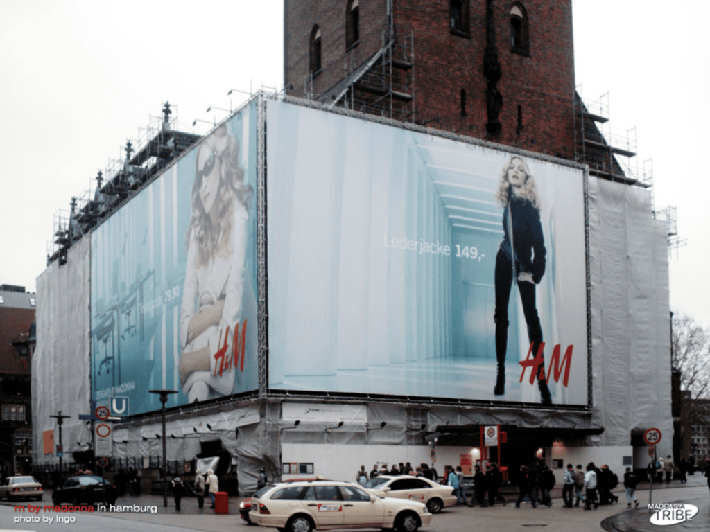
On the surface, this billboard appears simple: a blond woman posing in an empty space. This is typical of a fashion advertisement. The key difference is that this woman is none other than Madonna, the legendary pop star.
A well-known public figure is an excellent way to gain quick recognition for your fashion company. Without a doubt, it will attract fans of said person. It will also boost people’s trust in your company. Consider this: if a household name like Madonna is wearing a particular collection, it must be something worthwhile.
Humans are natural followers. They are more likely to wear something if they see someone they know wearing it.
[in_content_ads gallery=”logos” logo=”on” title=”Need graphic design help?” subtitle=”Try Penji’s Unlimited Graphic Design and get all your branding, digital, print, and UXUI designs done in one place.” btntext=”Learn More” btnlink=”https://penji.co”]
14. Banana Republic
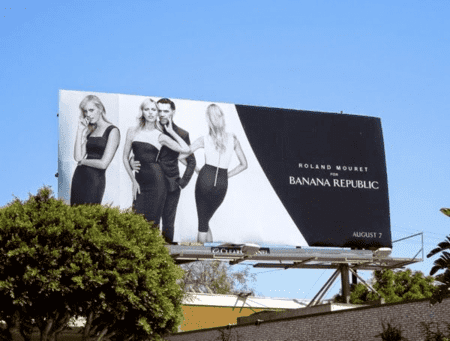
Banana Republic is known for its business attire and neutral colors. It stands to reason that their billboards would look like this. To achieve a sleek, clean, and sophisticated look, keep in mind that less is more. The fonts and colors should be simple, drawing attention to the clothing itself. Banana Republic is all about quality, and we see that here. To establish itself as a credible brand, the fashion company does not require flashy, in-your-face tactics.
13. Topshop
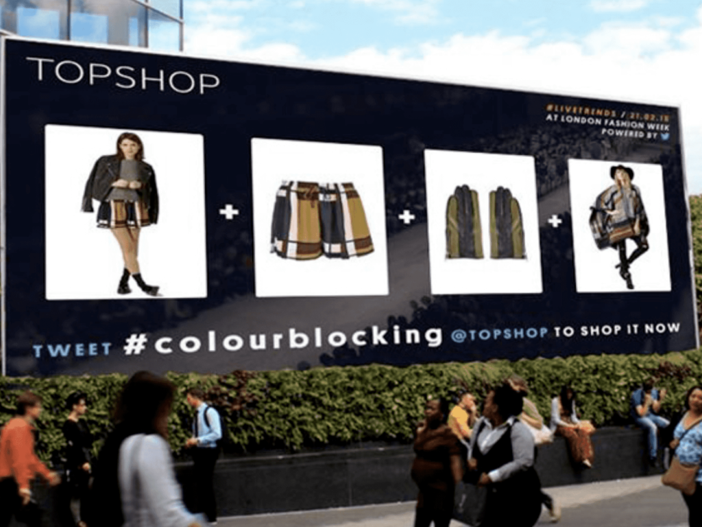
Topshop uses incredibly inventive methods to market itself. They are cheeky and relevant while showcasing several ensembles by using mathematical graphics. Additionally, it includes the simple call to action at the bottom. You can view their special offers by tweeting to their social media account.
12. Tommy Hilfiger
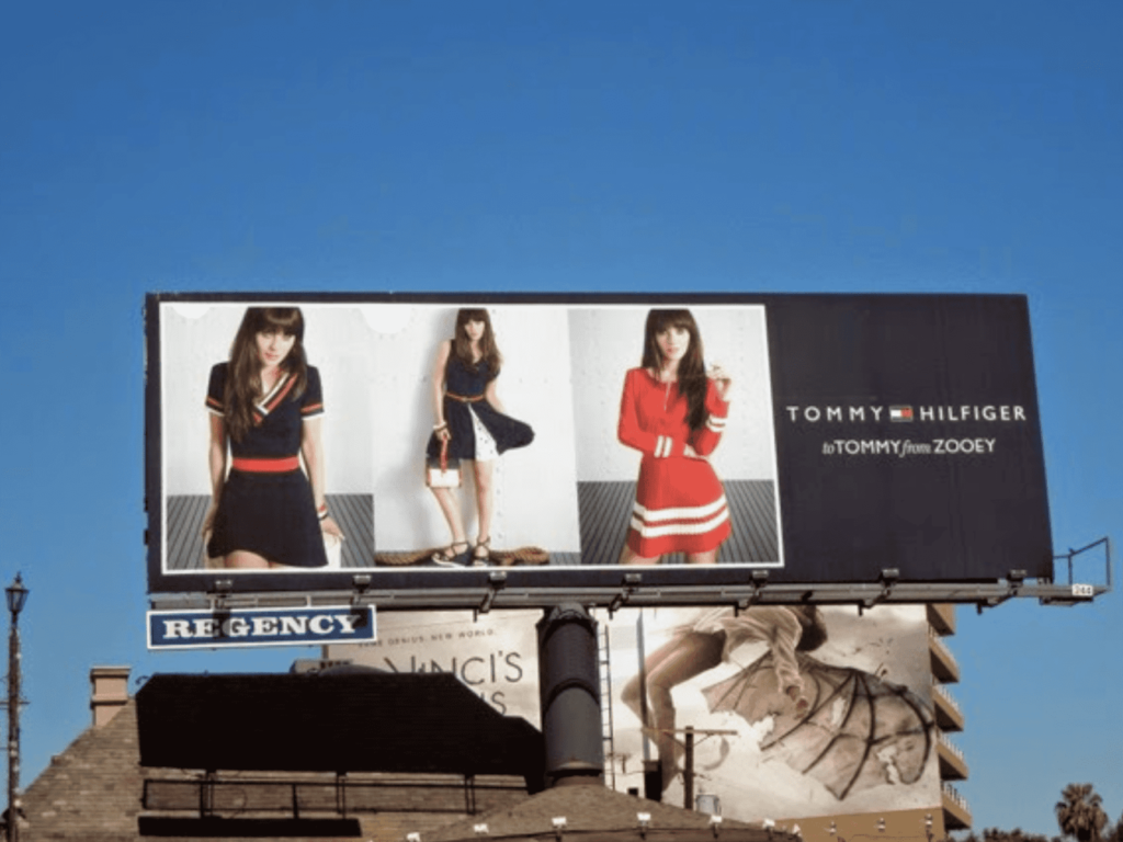
Tommy Hilfiger’s billboard also features several outfits. This advertising mixes the three outfits in a simple collage, without the use of plus signs. It’s the same concept with a different execution.
I want you to see how these three ensembles are all harmonious in some way. This frequently appears in advertisements from fashion companies. The advertisements must look unified even while promoting different garments. In terms of color and style, they must complement one another.
11. Micheal Kors
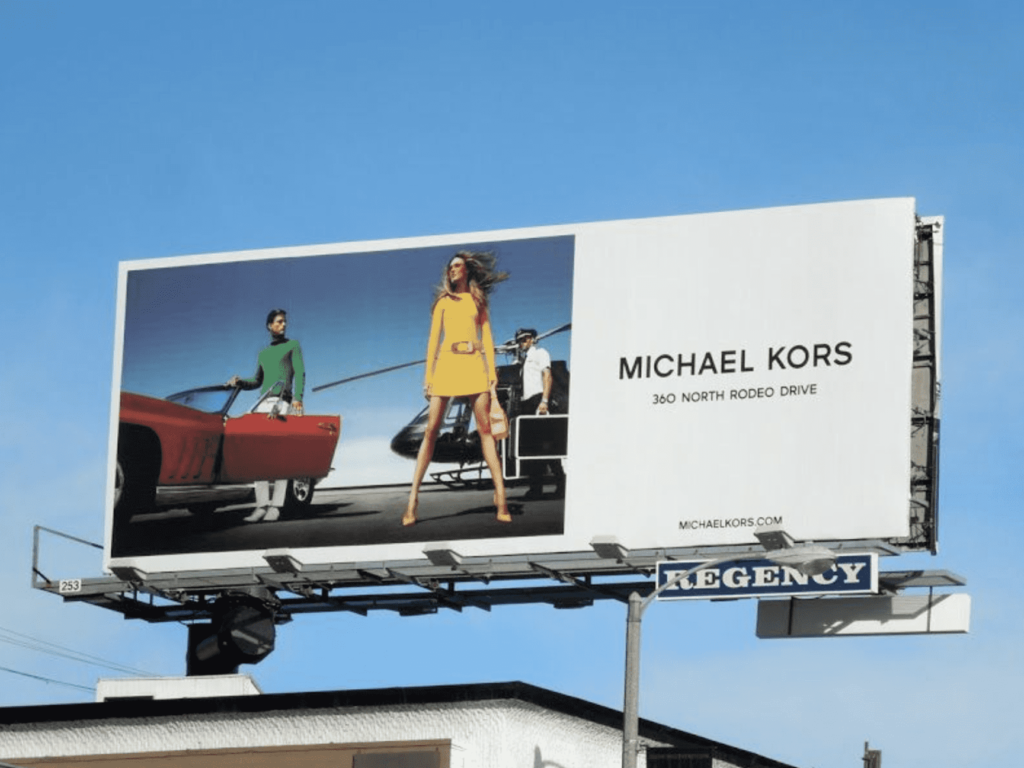
Michael Kors creates something both professional and dramatic. The brand appears to be portraying a scene while displaying its clothing. A scene from a larger narrative. There is a distinct setting, as well as numerous people and props. Although the models are obviously posing for a photograph, you get the impression that they could be doing something else.
10. Net-A-Porter
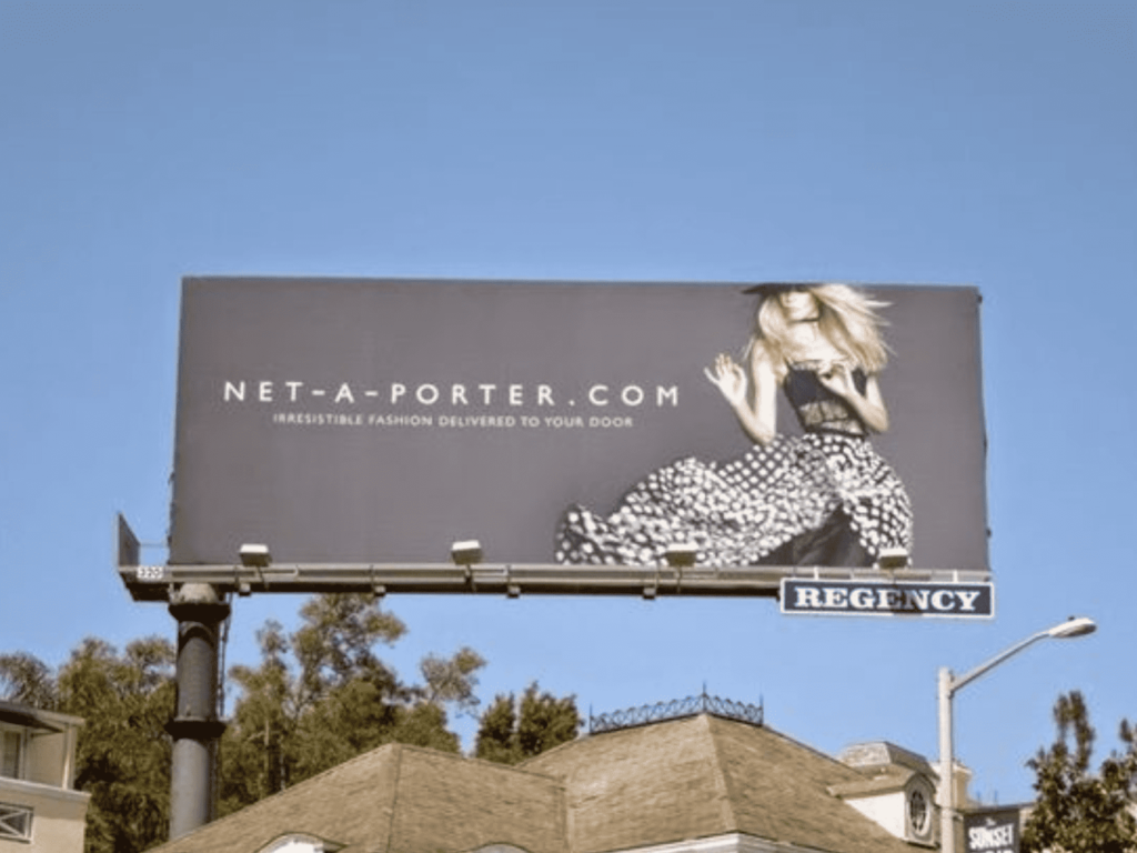
This Net-A-Porter billboard has a lot of movement, despite its simplicity. If you’ve ever wondered why fashion photographers go to such lengths to get the perfect shot, this is the reason. If this model was in a different pose, the billboard would be too generic. The clothing, however, is very appealing due to the way the skirt flows.
The right model, photographer, and outfit are essential for successful fashion branding.
9. Fashion Square Uniquely You
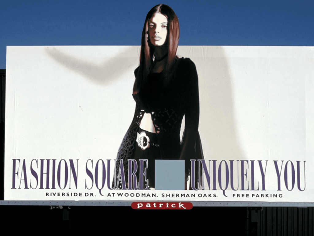
This advertisement is for a specific mall in Sherman Oaks. When looking at it, I think of sophistication, energy, and professionalism. The advertisement grabs your attention by featuring a sizable cutout that alters the bulletin’s overall shape. The model’s outfit is only made more prominent by the stark white background. It’s as if she’s the only thing that matters.
8. Calvin Klein
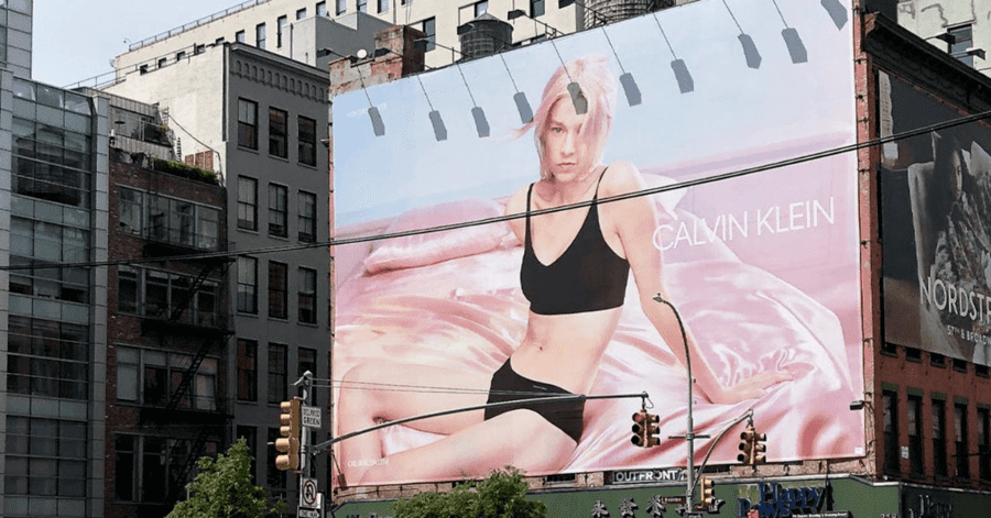
The model is also at the center of this Calvin Klein advertisement. Though the background is more vibrant this time. She appears to be relaxing on a pink satin throw. The model wears all-black underwear to make a statement among the pastels. She’s directing your attention in a very specific direction.
This clothing line is proof that you can have eye-catching marketing without losing sight of what’s essential. To determine which colors complement your personal style, it’s a good idea to explore.
7. GAP
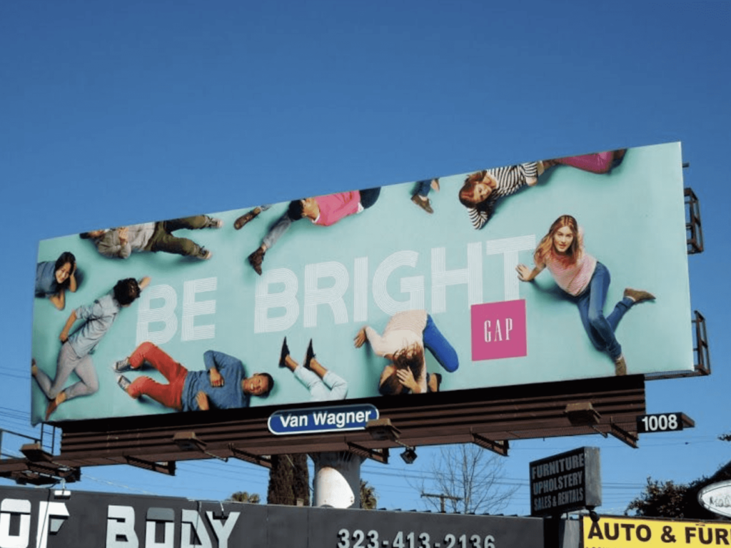
In contrast to everything we’ve seen thus far, GAP takes a completely different approach. Instead of highlighting a single model, the billboard depicts a group of people gathered around the phrase “Be Bright.”
GAP does not position itself as an elite brand. Instead, their target market is the typical middle-class person. To appeal to them, GAP needs people from a variety of backgrounds, ages, and body shapes.
So if you’re trying to appeal to the everyday person, consider what this fashion company is doing. Make your content relatable and approachable. Spread a positive message. Most of all, your advertisements must be diverse.
6. Nasty Gal
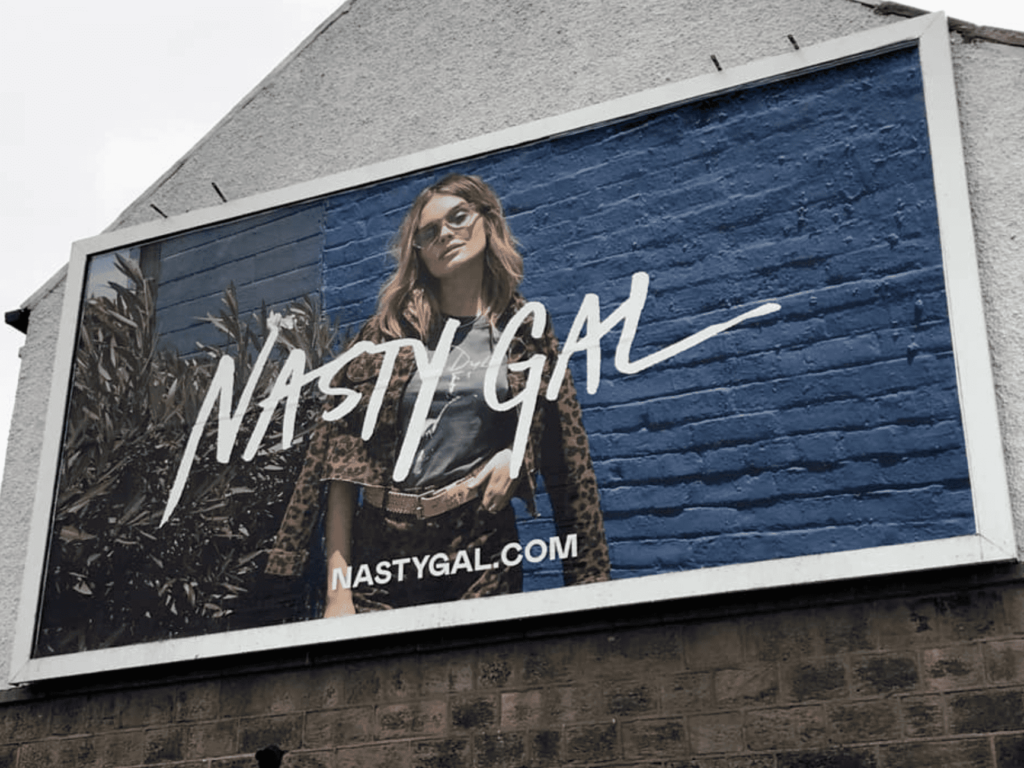
Nastygal is a fashion company that specializes in clothing for young women. This advertisement most emphatically demonstrates that. When marketing to a young female demographic, you want your clothing to appear fun, creative, rebellious, and lively.
This fashion billboard features a woman dressed in leopard print and wearing unusually shaped sunglasses. Her posture suggests that she is very confident in what she is wearing.
When designing a billboard, putting your target audience first works wonders. The demographic can sometimes determine the entire premise of an advertisement.
5. Logo
Here’s a billboard that plays with color very well. The use of orange urges the viewer to act fast. When combined with the statement of a fashion sale what’s a limited-time offer, there’s no way a young person wouldn’t take advantage of it. I find it impressive that this billboard was able to combine so many things with the color orange, while still having it look professional.
4. Barneys New York
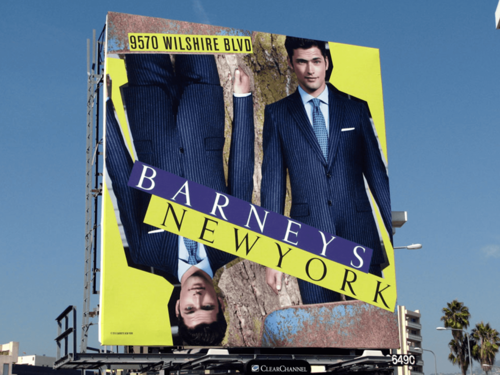
Another outrageous color choice is shown here. Although using a burst of color on a billboard is entertaining, there needs to be a strategy behind it. This Barneys New York billboard uses the colors yellow and purple. These two hues may seem random, yet they are the opposites of each other on the color wheel. Furthermore, they each have cold undertones of their respective hues, which enhances how well they combine.
This fashion company presents its collections in a highly stylized manner. Although it appears hazardous, it is very well thought out.
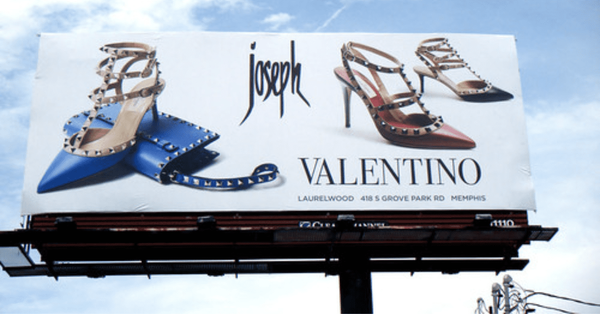
3. Valentino
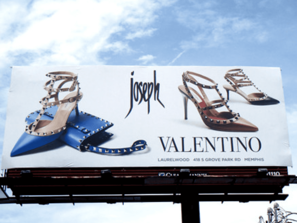
Sometimes just showing the product itself, with no model, is ideal. Valentino advertises their accessories by showing off their details along with the stylized text. The result is an advertisement with beautiful imagery that can be noticed from a distance.
2. Chaz Sun Fashion
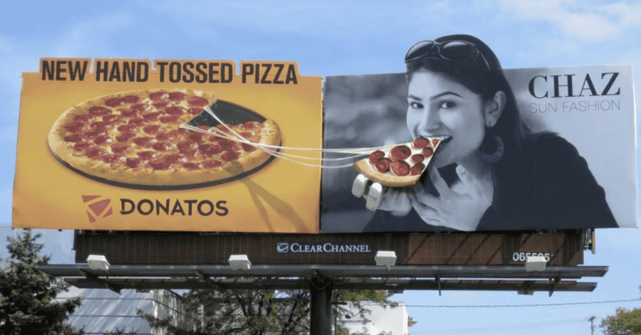
Yes, even fashion companies create humorous advertisements. Chad Sun fashion decided to collaborate with Donatos to release this mouth-watering billboard. It’s an honestly great departure from the typical high fashion ads. It shows a sense of relatability; after all, I’m sure even high-income shoppers enjoy a good pizza.
1. Ted Baker
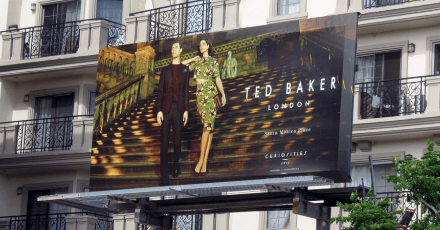
For number one, we have none other than Ted Baker. Much like Michael Kors, this fashion company portrays a scene. A scene of luxury and importance. Unlike Micheal Kors, the best scene takes up the entire day of the billboard, making it so that the viewer truly feels in the moment. Who doesn’t want to feel as if they’re descending from the steps of a chapel? If the simple act of viewing a billboard makes us feel rich, then we’re more likely to buy the clothes.


