Typography is the art and technique of arranging type to make written language. It can be an afterthought for many, but typography plays a major role in the way written word is received. Marketers, advertisers, graphic designers– artists of nearly every medium– utilize typography as a means of conveying both information and identity.
Properly wielding the tools type design will benefit you when developing a brand. This guide will encapsulate the basics of typography, including foundational information like classifications, best practices, branding advice, as well as what not to do when working with type.
Typeface or font: What’s the difference?

We’ll be using both of these words a ton throughout this article. And while they may seem synonymous, they aren’t. This typically doesn’t stop laypeople from interchanging the two, but an understanding of the difference is key to properly digesting this information.
Typeface
A typeface refers to a family of set features for letters and other characters. Typeface governs general attributes like the presence (or lack of) serif.
Font
A font is a specific set of features within the family of a typeface. Such as weight, oblique, italic, and size.
For example:
- GT Haptik is a typeface.
- GT Haptik Light Oblique 24 pt is a font.
- Light refers to the weight. Oblique refers to the angle, with 24 pt being the size.
Typefaces Classifications
The earliest typefaces were called Blackletter, used by Johannes Gutenburg on the first printing press in 1440. It quickly became the standard. Though later in the century, Nicolas Jenson recognized that simpler, more stream-lined letterforms would result in the ability to fit more text on a single page.
This would result in shorter books with faster setup times. He created the first Roman typeface, based on Blackletter and Italian Humanist lettering.
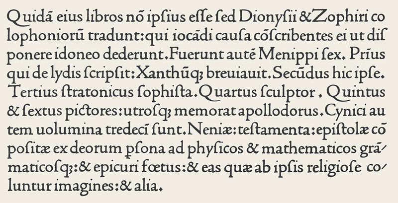
These changes were among the first made to the typefaces and set in motion a still-active art in doing so.
This section will cover 4 major typeface classifications.
- Serif
- Sans Serif
- Script
- Monospace
[in_content_ads gallery=”logos” logo=”on” title=”Need graphic design help?” subtitle=”Try Penji’s Unlimited Graphic Design and get all your branding, digital, print, and UXUI designs done in one place.” btntext=”Learn More” btnlink=”https://penji.co”]
Serif
Early typefaces still carry the influence of pre-movable typewriting tools. For instance, serif fonts are influenced by the chiseling of stone, which is how these early characters would have been originally produced. This practice creates little “feet” at the ends of the characters.
Old Style Serifs (15th to 18th Century)
Old Style serifs were developed by Renaissance typographers in the 15th century. They replaced Blackletter typefaces, which were devised in a hand-written, calligraphic style, and many of their letterforms still maintain their influence from pen-drawn strokes.
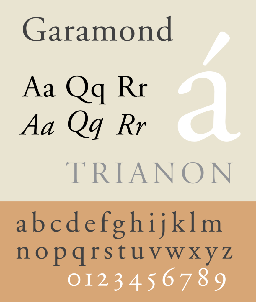
The serifs in this style tend to be slightly rounded, inclined, and cupped. The characters have diagonal stress as opposed to the vertical stress of later iterations. This suggests an influence from calligraphy. The characters are typically low contrast, meaning most strokes are about the same width.
Examples: Garamond. Goudy Bookletter 1911. Palatino.
Transitional Serifs (18th Century)
As the 18th century progressed, printing practices became more refined. The typefaces created during this period are known as transitional serifs.
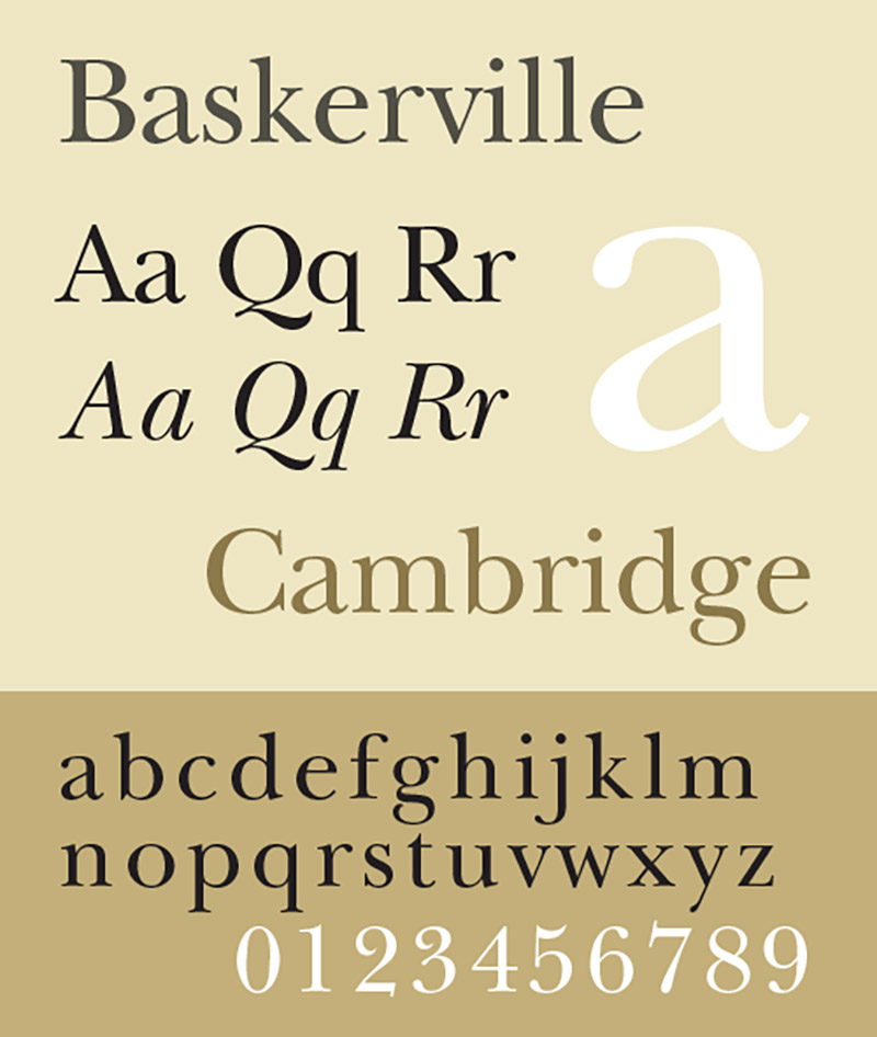
Some defining characteristics of this style are the sharper serifs and more vertically stressed characters. Additionally, this style tends to deploy higher contrast between thick and thin strokes.
Examples: Baskerville. Times New Roman.
Modern serif (Late 18th Century)
Fonts became even more refined and detailed as the 18th century progressed, due to further advances in the printing process.
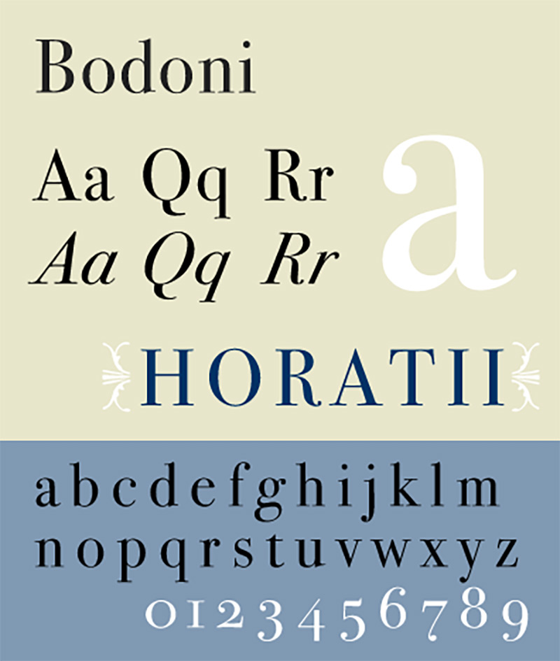
Characteristics include serifs that are completely straight and flat and possess completely vertical stress. The contrast is also extremely high between thick and thin strokes.
Examples: LTC Bodoni 175.
Sans Serif
Sans comes from the French root meaning “without”. So, sans serif quite literally means “without serifs”. These typefaces were first used in the fifth century BC, but the first printable type in this style was created by William Caslon in the 18th century.
They were considered an informal style at first, but their clean, minimal, and modern look has turned sans serif fonts into incredibly versatile tools.
Grotesque (20th century)
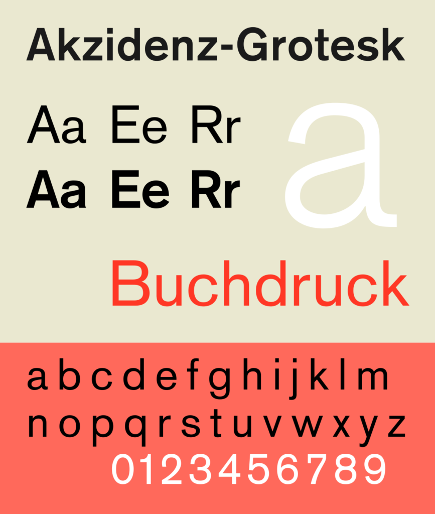
The grotesque style was commercially popular in the early 20th century. Some common traits include medium contrast between thick and thin strokes and open aperture gaps in characters like the lowercase a and e.
Example: Akzidenz-Grotesk.
Neo Grotesque (20th century)
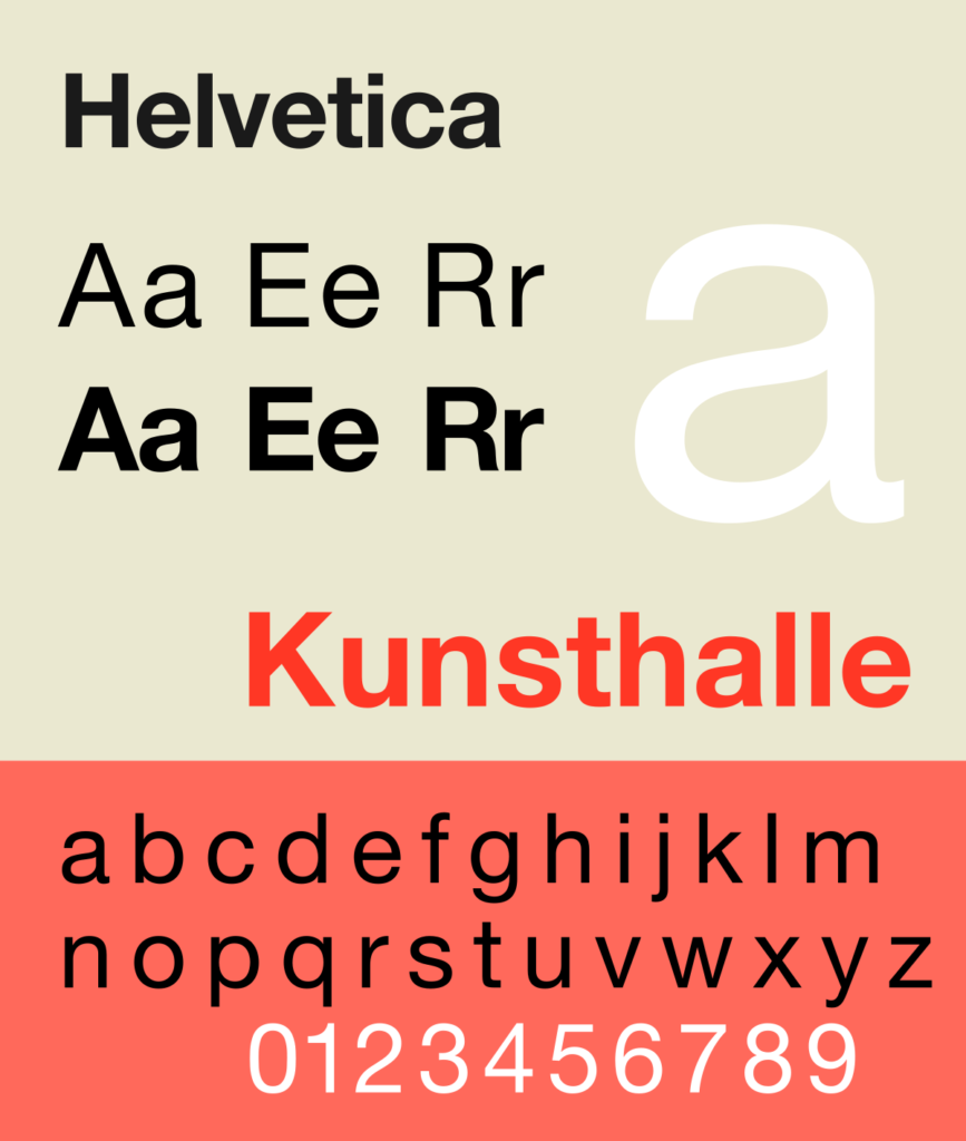
Neo Grotesque typefaces were the result of designers preferring clean, legible sans serifs. This led to much of the character and personality of the fonts being stripped away. Characters have uniform thickness with no contrast between thick and thin.
Example: Helvetica.
Humanist (20th century)
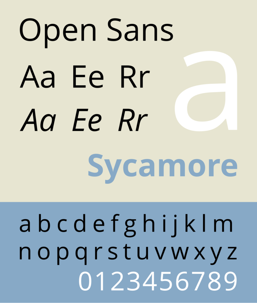
These are based on the proportions of Roman-style capitals. Some of the details of the characters possess a calligraphic style influence. These were developed in the 20th century as people began to feel as though modern Sans Serif lacked character and humanity.
Examples: Open Sans. Cantarell.
Script
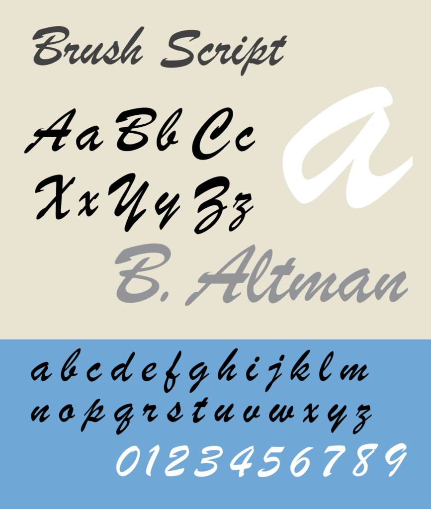
Script fonts offer eccentricity and artistry with their flowery, calligraphy-inspired design style. They generally appear as mimicked handwriting, channeling brush and pen strokes. Script fonts can be split up into two subcategories: formal scripts and casual scripts.
Formal scripts are typically based on letterforms from the 17th and 18th centuries, often imitating a quill or the nib of a pen.
Casual scripts are noted for having a more active hand and undoubtedly possess a less eloquent feel. These typefaces began popping up in the early 20th Century.
Monospace
Also known as fixed-pitch, fixed-width, or non-proportional font, these are fonts where characters occupy the same amount of horizontal space.
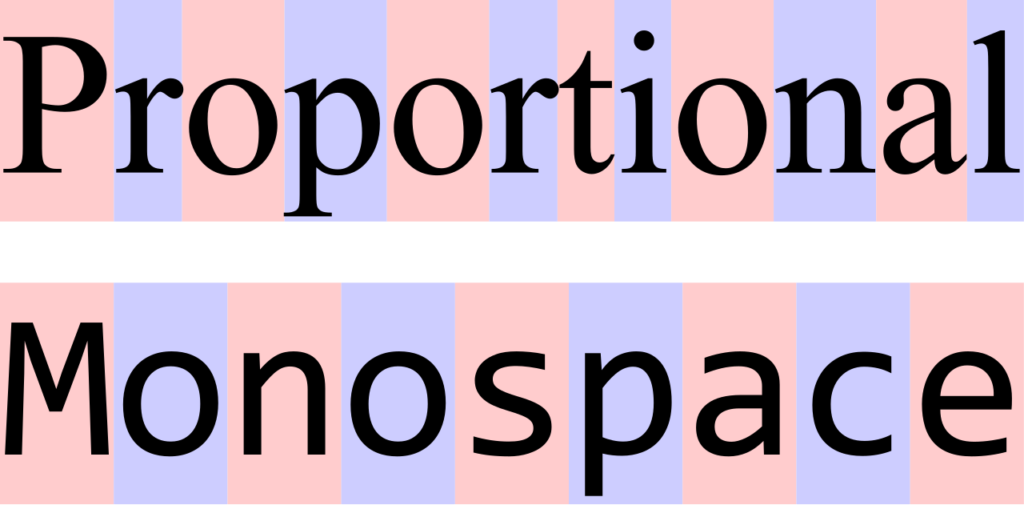
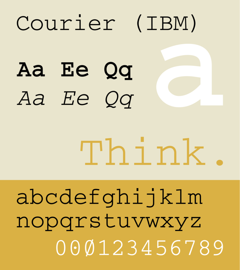
These fonts could be found on typewriters, as well as early computers. This even spacing increases legibility, making it a great choice for coding and software text editing.
Example: Courier New
When should I use which?
Serifs
Serif typefaces have been lauded for their readability. The serifs themselves guide the reader’s eyes from one character to the next, improving legibility. This type style is most effective when working with body copy or other long-format text, or when you’re looking to add a traditional feel to your work.
Sans Serifs
Many web designers prefer sans serif fonts because the clean, crisp lines are perfect for on-screen usage. If you look at most digital devices (or apps used primarily on them) you will likely find that the default typeface is sans serif. They are legible at smaller points, perfect for the wide variety of digital screens available.
Sans serifs are great options for display text, but they’re also versatile. They may be used for body text as well. As far as pairing fonts, you can typically get away with using two sans serif fonts. The same cannot be said for serif typefaces, which tend to look clunky when paired with another serif.
Script
Their decorative nature makes them great for display text and other situations where you need to catch an eye. But the legibility issues of this style make it difficult to utilize in any non-decorative or headline situation. For this reason, it’s best to avoid script typefaces when laying out body copy and other long-form text.
Monospace
Monospaced fonts are preferred by programmers because of the legibility associated with them.
Pairing Fonts: How to find a match
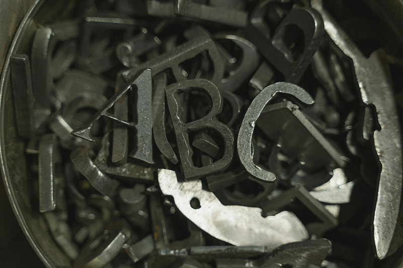
Whereas font effectiveness involves concerns like legibility and aesthetics, font combinations necessitate concerns like hierarchy and contrast, in addition to legibility and aesthetics.
When working on a project, you’ll almost certainly be tasked with pairing fonts. So, it’s reasonable to ask: what should I look for in a pair? How much room is there for experimentation? How can I test the effectiveness of a pair?
One of the most common combinations you’ll find is the classic pairing of the headline with body copy. This combination can be found in magazines, newspaper articles, advertisements, etc. But, there’s no shortage of instances where two or more fonts may come together. Here are a few tips to ensure your font pairings are always on point, creating an even, visually appealing means of consuming information.
Use superfamilies.
A good method for stretching the versatility of typefaces is utilizing superfamilies. A superfamily is a set of fonts that are crafted to work together in harmony. These fonts are related by their sharing of certain characteristics.
Within superfamilies, different character styles can coexist, providing both consistency and variety. They have the ability to shift their personalities while retaining the defining characteristics of the typeface.
For instance, Macklin — designed by Malou Verlomme and offered by Monotype Studio — includes sans, slab, text, and display. This proves that a well-constructed superfamily can single-handedly flesh out a magazine or newspaper layout.
An example of the stylistic variety included in some typefaces is well represented in a typeface like Aeonik, released through CoType in 2018. Aeonik offers 7 different weights (air, thin, medium, regular, bold, and black) and all of them can be italicized. That means that, with one typeface, you have 14 different personalities at your disposal.
Utilize hierarchy.
When a potential customer lays eyes on a graphic design, whether it be the front page of a magazine, newspaper, subway advert, billboard, etc. a subtle, yet important series of processes take place. And whereas it might seem effortless, there is a lot going into the brain’s processing of information.
Whether the purpose is to create hierarchy, or just ignite an aesthetically appealing visual. Eventually, you’ll have to integrate visual hierarchy.
To the learned typographer, body text will always be the subject of interest. But for normal people, and those not applying design theory to the work, the typeface for the body should not elicit strong emotions one way or another.
One shouldn’t think, “Oh, wow, what a cool font,” when seeing the body copy. Unless they’re a typography nerd. The content should be the core of the message.
Beyond the actual text itself, font sizes that complement one another can help. Creating a visual hierarchy by utilizing point size and weight can help two typefaces coexist healthily on a page or screen.
Contrast, not clash.
Pairing fonts is all about finding traits that complement one another.
An easy starting point when experimenting with combining fonts is by mixing one serif font with one sans serif font. While experimentation is key, there are some tried and true practices. For example, utilizing a sans serif for a headline with a serif as the body copy.
There is an ongoing debate among designers about whether serif or sans serif is more legible. In print, specifically with body copy, serif fonts can increase legibility. The serifs are the little feet on the ends of certain characters. It’s believed that these increase readability by leading the reader’s eye from one character to another.
Conversely, sans serifs are considered better suited for the digital landscape, being more easily consumed on a screen than their serif counterparts.
Use fonts with similar x-heights.

Another helpful rule of thumb for finding fonts that work well together is using fonts that have similar X-heights. The X-height refers to the height of the lower-case x for a typeface. Font with this similarly has a tendency to blend well. Be sure to give this the eye test though, as it’s not a foolproof theory. Additionally, certain font pairings that don’t have matching x-heights can still work together in the right circumstances.
Avoid double script.
We’re all familiar with this delicate, flowery style. It conjures sensations of calligraphic flourishes and obligatory RSVPs. And while this style can be of tremendous value in the appropriate setting, it looks out of place in most places. The nature of script typefaces includes lettering that connects, providing an elegant look for display text but an illegible nightmare for body copy.
A script font can be defined as a font that mimics cursive handwriting. There are two subcategories of script fonts: formal and casual.
A good rule of thumb is to never combine two script fonts.
Font Pairing Generators
Sometimes we need a little guidance when first learning a skill. Good news! The internet is chock full of websites to help you along the way. The following resources are good tools to assist you in finding quality typeface matches for your next graphic design job. Even better, all of these sites are free and easy to use!
Best Fonts for Websites
When choosing a typeface for your material, it’s important to take into consideration the medium. For example, screens will have different perceptual properties than paper. As a result, different font character styles will translate better to the website. Finding a good font for your website is essential. Here are a few things to look out for, and some classic typefaces that work online.
Being able to tell the difference between characters is essential to the effectiveness of the typeface. Let’s discuss two important components of typefaces: kerning and tracking.
Kerning
Kerning refers to the amount of space between individual letters. This is typically used for singular words in a logo or headline setting. Fonts come with default kerning; each different weight or style will necessitate a different default kerning. But knowing how to properly adjust kerning can keep your content from appearing awkward, clunky, or lazy. All of which should be the subject of severe avoidance on the part of any graphic designer, professional or aspiring.
Tracking
Tracking adjusts the spacing between the letters evenly across the entire word. This is particularly helpful when you’re working with heavier weights that require larger average spacing between letters. Certain fonts will naturally seem closer together, and tracking can help you adjust this, increasing legibility
How does font weight contribute to legibility?
The decorative, script or overly narrow fonts can decrease legibility. This is bad if the text you’ve written is, in fact, for the purpose of being read. But this doesn’t mean you need to coat your website in bold typefaces. An understanding of typographic hierarchy will assist you in how properly coordinating your font weights can create a coherent, visually pleasing design.
Website fonts: Nix the serif?
A longstanding typographic myth claims serif fonts improve legibility in print situations, while sans serifs are better suited for the digital screen. There is some truth to this. The serifs can increase readability in larger bodies of text due to the guidance of the “feet” leading the eye from one character to the next.
But this myth is rooted in the days when computer screens were not yet able to neatly render the serifs, making them less legible. Additionally, sans serif have clean, crisp lines that translate to the digital setting well. But this isn’t always a given.
Most legible fonts for web design
Georgia
Georgia was designed by Microsoft with low-res screens in mind. For this reason, it’s one of the best, most legible fonts in on-screen situations. But, it’s a serif font. So it contains those little embellishments at the ends of each character. Still, Georgia is an excellent choice for website design.
Helvetica
Helvetica is the benchmark sans for a reason. It’s a modern classic with impeccable readability and a large superfamily to work with. It’s sleek.
Quicksand
Most people will ingest your design through the use of a smartphone, tablet, or some other digital avenue. So it’s no surprise that many purveyors of smartphones and tablets are designing new typefaces to accommodate this trend. Google developed this sans serif purely for the purpose of being readable on small screens.
Futura
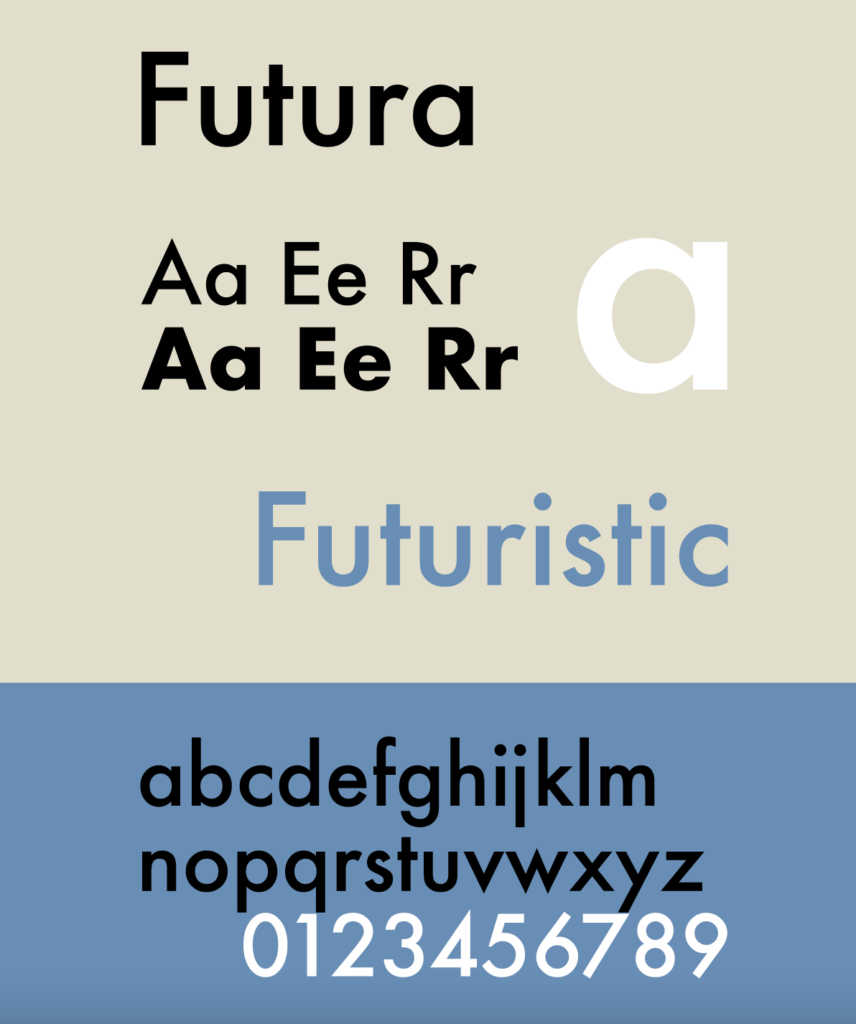
Some fonts are inexplicitly versatile. Futura is one of those fonts. Conjuring the Bauhaus spirit of the early 20th Century, Futura showed up on the scene looking incredibly contemporary. Today, it looks just as modern as ever.
Montserrat
Montserrat is a good choice for creating a clean, simple-looking web design. It has more discernable character than Helvetica or Arial but remains one of the easiest fonts to read.
Times New Roman
Many of us have come to see Times New Roman as the default typeface. For print and web documents. Despite having a small x-height, it’s still one of the more readable fonts.
Tahoma
Tahoma is a humanist sans seif. Much like the other fonts on this list, it was made for on-screen accessibility. In fact, Tahoma was the default font across all of Windows 2000 and XP. Its strength is as a menu and interface typeface.
Open Sans
Open Sans is notable for its kerning. Its natural spacing makes this typeface one of the easiest fonts to read. According to Google, Open Sans is “optimized for print, web, and mobile interfaces, and has excellent legibility characteristics in its letterforms.”
Typographic hierarchy
What is Typographic Hierarchy?
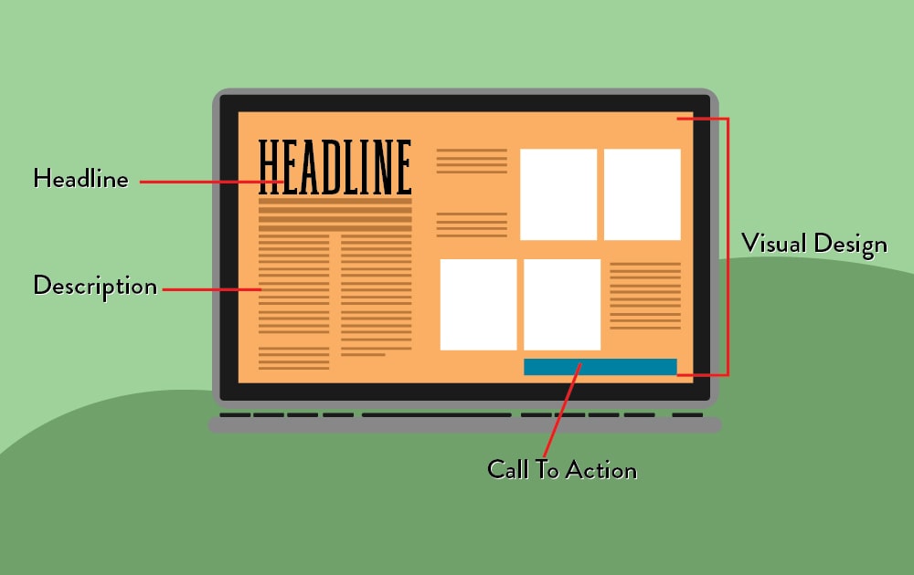
Typographic hierarchy is a system that uses typography — size, font, and layout — to create a hierarchy that shows users where to look for certain information.
A poorly designed webpage will overwhelm its visitors. Without a clear hierarchy, people won’t know which information to direct their attention to first. This is bad news, especially if these visitors are potential customers. When a potential customer arrives on your website’s landing page, they’re going to want a seamless experience.

Branding Fonts: Choosing the right typeface for your business
Have you ever judged a brand based solely on its logo? If your answer is yes, you’re not alone. After all, a venture’s logo is its most important visual asset. Brand awareness, trustworthiness, authoritativeness, and many other attributes depend on that one design.
In branding, a commercial wordmark is a font-based logo that focuses exclusively on the business name. Because of its reliance on the written word, a good wordmark design will require a decent understanding of typography. But whether or not your company uses a watermark as its premier signifier, you’ll need to find a typeface to accompany your brand’s visual element.
In this section, we will be discussing some of the most identifiable branding fonts, digging into how they work, and asking why so many successful businesses have used the same few fonts for decades.
It’s easy to assume that just because you want your logo to stand out, you have to go big and colorful, easily separating your name from the crowd of similarly designed logos. But, evidently, this is not the case. There’s a reason certain typefaces have maintained their stranglehold on logo design for so long. And many of them have been around since the mid-20th century.
Massimo Vignelli explicitly named his five fonts: Futura, Helvetica, Times New Roman, Bodoni, and Century.
There is an abundance of brands throughout modern history up until (and including) today who have rested easily on just a few well-designed typefaces. The following fonts have been mainstays in logo design for decades. Here are some of the most well-known brands that share those typefaces.
Some popular fonts for logo design
You might be surprised to find just how often companies rely on the same couple fonts to represent their brand. Here are a few classic typefaces that have been around for nearly a century, and yet businesses– old and new– are still relying on them to communicate their identity.
ITC Avant-garde Gothic
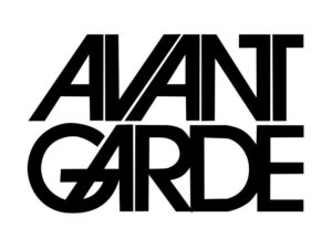
Avant-Garde Gothic is a geometric sans-serif font designed by Herb Lubalin and Tom Carnase. It was originally used in the magazine Avant-Garde, which ran from January 1968 to July 1971. It has since found its way into the design repertoire of countless firms.
Brands that use it:
- Adidas
- Bloomingdale’s
- Macy’s
- Mobile
- Nutella
- Billabong
- Element
Futura
Another geometric sans serif that has cracked its way into the annals of wordmark history is Futura. Originally designed as a contribution to the New Frankfort project, Bauer Type Foundry developed it in 1926. It was ahead of its time when it was first published, and has maintained its modern effectiveness nearly 100 years later. Here are some businesses that agree!
Brands that use it:
- BestBuy
- Domino’s
- FedEx
- GoFundMe
- Nike
Helvetica
Helvetica was designed by Max Miedinger and published by Linotype in 1957. It has been called “the benchmark sans”, and is considered a timeless staple of graphic design. Over the years, a number of variants have been developed, including different weights, widths, and sizes. Its firm, geometric simplicity makes it one of the best fonts for logos. Countless brands have relied on the sleek immediacy of Helvetica.

Brands that use it:
- American Apparel
- Jeep
- LG
- Panasonic
- Target
Worst Fonts: What to avoid in a typeface
Typography allows for a heap of experimentation and personalization. But that doesn’t mean there aren’t wrong answers.
Knowing what to avoid in typefaces can help you from risking your brand’s identity and reputation.
Here are just a few easy-to-dislike typefaces every designer should avoid:
Curlz
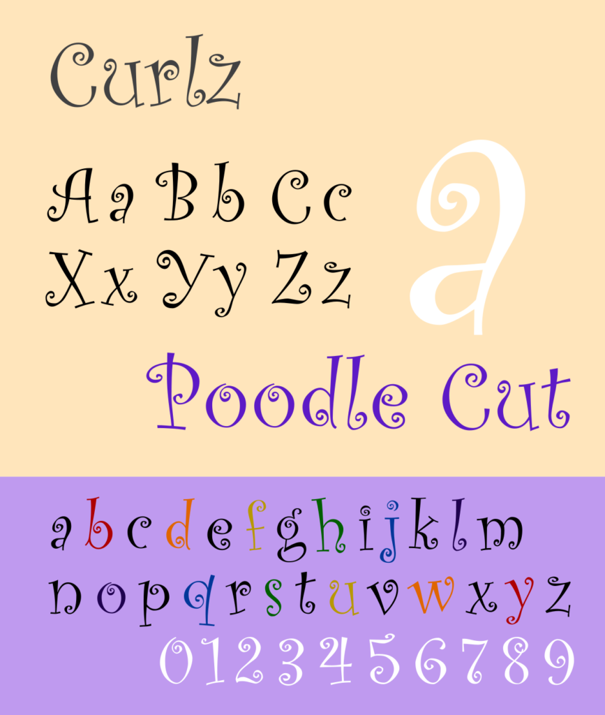
At first sight, Curlz might seem like a funny joke that you’re not in on. Try as you might, you just can’t seem to find the humor. It reeks of a toddler’s clothing store or the dilapidated consignment shop by your parent’s place.
It’s whimsical, flamboyant, and cheeky. Love that. But on the off chance that you want to be taken seriously, you should resist the temptation to drape your text in this font. Developed by Carl Crossgrove and Steve Mattison for Agfa Monotype, Curlz’s sole claim to fame is its status as runner-up for the Most Likely To Be Found in A Dr. Suess Book category of an award show that I made up. Next.
Impact
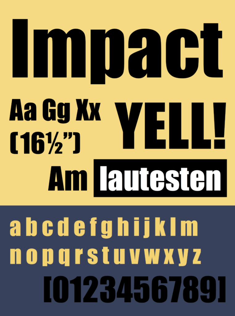
If there is a trend emerging with these entries, it’s probably something like this: default fonts on word processing software during the mid-2000s. From an 8-year-old’s perspective, Impact was in high regard. It was the font you reached for when you weren’t messing around. When you needed something attention-grabbing. Something earnest. And that’s just it. The aura given off by Impact is “an eight-year-old who’s not messing around.”
This is likely not the company you’re looking to keep in developing a brand identity. There are tons of typefaces out there that do what you think Impact is doing— only better.
Comic Sans
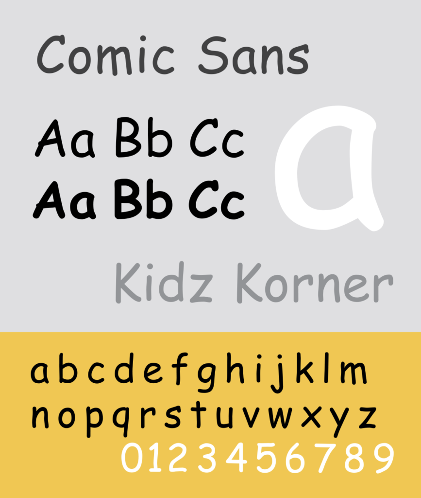
Long has this typeface been ridiculed for its childlike and playful-to-a-fault demeanor. We scoff at its clunky, outdated appearance, and its ability to immediately call out the amateurism of its users.
Like many sans serif typefaces, Comic Sans has a relatively even stroke. This is due to its unmodulated letterforms, meaning there is little to no contrast in the thickness of the characters. However, unlike fellow unmodulated sans serifs like Ariel or Helvetica, Comic Sans doesn’t account for the added thickness at the junction points of the stem and shoulder. This leads to uneven characters and contributes to legibility issues


