The art and science of crafting visuals with engaging content, presentation designs are tools to communicate ideas in a slide deck efficiently. It goes way beyond putting together text and images. It’s about strategically using visuals to tell stories and provide clear information. It aims to engage your audience and achieve your presentation goals.
Table of Contents
- Why Create Presentation Designs?
- Key Elements of a Presentation Design
- The Power of Storytelling in Presentations
- Typography and Font Selection
- Color Palette and Imagery
- Layout and Composition
- Effective Slide Structure
- Best Practices for Presentation Design
- Work with Penji for Your Presentation Designs
Why Create Presentation Designs?

Presentation plays a crucial role whether you’re educating, introducing a new product, or trying to get funding for your business. A well-crafted presentation design helps you with the following:
- Improved audience engagement: When you add compelling visuals, clear information, and a well-built narrative, you’ll succeed in keeping your audience interested and actively listening.
- Better information retention: Humans process visuals better and faster than text. An effective presentation design is an excellent way to help your audience remember key points and takeaways.
- Higher persuasion power: A well-designed presentation evokes emotions, builds trust, and makes your points more convincing.
- Stronger professional image: A polished slide deck is more than just a tool for communication; it’s a reflection of your professionalism. It enhances your credibility, reputation, and authority.
- Presentation goals achieved: Whether you aim to inform, inspire, convince, or educate, effective design can help deliver your message clearly and achieve your desired results.
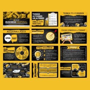
Example #1: Made by one of Penji’s pro designers, this presentation design created for Skief Labs uses stunning visuals, clear layouts, easy-to-read typography, and eye-catching color combinations.

Get a taste of unlimited presentation designs
Try Penji risk-free for 30 days & get unlimited presentation designs


Key Elements of a Presentation Design
If you want to create compelling and persuasive presentation designs, you need to understand its essential elements. They are the following:
The Power of Storytelling in Presentations
People are wired to connect with stories. When crafting presentations, engage your audience with powerful storytelling. This reaches them on a higher emotional level while making your message more memorable. Here are a few tips for doing this:
- Craft a compelling narrative: Structure your presentation like you would a story, with a clear start, body, and end. Begin with a problem, present your solution, and leave with a takeaway.
- Cite examples and anecdotes: Use real-life stories, case studies, and personal anecdotes that your audience can relate to and add that human touch.
- Connect with emotions: Stories are great in eliciting emotions such as excitement, empathy, and inspiration, thus adding impact to your message,
Typography and Font Selection
If you aren’t familiar with it, typography is the art of using fonts and text styles. In presentation designs, selecting suitable and appropriate fonts is essential for readability and visual appeal. To help you achieve this, follow these tips:
- Readability: Choose clear and easy-to-read fonts. Remember that they will go on a slide that viewers will watch from afar. Make sure to avoid any complex font, such as decorative or script styles, that can be hard to read even on a large screen.
- Hierarchy: Using different fonts and sizes creates a hierarchy of information. Headings should be bigger and bolder than those in the body.
- Consistency: Use consistent font styles and sizes throughout your presentation for a coherent look.
Color Palette and Imagery
Two of the more powerful visual elements valuable to any presentation design are color palette and imagery. Here’s how to use them efficiently:
- Strategic use of color: Use a color palette that aligns with your brand or the message you’re imparting. Colors evoke emotions while setting the tone for your presentation.
- Limit text on images: Avoid placing text directly on your images. This can make the visual look cluttered and difficult to read.
- High-quality images: Use only high-resolution images, charts, and other graphics. Pixelated or blurry visuals can distract your audience and muddle your message.
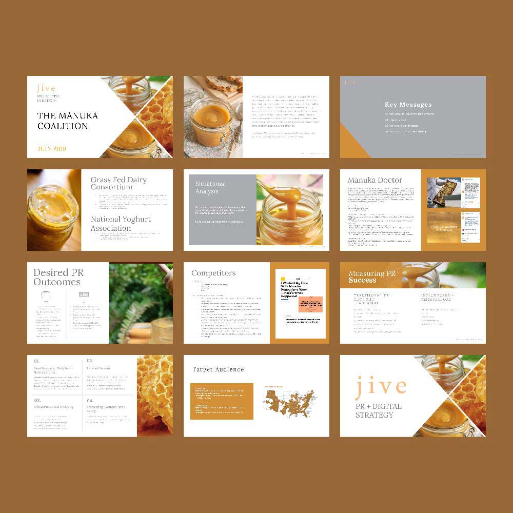
Example #2: This presentation design was created by Penji for Jive, a PR and digital marketing strategy company. It embodies the right use of typography, color palette, imagery, and the power of storytelling.
Layout and Composition
The layout refers to the arrangement of the design elements on your slides. On the other hand, composition is the overall visual balance. Here are a few factors you need to understand if you want to achieve this effectively:
- Whitespace: Also known as negative space, these spaces are void of any design element. Use this to effectively prevent information overload while creating a sense of visual breathing room.
- Rule of thirds: Think of dividing your slides into threes. Place the key elements along the intersecting lines or points to achieve an excellent balance in your presentation slides.
- Alignment and balance: Make sure your texts, images, and other elements are aligned for an organized look.
Effective Slide Structure
To effectively guide your audience through your presentation, you need to build a clear and concise slide structure. Here’s how you can do it:
- Begin with a strong hook: Grab their attention using a captivating opening statement, question, or image on your first slide.
- Focus on key points: Make sure you focus only on the main points on each slide. Use visuals and concise text to support your message.
- Add clear calls to action: Tell your audience what you want them to do after presenting. Include clear calls to action on your last slide.
Best Practices for Presentation Design

Aside from those mentioned above, below are a few more practical tips when crafting presentation designs:
- Avoid overloading with information: Do not bombard your audience with excessive text or complex visuals. These may confuse or overwhelm them. Instead, focus on your key points and support them with visuals.
- Use transitions and animations sparingly: While they can add visual interest, use them sparingly. Too many can distract and take away your audience’s attention to your content.
- Proofread carefully: Grammatical errors and typos can wreak havoc on your credibility. Ensure that you meticulously proofread your slides before you present.
- Keep it simple: Complex designs can be challenging to understand. Avoid jargon or technical terms and overly ornate images.
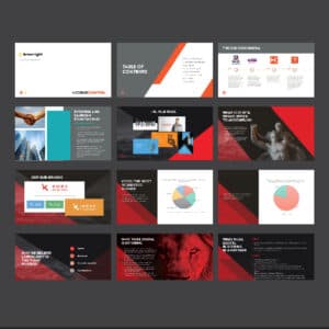
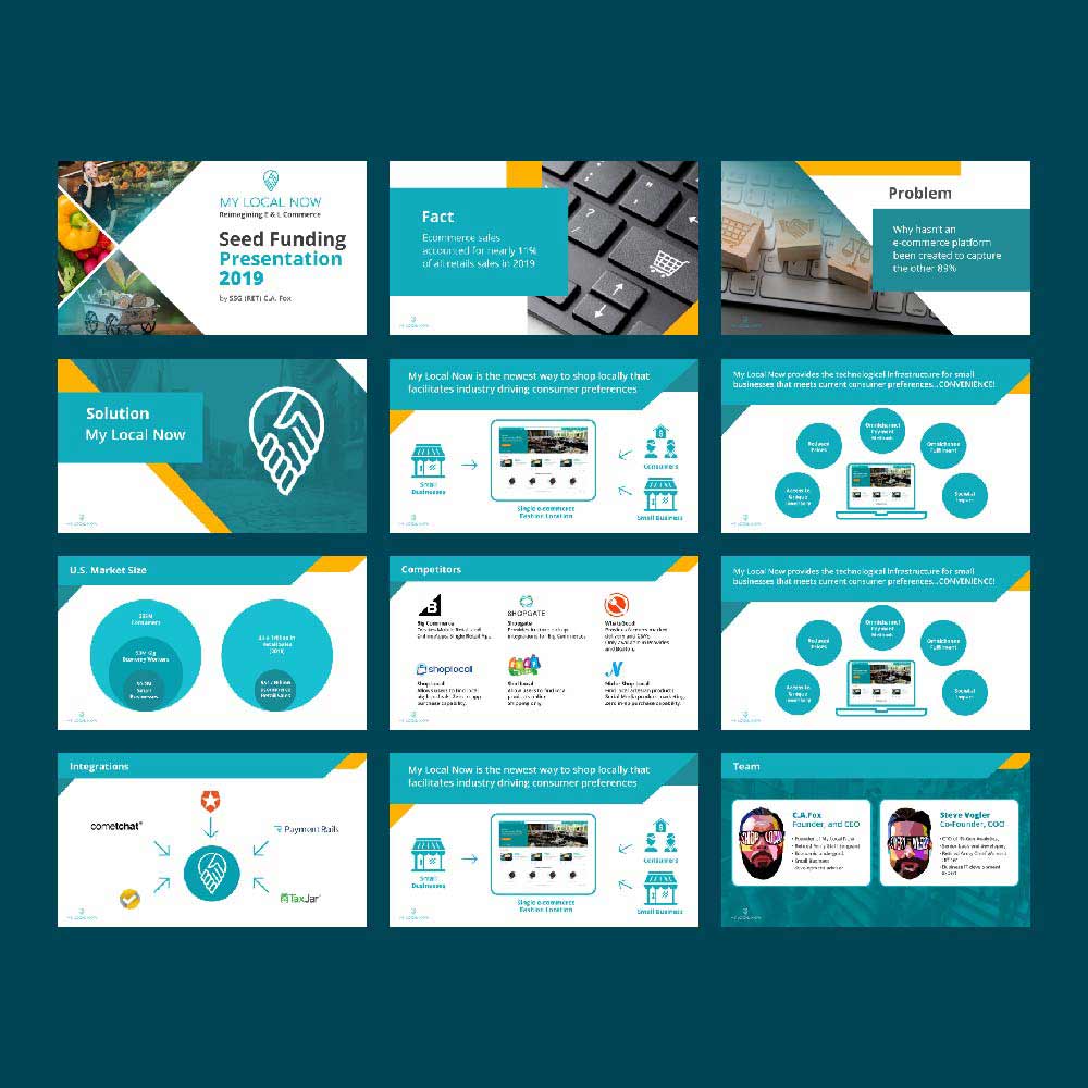
Example #3: Created for My Local Now, an ecommerce business, this presentation design exemplifies the excellent use of choosing the right color palette, ample white space, and keeping the overall design simple and easy to read.
Work with Penji for Your Presentation Designs

To answer the question of what presentation design is, it is the art and science of crafting slide decks that impact viewers. It communicates your message using strategic visuals, storytelling, layout, and other design elements.
However, if you don’t have the time and design skills to create your own presentation designs, you can always turn to the professionals. Penji has a team of talented graphic designers who can craft presentation designs that truly shine. Watch our demo video here or click this link to get them working.
Boost your business with unlimited graphic design
Get access to an unlimited pro designs risk-free for 30 days