TL;DR: Great web app design makes the difference between users loving your product and abandoning it. The best web app design examples combine clean interfaces, smooth interactions, and features people actually want. Netflix, Slack, Figma, Canva, and Spotify show how interactive designs keep millions coming back daily.
What Makes Good Web App Design?
Good web app design combines easy navigation, responsive layouts, fast load times, and interactive elements. The best examples like Netflix and Figma focus on user experience with clean interfaces, personalized content, and smooth performance across all devices.
Your web app’s design determines whether users stick around or bounce within seconds. We’ve all experienced clunky interfaces that make simple tasks feel impossible, and we’ve abandoned apps that looked like they were designed in 2005.
Good web app design shouldn’t make users think too hard about where to click. The difference between websites and web apps comes down to interaction. Websites just show information, while web apps let users actually do things like edit documents, manage projects, or stream content.
Looking at successful examples helps you understand what actually works instead of following generic design advice. These companies have tested their interfaces with millions of real users and refined them based on actual behavior.
Netflix: Personalized Streaming Done Right
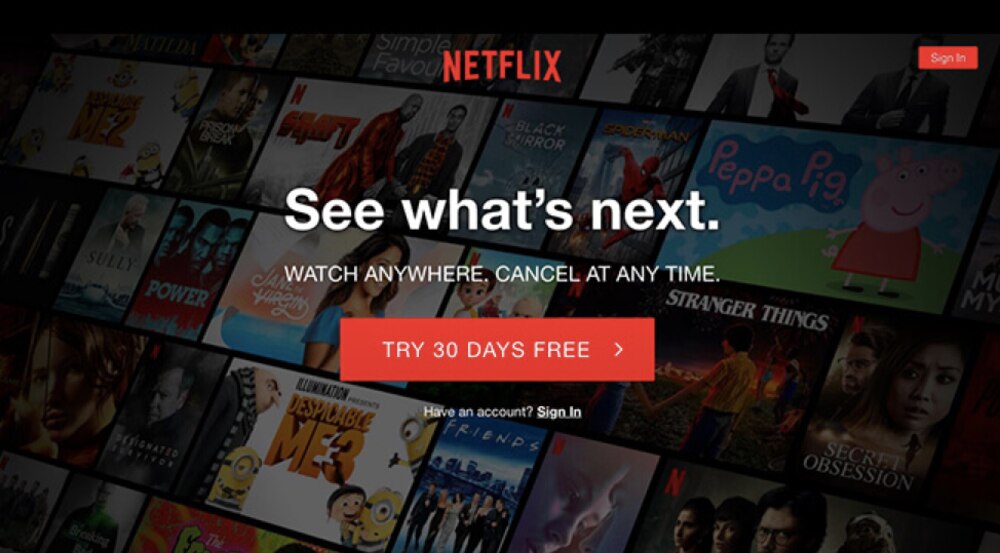
Netflix built one of the most recognizable web app design systems in streaming, and there’s a reason you can navigate it half asleep. The interface organizes thousands of movies into personalized rows based on what you’ve watched before, so you’re not scrolling through random categories.
The web design services behind Netflix focus on getting you watching something fast. Large thumbnails let you preview content at a glance, and hovering over titles auto plays trailers. The continue watching row appears right at the top because Netflix knows you’re probably finishing something you started last night.
Search works well, with results appearing instantly as you type. The video player keeps controls hidden until you need them. Quality automatically adjusts to your connection speed without annoying buffering interruptions. Every design choice removes friction between you and watching something.
Slack: Making Team Chat Not Terrible
Slack transformed workplace communication by creating a web app design that people actually want to use. The sidebar organizes channels and messages clearly without overwhelming you. Unread messages get highlighted with bold text and badges, so you know exactly where your attention is needed.
Threading keeps discussions organized instead of turning into chaotic streams where you lose context. The search function finds old messages and files quickly, which matters when you’re trying to remember what someone said three weeks ago. Companies like Penji use similar approaches with dashboards that actually make sense for managing creative projects.
Figma: Collaborative Design in Your Browser
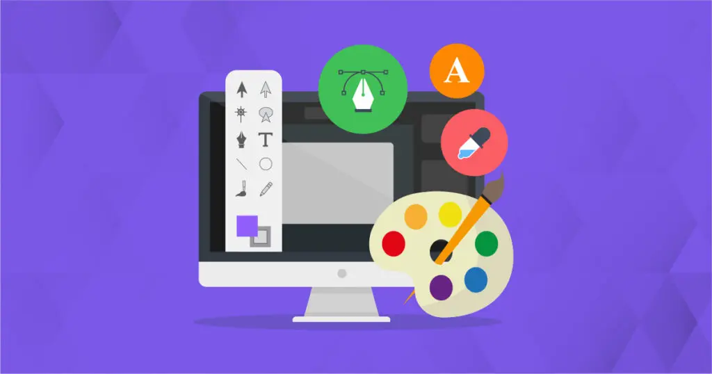
Figma proved that complex design software could work entirely in a browser without requiring downloads that eat up hard drive space. Multiple people can edit the same file at once, with cursors showing exactly who’s working where. Comments attach directly to specific elements, which eliminates endless email threads about vague feedback.
The interface puts tools exactly where designers expect them based on years of desktop software use. Vector editing, prototyping, and developer handoff all happen in one place. Companies offering web app design services study Figma’s approach to handling complex functionality through clean interfaces.
Canva: Democratizing Graphic Design
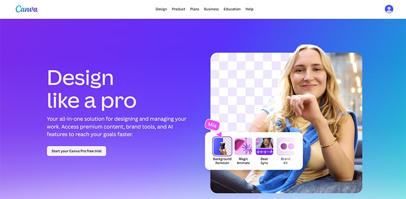
Canva made graphic design accessible to people with zero experience through smart web app design choices. The template library gives you professional starting points instead of blank canvases that intimidate beginners. Drag and drop editing works exactly like you’d expect, with smart guides helping align elements properly.
Organizations using design as a service appreciate how Canva handles brand consistency with saved colors, fonts, and logos. The mobile app syncs perfectly with the web version, so you can start projects on your computer and finish them on your phone later.
Spotify: Streaming Music That Feels Personal

Spotify’s web app design combines a massive music library with personalized discovery that actually suggests songs you’ll like. Playlists update automatically based on your listening habits. The interface switches smoothly between browsing new music, playing saved songs, and checking what friends are listening to.
The now playing screen keeps controls accessible while displaying album art prominently. Queue management lets you reorder upcoming songs easily when you’re building the perfect vibe. Companies working on website design services study how Spotify handles content organization when you’ve got millions of songs to manage.
What These Examples Teach Us
These successful web app design examples share common principles. They focus on speed, keeping interfaces responsive even with complex features running. Navigation makes sense without requiring tutorials nobody reads anyway.
They handle errors gracefully instead of showing cryptic technical messages. Loading states keep you informed about what’s happening. The best web app design doesn’t call attention to itself because users are focused on getting things done. Every interaction feels predictable and logical because someone actually thought about how real people would use this thing.
Ready to Build Your Web App?
Need help creating a web app design that users will actually love using? Work with Penji’s design team to bring your vision to life with interfaces that look great and work smoothly. Get your first design concepts within 24 to 48 hours, with unlimited revisions until it’s exactly right.
Frequently Asked Questions
What’s the difference between web design and web app design?
Web design focuses on presenting information where people just read stuff. Web app design handles interactive functionality where users perform tasks like editing documents or managing data.
Why does web app design matter for business success?
Poor design frustrates users and sends them to competitors who figured out how to make things easy. Good design increases engagement and improves conversion rates because people can actually complete what they came to do.
How much does professional web app design cost?
Costs vary wildly from $5,000 for basic projects to $50,000 and up for complex applications. Hiring web designers through subscription services like Penji starts at $499 monthly for unlimited requests.
What tools do designers use for web app design?
Figma leads for collaborative interface design because everyone can work together in real time. Sketch remains popular for vector design work. Adobe XD handles user experience design and prototyping.
How long does web app design take?
Simple apps might take 2 to 4 weeks for initial designs if feedback comes quickly. Complex applications with multiple user types can require 2 to 3 months or longer depending on how many changes happen along the way.
About the author
Table of Contents
- What Makes Good Web App Design?
- Netflix: Personalized Streaming Done Right
- Slack: Making Team Chat Not Terrible
- Figma: Collaborative Design in Your Browser
- Canva: Democratizing Graphic Design
- Spotify: Streaming Music That Feels Personal
- What These Examples Teach Us
- Ready to Build Your Web App?
- Frequently Asked Questions


