Branding assets typically use two or three colors, primarily for the purpose of better recall and high scalability. However, there are no hard rules to follow when designing a logo. You can use whatever color you want, and hell yes, that includes rainbows! These examples of rainbow branding and logos will show you how to use color to create the ultimate brand identity.
Rainbow Branding Logo Examples
Color theory holds a wealth of information for entrepreneurs and anyone doing rainbow marketing. We associate each color with specific moods, characteristics, and behaviors. Whether you’re branding or rebranding, it’s important to spend some time assessing these associations to see what makes sense for your project.
If you’re wondering how many colors a logo should have, the general rule of thumb is no more than three. But that doesn’t mean there can’t be exceptions to the rule. In fact, some of the most respected brands in existence broke the rules and went with rainbow branding and logos.
Apple’s old logo
While its current official logo is gray, the computer company’s 1977-designed logo was rainbow striped.
Google’s logo
Google’s quirky logo isn’t exactly rainbow in the traditional roy-g-biv sense. But it has a rainbow feel. It contains four colors and has changed remarkably little over the years.

eBay’s logo
eBay is another member of the famous rainbow logo club with its simple four-color scheme – remarkably similar to Google’s.
NBC’s logo
The NBC emblem is another example of renowned rainbow branding.
Microsoft’s logo
The Windows logo isn’t always depicted with the classic red-green-blue-yellow squares. But it has been present in many iterations over the last few decades.

The primary colors are typically considered blue, red, and yellow (though physics disagrees, swapping yellow for green). These are the colors most commonly used in logos to create a rainbow effect.
After the wave of brands making their logos rainbow for pride month, many people began to see rainbow logos as garish (see: rainbow washing). But that doesn’t mean you can’t pull it off in a novel way that puts those corporate copycats to shame.
What other companies have rainbow logos?
Rainbow branding doesn’t necessarily have to include the seven colors in order. In fact, they don’t have to include primary colors at all. This is how you design a logo that is eye-catching but simultaneously has depth. Your design can incorporate whatever colors are meaningful to your brand. These colors should evoke feelings associated with your brand’s personality and values. Let’s look at some less conventional examples of brands with rainbow logos.
Playstation’s logo
Tweak the tones – Playstation’s emblem is a fun example of a rainbow-esque logo with a twist. While they use red, green, blue, and yellow, the tones are slightly off from the primary colors you’d find in a standard rainbow. This gives it a unique and memorable vibe. In other words, you don’t have to do the classic “ROYGBIV,” which can actually end up looking a little too generic.
Instagram’s logo

Leave some colors out – Instagram’s newer logo has a rainbow feel with one bold color diffusing into the next. While it doesn’t include blue and green, its distinct tones of red, purple, and yellow still give this logo a stark rainbow feel. This is another strategy: Pick a few rainbow colors and run with them, maybe doing a gradient design if it floats your boat.
Billboard’s simple rainbow logo
Use black or white – If you’re concerned about overdoing it or appearing unprofessional, remember your branding doesn’t have to be heavily colored. Billboard does a great job of demonstrating this with a primarily black logo. This is a great technique for companies that want to maintain professionalism or those that work in a more conservative industry. This logo still manages to includes 5 colors of the rainbow.
Rainbow Branding Your Business Website
Rainbow designing your website doesn’t have to look childlike (unless you want it to). These companies used the rainbow in different ways to design their home pages. As you’ll see, they’re quite different, revealing that there are pretty much infinite ways to play with the rainbow.
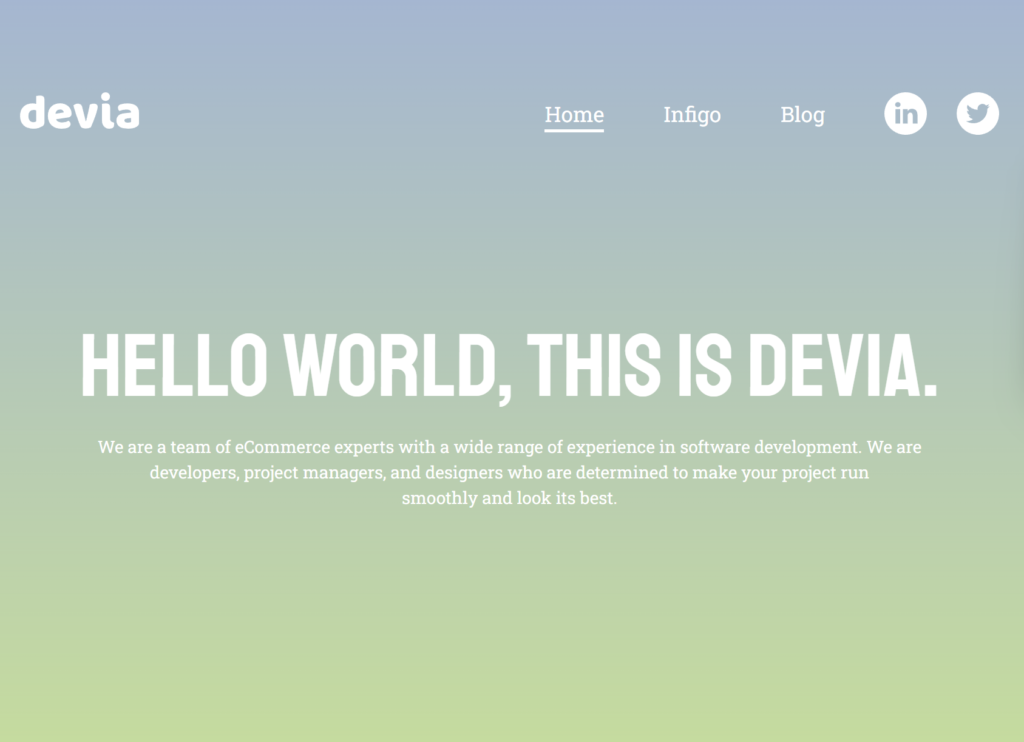
Devia’s Website
This software company has a muted rainbow color scheme as you scroll down each page. A soft gradient is a great way to use a variety of colors without overwhelming the viewer. If you want to use rainbow without being bold, pastels are the way to go. The white text creates another soft effect so the entire website is visually calming.
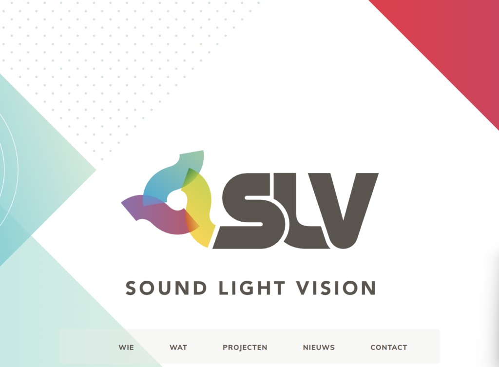
SLV’s Website
Sound Light Vision’s website leans toward crisp, cool tones while skipping over hotter colors like bright orange and red. Still, their website and logo play with rainbow colors, and the result is a distinct and well-defined brand. Leaning toward cool or hot tones is another way to approach rainbow branding your website.
Rainbow Branding and Logo Symbolism
Rainbows hold extensive symbolism. From the Irish ‘pot of gold at the end of the rainbow’ to the appearance of a rainbow in the Noah’s Ark story, most cultures have a connection to rainbows one way or another.
If you’re using the color spectrum in your branding, it’s a good idea to reflect on how it relates to you – What’s the meaning of your brand colors? Maybe you’re offering customers hope in light of a difficult problem (the rainbow after the storm). Or maybe you’re expressing brand values like creativity and play. Whatever the case, weaving symbolism into your customer journey adds another dimension to your brand.
Penji’s got your rainbow branding covered.
Whether you’re branding for the first time or simply adding visual assets to your current brand, Penji can help. Our graphic designers will work with you to create brilliantly customized graphic designs in the size and format you need them. Get your revisions back in as little as 24 hours so you’re not waiting weeks to move forward with projects.
Watch a demo to see how you can get unlimited graphic designs for your business.
About the author

Brianna Johnson
Brianna is a professional writer of 10+ years who specializes in branding, marketing, and technology content.

