
Every year, brands like Apple and Samsung launch new smartphones. Other brands must grapple and compete with these tech giants to ensure their smartphones still reach consumers. To do this effectively, they need creative ads to bring in more buyers and show off the value of their phones. Mobile advertising designs allow you to do just that, locating the right audience for the right smartphone releases. In this article, we’ll discuss print and digital mobile advertising trends and break down the top 10 mobile phone ads.
Advertising Mobile Phones
Advertisements for mobile phones have changed over the years. In the late 80s to the 90s, mobile advertising design was about having one prominent copy and several other copies that were more long-winded and detailed different features.
As the 2000s rolled in, phone advertisements have fewer copies and heavily featured the phone in different colors. Brands at this time showed off the visual aspects of the phone.
In the era of smartphones, many go for minimalist styles. Apple is one of the most prominent brands in running minimalist ads. However, some brands show off their creativity to capture the attention of potential users.
One thing that remains constant in advertising mobile phones is branding. It’s to ensure they easily get recognized and its branding is ingrained in the minds of their consumers.
Mobile phone print ads make more use of copy. For users to learn about their product on one page or in a spread, the copy is crucial to ensure that the message gets across and the features are detailed.
Many also use competitive advertising (i.e. Samsung and iPhone) to make comparisons of their products. Some do that by using the camera on their smartphones and seeing which one has better resolution or quality.
In terms of digital advertising, advertisers use different online advertising strategies that may not need to use copy and could present features visually to attract users. Through digital advertising, it’s easier to know who viewed the ad and clicked on it as well. Banner ads and digital display advertising are the most popular uses of digital ads for mobile phones.
1. Motorola Moto X
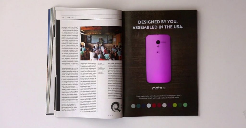
Motorola’s Moto X interactive print mobile advertising is one of the coolest mobile advertising designs on the list. The ad was published in the January 2014 issue of Wired Magazine. Several technical components were assembled on the magazine, which allows readers to change color in any way they wished.
In terms of design, it was simple, yet effective. The copy was limited and only the back portion of the smartphone was shown to demonstrate the color change as desired by the reader. Mashable stated that 153,490 readers have seen the ad.
2. Samsung Galaxy Note 8
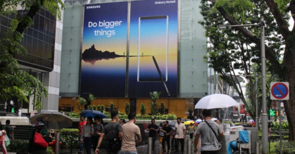
Samsung took over ad locations where most tourists go. Their mobile advertising campaign “Do Bigger Things” were shown on billboards in London, New York, and Paris.
There are different designs in different locations, but what remains is the most featured highlight–the use of its stylus. Many users may find the stylus an important tool for their design, note-taking, or editing. Samsung does a great job by demonstrating the usefulness and function of the stylus in its smartphone ad design.
Their mobile advertising campaign mixes both print and digital advertising, which is their strategy to reach their target audiences. The digital ads also present different and colorful designs to get a better understanding of the phone’s features in a vibrant manner.
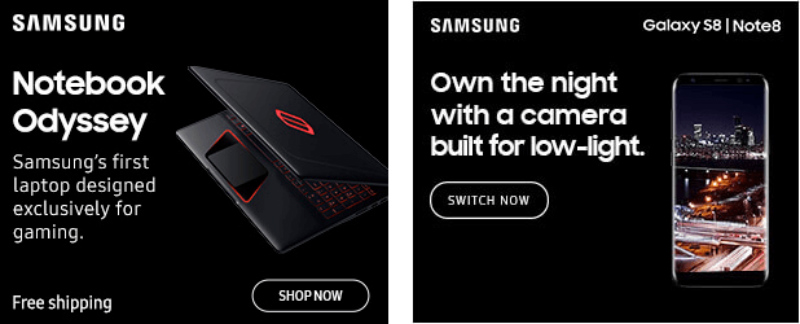
Meanwhile, the Samsung Galaxy S8/Note 8 banner ad is simple yet it can stand out in websites with a light background. It’s not as distracting and it would really capture one’s attention too. On the ad, it demonstrates the power of the camera at night, which also fits the color of the banner ad.
3. Samsung Galaxy Note 3
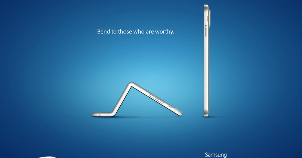
Samsung and Apple continue to vie as the top smartphone brands in the world. Both big brands show no signs of backing down in terms of their mobile phone ads. Samsung, a fierce competitor, antagonized Apple by launching an ad that wanted to market its bending prowess.
On the mobile advertising, you’ll see what looks like an iPhone bending the knee to the Samsung Galaxy Note 3. The design is simple and straightforward, yet it manages to tell a story. Bending was an issue that many consumers complained about that even a bend test was performed. In terms of reverting to its old state, the Samsung phone was superior.
4. iPhone 6‘s Mobile Advertising
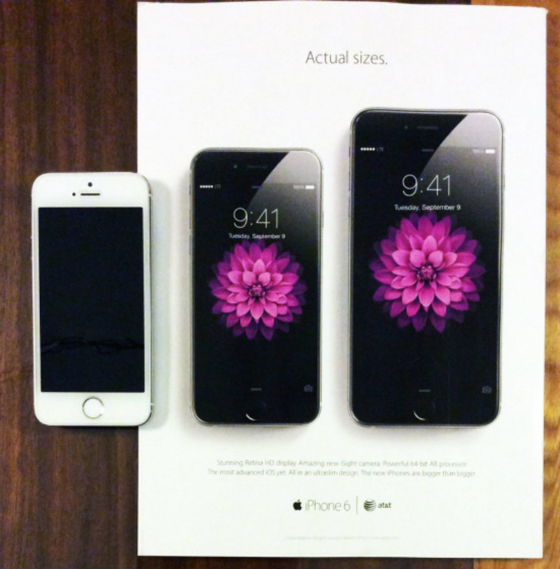
Apple doesn’t have a shortage of minimalist mobile advertising designs and most of the time they’re executed well. In their Bigger than Better campaign, Apple published a print ad on the Rolling Stone magazine, showcasing the iPhone’s size.
The design is on-brand since Apple leans toward minimalism more and that it presents its best feature: its size. Apple ads tend to focus on the phone and don’t present much copy. It seems to demonstrate that the phone speaks for itself and it may make potential consumers try out the phone for themselves in stores.
5. OnePlus 7 Pro
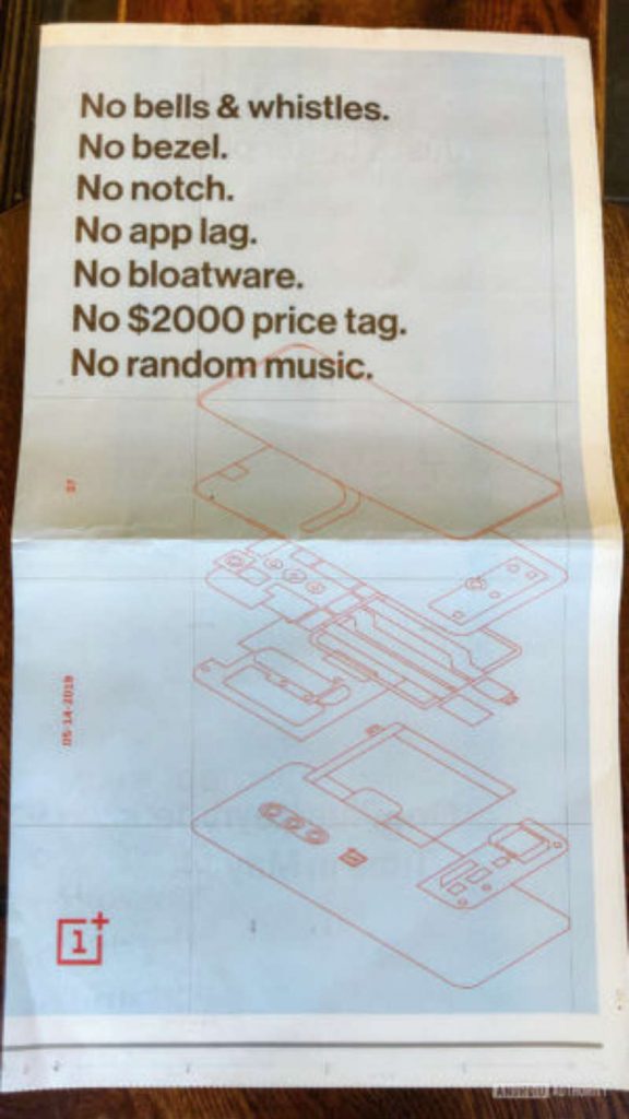
The OnePlus 7 Pro print mobile advertisement was presented in a spread on the New York Times on its April 29, 2019 issue.
The mobile advertisement’s design is unique because not many brands go for a deconstructed or disassembled version of their phone. What the OnePlus brand wants to achieve is its simplicity and its affordability.
It’s one of the best phone advertising designs because it’s creative and the concept is unique in that it shows off hardware and no other add-ons that make the phone expensive.
6. Sony Xperia Z2
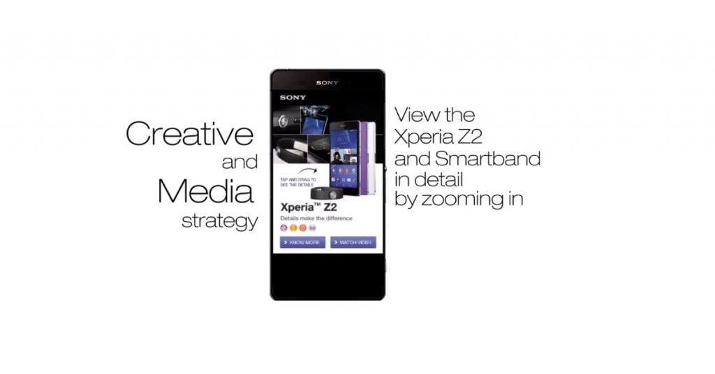
Vserv’s mobile advertising campaign for the Sony Xperia Z2 was a mobile ad campaign. Their digital ad presented its best features. Not only that, potential Sony users can tap and drag on the feature. That way, they get an idea of what the feature looks like up close.
Additionally, it showcased the phone’s three available colors and the smart band.
The design looks good that it tries to fit in all of its best features while engaging the users to explore the phone further. Not only that, the ad allows the consumer to learn more about the product and even watch a video if they want to do so. In a sense, its design serves more functions.
7. LG Optimus 3D
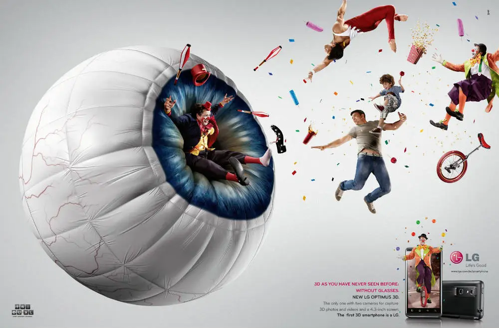
Dubbed as the first 3D smartphone, the LG Optimus 3D showed off their creative side for their mobile advertising campaign.
On the ad, there’s an inflatable eye that signifies the user viewing the images one could capture on the phone. It’s one of the greatest phone advertising designs because it relates to the smartphone’s main feature.
The brand is marketing the phone as a 3D phone. The ad looks as if the image is in 3D and it’s a great way to present their smartphone.
8. Google Pixel 2
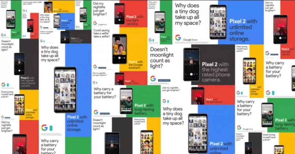
Google ran a tactical out-of-home advertising campaign for the Google Pixel 2 in the UK. There, they ran different copies which featured the phone’s best features.
The following features promoted are:
- Battery
- Storage
- Assistant
- Lens
- Camera
What makes their designs great is its on-brand with Google’s colors. It helps Google get recognized in the ads, which is a plus for the tech giant.
9. Nokia Nseries

JWT ran a print ad campaign for the Nokia Nseries in Indonesia.
It’s one of the best mobile advertising designs because it doesn’t just feature the phone. It’s what the phone represents in a larger picture.
Since the Nseries has a built-in GPS, the ads show a traveler in one of their print ads and two men with a boat and life vests in another. It shows that through the Nokia Nseries, they’re able to journey to their destination without a hitch.
The design is also intricate because it features elements such as trees and buildings that make the ad realistic and creative.
10. Samsung Galaxy S10
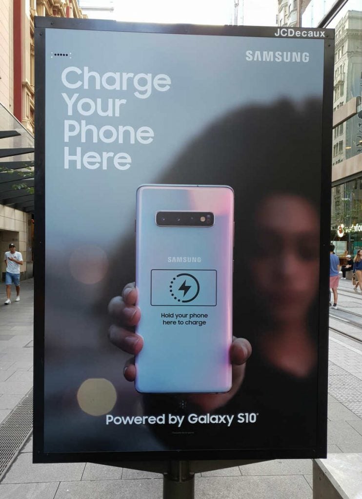
Samsung may have wanted its potential customers to know that one of its best features is the reverse wireless charging. The company ran a campaign by doing that in Australia and Singapore.
The ad’s design features a woman holding the Samsung Galaxy S10 backward. There, one can charge their phone by showing the back of their phone on the Samsung Galaxy S10 ad. It’s a clever ad to help passersby if their phone is in need of more juice.
The design is simple yet effective because one would want to go up to the ad and have their phone charged to help them get through the day or the commute. It’s also straightforward and makes sure it gets the message across as well.
Take Your Mobile Ad Design to the Next Level
Phone advertising designs don’t have to be complicated. They might show off a phone’s best features or use the campaign to demonstrate important selling points. Branding is also a vital component in mobile ads, as visual assets should be present at all times. Without quality, memorable branding, getting your message across may prove difficult. Never underestimate the power of simplicity. You have just a few seconds to reach your audience, so presenting a clear concept is key.
[convertkit form=3285107]
About the author

Katrina Pascual
Katrina is a content writer specializing in graphic design, marketing, social media, and technology. In her spare time, she writes monthly personal blogs to practice her craft.


