Are celestial figures meaningful to you and your brand? If a luminary like a moon is the best symbol to reflect your branding, you’re in luck! Check out these ten moon logo ideas that our Penji designers made! And learn what else Penji can do for you by watching a demo video here!
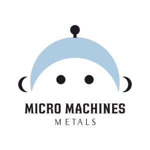
1. Micro Machines Metals
This downward crescent logo shows a human face by adding two more moon shapes as ears. It’s not an ordinary moon logo. The image represents a happy child in connection with toys such as miniature die-cast vehicles and toy car race tracks. In creating a logo, it is essential to consider the target market profile in the design. Your choice of colors, fonts, and other elements could make or break your final logo design.
2. Katmandoo Cafe
In this next logo, the designer paid more attention to color. Earth tones palette is always a good choice in graphic design. The muted and natural feel creates an appealing look that makes the brand more recognizable. In terms of shapes, the illustration also features a downward crescent and other elements like the leaves and outlines. That said, it’s best to choose the right color for it can transform and change the way your target audience feels about your logo.
3. Hotel Obsidian
The stylish combination of two moon shapes comprises this logo cyclone-inspired symbol. Under the attractive symbol is the brand name in straightforward typography. The strategic placement of elements balances Hotel Obsidian’s logo design. When planning for your own logo, keep in mind to maintain the balance among the various aspects. After all, the logos of the most prestigious brands are generally minimalist and straightforward.
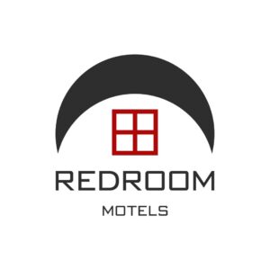
4. RedRoom Motels
Our next moon logo stands out in a red and black color scheme. According to Better Homes and Garden, plenty of colors go well with red. Regardless of the shade of red you want to use, you can pair it with black, navy, shades of blue, cream, pink, white, and even metallic shades. And to highlight the brand’s logo, it is best to use a white background, just like how the graphic artist has made this logo.
5. Shakky’s Rip-Off Bar
A moon logo with a tropical vibe! That’s how we describe Shakky’s Rip Off Bar brand identity. It features a coconut tree and three wave-like icons. While this example is well-suited for a bar located in a beach resort, it’s also a good choice for other business locations. More importantly, it is a logo design that perfectly balances the colors, typeface, and shapes. Doing so helps evoke the trust and confidence of the target audience.
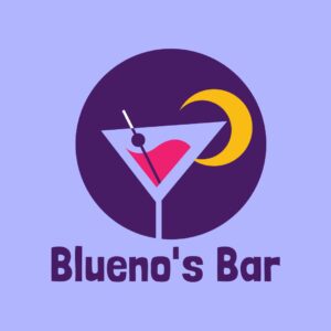
6. Blueno’s Bar

Meanwhile, Blueno’s Bar’s quirky moon logo exudes a chill and happy vibe. The cocktail glass decorated with a yellow moon shape is the primary identifying mark of the logo. In terms of color, this design beautifully combines purples hues with pink and yellow. This logo design deserves your attention if you’re a bar owner with a younger market segment.
7. Crescent Productions
Be Creative! Don’t be afraid to put several elements together. That’s what we always say when giving expert advice on graphic design. Never hesitate to play with different symbols and icons, whether you have a few ideas for creating your logo or starting from scratch. In this example, the brand’s iconic symbol consists of more than two elements. As you can see, it has a film reel, an abstract image of a house, and a moon shape strategically arranged inside a solid orange background. Likewise, there is also a variation in the chosen typeface.
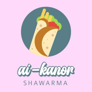
8. Ai-Kanor Shawarma

This logo for a shawarma joint is fresh and visually appealing. Being not too serious with your logo design is a good thing. It enables you to create memorable ones, particularly among the younger crowd. So, if you are searching for a logo for a food stall or diner near schools, parks, and entertainment halls, this one’s for you!
9. Pit Stop Diner
You’ll quickly notice that it’s a food establishment in a rest stop at one glance, even without reading the diner’s name. Why? It is attributed to the bright red steering wheel icon. The brand name is also integrated into the image. And to complete the design, there is a red pedestrian in the word “Diner.” Bookmark this design we created for Pit Stop Diner if you are considering a cool restaurant logo.
10. Chloe’s Corner Coffee

We are treating your eyes with an addicting coffee shop logo design for our tenth logo—Chloe’s Corner Coffee. It’s an abstract representation of coffee beans and a cup. The iconic symbols are made with a brown color scheme. As for the letter marks bearing the brand name, the chosen font style balances each other. Overall, the logo is suitable for all branding components of the business.
Stick With Brand-Worthy Fonts
Throughout this article, we’ve talked about fonts, typography, and typefaces. Why do we keep mentioning them? The bottom line – use brand-worthy fonts everywhere! There are endless possibilities where you can use typography to show off your brand’s personality. Here are a few to inspire you:
- Marketing materials such as websites, blogs, newsletters, and banners.
- Business materials include invoices, orders, delivery, and even thank you cards.
- Shareable and engaging content like IG and Facebook posts, pins, inspiring quotes with images, and infographics.
Try Penji’s 30-Day Money-Back Guarantee For Your Moon Logo
Take a giant leap for your brand with an amazing logo! Sign up for Penji here! But if a subscription isn’t ideal, you can visit our new Marketplace to get one-off designs for your one-time projects!
About the author

Rowena Zaballa
With a background as a former government employee specializing in urban planning, Rowena transitioned into the world of blogging and SEO content writing. As a passionate storyteller, she uses her expertise to craft engaging and informative content for various audiences.

