Aside from web design trends that pave the way for user experience, minimalist website design seems ubiquitous nowadays.
From eCommerce stores to graphic design services, the old adage, “Less is more,” comes as no surprise in web design. And with Penji, we’ve helped several businesses create minimalist websites that proved to be effective for their respective markets. You can sign up with us and enjoy unlimited graphic designs for a fixed fee every month.
Whether it’s the easy interface or navigable platform, a minimalist web design reels prospects in. It’s because the simplicity factor is not only built around the brand but also for the customers.
Here are a few reasons why minimalist website design is all the rage nowadays:
- Avoids cluttered space
- Communicates efficiently
- Conveys clear branding
- Lessens site maintenance
- Enhances mobile responsiveness
- Improves user experience
- Increases conversions
If you’re still at a loss on where to start with your website design, here are 15 simple website designs that’ll help you kickstart yours:
1. Evoulve
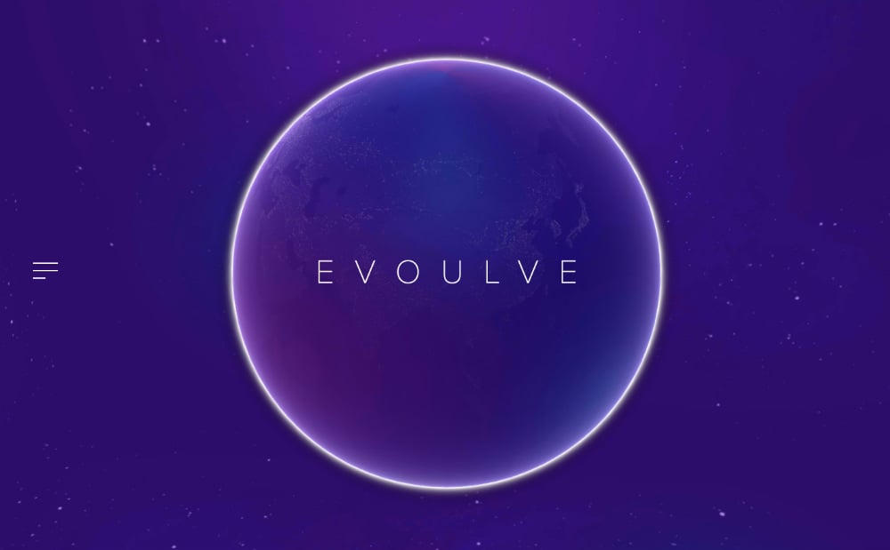
Evoulve is a brand aiming to transform high-tech innovation into feasible products. First of all, their website is reminiscent of a galactic space with a globe in the middle and stars in the background.
It has a couple of menu options and straightforward typography at the center of the globe. Overall, it’s modern and will remind you of the future — just like the company’s branding.
2. Sendamessage.to
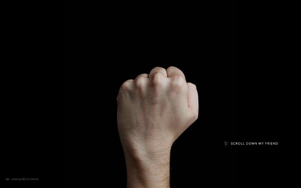
Sendamessage.to is a unique online tool that invites people to send personalized messages to their friends or loved ones.
There’s an oversized hand displayed in the middle of the homepage. Once you click on the arrow that says, “Scroll down my friend,” you get all sorts of different messages and various hand gestures.
3. Simon Foster
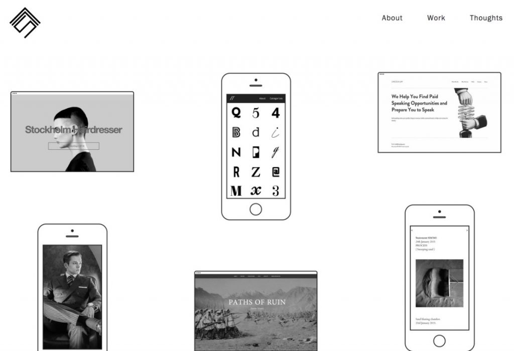
This minimalist website design is from the web designer himself, Simon Foster. He knows how simplicity can win over customers; hence, his minimalistic approach.
On the homepage, you will see the designer’s different projects. Plus, the menu options at the top are limited to three — apt for browsers who want fast navigation.
4. Johann Lucchini
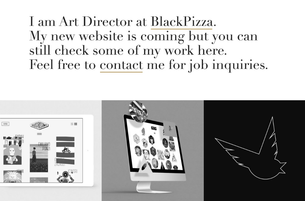
Johann Lucchini is an Art Director who helps businesses turn their dreams into reality. He provides services in the web developing space.
On his homepage, he claims his new website is in the works. However, what makes this minimalist is the way he displayed all of his previous works in black, grey, and white.
5. Femme Fatale
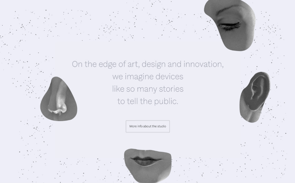
This minimalist web design has more of a fashion-forward approach to it. If you scroll down, you’ll see patches of a woman’s basic senses.
In the middle of it is the text that briefly explains the brand’s vision.
[in_content_ads gallery="websites" logo="off" title="You don’t have time to become a self-taught website designer" subtitle="Get a website that generates the revenue you’re looking for and encourages repeat customers." btntext="Let’s begin" btnlink="https://penji.co/pricing/?affiliate=J2O5AB8RAR3386837"]6. Rotate
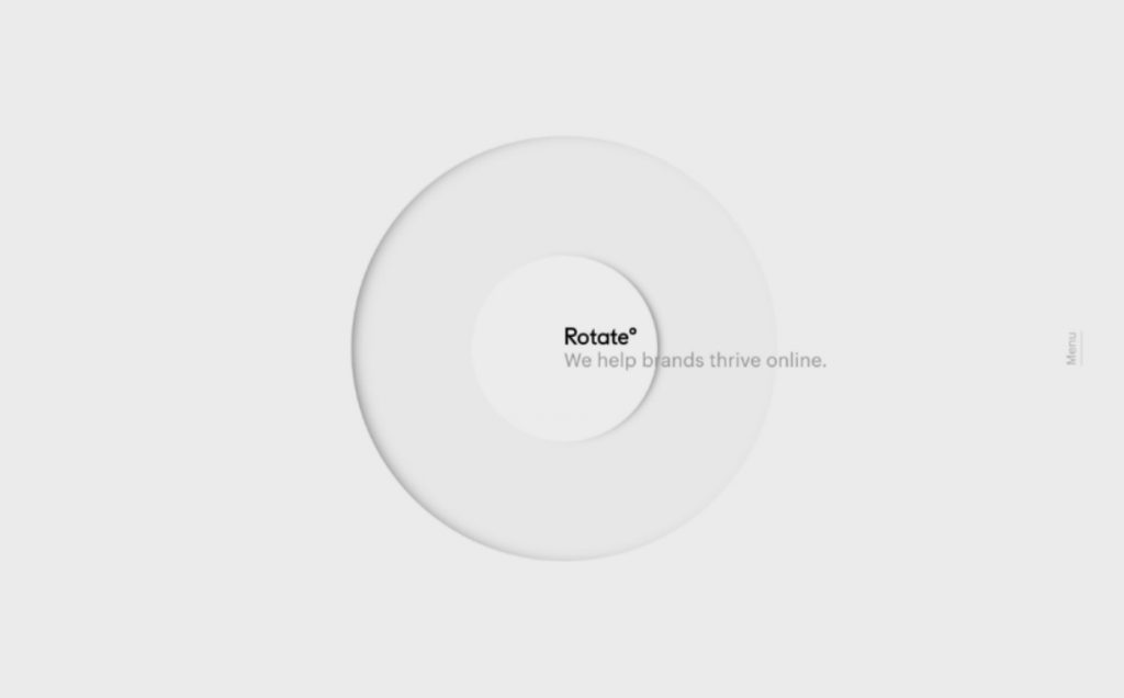
Rotate specializes in eCommerce marketing, development, and design in the luxury lifestyle space. Their homepage dons a beautiful dirty white background with two circles in the middle.
On the right side of the circle are the brand name and a brief text underneath. Beside it, you’ll find the “Menu” button. Once you click it, the plain background transforms into a black background with a colored scenic picture.
7. GSM London

Data visualization is not uncommon nowadays. Consumers would see a brand as credible with concrete data and statistics. And being an importer and exporter of oil, this is how GSM London captures consumers worldwide.
8. Tapmates
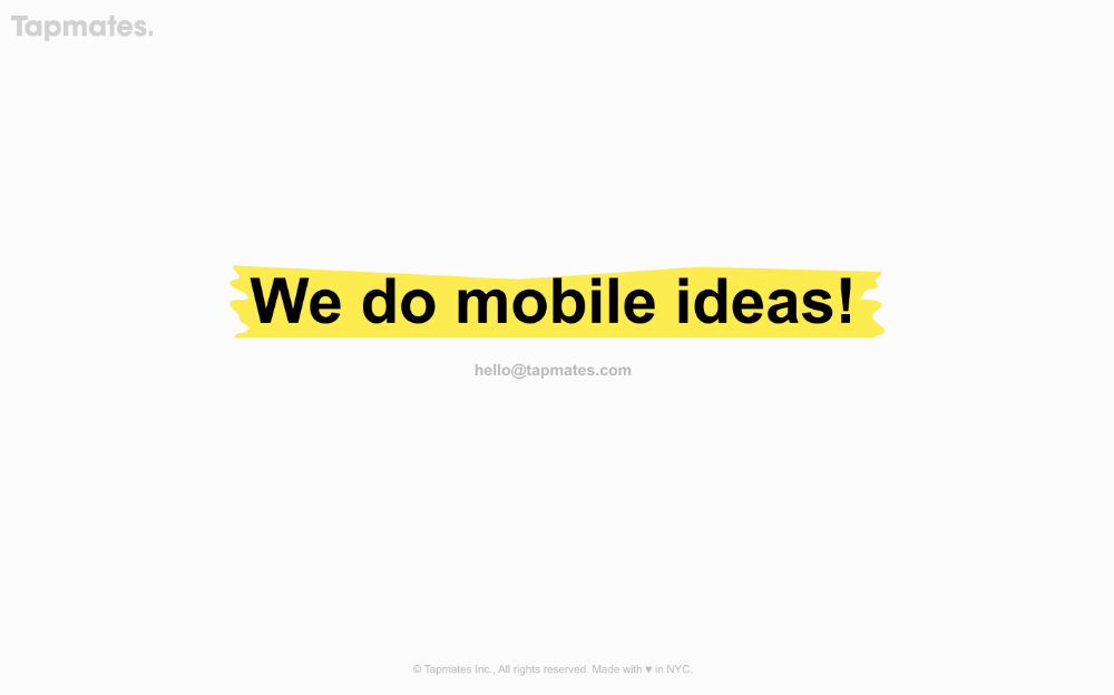
I must say, nothing is as minimalistic as Tapmates’ homepage. It’s straightforward and very pleasing to the eyes with no visuals but a short text that says, “We do mobile ideas!”
For their target market, this is enough to grab their attention, especially when dealt with the development of applications, icons, UX, UI, visuals, and more.
9. Mikiya Kobayashi
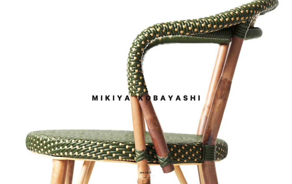
What better way to showcase your craft than boasting an oversized chair on your homepage? Mikiya Kobayashi knows how details make furniture pieces stand out.
His website has simple elements that show his artistry and adeptness in furniture designing.
10. Symbolset
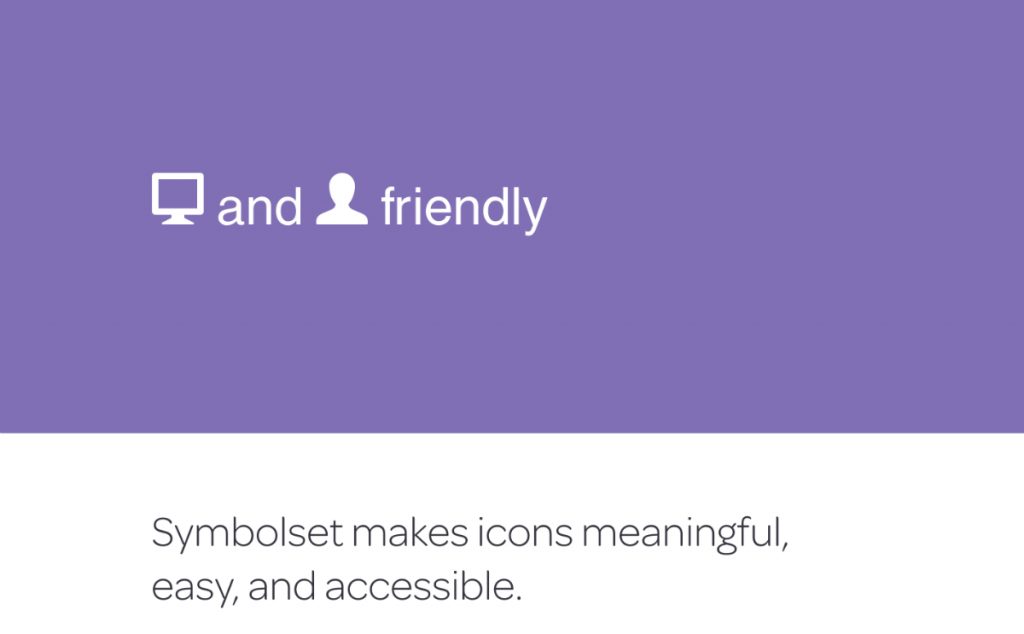
Symbolset has a specialty in creating icons that are “meaningful, easy, and accessible.”
Their website has interactivity written all over it. There’s an instruction for users to type a couple of words. Once you type the given words, they instantly turn into icons.
Lastly, there is a zoom control where you can manipulate the text and icon size. Overall, this minimalist website wins in terms of interactive features.
11. Perficient Digital Labs
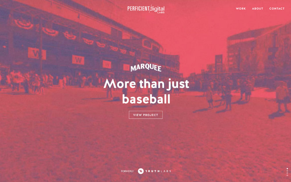
When it comes to usability and design, Perficient Digital Labs is a household name in the industry. They offer services such as user research, visual design, information architecture, data visualization, web applications, digital installations, and more.
And their simple website design has all the makings of a vintage approach with a modern flair. The image is covered in bright red. When you scroll up, it changes into different images, colors, and texts.
12. LLI Design
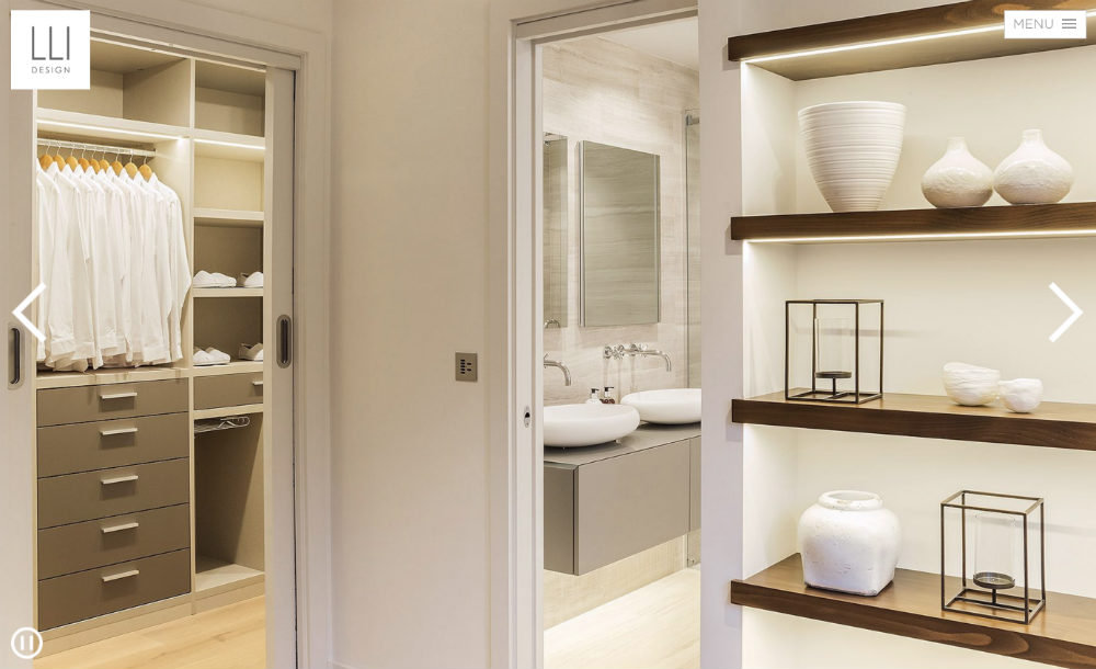
A designing service for home interiors, LLI Design has a clean-cut website that spells class and freshness.
The crispness of the design is evident in the high-quality images of various interior designs. Overall, the website is akin to their branding.
13. Red Antler
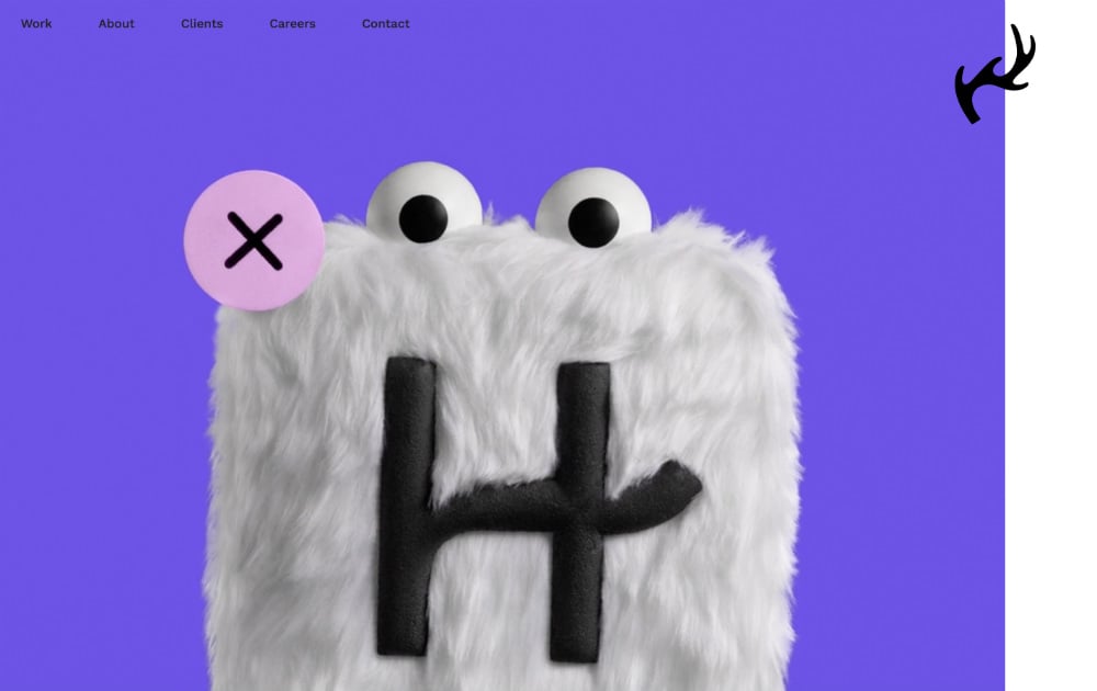
Red Antler banks on GIFs and clips and vibrant colors to entice entrepreneurs with marketing, development, and visual needs.
Even though it has all the different elements, their logo aptly sits on the upper right-hand corner.
14. We Ain’t Plastic
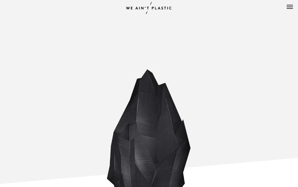
We Ain’t Plastic is a company that provides information architecture, user flows, wireframes, customized prototypes, and more.
The company believes in innovation, design, and collaboration. Likewise, the website boasts a modern feel that’s reflective of their branding.
15. Never Bland
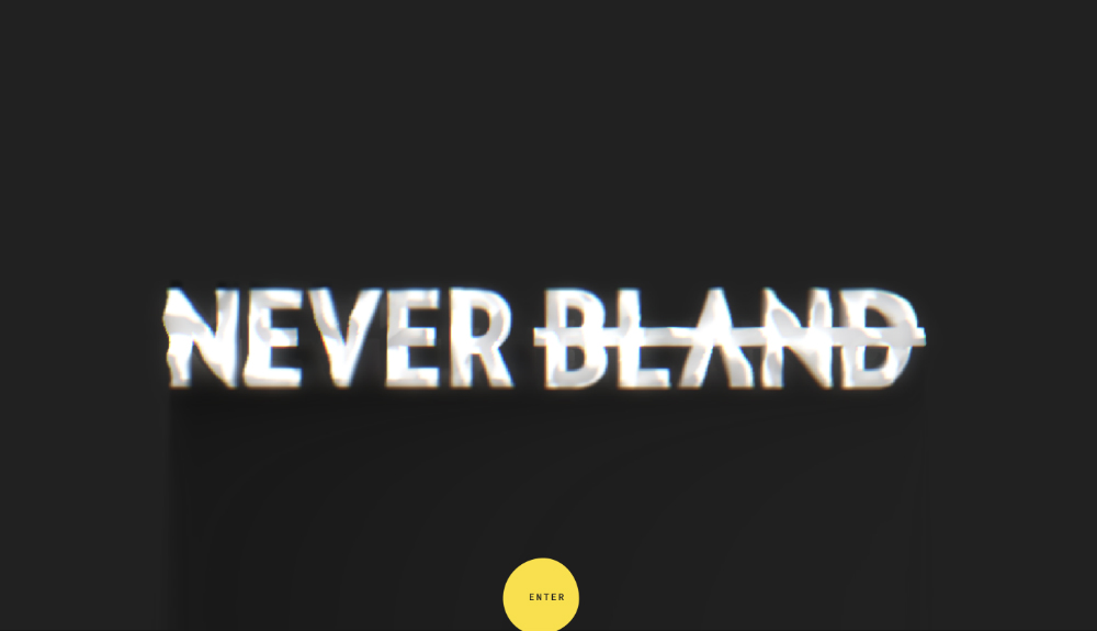
Never Bland is another organization of developers, designers, and forward-thinkers that have an appetite for new concepts.
Additionally, this hunger for new ideas resonated in their modern and interactive minimalist web design. It’s in black and white. However, a bright yellow blob, which sticks out amidst the dark background, follows the cursor around.
16. HalloBasis
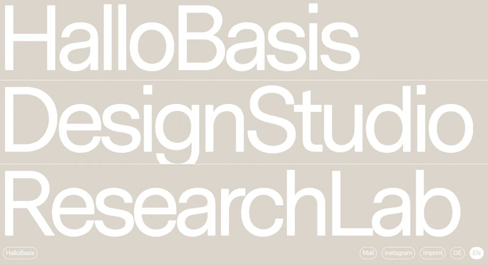
HalloBasis serves as an online portfolio site for the Dusseldorf design studio. It features a unique and minimalistic design that makes an impactful statement with a few elements. Its design features an oversized font aesthetic that makes it look like you maxed out your browser’s zoom feature.
One of the exciting design features for HalloBasis is its interactive “enter” page that serves as a welcome page. The background has an animated “people pattern” that looks pleasing to the eyes. It’s one of the cleanest web design inspirations that will urge you to redesign your website.
17. JazzFM
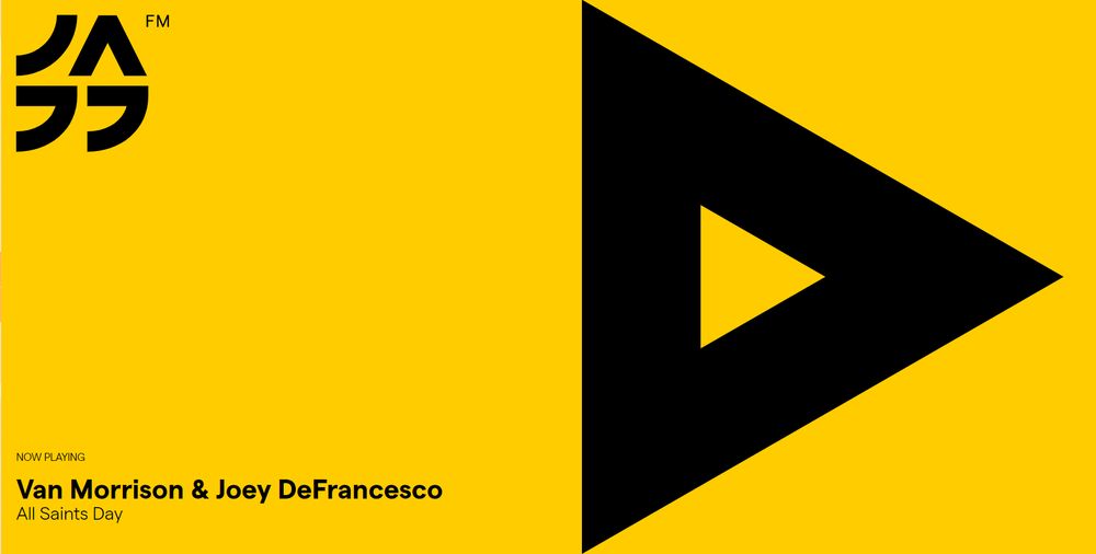
JazzFM Romania’s website design features quirky illustrations and a vibrant color scheme. It’s a Bucharest-based online radio station that showcases a minimalistic design and lets its music speak for itself.
The most exciting feature of JazzFM is the giant triangular button that fills almost half of the browser. Although the play button looks like part of the design, it’s an interactive and clickable function. As you click the button, you’ll see a giant box as the stop button. It will also display a “Now Playing” track on the bottom left corner of the screen.
18. Uber Sign Language
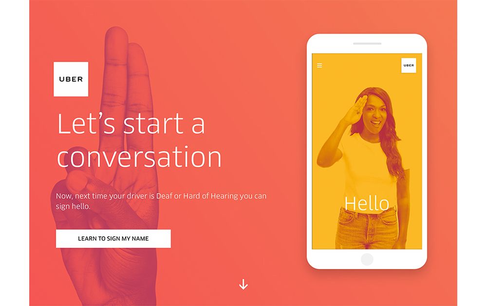
Fully integrating accessibility to its system, Uber created a website to help users learn primary sign languages. It provides users common phrases to help them interact with drivers that have a hard time hearing. The web design allows the content to speak for itself. It’s one of the great examples of minimalistic design that proves you don’t have to fill your website with text-based content.
19. Tinker
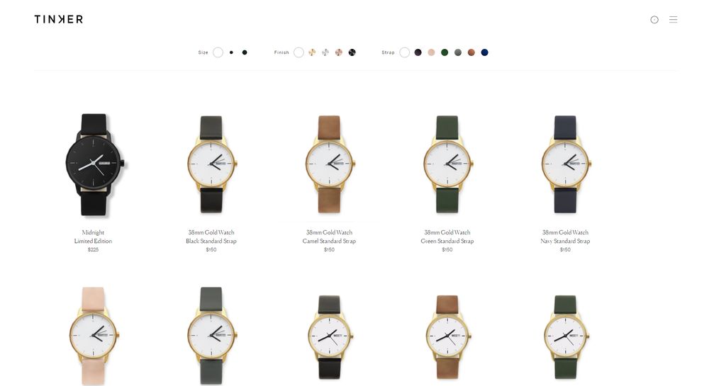
Tinker is a watch brand that has a simple concept. It’s a brand that lets the customer customize their watch by choosing:
- Face size
- Color
- Strap
- Metal
The web design has no additional design elements that distract the customer’s attention. It simply provides a clear and clean user interface that’s in line with the brand’s simplicity.
20. Leen Heyne
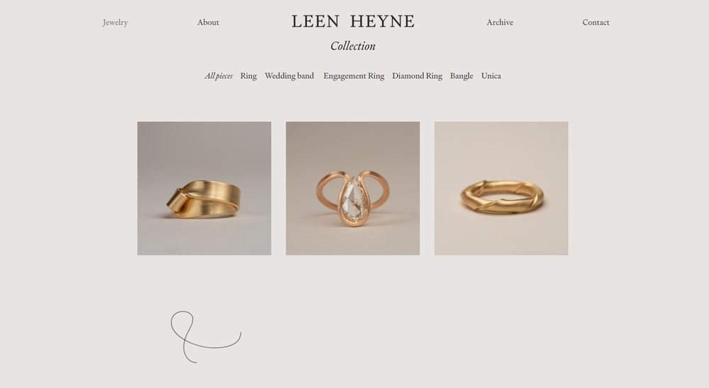
Leen Heyne’s logo, company name, and monochromatic background are the only design elements on its homepage. This web design approach lets the jewelry shine on its own, avoiding unnecessary elements. Its surrounding expanse widely takes advantage of whitespace, which allows the user’s attention to be directed at the product naturally.
21. Nua Bikes
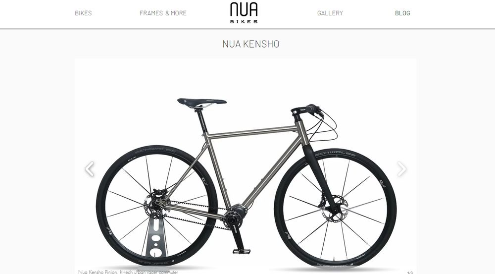
At first glance, Nua Bikes’ website looks minimalistic. However, it features a lot of elements on the screen. The overall “clean” look is all thanks to how the designer maximizes the use of whitespace. Its condensed text is not heavy on the eyes, along with other elements that frame the product. This approach makes the product more prominent to the user’s eyes.
Plus, if you want to start a blog and want a minimalist blog design, theirs is one you can consider as inspiration.
22. Maaemo
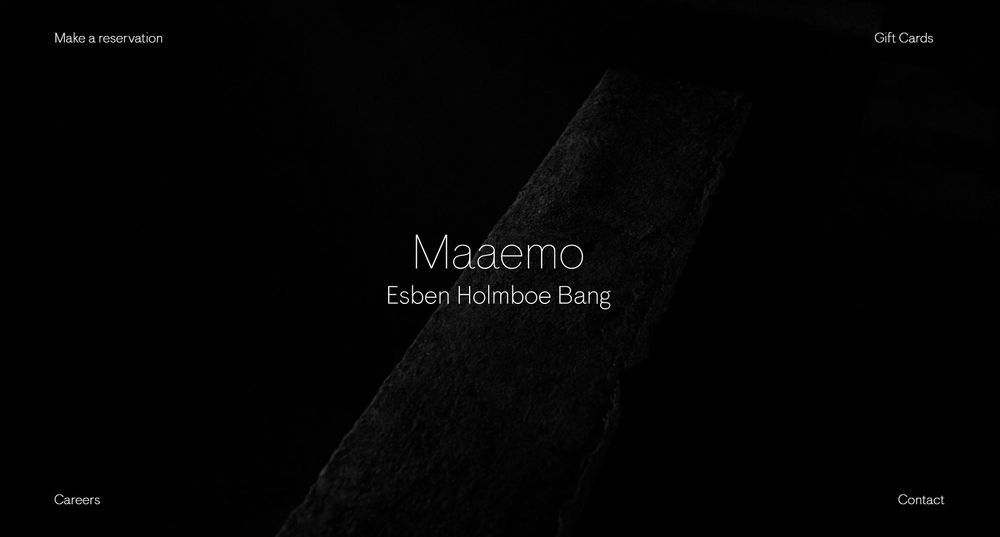
Maaemo is a Norwegian restaurant that received a triple Michelin star. It has a minimalistic and almost dramatic effect that highlights the restaurant name. The relevant links are strategically placed on each corner of the front page, allowing easy navigation for users.
23. Ava
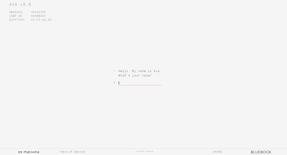
Ava has a clean black and white scheme that focuses on its interactive chat feature. It serves as a promotional website for Ex Machina, a sci-fi thriller film. The platform lets you converse with the film’s AI robot named Ava.
Get Your Minimalist Website Design from Penji
While most people think that creating a minimalist website design is easy, that’s far from the truth. In fact, it is more challenging to come up with a clean design that can speak volumes. Thus, you have to work with professionals such as the Penji team. This way, your website will still be effective regardless if we are to use limited design elements.
Like you, we want our services to be straightforward and that is why we established a quick 3-step process for our clients. Let’s share these with you.
Request for a Website Design
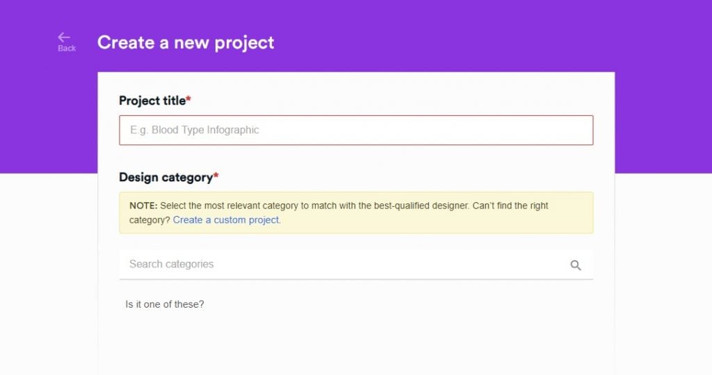
From there, you can go to our app. This app is where we course through everything, and that includes getting your design request.
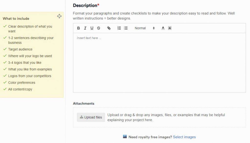
From the dashboard look for the New Project. Click it and you will be directed to a separate page. This page will require you to indicate all the design details. Don’t worry because you will be guided. There’s a checklist of what exactly you need to provide. That way, our designers can easily work on your project upon receiving your message.
Ask for Revisions
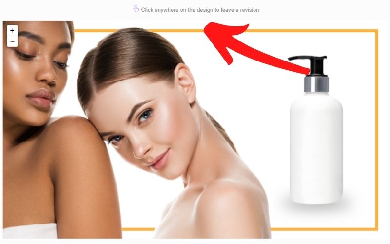
You will receive the initial design within 24 – 48 hours so we suggest that you check your app regularly. We value your feedback and we want our revisions to be completed the fastest possible time. View your website design, point to parts where you think changes have to be made, type the new instructions and click send.
Publish Your Website
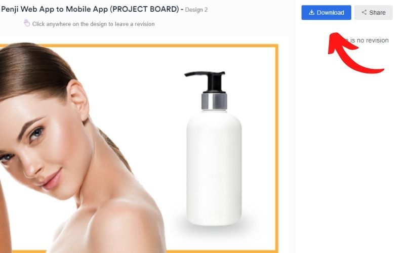
Once you are satisfied, you can already use the design for your new website. Start getting real traction and conversion. It’s that easy!
Wrap Up
Thinking of what minimalist components to put into your web design is challenging, let alone creating it from scratch. Since your business website is the best representation of your company, it’s recommended that you hire web developers and graphic designers to do the job for you.
Penji, an unlimited graphic design service, can help you with your visual needs. Our team of professional graphic designers will work with your hand in hand to reach design perfection.
For a flat monthly rate, you can have unlimited graphic designs and revisions with a 48-hour turnaround. Get in touch with our team and get to know more about our services.
About the author
Table of Contents
- 1. Evoulve
- 2. Sendamessage.to
- 3. Simon Foster
- 4. Johann Lucchini
- 5. Femme Fatale
- 6. Rotate
- 7. GSM London
- 8. Tapmates
- 9. Mikiya Kobayashi
- 10. Symbolset
- 11. Perficient Digital Labs
- 12. LLI Design
- 13. Red Antler
- 14. We Ain’t Plastic
- 15. Never Bland
- 16. HalloBasis
- 17. JazzFM
- 18. Uber Sign Language
- 19. Tinker
- 20. Leen Heyne
- 21. Nua Bikes
- 22. Maaemo
- 23. Ava
- Get Your Minimalist Website Design from Penji
- Wrap Up


