Creating a good logo is essential for every business owner. Why? Because it makes a memorable first impression and builds a strong brand identity. In creating a logo, the simpler, the better. Here are some examples that will guide you in choosing suitable layouts, fonts, and colors for letter M logo designs that differentiate you from competitors. Scroll down to see all the logos made by professional designers at Penji.
1. M&B Homes
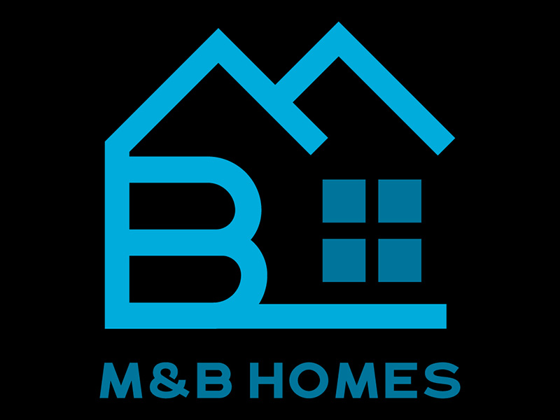
M&B Homes logo is a perfect example of a design that represents the services that a company provides. The letter M logo on top illustrates the roof, while the letter B on the left side stands for the levels or floors of the house being shown in the design. Plus, the four square shapes look like windows. Putting the elements together demonstrates the services and industry of M&B Homes.
Aside from that, using two colors, blue and black, makes the logo simple yet impressive.
2. Malcolm Carr Insurance Adviser
Essentially, an insurance adviser offers financial advice to clients on investing, retirement planning, and protecting their wealth against risks. With the integration of abstract design and texts, Malcolm Carr’s logo tells people about their credibility as licensed insurance advisers.
The letter M logo is designed as a bar graph which can also mean growth or an increase in assets. Likewise, the integration of the text “A member of Wealthpoint Network” adds more credibility to the business.
3. Marianist Excel Program
The following example is also a combination type of logo. The letter M logo represents the Marianist organization, otherwise known as the Society of Mary. Marianist is an international Roman Catholic religious association in the United States. As shown in the logo, the Excel text is an acronym that stands for Excellence in Character, Education, and Leadership. This could mean the logo presents the program’s core values.
4. Maritime Logistics
This is a logo for a sea freight shipping company. The logo features the yellow letter “M” with rays design inside and a boat. Then, below the icons reads the Maritime Logistics in carefully-chosen typefaces.
Meanwhile, the white background in this logo is another critical element that makes the overall design clean and simple.
5. Masterpolitan Magazine

Masterpolitan Magazine logo is highlighted in the pastel blue background. The letter M logo shows a magazine spread clearly showing the main business of the Masterpolitan brand. This dainty logo design creates a lasting first impression on new and existing customers.
6. Metaverse Institute for Social Good
In this example, the letter M logo is shown as two overlapping upward arrows, which could indicate the promising future of the metaverse. Recently, the metaverse has become a new norm in social networking and the virtual world.
Similar to the examples in our list, the white logo that stands out on a solid black background leaves a solid first impression about the brand.
7. Microevolve Tech
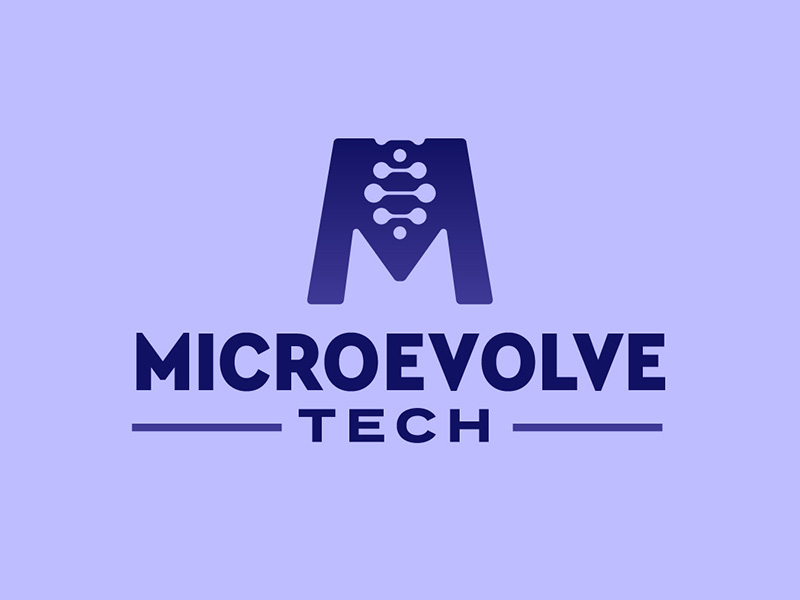
This example incorporates illustrations depicting genes and DNA in the letter M logo. By merely looking at the design, the audience would likely identify the industry to which Microevolve Tech belongs. The intricate design clearly shows that aligning the strategy with the type of product or services provided in creating a logo is very important.
8. Misc e-Shopping
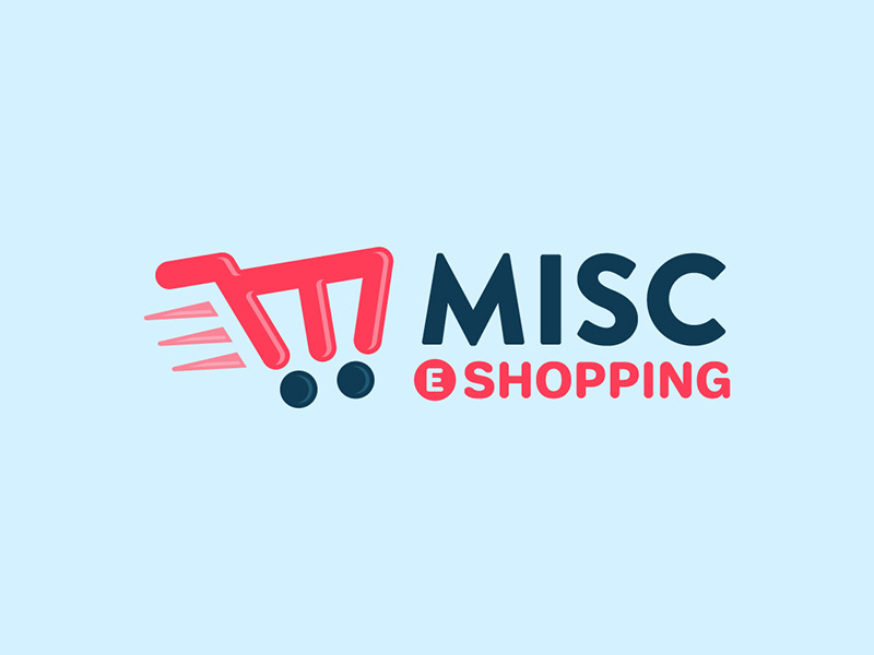
Misc e-shopping design is one of the most creative representations of the letter M logo – like a shopping cart. At a glance, people will already have an idea about the variety of products and services offered by Misc e-shopping. The design is unique, creative, and flexible. It will work well in business cards, brochures, t-shirt designs, and other marketing materials.
9. Mitch Alverson
If you want a logo that has strength and balance, this sample design is a perfect fit. The icon, color, and typography blend well together. That said, this logo reflects the personality of the owner.
10. Multi Millionaire Coaching
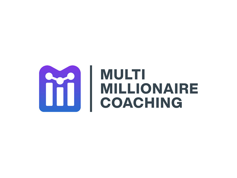
If you look closely at the logo above, you will see two letter M’s – the shadow or outline and the icons inside. Straightforward and innovative! The inner icon drawn as a bar graph represents growth or progress. Because, as a financial adviser or coach, helping their client increase their wealth, investment, and income is the primary objective of Multi Millionaire Coaching.
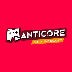
11. Manticore Games and Gadgets

This m logo with a solid red background is perfect for a games and gadgets shop. Its unique logo features a game controller, while lines accentuate the other letters in the brand name. Manticore’s logo design is an excellent example of an impressive logo for businesses related to gaming technology.
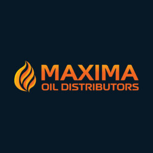
12. Maxima Oil Distributors

Creating a logo that instantly tells the nature of the business is one of the qualities of a good logo. For example, Maxima Oil Distributors has a fire icon that symbolizes the product or service offered by the company. In addition to the logo, the font color is also related to the type of business.
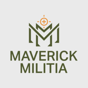
13. Maverick Militia
The double letter M as the logo mark is complemented with an army green font color. This logo design is an excellent inspiration for entrepreneurs looking for a straightforward yet memorable logo.
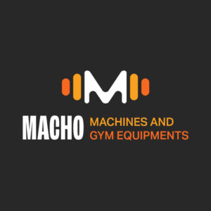
14. Macho Machines and Gym Equipment

You must have an attractive logo design to attract fitness buffs and gym operators to your business. Our next m logo features a dumbbell vector with a refreshing color combination. Aside from that, the variation in font styles and sizes makes the design more exciting.
15. MainMovers Courier and Deliveries
In this example, our designer at Penji creatively played with the m logo. Placing the logos and lettering against a white background makes it more versatile. It’s because you can easily adjust the design depending on the marketing materials you create.
16. Monday’s Pub and Resto
This chill and playful design will inspire you to create a logo for your bar and restaurant business. Monday’s Pub and Resto has an iconic logo with a pair of spoons and a fork. Likewise, the font style and colors match the logo, making the overall design calm and friendly.
17. Micah Paper Publishing
You can never go wrong with a bright red logo with gray letterings that stand out on a plain background. The letter m and a roof icon are incorporated into one memorable logo. It symbolizes the publishing house business of Micah Paper Publishing.
18. Mactan Sword and Blades

The silver logo shows an intersecting V and M, with the letter V emphasizing the blades. The texts are written in a slightly upward manner, making the design more visually pleasing to the target audience.
19. Manatee Cements
For an abstract-looking logo, here’s a creative m logo for you. Manatee Cements is an excellent example of a clean logo design because of the minimalist color and fonts. Bookmark this sample if you’re considering a straightforward logo layout.
20. Mucho Mexico Tacos

Looking closely at the tacos illustration, you can see a curly letter m logo. Integrating a product image is a perfect idea when creating your brand identity. The font style may seem ordinary, but it is an ideal element of the overall design.
21. Manifest Coaching Clinic

A coaching or mentoring firm must be credible and trustworthy to become profitable. This quality is shown through the simple letter m and the check mark icon. A check mark indicates a positive response and a sign of approval. Likewise, it also builds customer trust.
22. Metropolitan Medical Laboratories

Our following example features a laboratory apparatus, specifically, a volumetric flask with the letter M embedded in it. The white dots represent body fluids extracted during laboratory examination, one of the processes rendered by a medical laboratory. Overall, the design, including the color palette, signifies the medical-related business.
23. Madagascar Airlines

The Madagascar Airlines logo features a letter m represented by three lines in an oblique position. Its dark blue background complemented the white and deep pink logo and lettering, making it more visible when painted in a white aircraft.
24. Middleman Manpower Services
This logo in blue color tone has a triple m logo illustrated using solid diagonal lines. You can also see a profile of a man looking forward to it. It represents the nature of business of Middleman Manpower Services as an agency serving individuals looking for decent jobs.
25. Mighty Maiden Women Group

This organization of empowered women features a logo with significant elements. It includes a profile of two women and heart icons. Likewise, the heart icon is illustrated in such a way that it creates the m logo. The designer chose a visually-appealing color and font style, too.
26. Monarch Jewelries
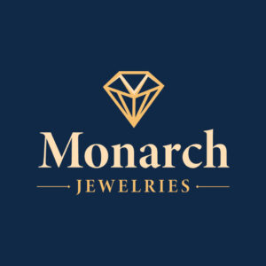
Monarch Jewelries’ diamond logo has an unconventional letter m on top. Its golden color perfectly represents the products and services offered by the brand. The size and position of the lettering are accurate, making it a flexible logo design.
27. ModernMan Tailor
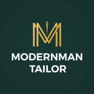
If you are a custom tailor shop owner, this design is for you! ModernMan features a double m letter and a needle in between them. The solid olive green background makes the logo stand out from the rest.
28. Mallards Community Bank

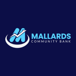
Mallards Community Bank integrates an upward two-dimensional line graph and a circular shape under the m logo. It demonstrates the bank’s mission to provide inclusive financial freedom and growth within the community. Be motivated with this inspiring logo!
29. Mandrill Muscle Works
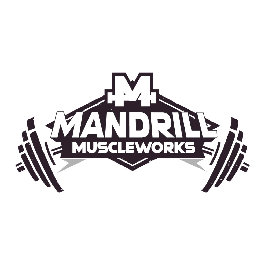
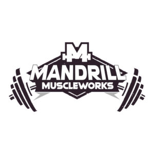
Mandrill Muscle Works’ black and white logo instantly tells the audience about the business. Its elements are strategically illustrated, making the design more masculine and powerful.
30. Midas Mining Corp
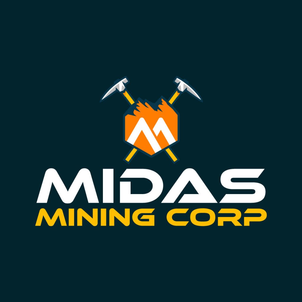
The letter m written on an orange sign board stands against the two axes. The relevant logo will truly inspire entrepreneurs involved in the mining and construction business as it shows a well-thought-out design.
How to Sign-Up for Penji for Logo Designs
Did you find the awesome letter M logo from our list? If yes, don’t hesitate to design your company logo. At Penji, signing up for logo designs can be done in four simple steps. To work with a talented graphic professional to create the perfect letter designs, follow these steps:
1. Create a design project
You can start by answering a simple form regarding your design needs. You’ll be asked to provide a project title, description, and files that the designer may use as reference. You can request multiple projects, ranging from ad copy, marketing materials, website designs, and of course, logos.
2. Connect with your designer
An account manager will connect you with the best designer for the project. This is where your conversation with them begins.
3. Review the draft
It usually takes one to two days for the designers to complete a project. If you need modifications in your logo or any project, you can submit your revisions. The best part of this is that you can request for free unlimited revisions. Once happy with the design, you can now leave your feedback.
4. Download and Repeat
If you’re satisfied with the revisions and happy with the output, you can now download your high-resolution images including source files. And if there are more projects in your queue, we will start working on them – on the same day.
After reading these simple steps, you are now ready to do a project with us. Head to the Penji website to learn more about our graphic design services.
About the author

Rowena Zaballa
With a background as a former government employee specializing in urban planning, Rowena transitioned into the world of blogging and SEO content writing. As a passionate storyteller, she uses her expertise to craft engaging and informative content for various audiences.
Table of Contents
- 1. M&B Homes
- 2. Malcolm Carr Insurance Adviser
- 3. Marianist Excel Program
- 4. Maritime Logistics
- 5. Masterpolitan Magazine
- 6. Metaverse Institute for Social Good
- 7. Microevolve Tech
- 8. Misc e-Shopping
- 9. Mitch Alverson
- 10. Multi Millionaire Coaching
- 11. Manticore Games and Gadgets
- 12. Maxima Oil Distributors
- 13. Maverick Militia
- 14. Macho Machines and Gym Equipment
- 15. MainMovers Courier and Deliveries
- 16. Monday’s Pub and Resto
- 17. Micah Paper Publishing
- 18. Mactan Sword and Blades
- 19. Manatee Cements
- 20. Mucho Mexico Tacos
- 21. Manifest Coaching Clinic
- 22. Metropolitan Medical Laboratories
- 23. Madagascar Airlines
- 24. Middleman Manpower Services
- 25. Mighty Maiden Women Group
- 26. Monarch Jewelries
- 27. ModernMan Tailor
- 28. Mallards Community Bank
- 29. Mandrill Muscle Works
- 30. Midas Mining Corp
- How to Sign-Up for Penji for Logo Designs
- 1. Create a design project
- 2. Connect with your designer
- 3. Review the draft
- 4. Download and Repeat

