Starting a law firm or practice can be a tedious process, and you don’t want to think about the added stress of designing your own logo and other assets to attract clients. If you need inspiration, you’ve come to the right place! Our very own Penji designers are guilty of creating the arresting law firm logos you see below. In addition, check out what else Penji can do for your law practice!
1. The Lincoln Law Group
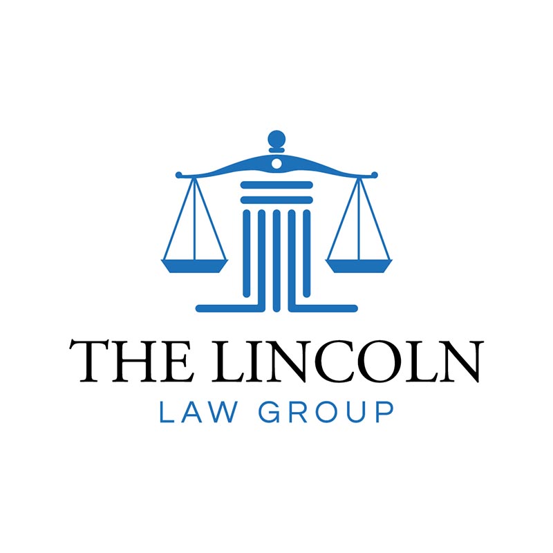
Blue is a color that is linked to peace, tranquility, harmony, security, orderliness, trust, and truth. These values align with many law firms’ goals and are the preferred shade in creating logo designs. To make it more appealing, the designer added a mirrored linear layout of the letter “L” at the base of the justice scale image.
2. Prestige Law Firm

Logos for small business ventures are extremely important. With that, Prestige Law Firm opted the sparkling crown on top of the scale as its unique identifying mark. The custom logo signifies prestige which is also the law firm’s name. Likewise, there’s a perfect balance between the logo elements and the dark blue background. This custom wordmark is truly exceptional and reflects the tone and personality of the brand.
3. Walker and Associates

For our third example, we are featuring a straightforward design. Both the image and the typography are simple but deliver a clear illustration of the brand’s image. The image on the left side shows an iconic profile of Lady Justice. It gives a solid message to the target audience about the lawyer’s goal to promote fairness in court.
4. Taylor and Baylor Family Law

A law firm logo does not always follow the blue-shade trend. The unusual shade of brown with complimentary text color works nicely here. The overall design suggests the firm’s credibility as a family law specialist.
5. Blanchard Legal Counsel

The logo incorporates the law firm’s initial “LBC” in the design. In terms of color, the minimalist brown palette is highly pleasing to the eye. Plus, the emblem could be used as a logo for other corporate branding assets such as business cards, letterheads, etc.
6. Metropolitan Law Group

Creating a law firm logo may feel complicated, but when done properly, it can be very rewarding for your brand. The logo elements in blue and orange stand out on a white background. The letter “M ” resembles a pillar. In short, it is the strong foundation of the law firm when it comes to handling and winning legal battles.
7. Monroe and Associates Law Firm

Since dark blue palettes are trendy among law firms, this one is a well-executed design. It creates a feeling of power, integrity, and professionalism. Meanwhile, the unique rendition of the law firm monogram makes this logo stand out from the competition.
8. Converge Law Firm
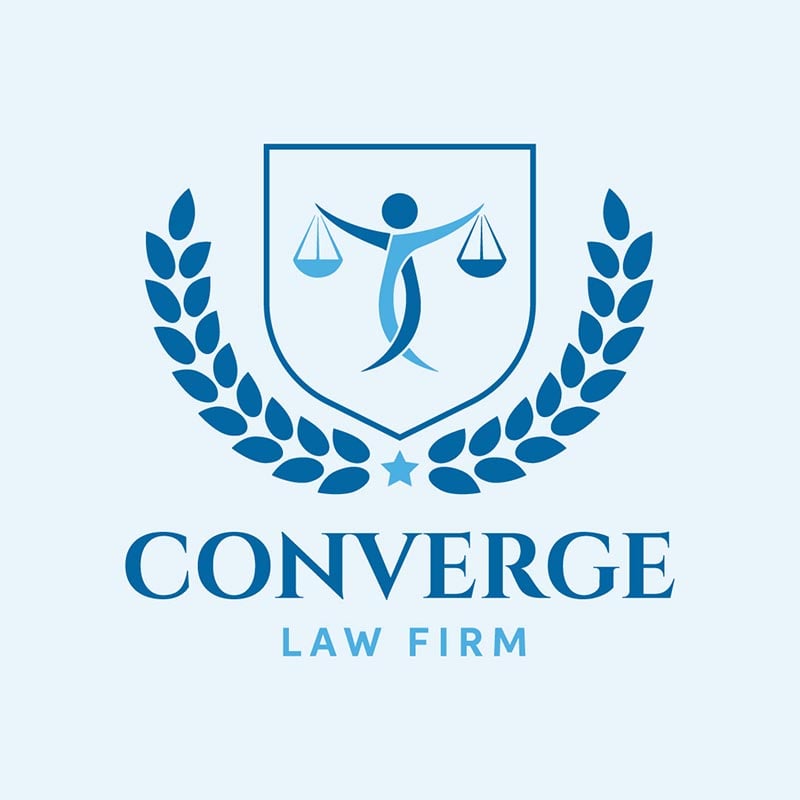
This design is the best among the rest. The highlight of the overall image is the law firm’s emblem or seal. Another plus factor here is sticking to one color in varying shades. These elegant colors are great for those who want a clean, simple, yet high-end design.
9. Richmond & Partners Consulting

A flexible logo that you want to see in almost every marketing material of the firm. These include signage, stationery, corporate uniforms, press kits, and websites. The creator integrated some geometric shapes into the design to make it more sophisticated. More importantly, the gold emblem complemented the white and blue hues.
10. Townsend & Co. Law

This law firm logo design is worth emulating. The logo and the text seem ordinary, but the overall look becomes eye-catching because of the unique background color. If you are tired of looking at the usual color palettes again and again, this one is a perfect design inspiration to include in your mood board.
How to Get a Good Law Firm Logo

A modern and distinct logo will enhance your law firm’s marketing strategies by making your brand high-impact and appealing. A consistent brand presentation assures a revenue increase of as much as 33%. And now that you’ve analyzed the logos and gotten some ideas, you can start working on your logo. Below are the popular methods and the best places for logo design:
1. Through DIY Design
If you have some graphic design skills, you might start creating a logo yourself. Unfortunately, this method is not recommended unless you’re a trained designer. It is because problems may arise when making a logo without proper skills. You might have concerns about unprofessional final output and incorrect final file format. Sometimes, a DIY design may look appealing but fails to connect with the target audience.
2. Purchasing a Logo from Stock Image Sites
Some good logos are available on stock image sites. However, they may not stand out from other symbols. It could be a good alternative if you can’t afford to hire a designer.
Depending on the copyright stipulated by the stock logo’s owner, you may be unable to edit or enhance the image or use it for commercial purposes. Still, there are a few sources where you can buy stock logos, such as Shutterstock, iStock photo, and LogoGround. Need more options? Here’s the updated list for finding open source images on the web.
It is best to note that stock logo sites are helpful for inspiration but usually don’t offer enough originality for professional use.
3. Hiring a Designer
If you have a budget, hiring a designer is your best choice for a law office logo. Designers have a thing for color, layout, and integration of the most crucial element for your brand. There are many places to work with law firm logo designers, including Penji. But don’t waste your time looking for designers who promise a mixed bag of various skills. Research their expertise and go from there.
Is the verdict in with these law firm logo designs? While you’re helping clients get justice, let’s help you with designs to attract more clients. And if you’re ready, you can subscribe here! Plus, you can save money by going to our Marketplace and requesting one-off designs!
About the author

Rowena Zaballa
With a background as a former government employee specializing in urban planning, Rowena transitioned into the world of blogging and SEO content writing. As a passionate storyteller, she uses her expertise to craft engaging and informative content for various audiences.
Table of Contents
- 1. The Lincoln Law Group
- 2. Prestige Law Firm
- 3. Walker and Associates
- 4. Taylor and Baylor Family Law
- 5. Blanchard Legal Counsel
- 6. Metropolitan Law Group
- 7. Monroe and Associates Law Firm
- 8. Converge Law Firm
- 9. Richmond & Partners Consulting
- 10. Townsend & Co. Law
- How to Get a Good Law Firm Logo
- 1. Through DIY Design
- 2. Purchasing a Logo from Stock Image Sites
- 3. Hiring a Designer

