There are over four million apps available for download on Google Play and the App Store. But Statista finds there are more Android apps than iOS ones. Aside from publishing costs, it raises the topic of app design as well. Does it boil down to preference or ease in design? And which is better, iOS app design or Android app design?
In this article, learn the differences between the iOS app design and Android app design. Plus, learn how you can use Penji to request app designs.
iOS app design vs. Android App Design: The Basics
Although both are the two most leading tech brands in the market today, their app designs differ. Despite such, both Apple and Google have their set of guidelines that app designers and developers should follow. Apple has the Human Interface Guidelines, while Google has Material Design. This will ensure that app designs are consistent on their respective operating systems. But how are iOS and Android app designs distinct?
For one, iOS app design works on a closed ecosystem. This means there are limitations for developers looking to create one from scratch. That’s because Apple enforces more restrictions for their clients’ benefit. With a closed ecosystem, this provides Apple users a more secure and stable app usage.
On the flip side, Android is the opposite. Their app design works on an open-source system. While developers may find this more convenient for modifications, this might jeopardize the users’ security. Sometimes, some network operators may block Android updates and whatnot.
Another essential thing to note before you start designing iOS or Android apps is the naming conventions. While both iOS and Android have similar UI elements, their naming conventions could confuse while working on each app.
One such example is the bar. In iOS, these are the bars available:
- Navigation bars
- Sidebars
- Search bars
- Status bars
- Tab bars
- Toolbars
On the other hand, Android only have these:
- Top app bar
- Bottom app bar
- Bottom navigation bar
Overall, these two varied app designs have their pros and cons. But one thing is for sure. Apps are money-making channels which can be in the form of subscriptions, in-app purchases, advertisements, and download fees.
iOS App Design vs. Android App Design: Does It Have to Be Different?
If you’re still in a pickle, whether you want to create an iOS app design or Android app design, this guide can help.
If you compare both tech magnates side by side, both are the topmost tech companies to date. Google Play offers over 2.56 million apps, while the Apple store trails not far behind with over 1.85 million apps.
It’s no surprise that both these companies have millions of users each. And when it comes to app creation and design, the difference shouldn’t be a primary concern.
To cut the story short, you don’t have to create an app with a “feel” that is either defined as iOS or Android. The most vital factor when creating an app is navigability. Whether the icons, buttons, tabs, or menu are similar to iOS or Android apps, your users should be able to navigate the app seamlessly. And to achieve this, consulting professional app designers like Penji is the only option. Check out how Penji’s design process works here.
But to help distinguish the stark differences between the two, browse through this quick guide.
iOS App Design vs. Android App Design: Controls
One of the most prominent differences of an iOS app design vs. an Android app design is in the controls. The ease of navigability relies on how the buttons are laid out. Here are a few:
Tap Target
A tap target pertains to any web page or app design element that users interact with. It refers to the screen that users tap on via a touchscreen feature.
For iOS screens, the minimum tap target size is 44 x 44 pt. As for Android apps, the minimum tap target size is 48 x 48 dp. Density independent pixel (dp) is used for Android apps, while point (pt) is used for iOS apps. However, both mean the same thing. It merely refers to “screen density.”
In layman’s term, it measures the screen’s definition. A tap target is also impacted by how the links and buttons are designed closely together.
Main Menu
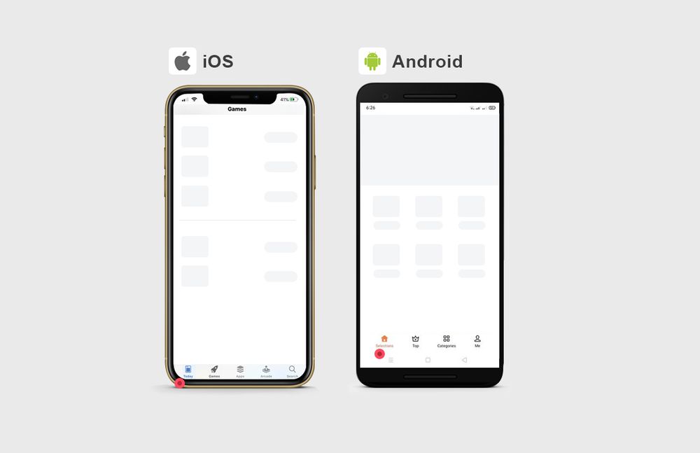
For iOS apps, you’ll notice that the main navigation menu is typically sprawled across the app’s bottom. Each is represented by an icon, which is also limited from two to five icons.
Android apps carry the main navigation menu throughout the screen. For instance, there is a hamburger menu, usually on the upper left corner. Plus, the search bar runs across the top right corner. Lastly, there is also a floating action button traditionally displayed on the app design’s lower right.
Secondary Menu
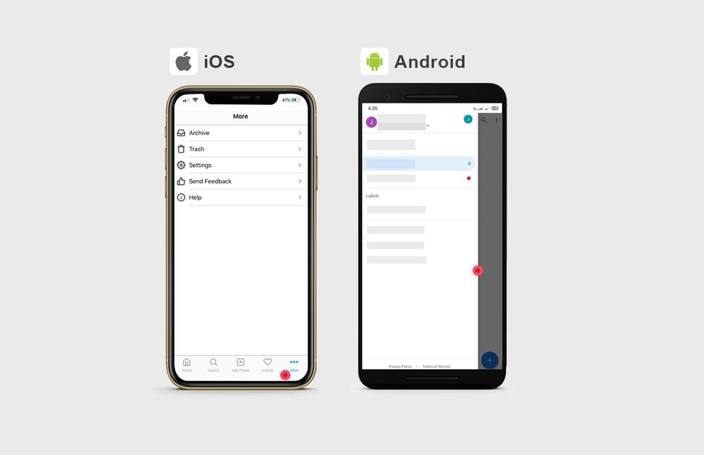
The secondary navigation destinations that can’t be accommodated on the main app page are placed in a hidden menu.
For iOS, they include a drop-down “More” tab that lists these options. Meanwhile, Android lists these options on a “hamburger” menu.
CTA Buttons
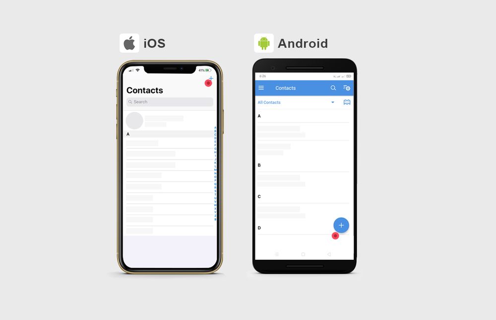
The main call to action in iOS app design is typically displayed on the upper right corner of the screen. On the other hand, Android usually displays its primary call to action on the lower right of the screen. This is called the “floating action” button.
Moreover, for other calls to action, iOS lays them out on a bottom menu. Android displays its other calls to action on a top menu.
Back Buttons
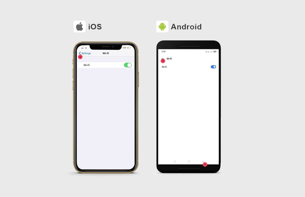
The back controls for both iOS app designs and Android app designs are quite similar. For iOS, the back button is on the upper-left with an arrow-like symbol and text indicating the title of the page.
For Android, the back button is anywhere on the upper-left as well. However, some Android phone screens have a permanent back button on the lower left.
Additionally, both iOS and Android apps do have another way of navigating back control. And that is to swipe right from the screen’s left edge.
Search Button
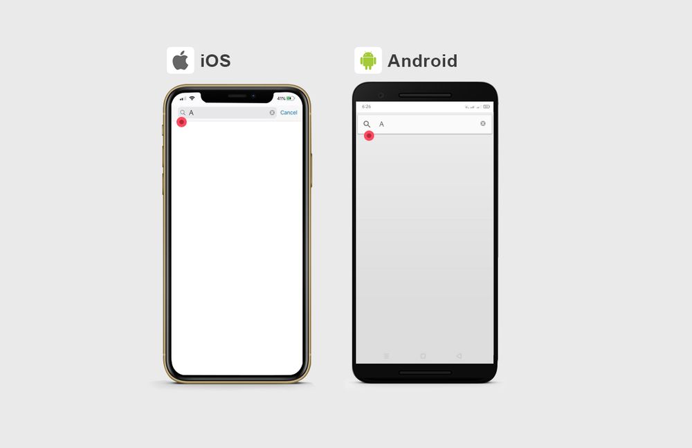
When you visit an app, and it requires you to search a particular thing right away, iOS and Android display a separate page with the search bar. However, if the search is one of the secondary actions on a page, the search icon for both apps can be found on the top.
The only time both iOS app design and Android app design differ is how you cancel your query. On the iOS search field, you can click on the “Cancel” command displayed on the right side of the field. For the Android search field, you can cancel your query and click on the arrow placed before the field.
Another similarity is when clearing your text on the field for both iOS and Android apps. You can click on the “X” icon on the field’s edge.
Selection View
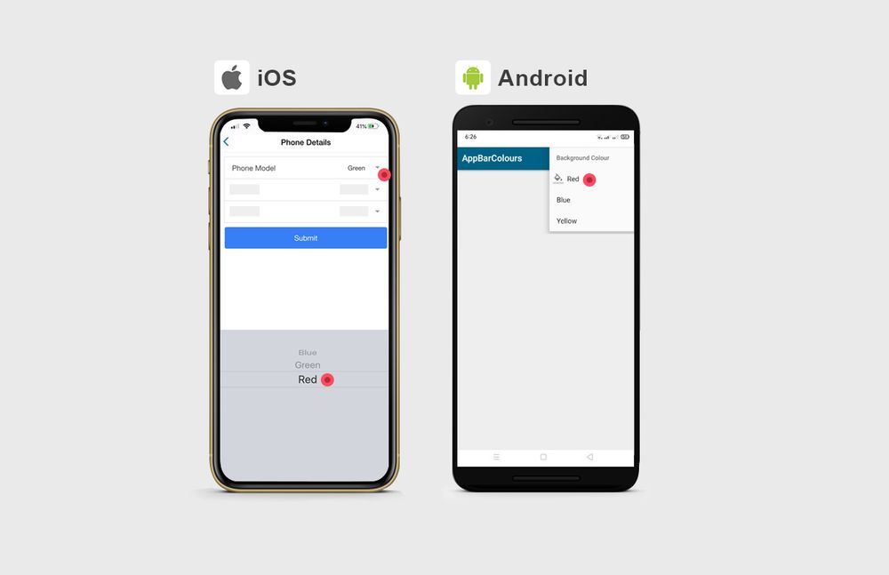
The control for selecting items on both iOS and Android apps is also very distinct. For iOS, clicking an option would show a “Picker” control where you can scroll through the choices. It also displays a checkmark on the right side for single-option lists.
For Android, a drop-down menu of the list of options appears after you click on the category. The single-option list also uses a radio button, which is displayed before the text.
Date Options
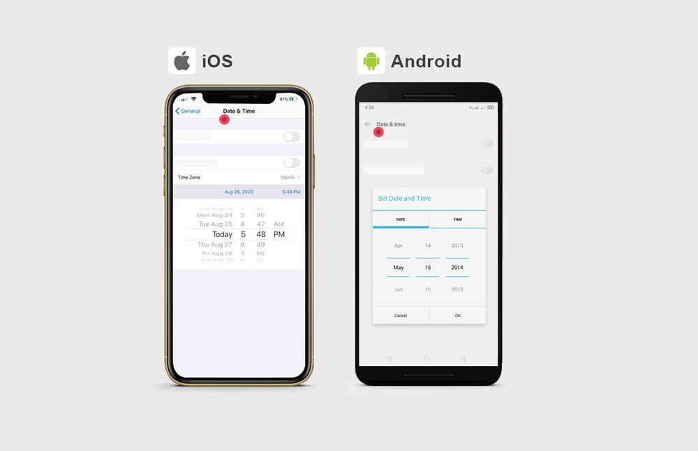
Selecting the dates on both iOS app design and Android app design is also different. Apple lets you choose from a spinner where you can scroll through the months, days, and years.
On the other hand, Android lets you do more customization when setting the date. You’ll get a separate view of the date options, which enables you to customize to show the year or not.
Undo Controls
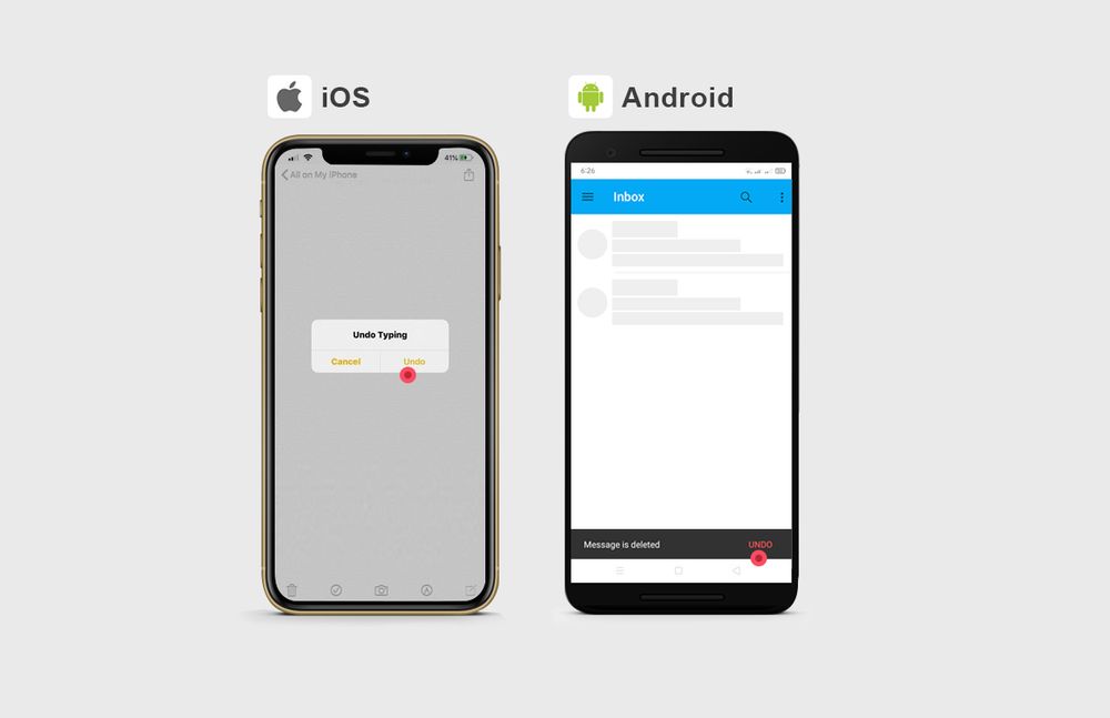
The most recent Apple mobile phones usually have the “shake to undo” feature. However, being an Apple user myself, I rarely use this feature. I find that being able to tap an undo button is more convenient and practical. With an iOS app design, you’ll get a pop-up that shows the main task with CANCEL and OK options.
As for Android apps, the undo control is through the form of a “snackbar” at the bottom. It appears after you perform an action and has an “Undo” command beside it.
Typography
Typography is also another crucial element of app designs. And selecting the right font that is relevant to your business is imperative. This is where Penji’s experts can help you. Watch the demo video of how Penji works here.
Both iOS and Android apps differ when it comes to default fonts.
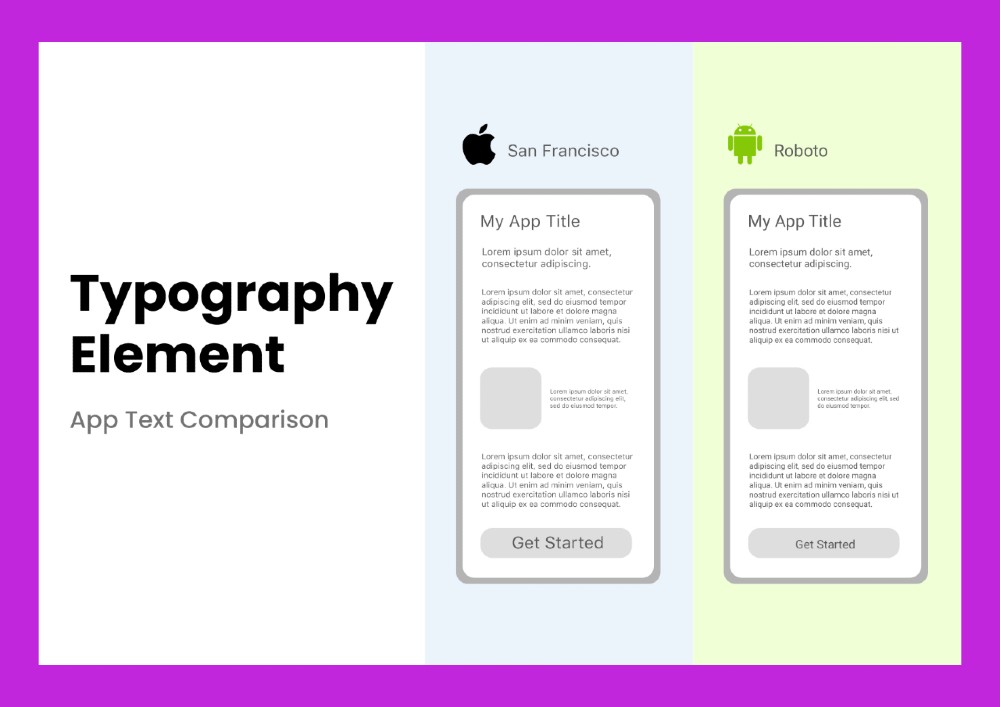
- iOS app design’s default font is San Francisco
- Android app design’s default font is Roboto
While iOS apps use “pt” to measure font size, Android apps use “sp,” which means scale-independent pixels. Here are the primary differences in sizing:
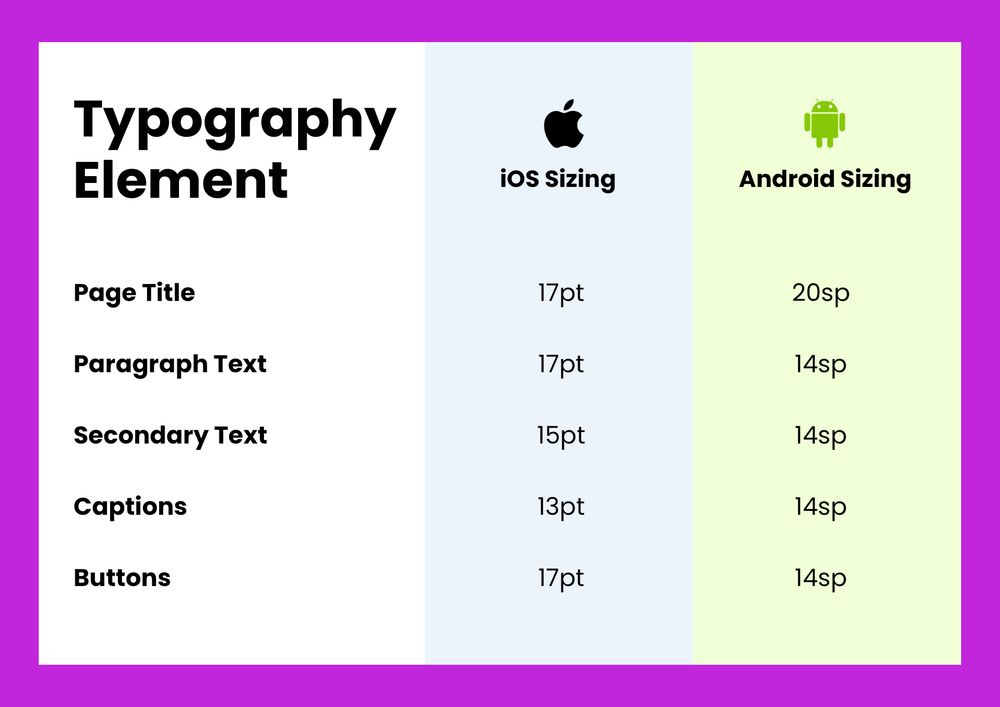
Overall, Apple uses bigger font sizes compared to Android.
Finding Your App Designer
You may now have an idea of how different the iOS and Android app designs are, but should you build apps on your own?
Apart from having an app developer on your team, you need a designer as well. Expert designers have the know-how and resources to create a functional and beautiful app for your brand and business. But where can you find a designer?
Freelance sites
One of the most sought after options are freelancers. For one, you can hire them on a per-project basis. You don’t have to worry about any long-term commitments.
Fortunately, sites like Upwork, Toptal, and Fiverr have freelancers that are up to the task. You can find freelancers starting at $10/hr. That would be a bargain on your end, but you want to find someone with a high rating and even a higher price for designing the app you want. And while freelancers seem like an attractive option, some may want to opt for a design agency that could guarantee quality even at a high cost.
Design agencies
Several brands and businesses trust design agencies for their process and capabilities. Since some may have a team of app designers and developers, it can be considered an all-in-one solution. Plus, you can expect them to know their stuff. After all, they can tap experts to guide them with development and design. Despite such, their steep pricing may cause businesses to look for alternatives.
Unlimited Design Services
If you want affordability, speed, and quality wrapped into one, unlimited design services can provide that for you. One of the reasons businesses (and even agencies) tap unlimited design services is it eliminates the hiring process. Since it follows a subscription-based model, a company can choose any plan. Plus, anyone can cancel anytime. So, it’s a win-win.
Apart from that, not only will unlimited design services offer app design, but they can provide marketing, branding, and advertising designs as well. That’s the case for Penji! All you need to do is subscribe to either the Team or Agency plan and submit your first request. Read more below on how you can get a compelling app design.
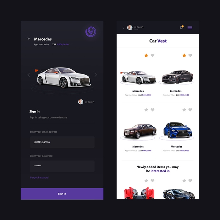
Penji App Design Samples
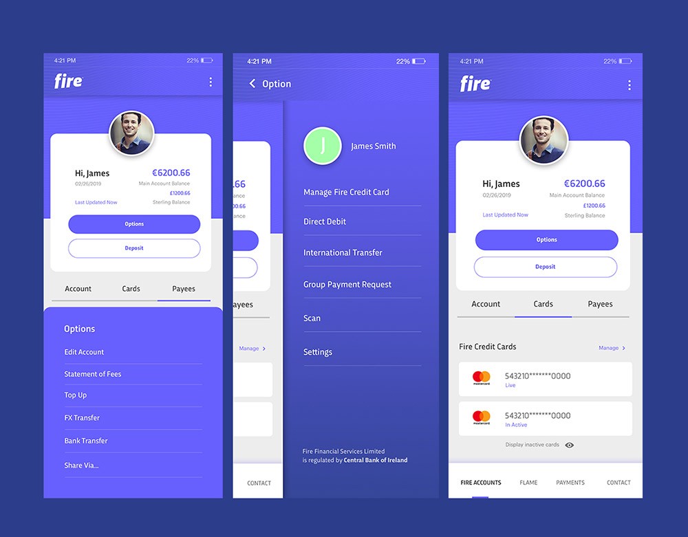
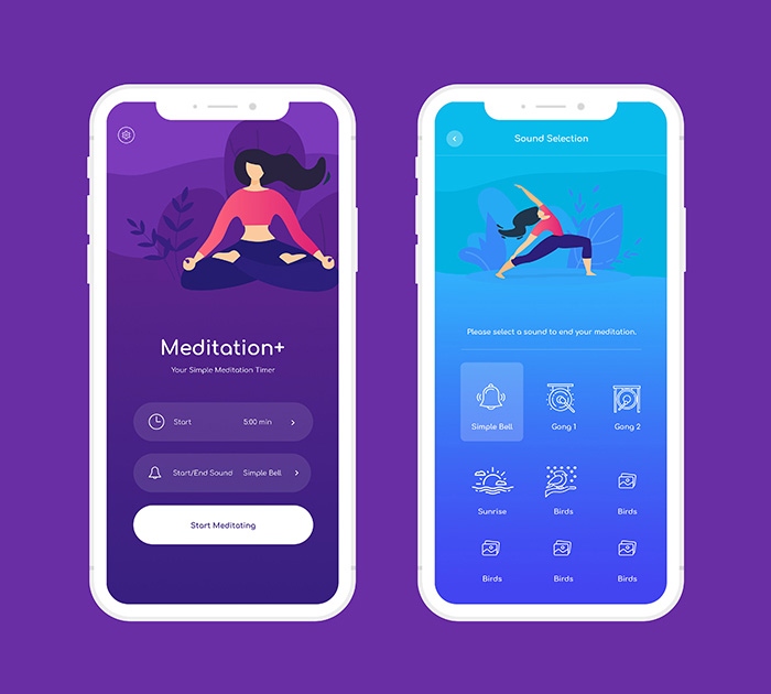
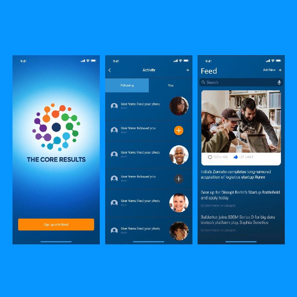
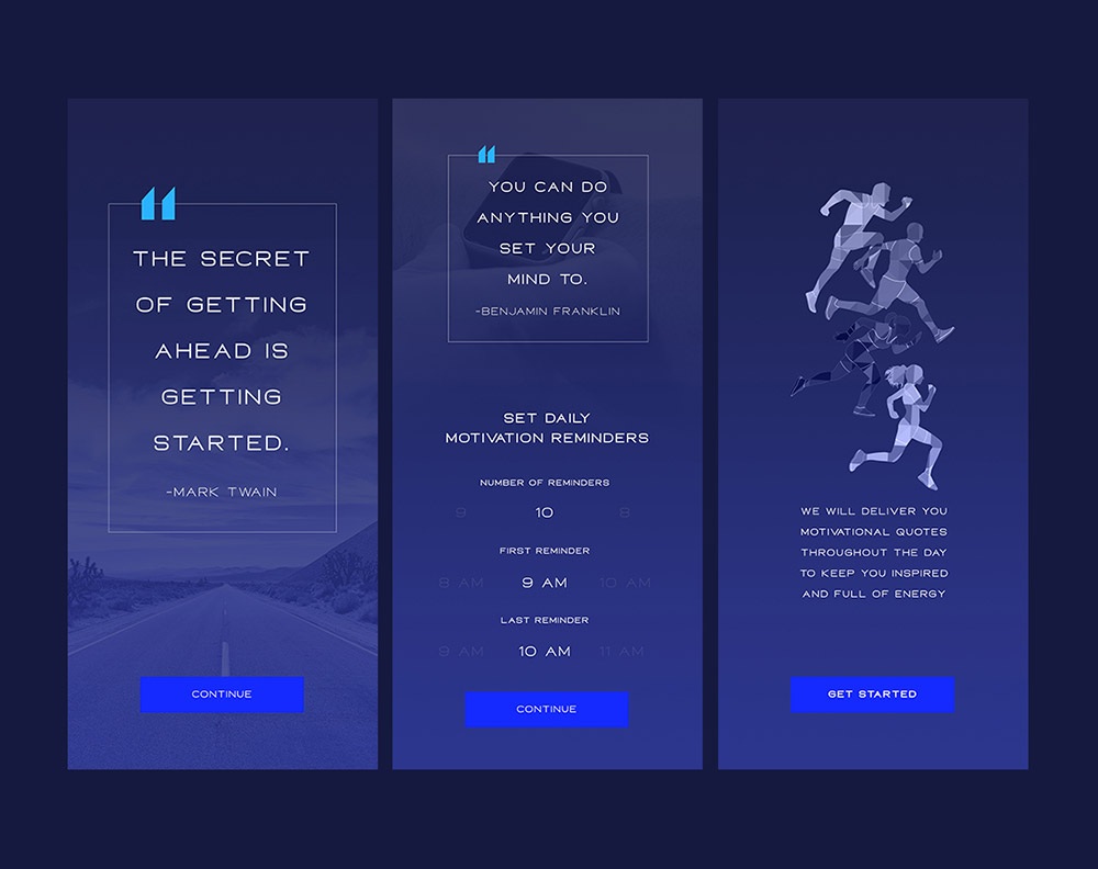
To get an idea of how Penji can help you with designs, check out these samples from our designers:
Requesting App Design on Penji
Once you’re ready for your app design, choose experts who know the right elements to help achieve your goals. Professional app designers from Penji ensure you get quality app design at a fraction of the cost. Plus, Penji’s customized design platform makes it easy to request for app designs or any design. All it takes is three steps:
Create
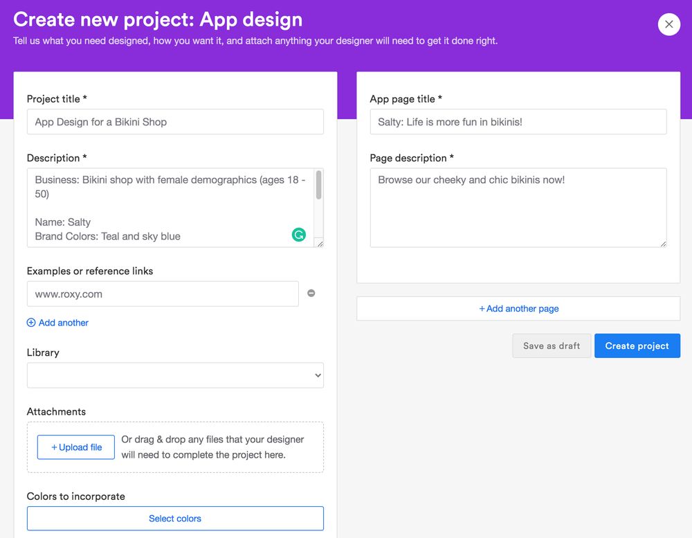
Create a new project by choosing from the list of design types. Choose “App design” for this project. The next step leads you to a form where you need to give brief but complete descriptions of the project. Here’s an example.
Review
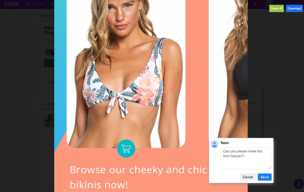
The turnaround time at Penji is 24 to 48 hours, depending on the complexity of the design. It’s fast compared to other design services because a skilled designer will be assigned to the right project every time.
When you receive the first draft, click and type in your comments if you want some design changes. This feature makes it easy for designers and clients to communicate revisions.
Download
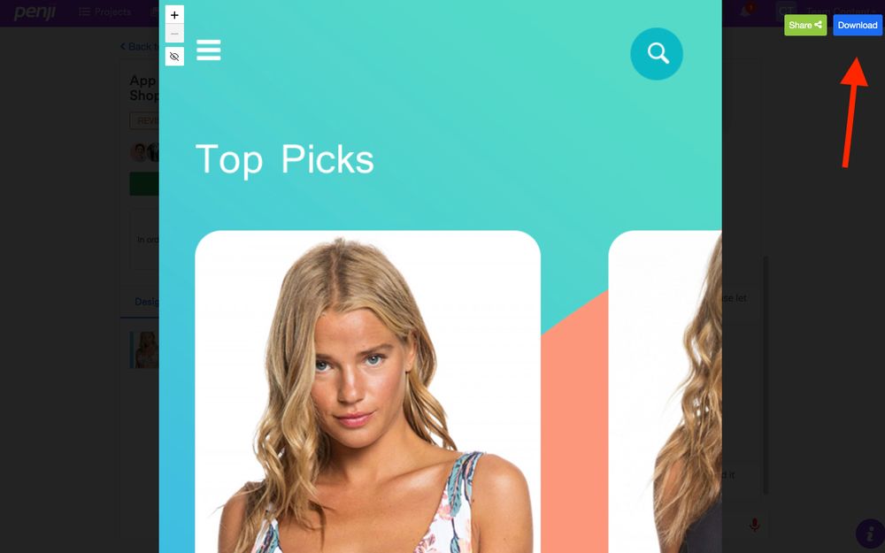
Only download the design when you’re 100 percent happy with it. Penji offers unlimited revisions, so you need not worry about asking for a handful. Once you’re satisfied, click on the “Download” button, and the design will be saved on your computer.
Your app design is now ready for commercial use as you own full rights and licenses for all designs created.
Sign Up to Penji for Hassle-Free App Design
If you want to experience a seamless app design process with quality in mind, subscribe to one of Penji’s plans. At $499 a month, you can already get unlimited app designs your business demands. Sign up here and try it out!
About the author
Table of Contents
- iOS app design vs. Android App Design: The Basics
- iOS App Design vs. Android App Design: Does It Have to Be Different?
- iOS App Design vs. Android App Design: Controls
- Typography
- Finding Your App Designer
- Penji App Design Samples
- Requesting App Design on Penji
- Sign Up to Penji for Hassle-Free App Design


