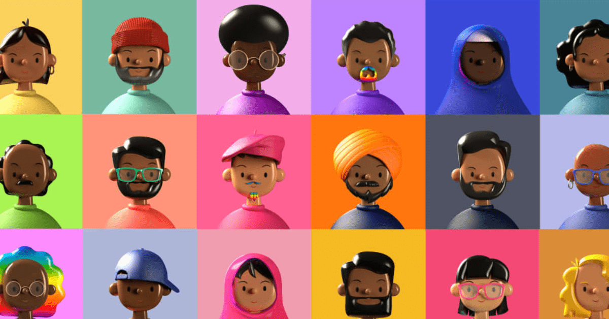
Can you believe we’re more than halfway through 2022? It seems like only yesterday that 2020 was the ‘future’. Anyway, as we hurtle towards the end of this year, it’s a good time to reflect on some of the graphic design trends that are dominant in 2022. Although 2023 is on the horizon, it’s a great practice to look at current trends to get a good scope of the future. I’ve gathered 15 of the most interesting graphic design trends of the year. Let’s see what makes them stand out.
15. 3D Imagery
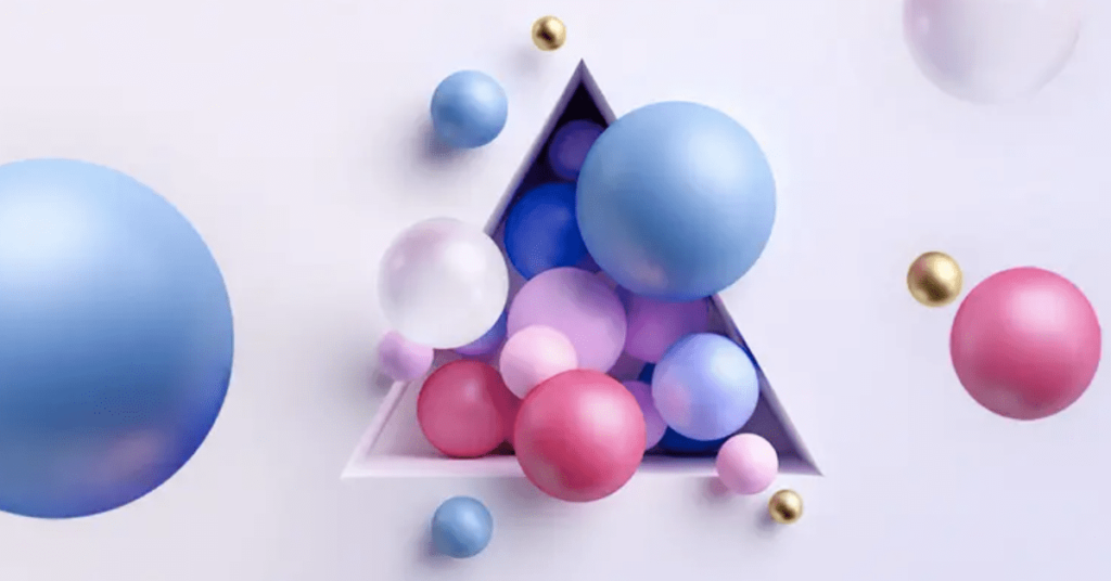
Whether it be an illustration or an actual model created using Blender, there’s no question that 3D imagery is in style. Its popularity has continued to rise since it began to dominate animated films. Advertisers use 3D imagery as a modern alternative to flat art or traditional animation.
14. 3D and 2D Elements Combined
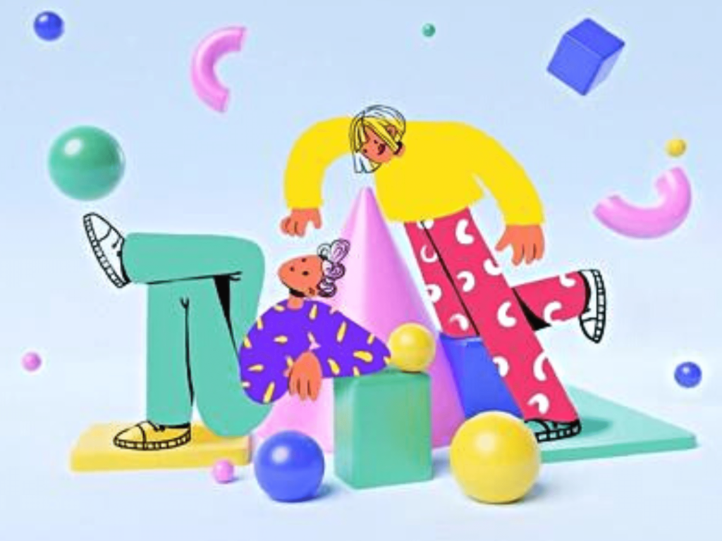
Don’t be fooled by the popularity of 3D art and animation; 2D elements aren’t going anywhere. In the world of advertising, 3D elements are often combined with 2D typography, animation, and illustration. It can be as simple as a 2D message next to a 3D gif. It can be as complex as directly integrating 2d art into an otherwise 3D image. Regardless, this combination makes for an unlikely, yet memorable pairing.
Gotta love some good teamwork.
[in_content_ads gallery=”logos” logo=”on” title=”Need graphic design help?” subtitle=”Try Penji’s Unlimited Graphic Design and get all your branding, digital, print, and UXUI designs done in one place.” btntext=”Learn More” btnlink=”https://penji.co”]
13. Holographic Design
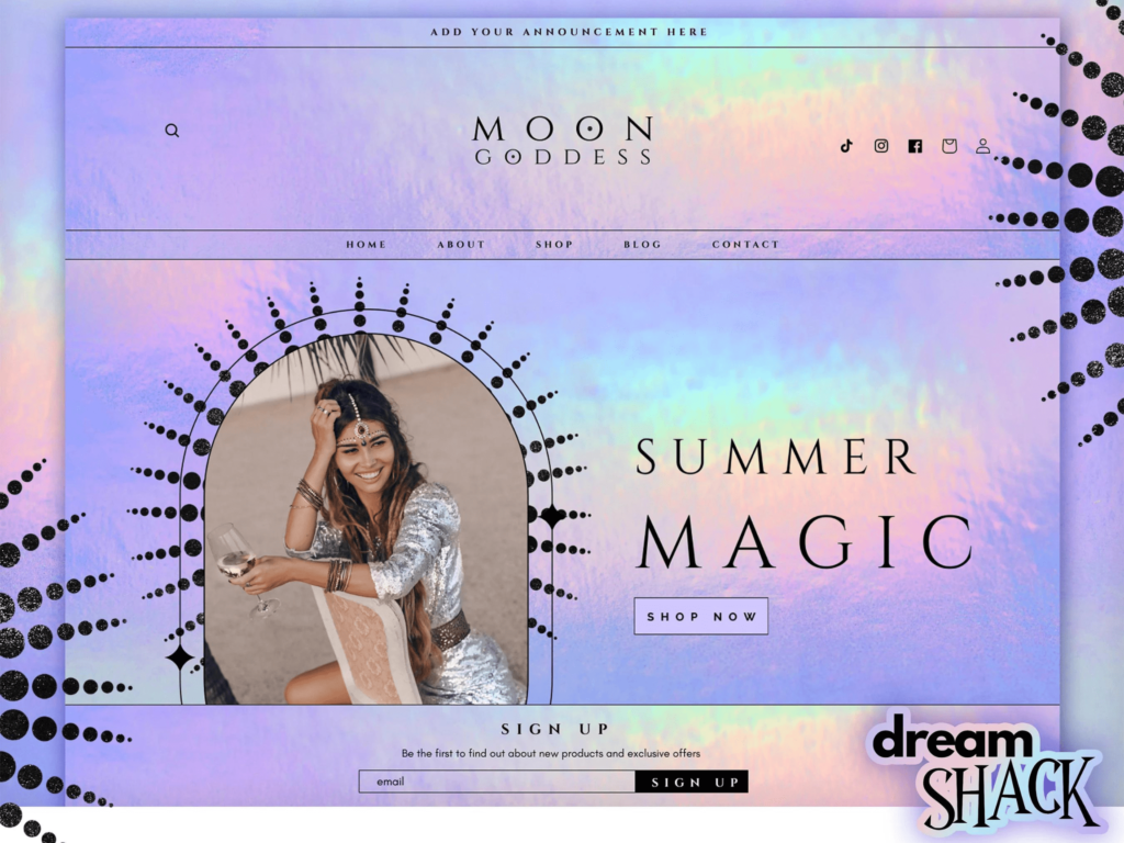
You might’ve seen these mesmerizing patterns on websites, artwork, and album covers. They tend to invoke a sense of wonder. Holographic Design is inspired by (you guessed it), holograms. In case you don’t know what that is, they’re basically photographs that have been fragmented from an item and then displayed in 3D. The result is this metallic, wavy, and colorful imagery.
This trend started on a 2018 runway and has spiked in popularity ever since. Nowadays, you can spot holographic designs in all types of promotional material.
12. Psychedelic Fonts & Shapes
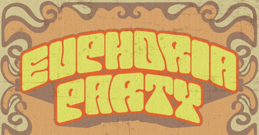
What does it mean for something to be “psychedelic?”
In everyday spaces, this term refers to a specific drug that alters a person’s emotions, senses, and thought process. So, when thinking of a psychedelic font, it stands to reason that it would make alterations to the status quo.
Psychedelic fonts are experimental in nature. They have a specific abstract and nostalgic quality.
11. Inclusivity
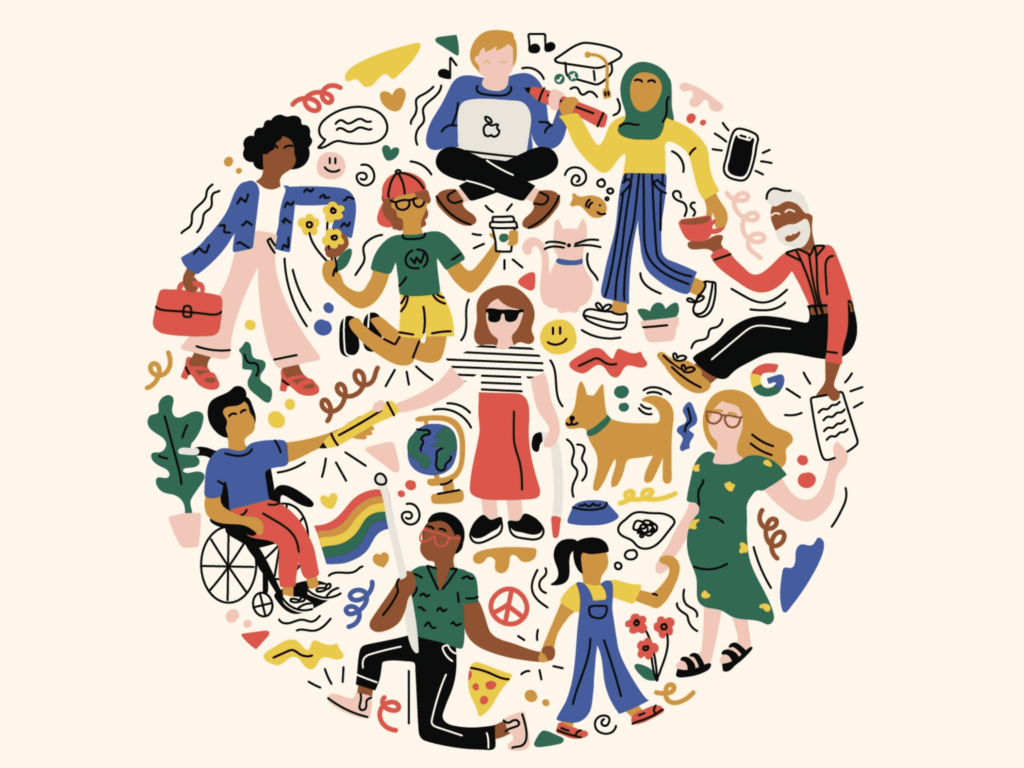
Now, I’m not sure if you know this but… the world is a BIG place. And in this big place, there’s a vast array of people, all from different backgrounds.
For the longest time, advertisers would primarily cater to a straight, white, able-bodied audience. Graphic design trends reflected that. Sometimes it seemed like those were the only people who existed in the media’s eyes. As the years progressed, companies have been making the effort to paint a more realistic picture of the world. In reality, queer couples, POC, and transgender people exist. Showcasing a diverse group of characters will help your brand reach a wider audience.
10. Muted/Natural Colors
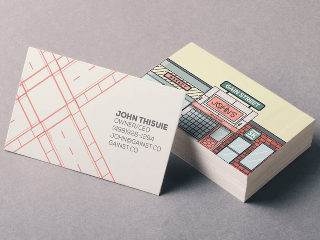
Minimalism has been a staple of the 2010s, and it seems like the early 2020s are still hanging on to that ideal. While graphic design has gotten more experimental, many companies still opt for a less in-your-face look. So, while you may see an uptick in alternative fonts and illustrations, the colors are often more subdued. A popular stylistic choice is to take colors from nature to invoke a sense of calmness.
9. Big and Bold Typography
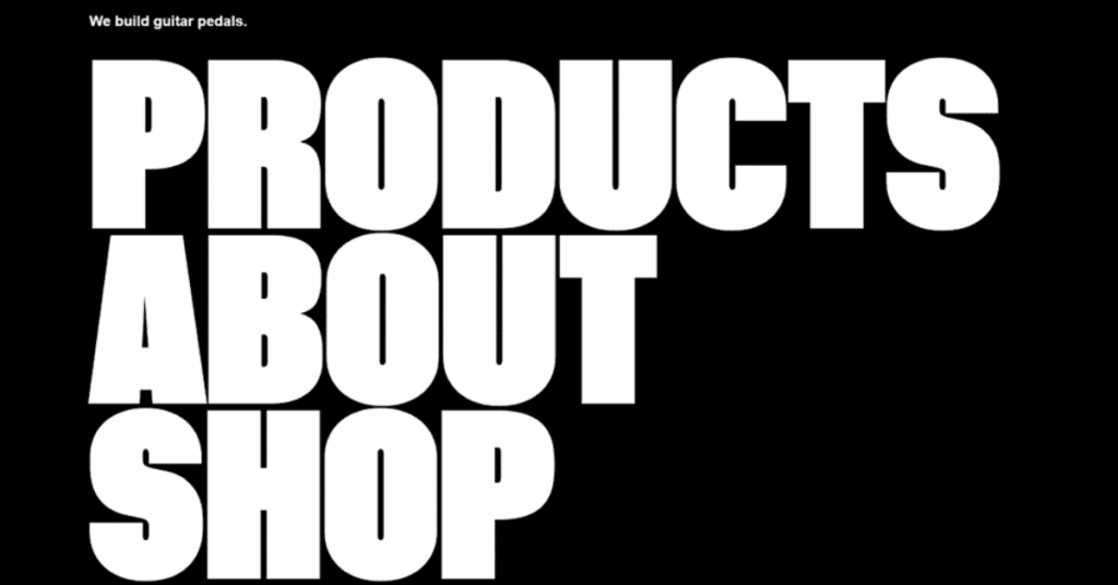
To grab the attention of the viewer, many graphic designs include big and bold typography. If a company has something important to say, or simply wants to provide some shock value, they may opt for this trend. Even when the font and background are plain, a large font size can take your design to the next level.
8. Retro/Vintage Designs
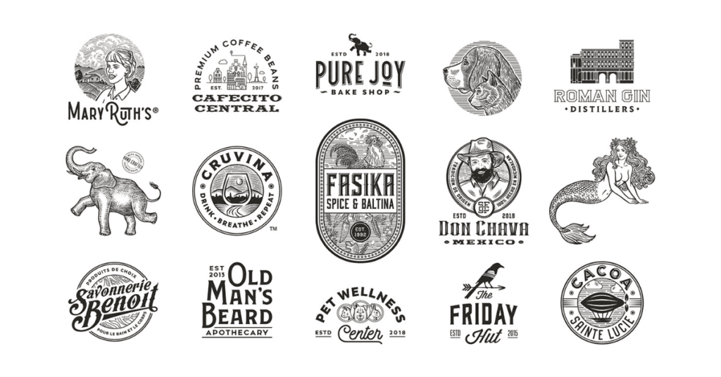
Nostalgia will forever be in style. Most people enjoy being reminded of simpler times; when they were younger with more free time and less responsibility. People can also feel nostalgia for periods they weren’t a part of.
When it comes to Vintage or Retro design, any company that uses it in 2022 will stand out from the crowd. This type of style is a great way to keep your brand timeless amongst the changing trends.
I mean, just look at Coca-Cola; they haven’t changed their logo in decades, and they’ve continued to be a household name.
7. Geometric Shapes
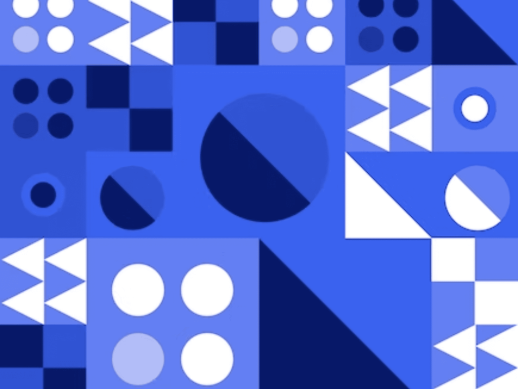
Geometric shapes can be a great asset to add interest to a minimalist design. Although they appear simple, combining geometric shapes into a cohesive design is difficult. Professional designers understand how to make shapes and colors stand out in a way that makes your brand unique.
6. NFTs

When it comes to graphic design trends, NFTs are all the rage in 2022. Although they may initially seem strange or silly, these tokens can be quite useful when it comes to marketing and advertising. Many businesses are turning to NFTs to promote their products or services, with some of them even selling these tokens for relatively low prices. Whether used as collectibles or simply incorporated into graphic designs, NFTs are a powerful way to grab people’s attention and get your message out there.
5. Maximalism
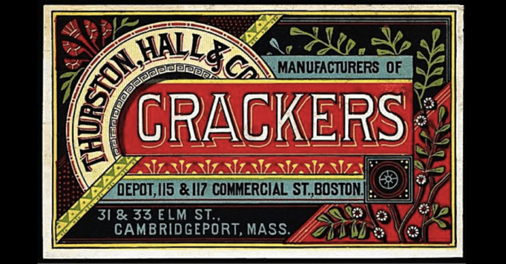
So, we all know that minimalism has become very prevalent in the last decade. People have had their bedrooms, clothing, and graphic designs stripped down to the most basic levels. What 2022 offers, however, is an opposition to the norm.
Introducing: Maximalism. It’s all about decorating things to the highest standards. When it comes to graphic design trends, you’ll see all sorts of colors, unique shapes, and intricate illustrations. A good graphic designer will understand the way these elements interact with each other. They can bring everything together in a coherent, eye-opening way.
4. Minimalist Logos
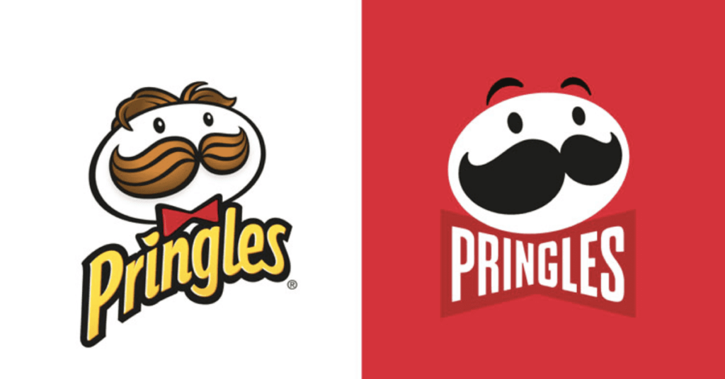
Now, if you’re a fan of minimalism, there’s no need to worry; that trend isn’t going anywhere just yet. In fact, minimalism may be on the increase. Have you seen the recent logo changes of your favorite companies?
The logos of both new and old companies have become flatter, and less detailed. Love it or hate it, this is a very common move for big brand names to draw attention to themselves while staying up to date. As for newer companies, it’s a way to make themselves appear modern, luxurious, and/or professional.
3. Gradients
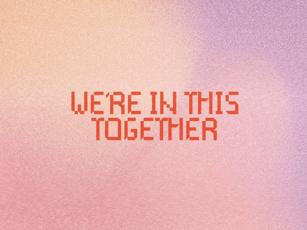
Gradients are very trendy in graphic design circles these days, and that’s for good reason. Their vibrant colors and dramatic shifts in hue add a dynamic element to any design that flat colors simply cannot match. If you’re looking for a way to inject more personality into your graphic designs without going completely overboard, opt for gradients as your go-to design choice.
2. Colorful Minimalism
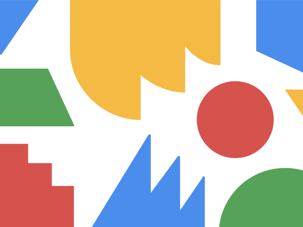
Minimalism lends a fresh and professional look to any design, neatly organizing all of the different elements on the page. However, sometimes minimalism can feel a bit too plain or rigid on its own. That’s where bright colors come in. When used strategically alongside more minimalist graphic elements, bright colors can add excitement and personality to your design, making it pop and stand out from the crowd. Whether you’re creating a logo for your business or designing a flyer for an upcoming event, integrating bright colors into your graphic concept is a great way to elevate your work while still keeping it clean and polished.
1. Anti-Design
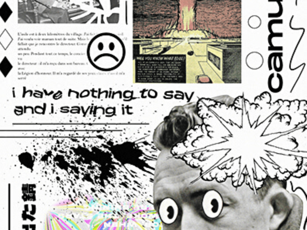
What if you want a design that’s TRULY out there?
Some companies want their brand to be known as large, strange, or counter-culture. If that’s the case for you, then anti-design might be up your alley.
Anti-Design’s goal is to rebel against popular graphic design preferences such as minimalism, flat design, and bright colors. Instead, many graphic designers have been drawn towards a darker, more aggressive graphic style characterized by asymmetric shapes, bold typography, and a moody color palette. While this trend may seem like an unlikely departure from the mainstream aesthetic of contemporary graphic design, it speaks to the creative desire to push boundaries and create work that stands out from the crowd.
Graphic designers have been experimenting with new techniques and technologies to create visually stunning designs that stand out from the rest. As we move into 2023, we can expect to see more innovative and creative designs that push the boundaries of what is possible.
About the author
Table of Contents
- 15. 3D Imagery
- 14. 3D and 2D Elements Combined
- 13. Holographic Design
- 12. Psychedelic Fonts & Shapes
- 11. Inclusivity
- 10. Muted/Natural Colors
- 9. Big and Bold Typography
- 8. Retro/Vintage Designs
- 7. Geometric Shapes
- 6. NFTs
- 5. Maximalism
- 4. Minimalist Logos
- 3. Gradients
- 2. Colorful Minimalism
- 1. Anti-Design


