Are you ready to enter the arena of gaming and esports?
Thinking of venturing into the exciting world of gaming and esports? Video game companies are revamping and improving everything possible, from sleek consoles to flawless graphics and better user experience just to get the bigger piece of the customer pie. Here are 30 gaming logos to prove this.

Statistics tell us that the eSports market is expected to exceed 1.6 billion U.S. dollars by 2024. With that number in mind, it’s no wonder why video game developers are always on the ball.
And now that many startups are trying their hands out in esports, it’s interesting to look at gaming logo designs and how they contribute to brand identity and the overall gaming experience.

Here’s a cheat code if you don’t have the time or expertise to create your own professional logo: sign-up up at Penji and have the top 2 percent of designers craft winning logos and branding mockups for you. Excited yet?

Here’s a list of 30 gaming logos to inspire you. Some logos on this list are the franchise’s latest designs, while some are a few years old but nonetheless still make a mark.
1. Call of Duty
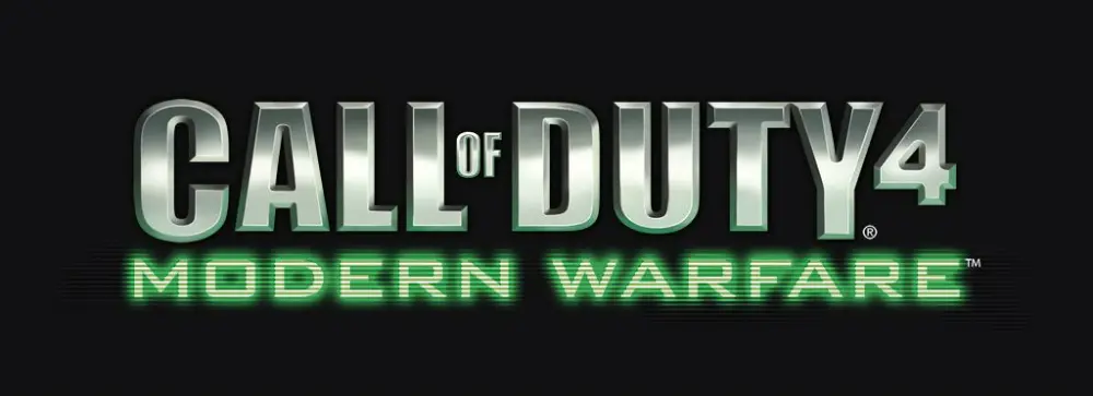
Call of Duty 4: Modern Warfare’s gaming logo may be simple but evokes a lot of meaning nonetheless. The logo’s silver and gray gradient, together with a digital-looking green font, looks tough and rugged. It’s very apt for the long-running FPS franchise known for outstandingly competitive gaming communities and professional esports tournaments.
2. Counter-Strike: Global Offensive
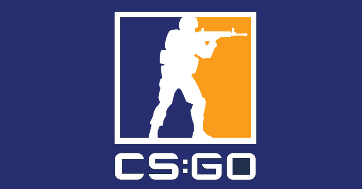
Having been one of the most popular gaming brands worldwide, Counter Strike’s logo has become an icon in the gaming industry. Its series, CS: GO, uses its classic image of a soldier silhouette, this time over a dark blue and gold background.
3. Dota 2
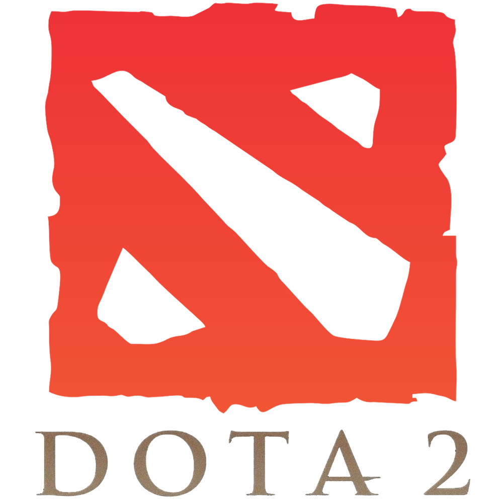
Another esports game that has gained a stable following all over the world for the past years, Dota 2’s logo is mostly red and orange, projecting energy, vibrancy, and passion. The jagged edges of the image, together with the serif font gives the logo a touch of old-school, almost Mayan-inspired design.
4. Overwatch
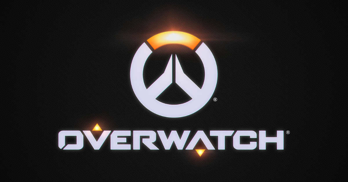
The logo of Overwatch offers a clean visual, mostly light gray in color. The red, orange, yellow, and white gradient that resembles a reflection of light gives the logo a touch of illumination. The logo is an example of cool vector designs that break away from plain shapes and typography.
5. League of Legends
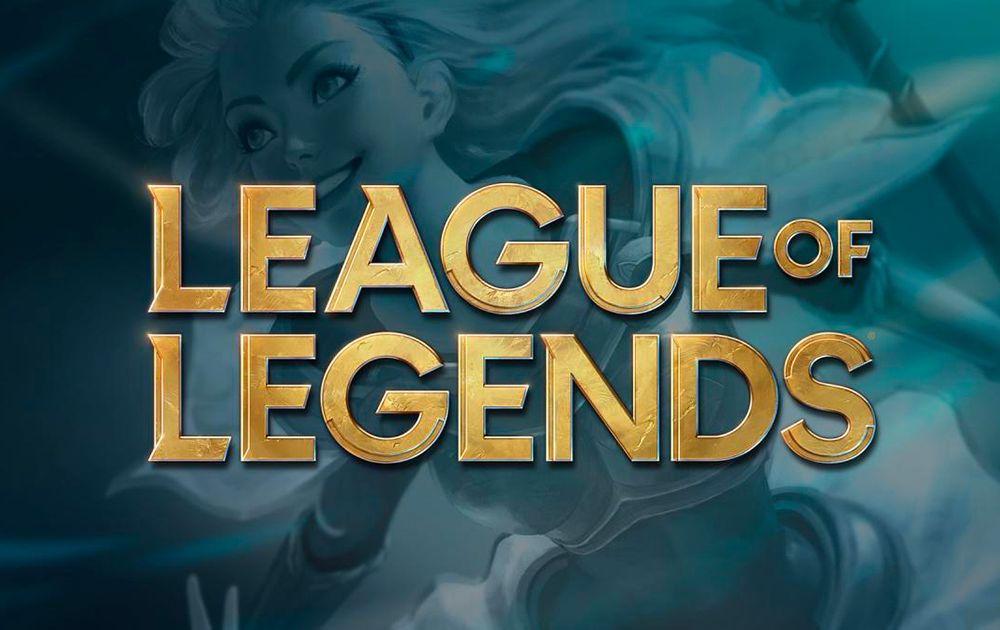
With 100 million active players tracked per month, League of Legends is undeniably one of the most popular esports games in the international arena. Unlike other popular esports platforms that bank on strong-looking design, this gaming logo is delicately crafted. It has edges so crisp and coloring and so intricate that it could pass for a movie title card.
[in_content_ads gallery="logos" logo="off" title="Get a logo as timeless as your brand" subtitle="Logos should be as unique as your business. Hook your audience with a 100% custom logo design." btntext="I need this!" btnlink="https://penji.co/pricing/?affiliate=J2O5AB8RAR3386837"]6. Fortnite
The extreme simpleness of the colors (or lack thereof) of Fortnite’s logo, makes up for in the shapes department. The black and white palette allows viewers to focus more on the silhouette, making the intricacies easier to digest even at a glance.
7. StarCraft II
StarCraft II’s complex logo is noticeably sophisticated compared to its other counterparts. The bluish-gray typography is texturized to look similar to fabricated steel, with a touch of faint yellow light shining on top. The irregular blue lines at the center back give the image a dose of motion and energy.
8. Rocket League
Pitting two teams of cars against each other on a football pitch, Rocket League’s logo features an image of a car with wavy line accents. The optical illusion of reflection is what makes this logo unique and stand out from the rest, giving it an elegant appeal fitting for a luxury car brand.
9. NBA 2K
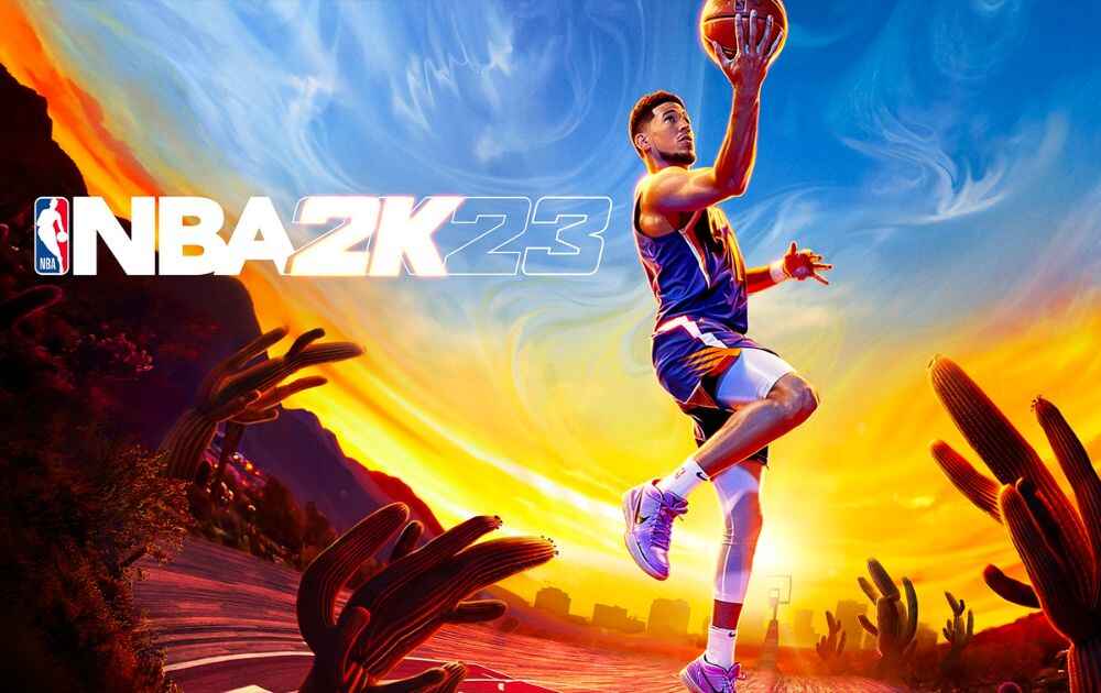
NBA 2K 19 knows that its biggest asset is the immense popularity of what could be the most-watched basketball league all over the world, and it aptly banks on it. With the league’s iconic logo already displayed, it shows nothing more than a simple dark gray typography with a striking red accent.
10. FIFA
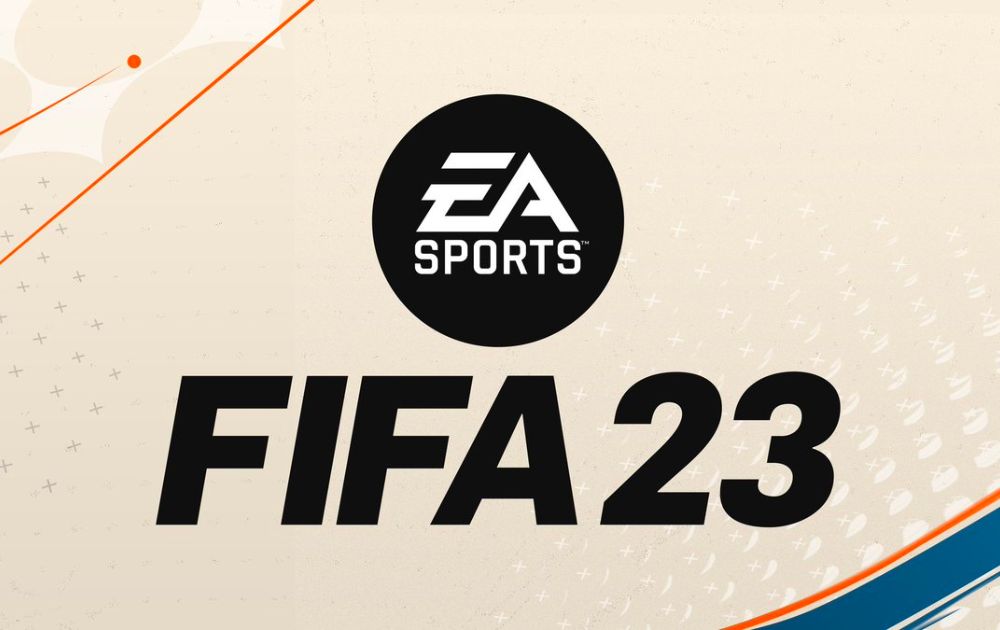
Being another esports platform branching out from a popular sports league, FIFA’s logo stays loyal to its origins’ aesthetics. Its 2019 Global Series logo features a color palette of light and dark hues of greens and blues, giving it a complex and energetic appeal.
11. Playerunknown’s Battlegrounds
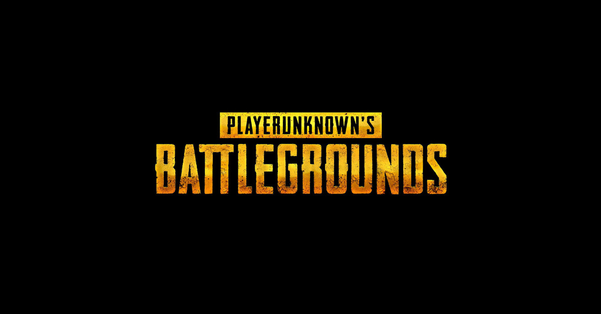
The logo of PlayerUnknown’s Battlegrounds is mostly warm in color, reflecting courage and independence appropriate for the online multiplayer battle royale game.
12. Rainbow Six Siege
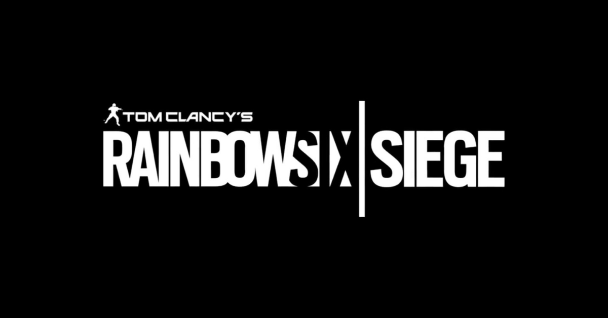
What makes Rainbow Six Siege’s logo enigmatic is its creative use and inclusion of negative space in typography. The artistic layout catches the spirit of Tom Clancy’s l online tactical shooter video game.
13. Hearthstone
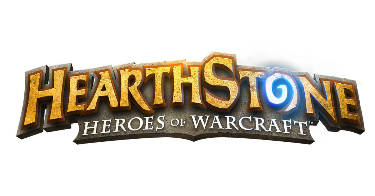
The logo of this free-to-play online digital collectible card game has an arcade-reminiscent aesthetic, paying homage to the Warcraft series on which it was based.
14. Magic: The Gathering Arena
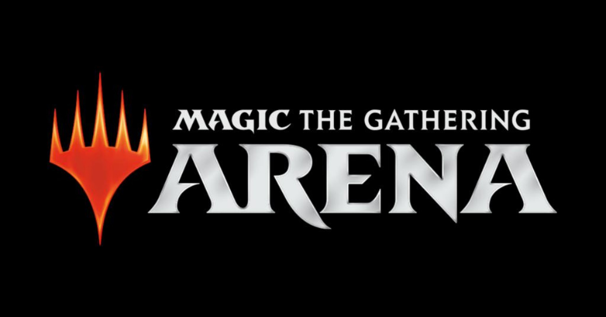
Magic: The Gathering Arena’s logo is straightforward and powerful owing personality to the thick block typography with sharp serifs. The red fire-looking accent draws attention and adds interest to an otherwise too-plain logo.
15. Heroes of the Storm
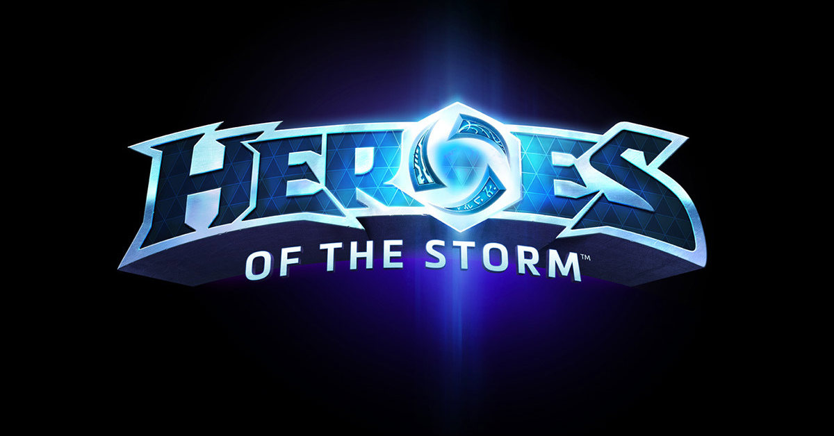
Heroes of the Storm’s logo features texturized font with a design emphasis on the letter O. It is made of three triangular shapes that bear meanings associated with heroes from Blizzard’s franchises.
16. Apex Legends
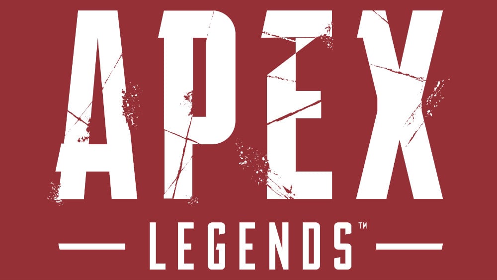
Apex Legends’ logo features block letters for its first word, made interesting by irregular lines that resemble scratches fitting for its battle royale theme. The smaller, thinner font of the second word with horizontal lines on either side creates a symmetrical effect and contributes to the overall balance.
17. Gears of War 4
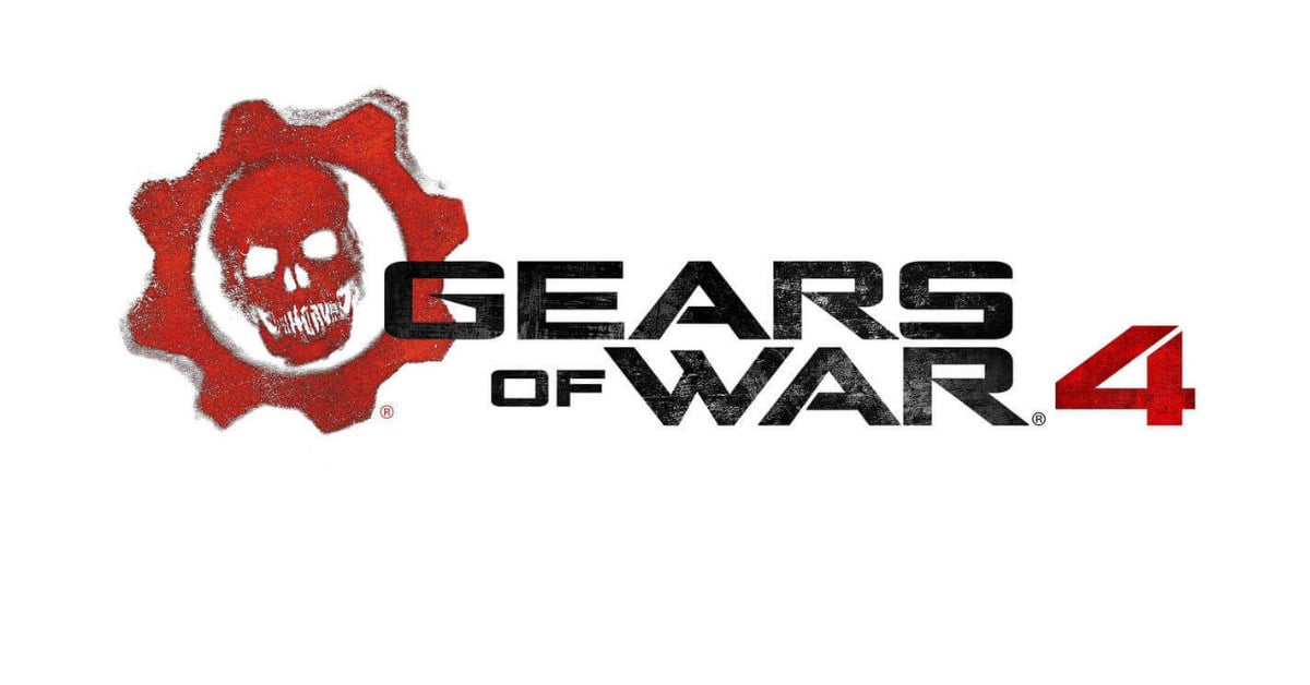
Gears of War 4 logo features a prominent red gear with an image of a skull in the middle. The logo has a smudged stamp look and a simple color palette of red and black, reflecting power and excitement. The overall design is fitting for a third-person shooter video game.
18. Arena of Valor
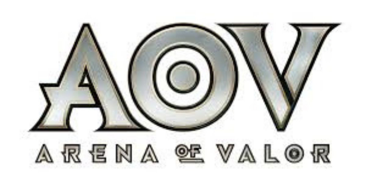
The logo of this multiplayer online battle arena features its acronym: AOV. The font style with sharp edges invokes a Viking feel. And the letter O was crafted to look like a target and a round shield at the same time.
19. Super Smash Bros. Ultimate
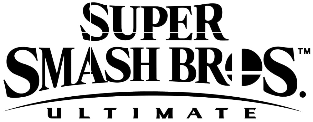
The logo of the fifth installment in the Super Smash Bros. series doesn’t veer too far away from those of its previous versions. Plain black in color, the negative space cross shapes on the letters complement the font style shape.
20. Tekken 7
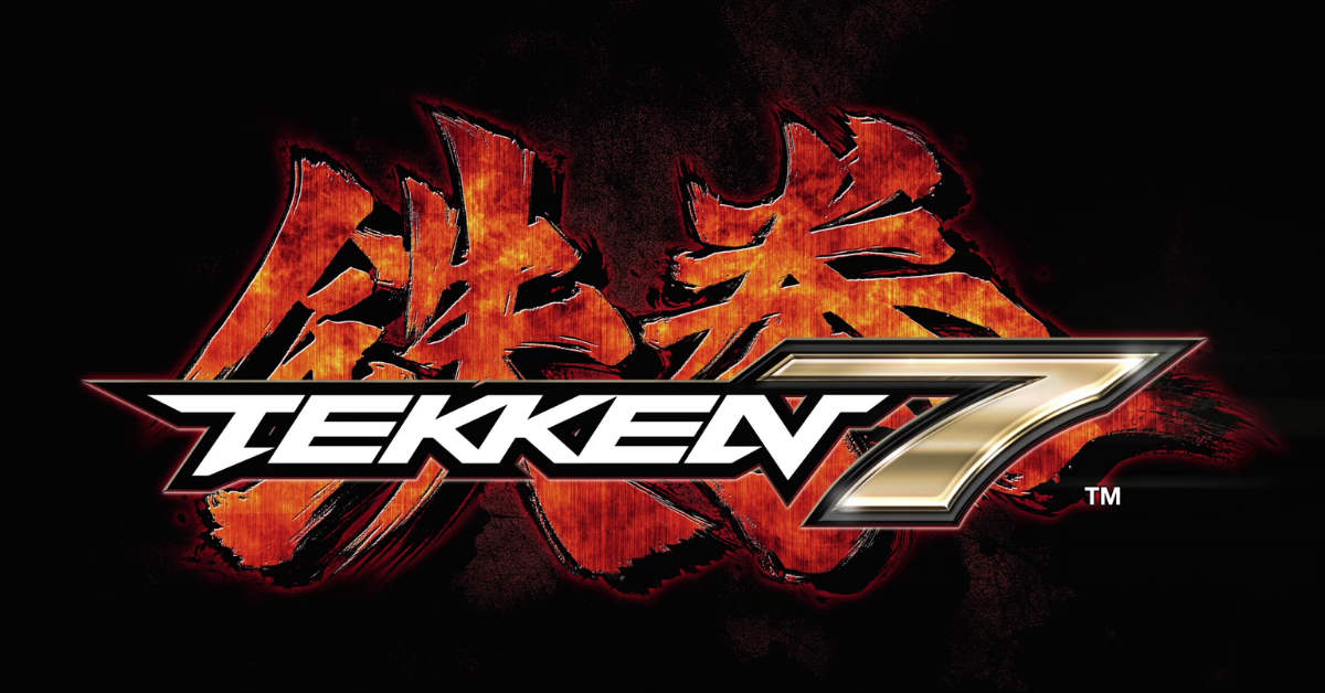
Tekken 7’s logo features sleek and edgy text colored white and gold over a background with Japanese characters appearing to have a burning effect.
21. Brawlhalla
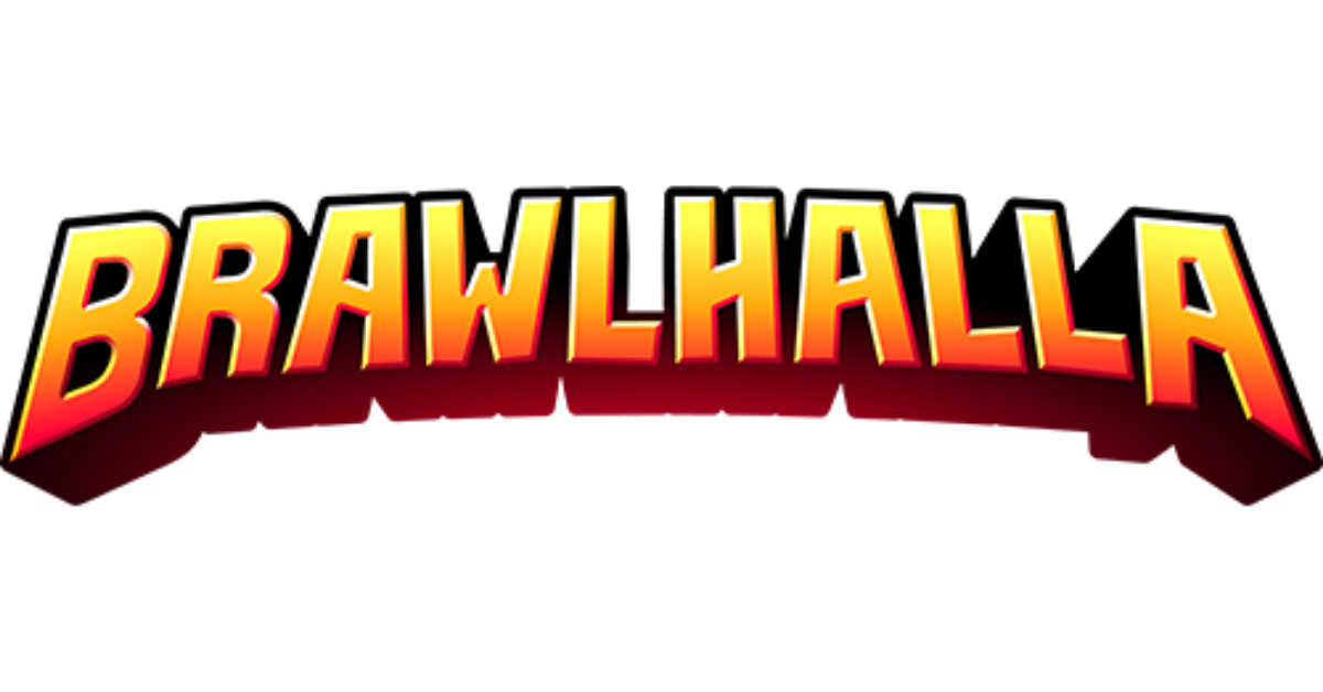
The logo of this free-to-play fighting game developed by Blue Mammoth Games has a classic look akin to traditional comic books. The warm color palette matches well with the simple font style fashioned in a symmetric arc.
22. Warcraft III: Reign of Chaos
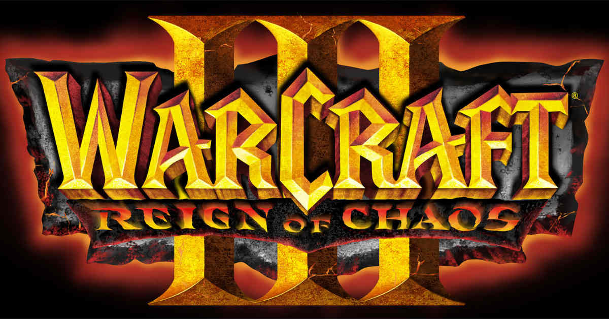
Being a high fantasy real-time strategy computer video game, the logo of Warcraft III: Reign of Chaos is anything but simple. The prominent irregular stone-like shape underneath supports the strong appearance of all three layers of text, all bearing different font styles.
23. Street Fighter V
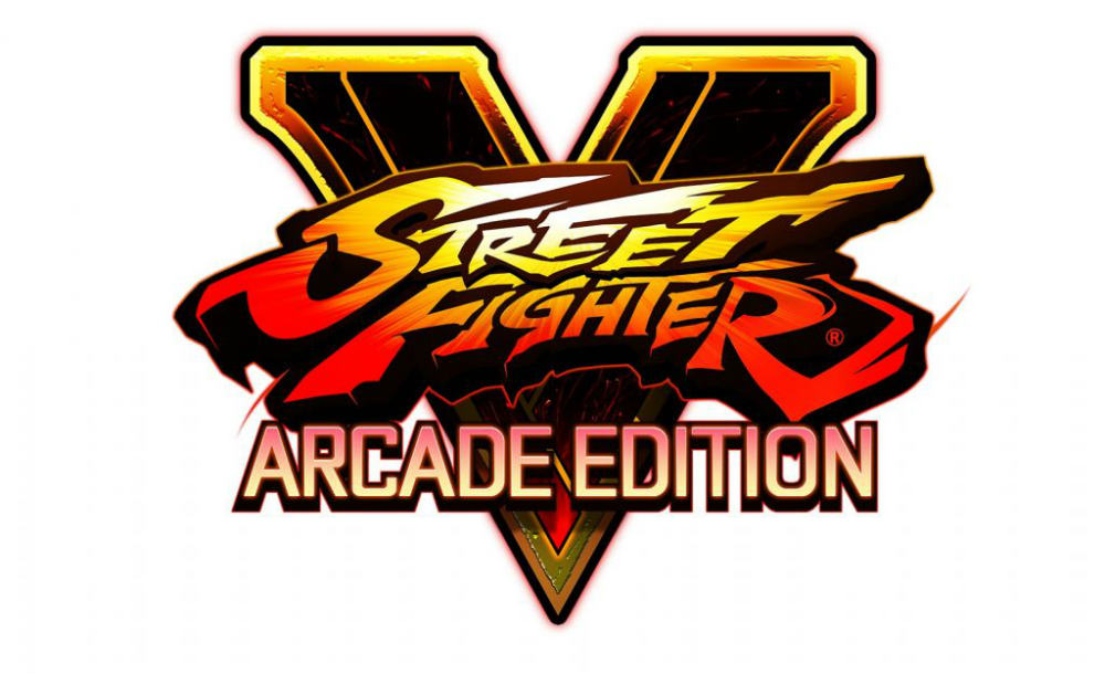
Published by Capcom for PlayStation 4 and Microsoft Windows in 2016, the logo of Streetfighter V still shows the original and classic font style with an energetic warm color palette.
24. Forza Motorsport 7
Forza Motorsport 7’s logo is painless but elegant, featuring a letter F with lines that give motion to the image representing the racing video game developed by Turn 10 Studios.
25. Madden NFL 19
Just like NBA 2K 23, this American football sports video game knows that just using the National Football League logo is more than enough to gain fans’ attention. And just like its basketball counterpart, it uses a very simple font to highlight the actual league it is based on.
26. Resident Evil 2
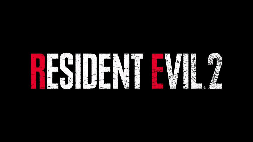
This survival horror game is a remake of an earlier version released in 1998. Developed by Capcom, the second version relaunched in 2019 PlayStation 4, Xbox One, and Microsoft Windows. The text colors are white and red, and the typeface features a texture similar to broken glass. The logo is simple but makes a powerful impact.
27. Mortal Kombat 11
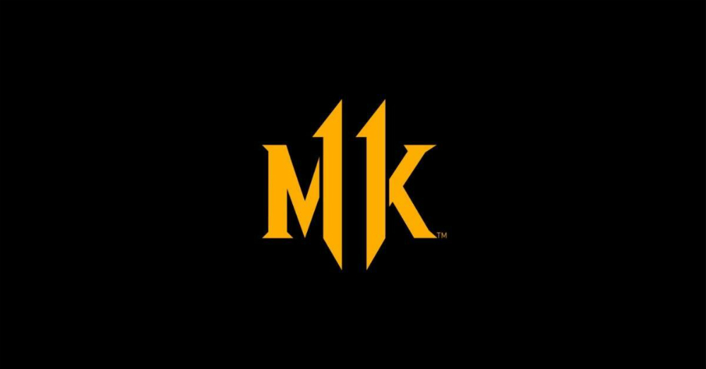
We can’t help but admire the logo for Mortal Kombat’s 11th installment. Though this installment was launched back in April 2019, the branding visual still looks simple but sleek by today’s standards. The game’s logo looks clever as it shows the letters MK and the number 11. In the same vein, the font style is distinct but not overwhelming.
28. Far Cry: New Dawn
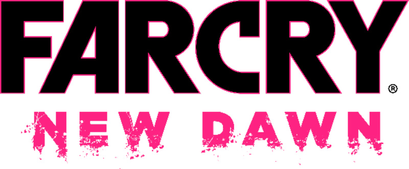
This version was a spin-off and a sequel to Far Cry 5. A number of its pre-existing gameplay elements are from the original series. However, it also features new elements, making the game even more engaging. The logo is bold, and its font styles are anything but subtle. It’s a unique logo that can’t be associated with any other franchise other than Far Cry.
29. Dragon’s Dogma: Dark Arisen
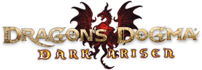
This is an enhanced version of the action role-playing video game first released in 2012. The setting is a fantasy world called Gransys, where players take the role of the Arisen, a human protagonist on a venture to destroy the dragon Grigori. The professional logo design of the game is intricate. In fact, it has fine details not only in the text but also in the illustration behind it.
30. War Thunder
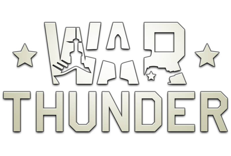
War Thunder is a big hit among players who are into vehicular combat games. The game comes in a cross-platform format available for various gaming consoles. These platforms include PlayStation 4, macOS, Linux, and Xbox One. The logo is simple but meaningful, with a typeface that shows military elements.
About the author

Carla Deña
Carla is a journalist and content writer who produces stories for both digital and legacy media. She is passionate about creativity, innovation, and helping small businesses explore solutions that drive growth and social impact.
Table of Contents
- 1. Call of Duty
- 2. Counter-Strike: Global Offensive
- 3. Dota 2
- 4. Overwatch
- 5. League of Legends
- 6. Fortnite
- 7. StarCraft II
- 8. Rocket League
- 9. NBA 2K
- 10. FIFA
- 11. Playerunknown’s Battlegrounds
- 12. Rainbow Six Siege
- 13. Hearthstone
- 14. Magic: The Gathering Arena
- 15. Heroes of the Storm
- 16. Apex Legends
- 17. Gears of War 4
- 18. Arena of Valor
- 19. Super Smash Bros. Ultimate
- 20. Tekken 7
- 21. Brawlhalla
- 22. Warcraft III: Reign of Chaos
- 23. Street Fighter V
- 24. Forza Motorsport 7
- 25. Madden NFL 19
- 26. Resident Evil 2
- 27. Mortal Kombat 11
- 28. Far Cry: New Dawn
- 29. Dragon’s Dogma: Dark Arisen
- 30. War Thunder


