A fish could be a suitable logo icon if your brand is geared toward ocean-related activities, products, or services. It’s an animal that symbolizes prosperity, abundance, and transformation. And brands can leverage these symbolisms to show growth, success, and adaptability. If you’re looking for fish logo design inspiration, here are 10 fish logos you can follow.
Need help with your fish logo? Penji offers unlimited designs or one-off projects at affordable rates.
1. Aqua Crave Seafood Restaurant
A playful take on fish logos, this Aqua Crave Seafood Restaurant logo features a white fish positioned on top of waves, set against a vibrant orange background. It is illustrated in a simplistic, minimalistic style, with clean lines and a sleek silhouette. It has waves underneath it with circles that represent bubbles.
The most distinctive aspect of the logo is the quirky handwritten font used to spell out the brand name. It is playful and lighthearted, conveying a sense of fun and approachability. The hand-drawn style of the font adds to the overall whimsical and charming logo aesthetic.
2. Atlantic Sushi
This fish logo for Atlantic Sushi features a top view of a sushi roll, designed to look like a yin-yang symbol, with two fish arranged in opposite directions. The design uses bright shades of blue, yellow, and red, making it appealing and appetizing.
The logo features two chopsticks on either side of the sushi roll to further emphasize the sushi’s origin. It uses a sleek and modern design to give the logo a contemporary feel. It effectively conveys the Atlantic Sushi brand and its emphasis on fresh and delicious food that blends the best of both worlds.
3. Big Hook Photography

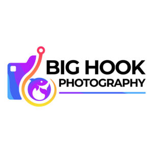
This Penji-designed logo for Big Hook Photography features an illustrated camera with a unique twist – a big hook attached to the front of the lens with a curled fish inside it. The camera illustration is stylized, with a bold, playful aesthetic that captures the brand’s essence.
The brand name, “Big Hook Photography,” is presented in a straightforward font, using black for legibility and contrast against the colorful camera illustration. The plain font used for the brand name helps balance the busy and vibrant camera design, allowing it to stand out and catch the eye.
4. Blue Water Resort
Designed to evoke feelings of relaxation, tranquility, and the beauty of the ocean, this Blue Water Resort logo is one to inspire you. It has a circular icon with an upturned whale on top, suggesting that the resort is near the coast, where visitors can enjoy whale watching and other sea life activities.
If you’re looking for a logo design example that perfectly represents its brand, this is it. It conveys a sense of luxury and relaxation while emphasizing the surrounding area’s natural beauty. The design connects to nature, creating a sense of escape and freedom from everyday life.
5. Dory’s Bites

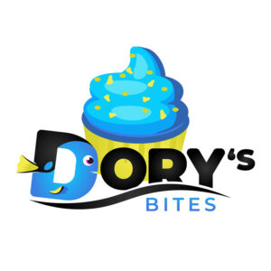
Another fish logo that’s playful yet memorable is Dory’s Bites. It has a fish-shaped “D” as the main focal point, illustrated in a simplistic and stylized manner. It has a bold and rounded design that captures the whimsical nature of the brand.
At the back is a huge cupcake done in the same colorful and playful manner. The cupcake emphasizes that Dory’s Bites specializes in desserts and baked goods while adding a sense of sweetness and joy to the logo. It is an excellent fit for customers looking for delicious treats and a fun and lighthearted atmosphere.
6. Kokoi Grilled Fish

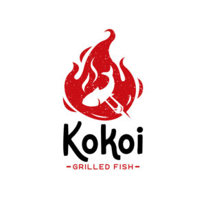
This fish logo designed for Kokoi Grilled Fish features a striking silhouette of a fire in red, with a fish on a fork inside the flames. The use of the color red in the logo further emphasizes the heat and intensity of the fire. It also evokes a sense of passion and energy and is suitable for stimulating the appetite.
With its striking color and powerful imagery, this logo effectively conveys the brand’s focus on flame-cooked seafood dishes, making it an excellent fit for customers looking for a unique and flavorful dining experience.
7. Prime Fishing

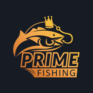
To clearly shows that Prime Fishing is a brand that specializes in the outdoors, it uses an illustration of a fish with a hook in its mouth and a crown on its head. This stylized illustration is straightforward yet exudes a sense of regal authority and strength.
Using a bright yellow-orange shade for the fish adds a sense of vibrancy and energy to the logo while also making it stand out against the black background. This fish logo is likely to appeal to customers who are looking for a brand that is both strong and sophisticated.
8. Puff Fish Supplies

Pet store Puff Fish Supplies has this cute and round pufferfish as its logo. It is designed to be fun and playful, with a friendly and approachable character. The pufferfish is drawn in a cartoonish style, with a round and chubby design that creates a sense of warmth and friendliness.
The fish smiles with a few bubbles on the side, adding a sense of playfulness and whimsy to the logo. The use of brown and orange colors creates a warm and inviting feel while adding a sense of energy and vibrancy to the design.
9. Sail Moon Business Solutions

The Sail Moon Business Solutions logo is designed to be sleek and sophisticated, focusing on the sailboat and moon imagery. The dark brown background creates a sense of stability and dependability while contrasting the lighter colors used in the rest of the logo.
Using a sailboat suggests that the brand is related to travel or transportation, and the fish shape adds a sense of playfulness and creativity to the design. The moon in the sky emphasizes the significance of travel and exploration while adding a touch of elegance and sophistication to the logo.
10. Two Nah! Film Production
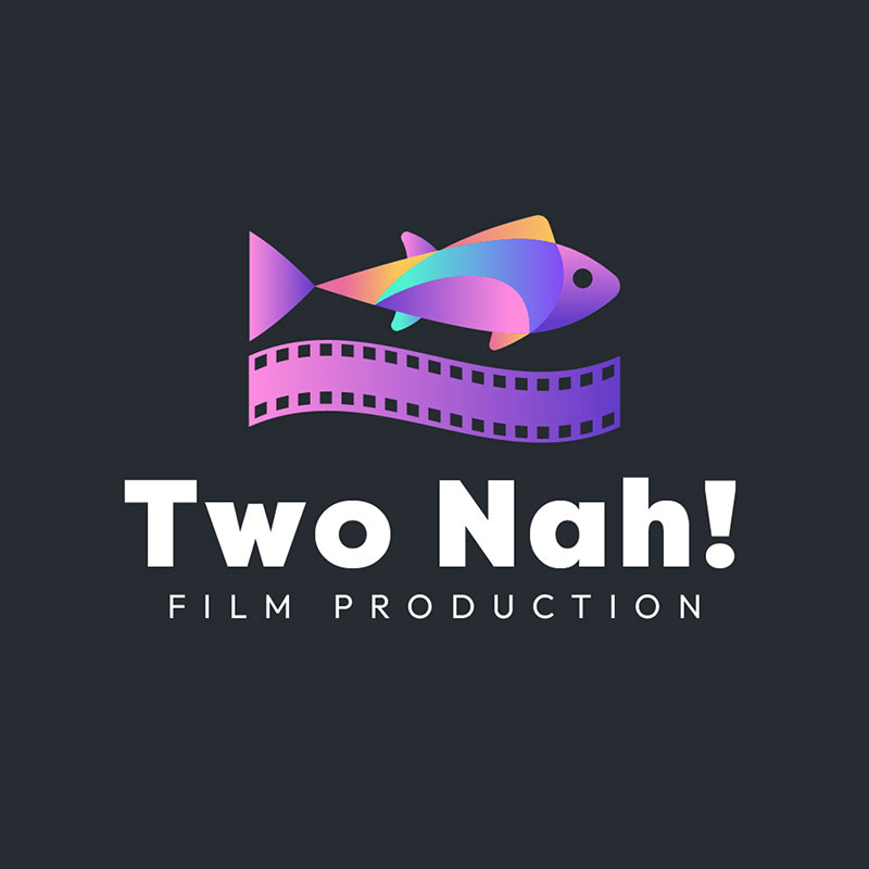
The use of bright colors and playful imagery in Two Nah! Film Production’s fish logo creates a sense of energy and excitement. The strip of film below the fish adds a sense of professionalism and expertise to the design.
The logo’s primary color is purple, with different shades of bright pink, yellow, and orange, adding a sense of vibrancy and playfulness to the design. The use of bright colors suggests the brand is creative and innovative while appealing to a younger and more diverse audience.
Final Thoughts
Whether you’re a seafood restaurant or a fishing gear supplier, a well-designed fish logo can help you reel in customers and make a splash in the crowded world of branding. These examples created by the talented Penji graphic designers can surely provide the inspiration you need.
Click on this link to get the fish logo designs started!
About the author

Celeste Zosimo
Celeste is a former traditional animator and now an SEO content writer specializing in graphic design and marketing topics. When she's not writing or ranking her articles, she's being bossed around by her cat and two dogs.


