

Even the most abstract of logos are often designed with delicate deliberation. Each line, curve, and color offers something integral to the whole. In some cases, you may find that logos you’ve known intimately for a long time have hidden messages sown within them.
While these subliminal suggestions may go unnoticed at first, the clever approach provides customers with a multilayered visual experience that can go a long way in maintaining cultural relevance for decades. Here are 10 hidden meanings in logos you won’t be able to unsee:
Hyundai
At first glance, this emblem looks like the initial “H” for Hyundai. However, if you look closer, you can see that the design represents a handshake. A trusted company and a satisfied customer.
Unique logos perfect for your brand
Hire a professional designer to create a logo that stands out!


Amazon
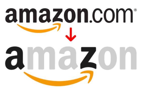
Amazon’s logo has been plastered all over the planet by this point. Despite that, the hidden smirk spanning the A to Z has likely flown under the radar for many. The grin of a well-pleased customer acting as a link between A and Z can be seen as a representation of the expansiveness of Amazon’s service.
Baskin Robbins
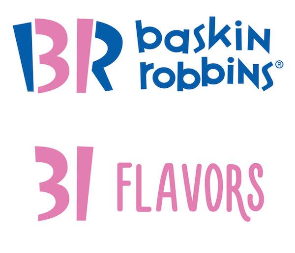
The famed ice cream brand has long been a mainstay in the frozen treat game. The logo has a dual purpose. It represents the initials of the company and also the 31 varieties of ice cream they offer!
Toyota
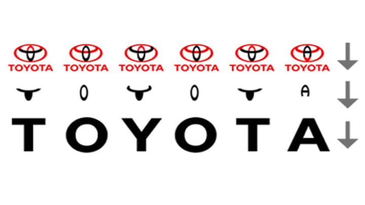
Toyota consistently ranks among the most respected and reliable car manufacturers. In fact, Fortune Magazine has ranked Toyota as the number one motor vehicle company on their “World’s Most Admired Companies” list for six years running. Despite this, the depth of their logo has gone quite unnoticed. This design encompasses every letter of the company name in its abstract logo.
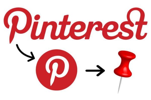
Pinterest’s logo has found an interesting way of creating a combination mark. The P in Pinterest also pins!
Beats
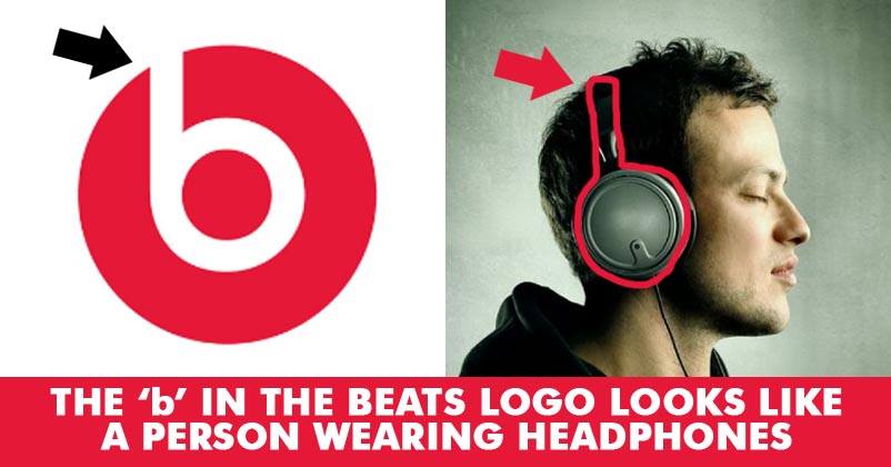
The negative space held within the red sphere is not just a neat monogram. It’s also meant to show a person wearing headphones. Beat’s ability to represent the use of their product in their otherwise minimalistic design makes it a fantastic example of how effective simplicity can be.
7. FedEx
The arrow hidden in the space between the “E” and the “X” creates a subtle but clear gesture. Direction, movement, and assertiveness. The FedEx logo is a wordmark that perfectly sums up the company’s service– and almost as if by accident!
BMW
BMW’s logo has often been the subject of debate. It’s been said that the logo represents the rotating blades of an aircraft. This makes sense, given BMW’s involvement with aviation theory early in its history. It is also thought to be a reference to the Bavarian flag, the German state in which BMW was born.
Toblerone
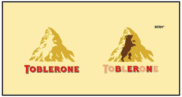
The Swiss chocolate brand’s logo bears an ode to its birthplace, Switzerland. The capital of which is Bern, which is also subliminally fused into the name of the company. There is a bear on the coat of arms of Bern. This is the reason for the negative space within the mountain. The silhouette of a bear!
LG
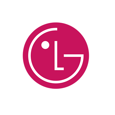
This well-known logo’s meaning is threefold. While the negative space inside the circle suggests a smiling face, it does so using an “L” and a “G”. Additionally, it represents an on-and-off symbol!
Be sure to stay up to date on logo design trends. For more articles on logo design, check out Penji’s learning center!


