
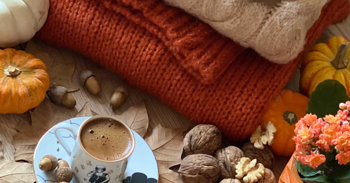
Autumn is the time for pumpkin spice, golden red leaves, and layers. This year, expect strong contrast between calm and nostalgic color palettes and darker, gloomy color schemes. If you’re considering changing your brand image in anticipation of the 2023 Fall season, we’ve got you covered. Check out the top ten color fall color palettes to guide you in embracing the season to level up your brand image
1. Midnight Green + Ruby Red + Dark Orange
Draw inspiration from this warm color palette with a rich jewel tone. Pair them together to create a warm saturation level that feels like wearing a cozy sweater. This fall color is perfect for any branding asset you can think of. Get your mood board ready and start planning your design project! Whether for a beauty, fashion, or home furnishings brand, you’ll come up with a warm, visually appealing design.
2. Cornsilk + Fawn + Kombu Green
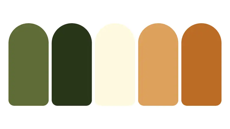
Level up your aesthetics with this refreshing fall color palette. Visualize an early-fall hike and be inspired by the colors of the woods. Enjoy the atmosphere while you see many trees still with deep green leaves. And when it comes to your design, match the deep, dark green with the lighter tones to achieve beautiful contrast.
3. Tan + Brown Sugar + Almond Brown
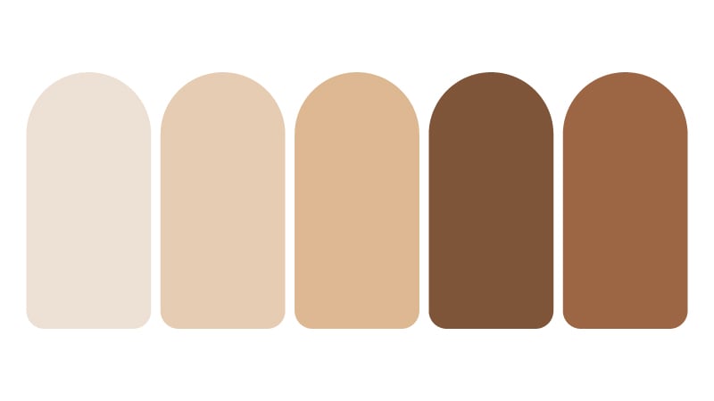
Feel the vibe of the crisp fall air just by using this monochromatic brown fall color combination. You can pair similar shades for a timeless, sophisticated effect. Or go bold by choosing the two intense shades. This color palette is ideal for website design and merchandise like t-shirts and caps to promote your brand.
4. Ash Gray + Dark Slate + Dark Sea Green
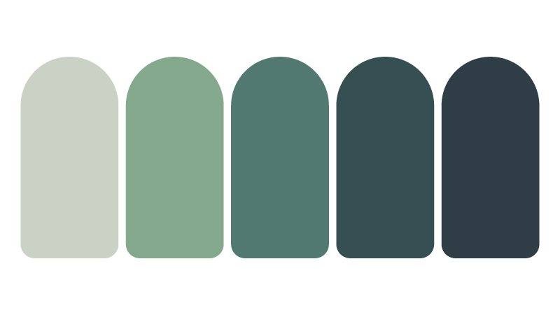
Red and orange are the typical colors of fall. But the deep green or other evergreen trees can inspire you as well. So, you must explore all things and use this lush fall color scheme in your design. This color combination will make your brand look reliable and works particularly well for tourists and medical or health-related fields.
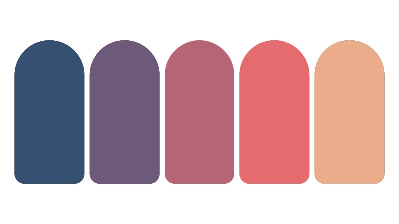
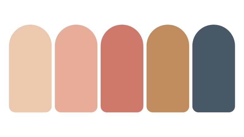
5. Rose Dust + Tumbleweed + Mn Blue
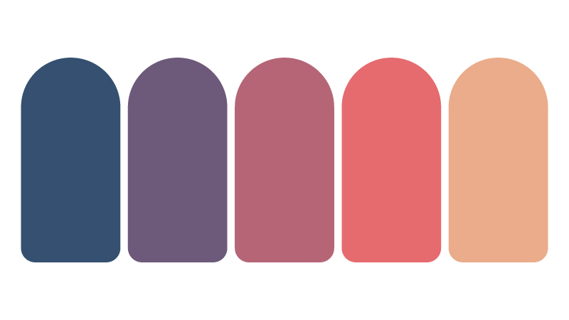
From green, let’s move on to the rose dust color scheme. This fall color palette enhances the warmth level by pairing slightly desaturated shades. It brings a sense of calm and warmth because of its easy-on-the-eye colors.
6. Deep Space + Auburn + Indian Yellow
Upgrade your visual communication with this color palette inspired by every family of the autumn spectrum. Use this color scheme to attract your audience’s attention to the center of the logo. A color pairing like this would be perfect for your social media assets to celebrate the season.
7. Antique Brass + Desert Sand + Ash Gray
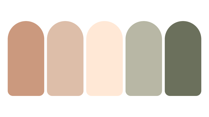
If you’re looking for an earthy fall color palette, this antique brass, desert sand, and ash gray combination is a good choice. This scheme pairs dusky brown shades with desaturated greens, creating an excellent balance. Since the shades are neutral, it would be easier to match them with other colors to come up with a unique design.
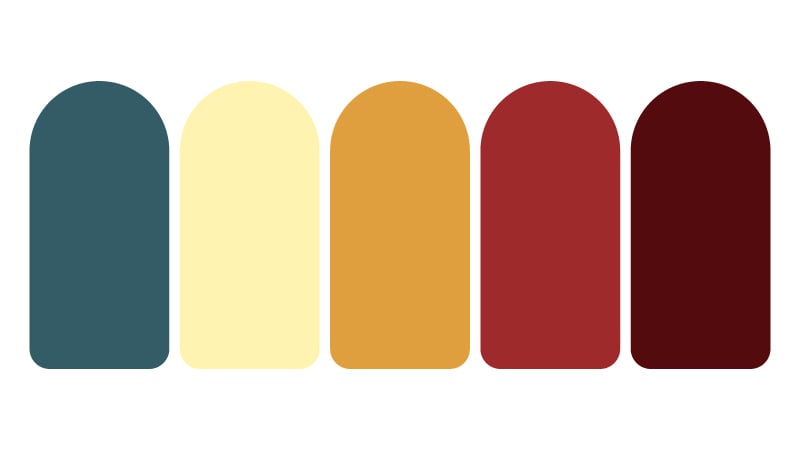
8. Dark Sienna + Rust + Blood Red
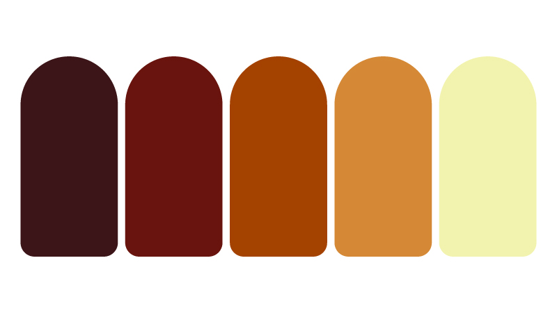
Now, go for one of the most iconic fall colors. This color combination is more of darker earth tones from the red-orange-yellow family. All other color pairs well with rust, one of the most traditional fall colors. This fall color scheme evokes energy, stability, and excitement, making it a mainstay in sports marketing assets.
9. Peach + Tumbleweed + Charleston Green
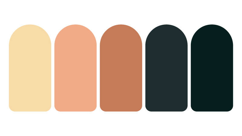
Peach is probably not your first thought when you consider fall color palettes. Surprisingly, the dusky tone is an ideal counterbalance of gloomy brown and nearly-black green colors. This color pair works well because it maintains a balance between the techniques.
10. Melon + New York Pink + Persian Orange
Here’s a color palette with multiple shades in the brown family. Most colors here are neutral, making them easy to pair with any color. It is best to choose a palette like this if you want to bring a comfortable feel to your designs.
What are fall colors and their meaning?

The colors of fall foliage can include shades of red, orange, yellow, brown, and sometimes purple or pink. These are inspired by the changing pigments in the leaves of trees and other plants as the temperature drops.
Fall colors are often linked with the changing seasons and the natural cycle of life, death, and rebirth. They can also symbolize warmth, comfort, harvest, and abundance. In some cultures, fall colors are associated with spiritual themes such as gratitude, letting go, and embracing change. Fall colors are generally celebrated for their beauty and the sense of wonder and awe they inspire.
In graphic design, inspiration from the changing seasons can make the job much easier. Brands strive to reinforce their brand story through color. That is why graphic designers and business owners would agree to take their designs and branding materials to the next level. And they can do that by taking cues from our collection of exciting color palettes.
How to choose the right color combination
Color theory plays a huge role in our lives. Every day, we subconsciously make assumptions that trigger positive or negative emotions. Take note of this when creating your logo or any design. The color scheme you choose tells a story, and you want that story to reflect your brand while resonating with your target audience.
Here are some insights to help you select the perfect color scheme:
- Consider the context.
- Use a color wheel and color palette generators
- Use a limited color palette.
- Consider color psychology
- Think about contrast
- Test your color combinations.
It is best to remember that color is subjective. There’s no “right” or “wrong” color scheme. Ultimately, your color choices should align with your brand or project’s goals and resonate with your intended audience.
BONUS: 5 Best Color Palette Generators of 2023
There are plenty of season-inspired color schemes that you can consider. We’ve only provided you with ten inspirations. So, if you want to discover your color palette, why not customize it and use a handy color palette generator? And to help you get started, here are our top 5 picks from color palette generator tools for 2023.
1. Venngage
Venngage is a popular information platform for creating and organizing important visual assets for your organization. It has a free Accessible Color Palette Generator to generate various color palettes compliant with the Web Content Accessibility Guidelines (WCAG). The feature works in two ways.
- Randomize. As the term suggests, it can generate palettes based on a random color.
- Generate from HEX. Key in the HEX code to color palettes based on your color of choice.
Once you find a palette you like, click Download, and you will get a text file containing the HEX codes for that palette and the text color that goes with it.
2. Coolors
Coolors is an intuitive color palette generator that lets you discover palettes based on keywords. You can also create your color palette using an uploaded image or see what your selections look like for people who are colorblind, create gradients, and more. This free tool is available on the web, iOS app, Adobe extension, and Chrome extension.
3. Adobe Color
Adobe Color is another outstanding tool with a more technical feel than Coolors. The free tool allows all users to extract themes from pictures, generate color palettes, or create gradients from uploaded images, whether they have subscriptions to Adobe products.
4. Colormind
Colormind is quite different from the color palette generators on our list. It allows one to generate a color palette and see how it would look used to a website.
The AI-powered system generates color schemes or locks in some of your top picks and fills in the blanks. Once you see a color you love, lock it into the palette and switch up the order to know how the system changes the sample website.
5. Paletton
Paletton looks intimidating because the interface is quite technical-looking. You can adjust the color wheel distance to pick shades similar to your primary color or ones opposite on the color wheel.
Likewise, users can choose from presets that generate monochromatic, adjacent, or complementary with three- and four-color options or modify individual selections to see how the shades shift. It could be more intuitive than other options on this list, but it’s your best bet if you want a science-based color palette generator.
Let Penji designers work on your fall-inspired designs.
It’s hard to go wrong with a fall color palette when adding seasonally appropriate visual assets to your creative strategy. With that said, working with professional designers can be highly beneficial. Graphic design professionals can help you if you want to achieve a high-quality, effective design for your project.
Now that you know the best fall color palettes, it’s time to work only with the best designers in town. Entrust this job to professional designers at Penji. They know what to do with designs inspired by the changing seasons. Worry no more and subscribe now. You can choose from our three pricing plans and avail of a 30-day back guarantee.
About the author

Rowena Zaballa
With a background as a former government employee specializing in urban planning, Rowena transitioned into the world of blogging and SEO content writing. As a passionate storyteller, she uses her expertise to craft engaging and informative content for various audiences.
Table of Contents
- 1. Midnight Green + Ruby Red + Dark Orange
- 2. Cornsilk + Fawn + Kombu Green
- 3. Tan + Brown Sugar + Almond Brown
- 4. Ash Gray + Dark Slate + Dark Sea Green
- 5. Rose Dust + Tumbleweed + Mn Blue
- 6. Deep Space + Auburn + Indian Yellow
- 7. Antique Brass + Desert Sand + Ash Gray
- 8. Dark Sienna + Rust + Blood Red
- 9. Peach + Tumbleweed + Charleston Green
- 10. Melon + New York Pink + Persian Orange
- What are fall colors and their meaning?
- How to choose the right color combination
- BONUS: 5 Best Color Palette Generators of 2023
- 1. Venngage
- 2. Coolors
- 3. Adobe Color
- 4. Colormind
- 5. Paletton
- Let Penji designers work on your fall-inspired designs.


