
If there’s only one place you can showcase your brand in, it has to be Facebook. It is the world’s biggest social media platform and also the most valuable. Advertising here affords you a front seat to a wide range of demographics, giving you a fair shot at reaching your ideal audience.
One of the best ways to use it to boost your brand is through Facebook carousel ads. Here are the best Facebook carousel ad examples to teach you how to take advantage of this amazing channel.
Product Carousel
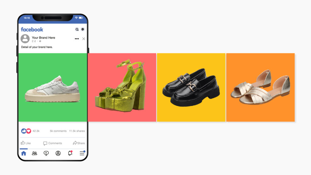
Ecommerce brands thrive when they employ product carousels, and it’s one of the most popular types of Facebook ads. It’s not just about getting a slew of products in front of potential customers. It’s about careful curation and targeting. Marketing complementary products together can work well, or simply marketing best-selling products that are sure to spark interest.
Tutorial Carousel

Carousel ads are popular among product-based businesses, but by no means are they off limits to other types of businesses. These ads give a step-by-step process of how something works. Tutorials can be useful to a wide range of businesses, nonprofits, and other types of platforms with a message to share.
Text and Video
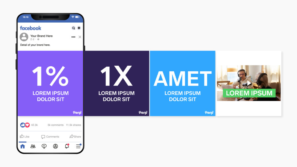
Carousels are obviously great for imagery, but bold, well-placed text can go a long way. Some brands even mix text slides with video. You can display up to 10 images and video clips. Each slide gets its own headline, description, and link.
Reviews Carousel
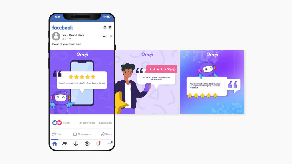
Reviews are clearly less eye-catching. But when powerful reviews are shared with viewers who have a genuine need, it could raise your social media ROI fast. People generally want to hear their pain points addressed and to know that a product or service will deliver. With carousel reviews, you can provide ample reassurance.
Facebook Carousel Ad Examples
Creating a good ad is a little science, a little art. Some key ingredients include:
- A clear, enticing offer
- Imagery that tells a story
- Phrasing that resonates with the audience
- A design that makes sense & clarifies the offer
Take a look at these Facebook carousel ad examples and see if you can find these elements.
LinkedIn Ad
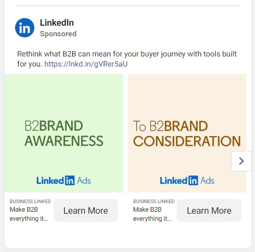
Being a professional network, LinkedIn’s branding history could be considered dry. But their simple imagery and language speak to a B2B audience that wants to increase opportunities. The ad offers a sense of possibility and entices company owners to click and learn what new features LinkedIn now offers.
Makeup Carousel Ad
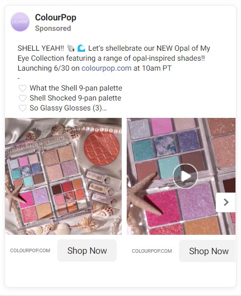
Some brands can lean on the imagery of their products to market themselves. This is what ColourPop has done, centering a colorful makeup palette that’s bound to catch the eye. The brand uses images and video to display products and promote the newest product line.
Online Education Ad
Thinkful employs a brilliant strategy, speaking directly to what their audience wants: a higher salary. The online education platform boldly highlights the value of signing up, and they waste no time with imagery, bold colors, or lots of carousel slides. They communicate their message in just two.

Furniture Ad
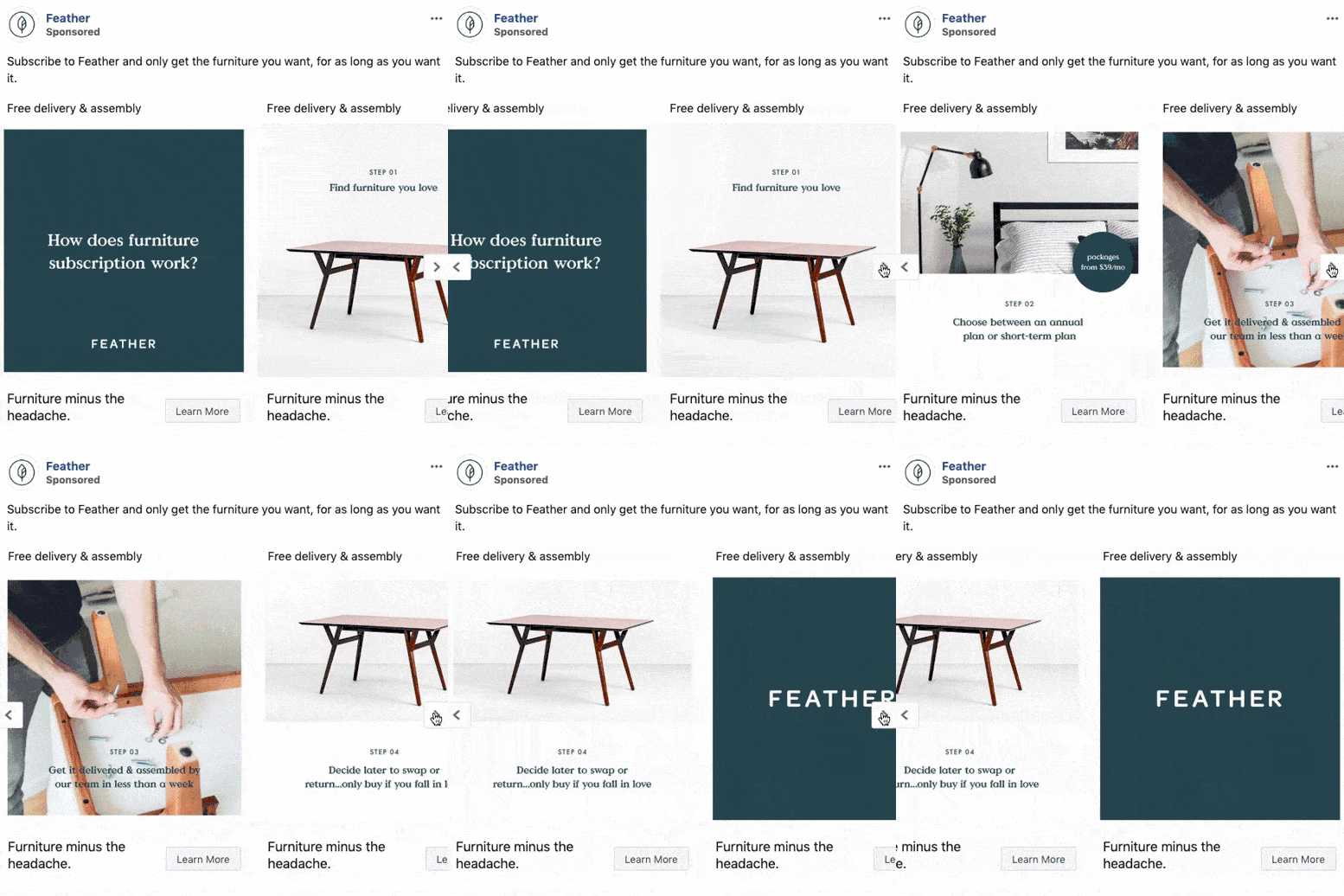
This Facebook carousel ad example from Feather features sleek, modern furniture. Their branding perfectly matches the clean, minimalist vibe of the products. The copy is concise, and though a furniture rental company is somewhat of a hard sell, each slide frames the process positively and gives more information.
Shutterstock Ad
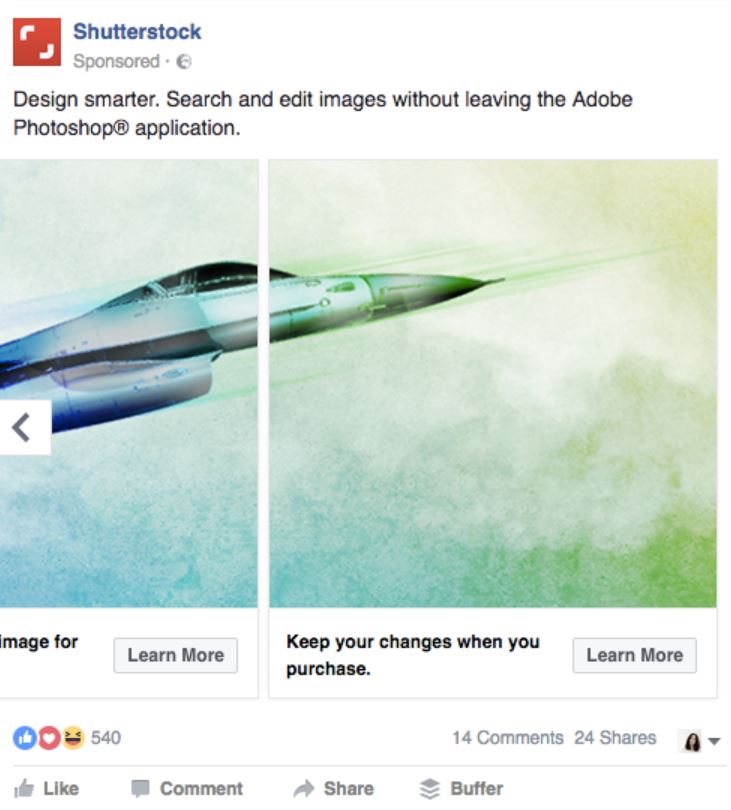
This Facebook carousel ad has an impressive image that spans across two slides. It’s an increasingly popular strategy brands use because it catches the eye more effectively. Rather than looking at bite-sized slides, you can take in Shutterstock’s beautiful imagery all at once – a great idea when the product itself is images.
Tips for Creating Facebook Carousel Ads that Pop
If you want to create something as eye-popping as these Facebook carousel ad examples, here are a few valuable tips:
Use your best photo for the first image
Anyone on social media can tell you that ads are everywhere. We are bombarded with them each and every day, this is why showing your best images first matters. Make sure that the first image on your carousel is impactful.
Tell a story
While most Facebook carousel ads have various images in them in the hopes of showcasing more, using one image can sometimes add more impact. Tell a story by breaking up one long image and placing it in individual cards. See example below:

Follow Facebook’s design recommendations faithfully
Facebook has recommendations for designs, text, and technical requirements for its carousel ad. If you want your ads to perform best, always adhere to these.
Do note that Facebook gives us the option to automatically show your best images first on the carousel. This would be useful for the first tip on this list. But if you want to tell your brand story with a cut-up image, untick this option.
Get Unlimited Facebook Ads & Graphics
Tired of designing your own Facebook carousel ads? When you team up with Penji, you get a graphic design team that does everything for you — from Facebook ads to illustrations, logos, landing pages, and more. If you need a design, we’ll get a draft back to you in as little as 24 hours.
Say goodbye to…
- unreliable freelancers
- amateur designs
- hiring and firing
- missed deadlines
- huge workloads
- inconsistent branding
And best of all, pay a fraction of the cost you’d pay a full-time designer and get a whole team instead.
With no contracts, you have nothing to lose! Ready to see how Penji can streamline your graphic design process for good? Check out a demo and see how it works.
About the author

Brianna Johnson
Brianna is a professional writer of 10+ years who specializes in branding, marketing, and technology content.


