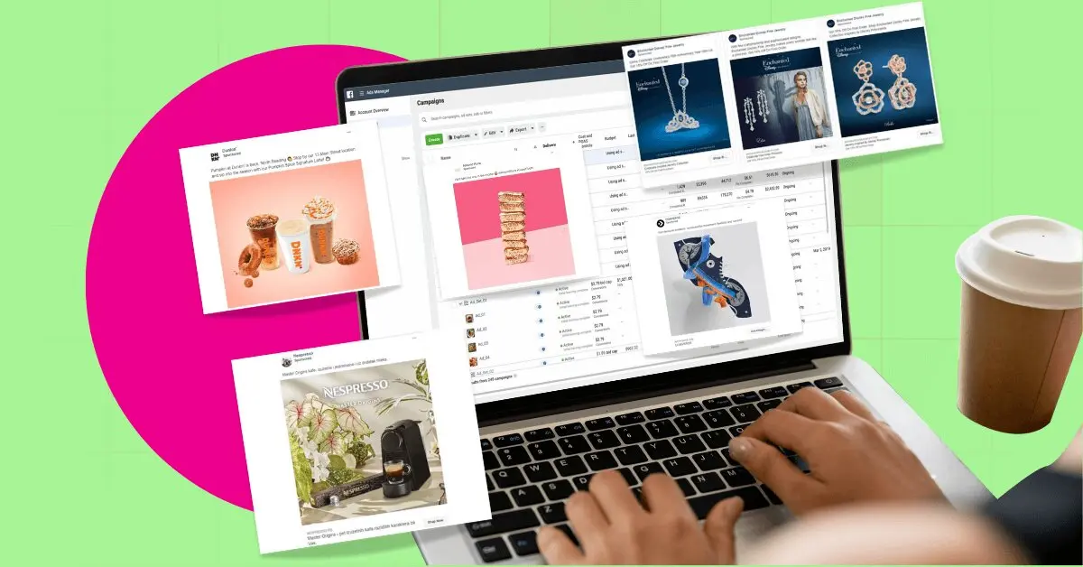
Have you ever purchased a product or service after seeing it on social media? If you’re like most people, your answer would be a resounding yes. You might even have a few items in your shopping cart right now, just waiting to be checked out! So, it’s no wonder businesses of all sizes are counting on effective Facebook Ads to take them closer to their audience.
Without a doubt, Facebook is an excellent marketing tool for small businesses. Why? Because it levels out the playing field between local micro ventures and mega-corporations. Bigger companies may have heftier ad budgets than small businesses. But that doesn’t guarantee success. It depends on the right targeting, strategy, and Facebook Ad designs that work.
In between strategizing and studying ad analytics, marketing managers don’t have the time to experiment with graphic design. And with such stiff competition, you just can’t keep in step with the bigwigs using amateurish visuals.
Need Facebook Ads designed? Scroll to the bottom of the page for a special promo code!
Table of Contents
- Add Texture
- Address a Problem
- Highlight the Offer
- Deconstruct the Product
- Go Minimalist
- Use Brand Colors
- Create an Eye Candy
- Use Ads that Cater to Different Tastes
- Go With the Season
- Display a Virtual Fashion Show
- Use the Power of Nature
- Paint a Scene
- Humanize the Image
- Create a Lookbook
- Use Images that Tell a Story
- Prioritize Essential Information
- Stay Focused on your Call-to-Action
- Requesting a Facebook Ad Design on Penji
Here are some of the best Facebook Ads we found on the Facebook Ad library. Note how each marries creative images with marketing tactics to maximize their ad spend.
1. Add Texture
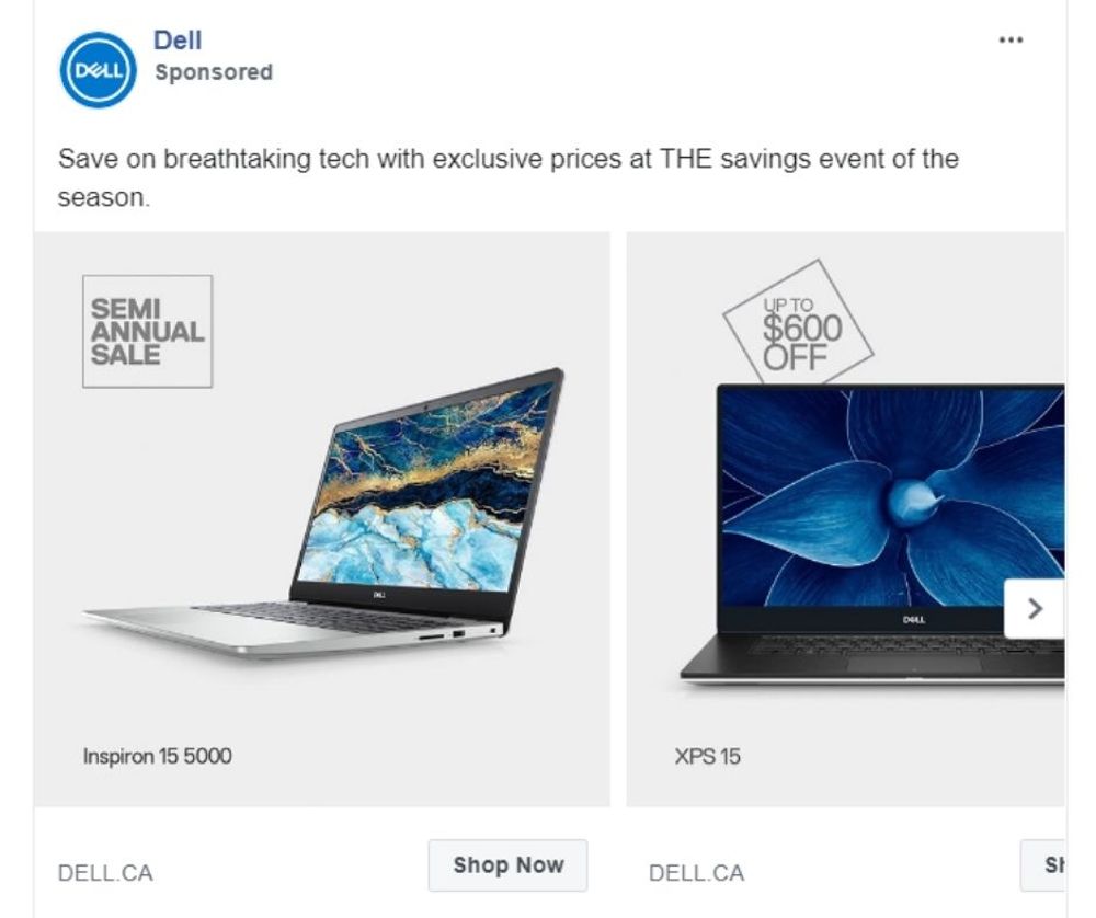
Image Credit: DELL
Some items are challenging to market visually. For instance, laptops that go in monochrome grays, silvers, and blacks don’t really jump out to anyone scrolling down the screen. However, Dell managed to make its devices look a lot more interesting by displaying patterns on the laptops’ screens.
As a result, the displays created the texture needed to catch the audience’s attention. If you look at the carousel ad, you’ll immediately get drawn to the patterns on the screen. And in so doing, you’ll also be swayed to pay attention to the devices and the sale and discount labels.
2. Address a Problem
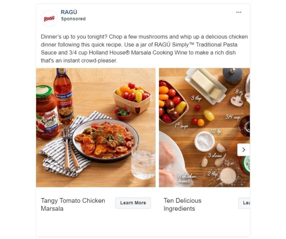
Image Credit: RAGU
If you look at the most effective Facebook ads, you’ll see that they all address the audience’s problem. By acknowledging a problem and offering a solution, the brand becomes a valuable resource to the audience.
For instance, take a look at this carousel ad for Ragu. Instead of merely using the ad to highlight the product, they made it function like recipe cards. It’s perfect for anyone who wants to make a delicious dinner with minimal ingredients, time, and effort.
3. Highlight the Offer
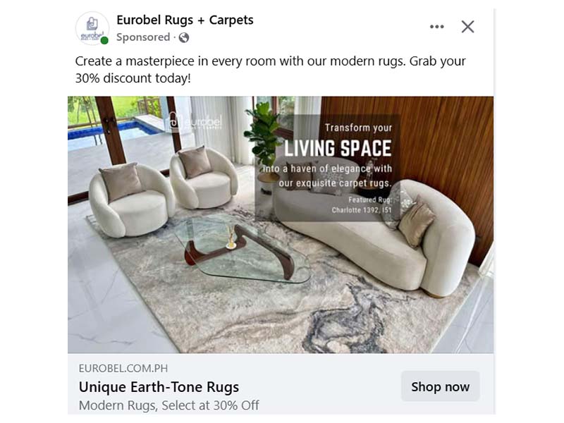
Image Credit: Eurobel
This Eurobel Rugs + Carpers ad promotes its Unique Earth-Tone Rugs with a 30% discount. It emphasized that the rugs let you create an elegant living space with their modern rugs – at a discounted price.
Offer ads can be highly effective for businesses, attracting new customers, driving conversions, and generating buzz through special deals. Using Facebook’s ad targeting features, Eurobel can present its sales promotion to customers directly on their feeds.
4. Deconstruct the Product
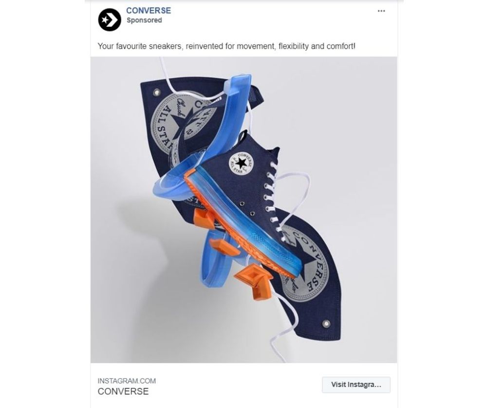
Image Credit: Converse
Though it may be too early to count down the best Facebook Ads 2020, this ad could easily make it to the list. The beauty of this ad lies in how it deconstructed the product that made for an interesting visual. When creating an ad, try to think outside the box and find another angle to present your product.
5. Go Minimalist
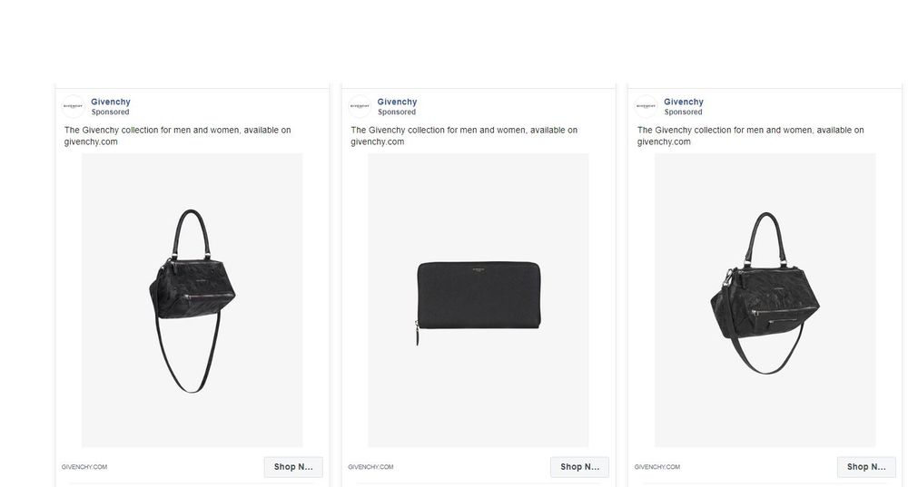
Image Credit: Givenchy
Though elaborate advertising art can be effective in sparking interest, minimalist designs can be just as stunning. Take, for instance, this ad set for Givenchy. It features different products, but they all appeal to the same audience. The images are simple, fuss-free, and draws all the attention to the product featured.
6. Use Brand Colors
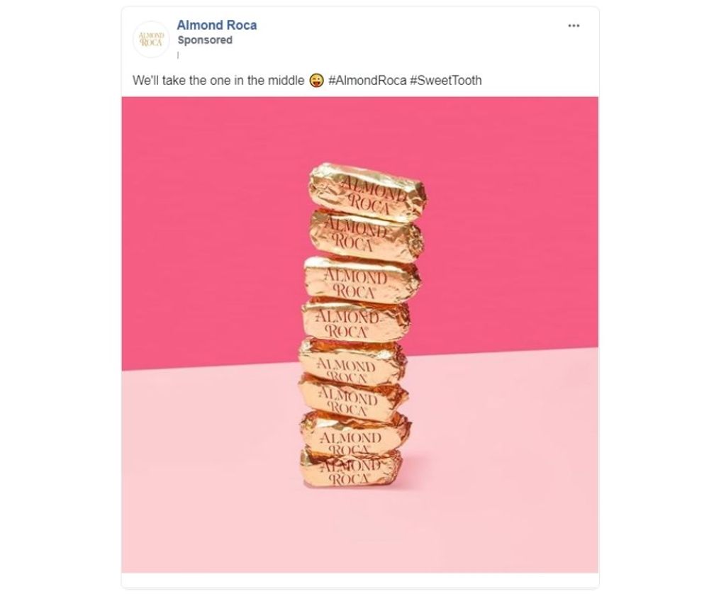
Image Credit: Almond Roca
The color palette is crucial in branding. That said, it pays to use the brand color palette in your ads to reiterate brand identity and improve recall. For example, this Facebook ad for Almond Roca has a background using its iconic shades of pink.
7. Create an Eye Candy
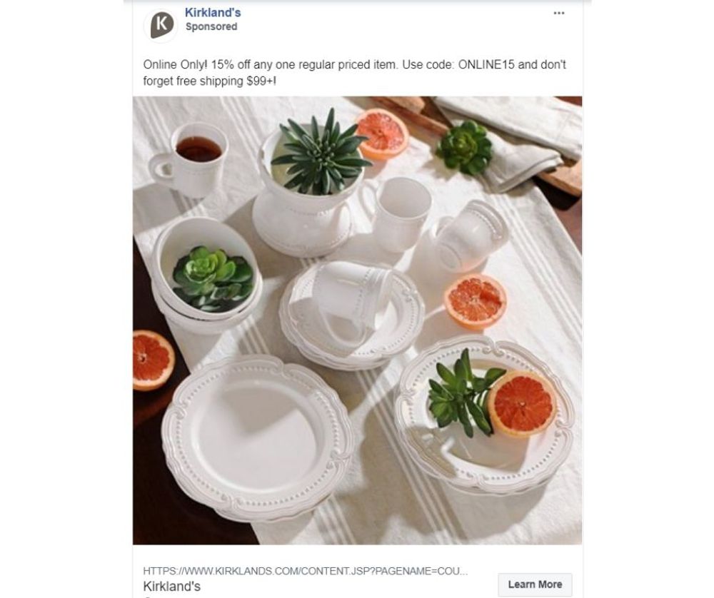
Image Credit: Kirkland’s
So, here’s what makes social media ads different from traditional ads. Facebook and Instagram ads need to look stunning enough to stop the scroll. With a lot going on in their feeds, people tend to ignore a lot of posts that don’t register to them as important. Yes, a powerful Facebook ad copy template would help a lot, but it’s the visuals that must first catch their attention.
So, think of an image that would make your audience look. For example, Kirkland’s Facebook ad will make anyone who loves kitchenware stop the scroll and marvel. The image features a dose of color from the citrus and succulents but eventually draws the eyes to the show’s star, which is the dinnerware set.
8. Use Ads that Cater to Different Tastes
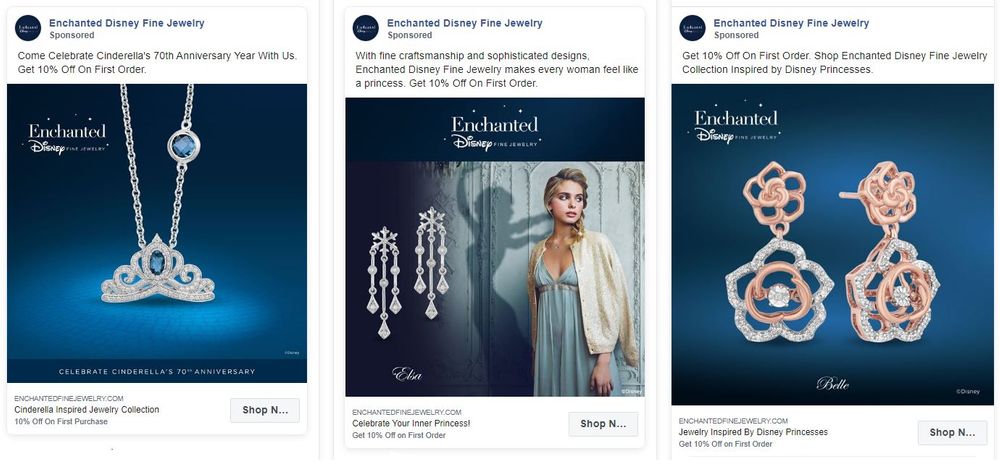
Image Credit: Enchanted Disney Fine Jewelry
Ventures must get to know their audience well. And if you did your research, you’ll know that your audience is divided into segments. When creating a comprehensive campaign, try to appeal to your audience segments through different images and Facebook ads scripts.
For example, this ad for a jewelry collection targets audiences according to the favorite Disney princess. The brand acknowledges that each ad viewer would probably have a different aesthetic taste in jewelry, thus the variety in ad creatives. Aside from releasing separate single-image ads like this, it might also help create a carousel ad to show all the collection items.
9. Go With the Season
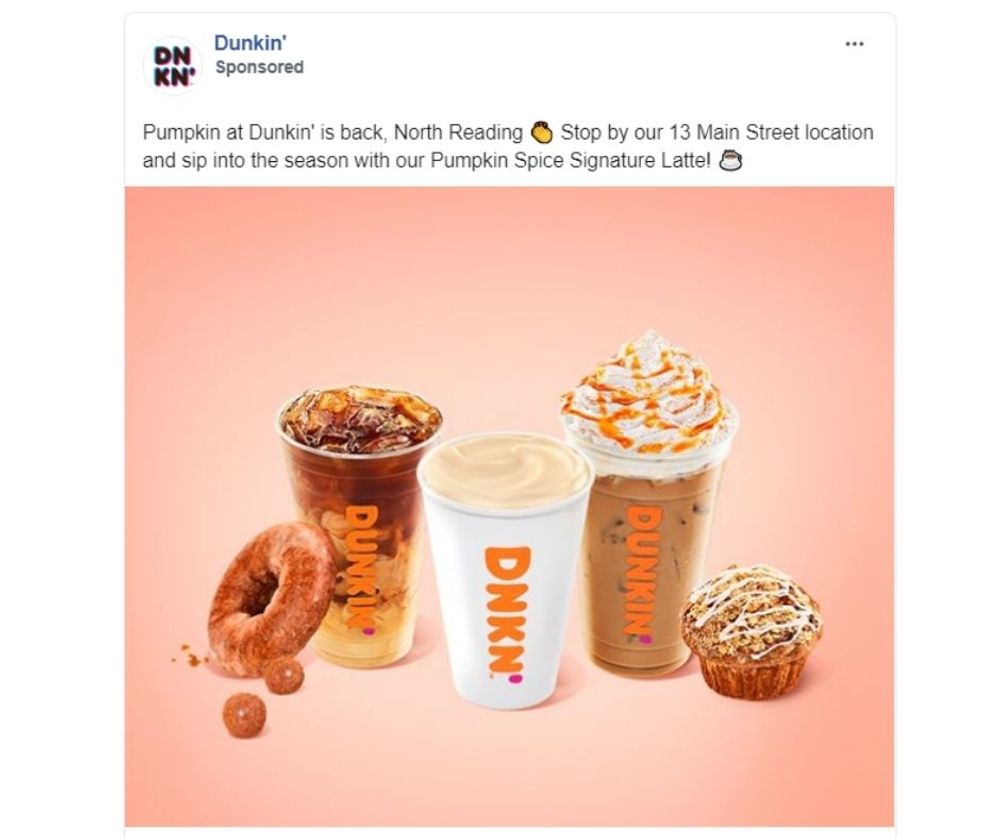
Image Credit: Dunkin’
Seasonal marketing involves adjusting your campaigns to fit cyclical events. Doing so gives you and your audience a common ground, thus making your brand more relatable.
For instance, take a look at this ad for Dunkin’ Donuts. Just as people are looking forward to colder months, the brand jumps in and encourages anticipation for fall foliage and pumpkin spice season. Aside from seasons, you can also include national holidays and other events into your ad campaign calendar.
10. Display a Virtual Fashion Show
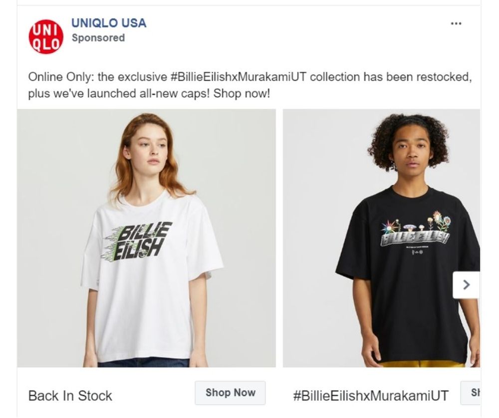
Image Credit: Uniqlo
If you’re selling apparel, showcase your collection with a carousel ad that works like a virtual fashion show. Use images of models donning the items and treat your prospects to a free catalog through your ad.
And while in the business of using photos of items worn by models, make sure that you show their faces. Psychology says people have a natural tendency to look at faces, and we seek them out everywhere we look. So, if you want your apparel line to be noticed right away, put them on models and show their faces.
11. Use the Power of Nature
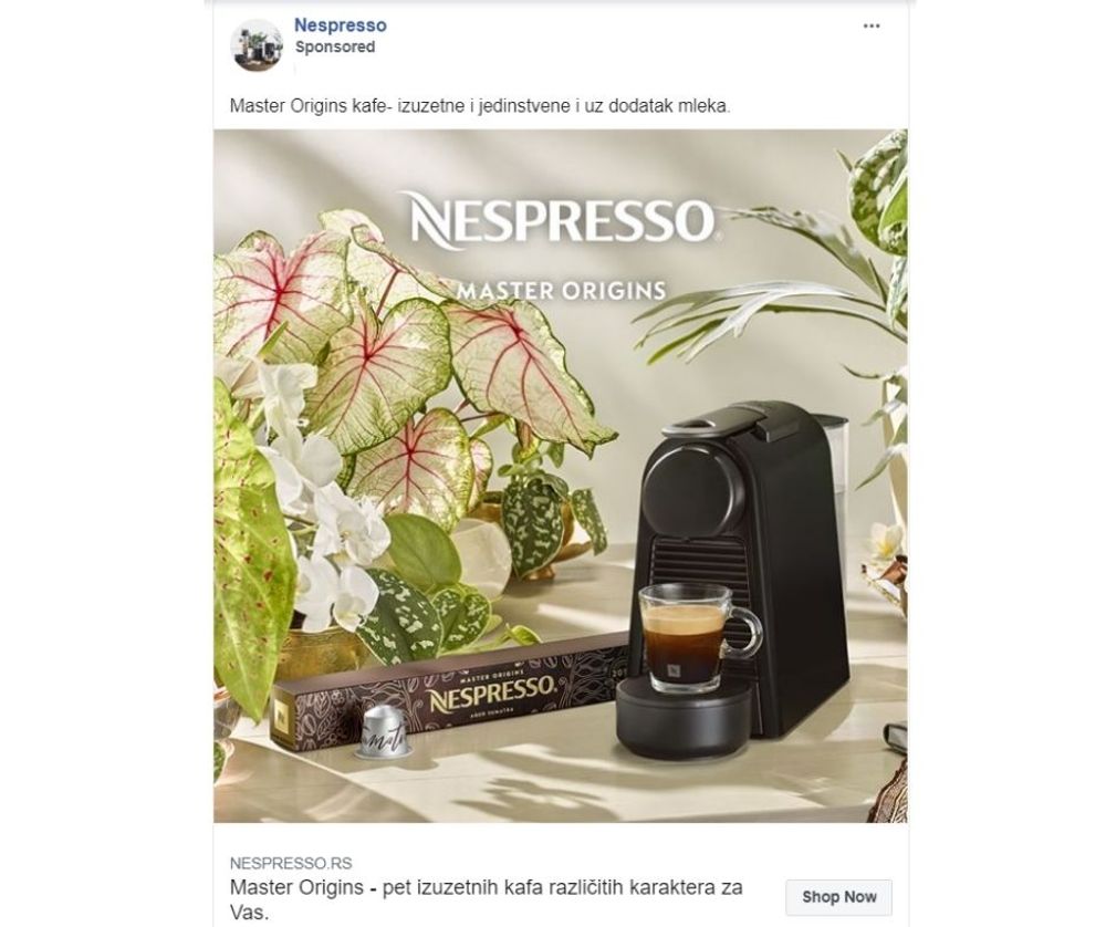
Image Credit: Nespresso
If you’re looking for Facebook campaign ideas for a product or service connected to wellness, nature visuals can be your best friend. Research at Manchester Metropolitan University found that nature scenes positively affected respondents similar to that of meditation.
To prove the research findings true, take a look at this ad for Nespresso. Doesn’t it make you feel pleasant, light, and at ease? With most coffee ads trying to project an energetic, caffeine-loaded vibe, this ad stands out as it does the opposite.
12. Paint a Scene
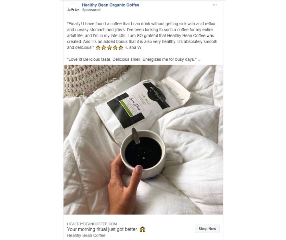
Image Credit: Healthy Bean Organic Coffee
This ad for Healthy Bean Organic Coffee is a great illustration of how testimonial Facebook ads can work so well. The caption is a five-star review of a buyer saying how happy she is with the coffee that doesn’t cause acid reflux and tummy jitters. Though the review is already good material, it’s the visuals that hit the home run.
The image paints a scene any acidic coffee lover would want for themselves. Sipping a delicious and relaxing cup of coffee without having to worry about heartburn or bloating a few minutes later.
13. Humanize the Image
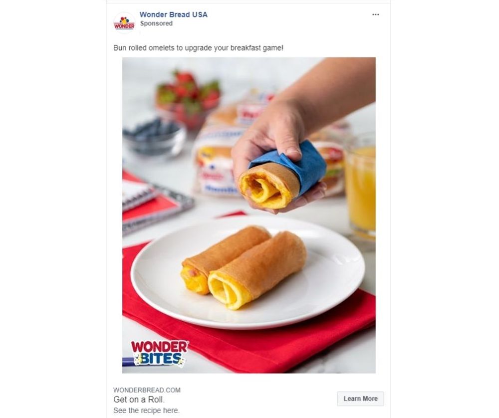
Image Credit: Wonder Bread USA
Many effective Facebook ads showcase product in all its glory. Many use stylized product photos focused on the object alone, and there’s really nothing wrong with that. However, it pays to shake things up a bit by adding a human touch.
Take this Facebook ad for Wonder Bread, for instance. You’d be surprised at how a hand reaching out for a bun-rolled omelet made all the difference in making it look more relatable! With that hand in the image, the ad isn’t all about the bread anymore. It’s about the experience you’ll have when you buy the product and make a roll yourself.
14. Create a Lookbook
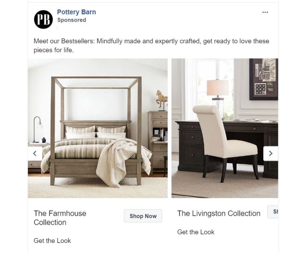
Image Credit: Pottery Barn
Many furniture stores entice buyers to purchase by giving away brochures or lookbooks. These materials help the audience see how each piece falls into place. Also, the images encourage the prospect to buy more than one item to get the whole look.
However, distributing printed materials can be costly, not to mention not very environment-friendly. Luckily, you can create a similar feel online – and right into your Facebook ad, no less. Just take a look at this ad for Pottery Barn, for instance. Swiping the carousel ad is akin to flipping the pages of a furniture magazine.
15. Use Images that Tell a Story
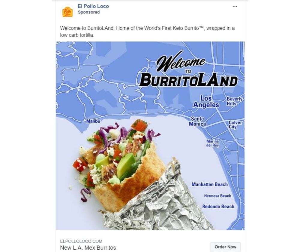
Image Credit: El Pollo Loco
El Pollo Loco has a campaign that combines traditional Mexican flavors with the creative culinary influences in Los Angeles. The line includes one that’s extra cheesy, one made with Mexican shredded chicken or tinga, a plant-based version, and a keto version.
The Facebook ad shows a burrito amid an LA map, highlighting that they’re paying homage to their SoCal roots. At first glance, even without knowing what the campaign is, you’ll see that it has to do with geographical affiliation.
16. Prioritize Essential Information
Image Credit: Monday
When creating a Facebook ad, you must ask yourself: What does someone get out of using your product? How will it help them? These are the essential areas you should focus on in your copy, and you should do so clearly and concisely.
For example, Monday.com CRM helps teams manage tasks and workflows effectively to promote collaboration and productivity. In the ad above, Monday.com shares its value with the copy: “Easily customize your CRM without code or support. “With Monday sales CRM, track every deal, manage all activities, identify bottlenecks, and increase productivity.” These two statements explain entirely the benefit of the service being advertised.
17. Stay Focused on your Call-to-Action
Image Credit: Stance Philippines
Requesting a Facebook Ad Design on Penji
Let’s face it – tinkering with Facebook Ads Manager is no easy task. For one, it takes time to get the hang of this marketing tool. And even after you master the features, you still need to keep up with constantly emerging trends.
Thankfully, Penji can do the design heavy-lifting so you can focus on your digital marketing strategy. Best of all, it only takes three easy steps:
1. Create a Project
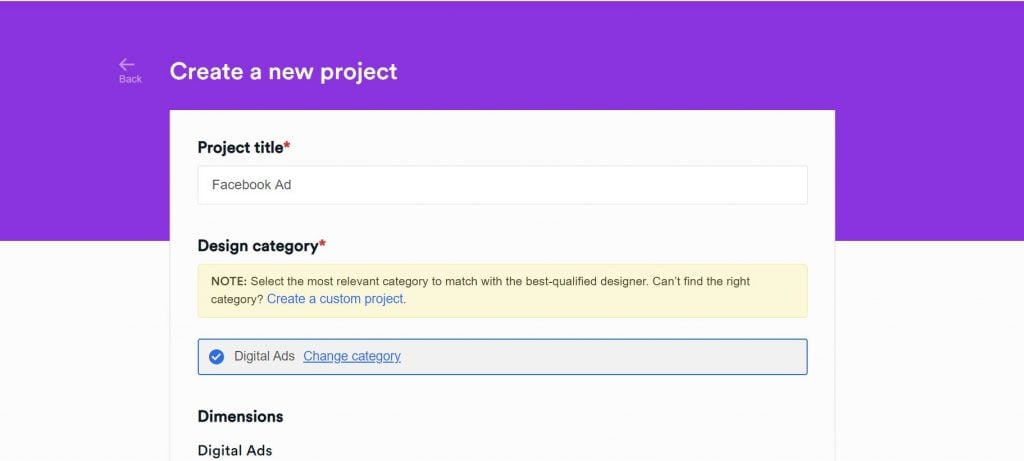
In the dashboard, click New Project. Type in the title of your project and select the category. You can choose the Digital Ad category. Type in the description of your project and hit Create Project. It will be assigned to a graphic designer who specializes in digital ads.
PRO TIP: It can be challenging to describe visuals sometimes. To ensure that you and your designer are on the same page, include links or files of images that you’d want to inspire the designs. Also, be as clear as possible if you already have a certain peg in mind. Specify the color palette and royalty-free images in the brief.
2. Review and Revise

Within 24 to 48 hours, the designer will send you a draft. Click on the file within the thread and review the design. If it’s exactly how you want it to be, proceed to step three. If you want anything revised, simply click on that part and type in your comments. The draft will be sent back to the designer for revision. Our packages come with unlimited revisions, so don’t be shy to request for changes!
3. Download
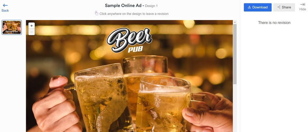
Once you’re 100 percent happy with the design, click on the Download button at the top right corner of the screen. The file will be saved straight to your device. Easy-peasy!
The Lowdown
Here are some key takeaways from the digital ad examples above:
- Depending on the product or service that you’re marketing, make sure that the ad addresses your audience’s key concern. For instance, if you’re selling a food product to busy people, how can it make food prep easier? If you’re selling apparel to a trendy niche, how can they wear it so that they look fashionable?
- Have the right image size for the type of Facebook ad you’re creating. For instance, single-image ads are usually 1,200 x 628 pixels, while story ads for Facebook and Instagram are 1,080 x 1,920 pixels. If you’re creating carousel ads, however, you can choose 1,080 x 1,080 pixels.
- Always make the brand the front and center of any campaign. Each ad set and ad creative should tell the brand’s story, bringing you closer to the heart of your audience.
So, are you ready to kick it into high gear? Sign up today with promo code “FBADDESIGN” and get stunning designs for effective Facebook ads! Choose any of our packages and try it risk-free for 30 days.
About the author

Carla Deña
Carla is a journalist and content writer who produces stories for both digital and legacy media. She is passionate about creativity, innovation, and helping small businesses explore solutions that drive growth and social impact.
Table of Contents
- 1. Add Texture
- 2. Address a Problem
- 3. Highlight the Offer
- 4. Deconstruct the Product
- 5. Go Minimalist
- 6. Use Brand Colors
- 7. Create an Eye Candy
- 8. Use Ads that Cater to Different Tastes
- 9. Go With the Season
- 10. Display a Virtual Fashion Show
- 11. Use the Power of Nature
- 12. Paint a Scene
- 13. Humanize the Image
- 14. Create a Lookbook
- 15. Use Images that Tell a Story
- 16. Prioritize Essential Information
- 17. Stay Focused on your Call-to-Action
- Requesting a Facebook Ad Design on Penji
- The Lowdown

