Looking for inspiration or ideas to include in your new eCommerce website? If you’re about to start an online store and don’t know where to begin, here are 20 eCommerce website designs that are truly awe-inspiring, you’d want to follow their suit.
When smart ventures need a stunning website design like these examples, they turn to Penji. We offer high-quality website designs that allow brands to stand out from their competitors.
If you already have a website but want to go forward with a new design, read on and see how these unusual eCommerce designs have become some of the best so you can learn a thing or two and be an inspiration as well.
1. Not Another Bill
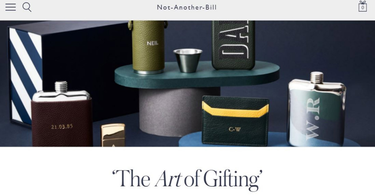
A website that offers gift subscription services and more, Not Another Bill has a minimalistic design approach to give emphasis on the products they sell. The use of a crisp and clear photo gives a feeling of looking at a stylish fashion magazine.
2. New Chapter
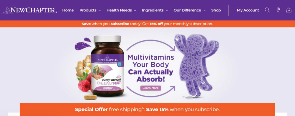
The New Chapter ecommerce design has included quizzes and customized “choose-your-own-adventure” packages to give users and prospects a fun and engaging website experience. It helps educate viewers about their products to eventually convert them into sales.
3. Hebe
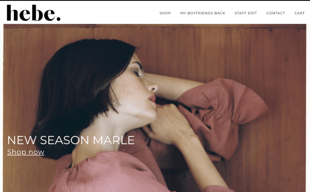
Hebe’s use of high-quality photos combined with an excellent choice of typography makes it appealing and attractive which is what an online clothing store should be. Everything about the website spells class and style, without the fluff. Not much noise around here, just pure fashion.
4. PowerOnPowerOff
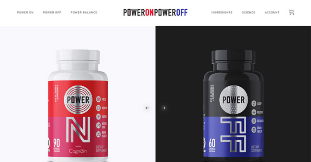
Straight off the bat, PowerOnPowerOff informs viewers all about their products and what they can do for you instead of bombarding you with their promos or discounts. The website features long scrolling that adds new information and becomes interactive as you go down the homepage.
5. Simply Chocolate
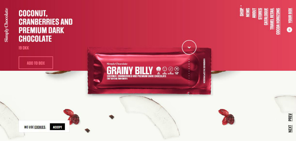
Based in Copenhagen, Denmark, Simply Chocolate’s website brilliantly displays each chocolate bar in an ingenious way. When you scroll down the page, you’ll see a chocolate bar floating around, gets unwrapped, and is broken into pieces. You simply have to see it to believe it.
6. Rebecca Atwood
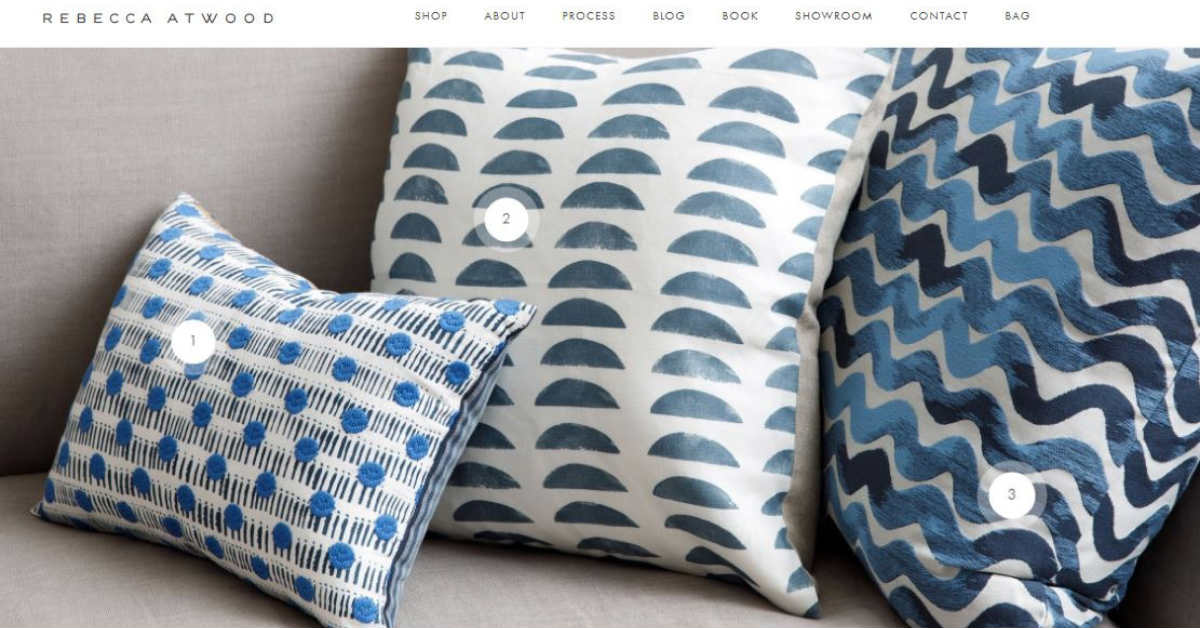
This website looks good overall, whether viewed on a desktop or on mobile which is an essential factor when designing your ecommerce store. It has a “click to buy option” that redirects you instantly to the product page, lessening the work of searching for it at another page.
7. Bon Bon Bon
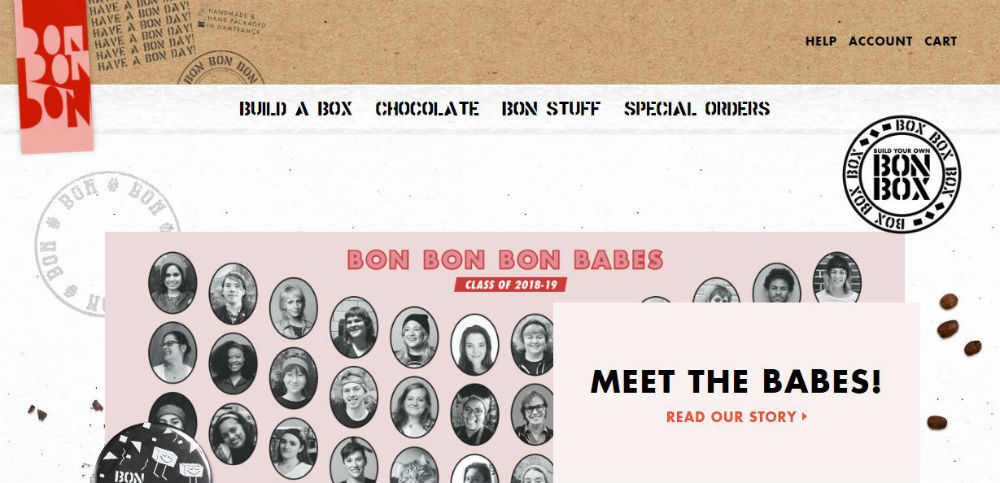
Another chocolate company, this time, based in Detroit, but full of spunk and swank. The website is fun and light, and the addition of a box that lets users choose their faves: the Build a Box Box Box, makes for great user experience.
8. Bliss
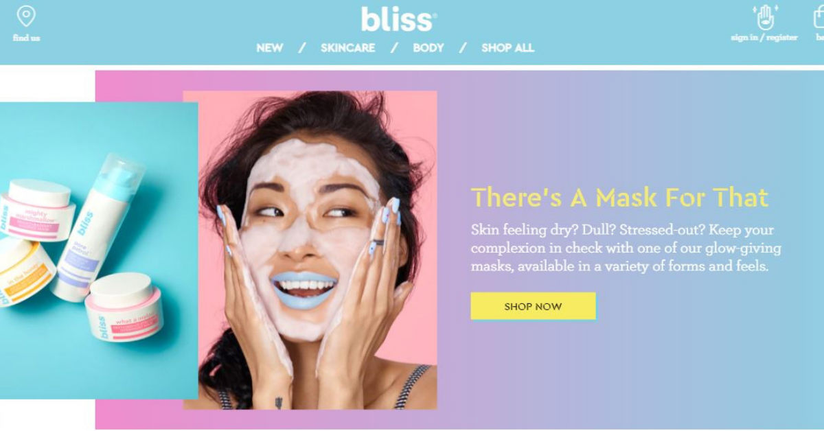
Filled with bright and cheerful colors and images, Bliss’ website is spilling to the brim with fun and energy. The use of clear and high-resolution photos makes for an appealing and attention-grabbing website.
9. The Sill
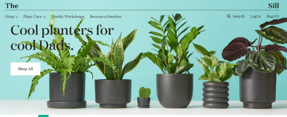
Selling plants for everyone in the family, The Sill’s website oozes with green and all the colors of nature to provide a refreshing feel and look. The words ‘The’ and ‘Sill’ are placed at the extreme sides of the homepage and will cleverly come together as you scroll down. The company motto is “Plants Make People Happy” and this can be clearly seen all throughout the website.
10. The Parfait Stand
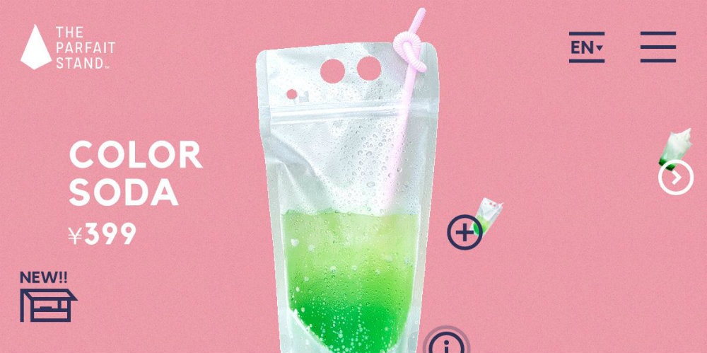
Tokyo, Japan is home to The Parfait Stand and its website is one of the best ecommerce website design because of its use of stylized photos of the products and the restaurant itself. The landing page uses an animation that adds dimension to an otherwise flat representation of sodas floating around.
11. Crossrope
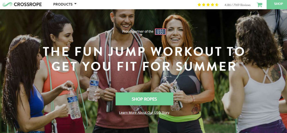
A new take on the jump rope, Crossrope offers a unique and fun experience while getting results for your fitness goals. The website perfectly tells their story to encourage people to have fun using a totally new and different method.
12. Mulberry
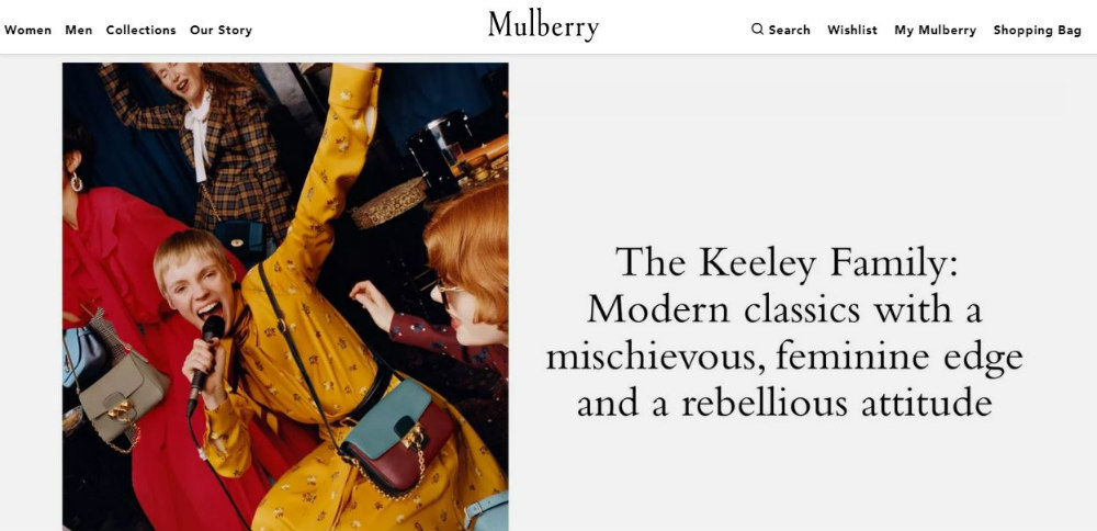
A high-end fashion online store, Mulberry uses colorful photos that have the zoom to hover technique that encourages clicks and views. The website uses big, bold images and few words that won’t distract the audience from seeing the real start of the show—their clothes and accessories.
13. Skullcandy
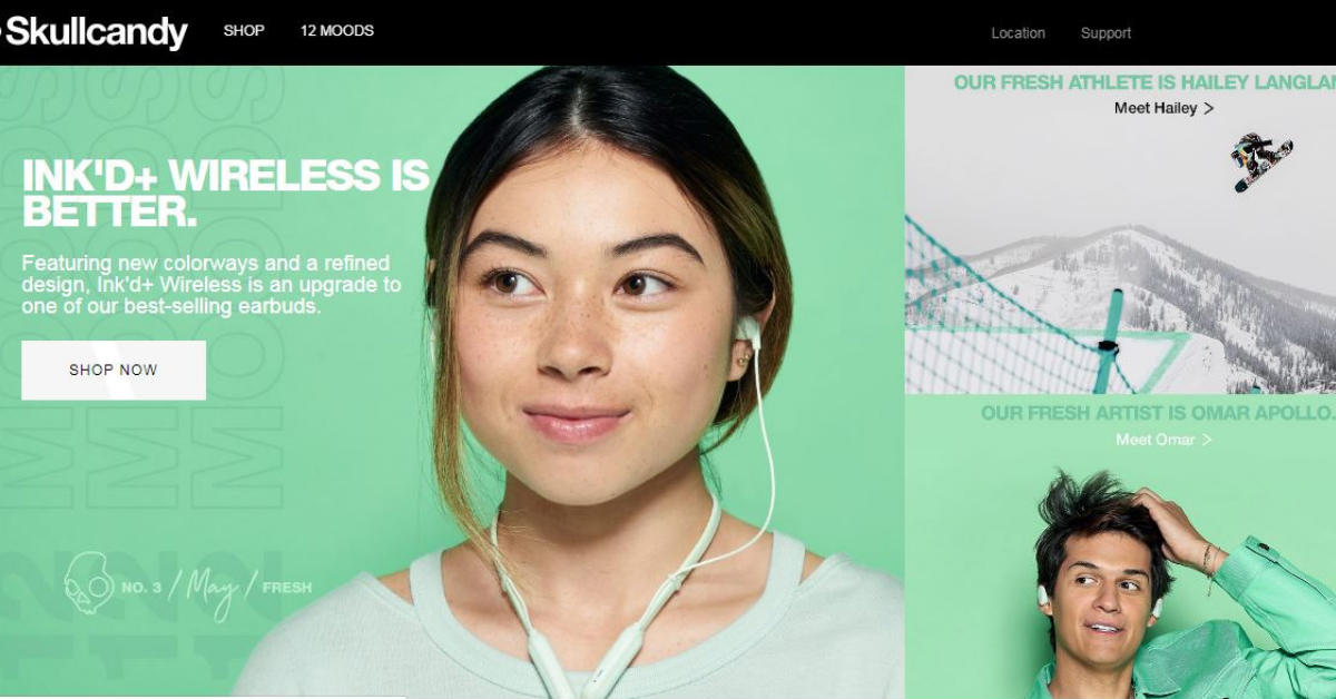
Great color combination and photography that jumps out of the page, Skullcandy’s website has got what it takes to grab their target audience’s attention. Every page clearly describes their brand while engaging the viewers for fun user experience.
14. Owl
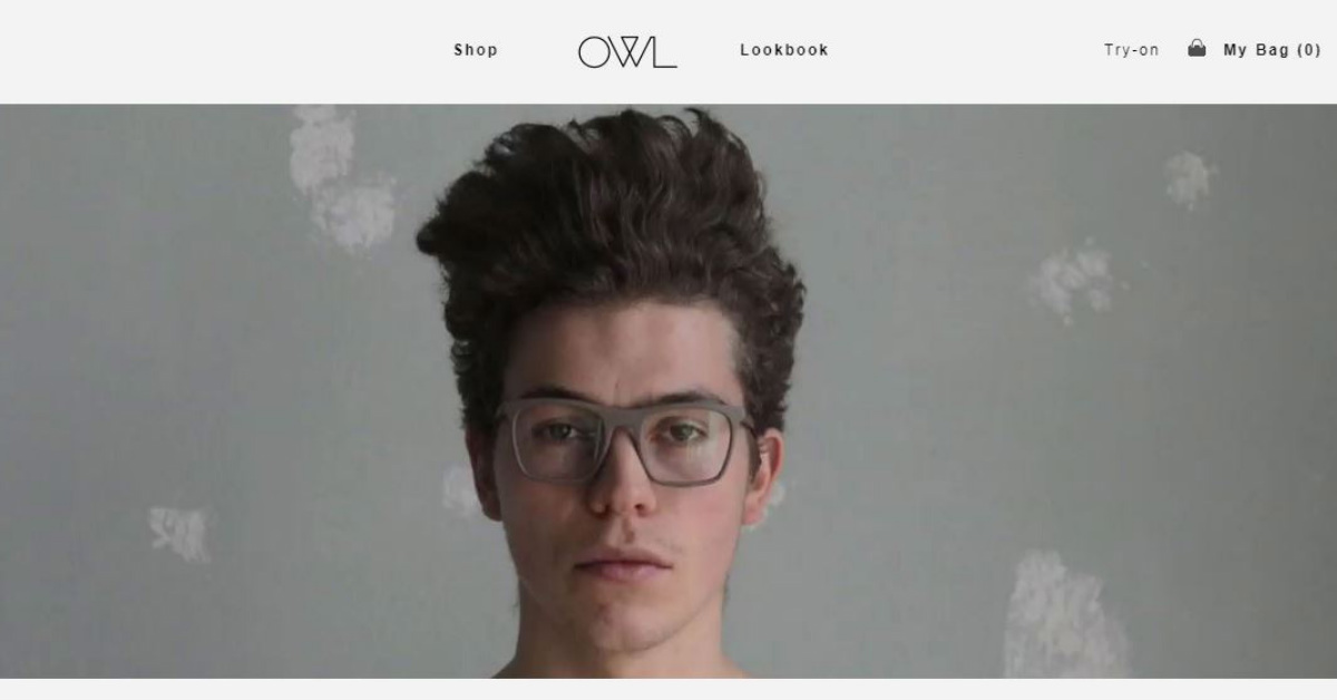
The Owl website is packed with creativity at every turn – something that we, at Penji, loves to do with our web designs! It has a touch of minimal design that you can see at the videos that automatically play to showcase their products. Since the design is very minimalistic, download times won’t bore even those with short attention spans.
15. Caroline Z Hurley
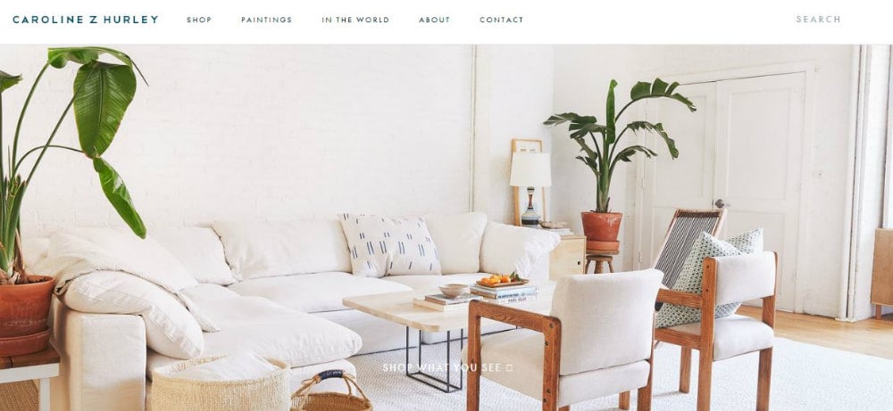
Once you see the crisp and clear photo on the homepage of Caroline Z Hurley’s website, you’ll get a sneak peek at what the whole website is about. The wonderful imagery sells without exerting too much effort. The products are laid out conveniently, making it simple and easy to make your choices.
16. JeepPeople
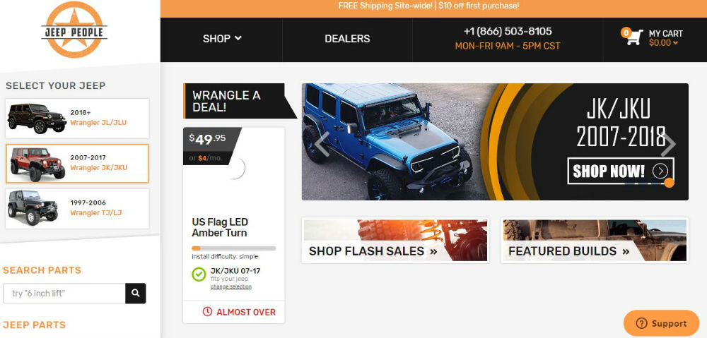
Jeep fans won’t have a hard time getting all of their jeep needs with this JeepPeople eCommerce design. It is designed specifically to guide their customers in buying the parts that work well with the make and model of their vehicles. No more guessing game, you are asked to select your model and go on from there.
17. Molly Jogger
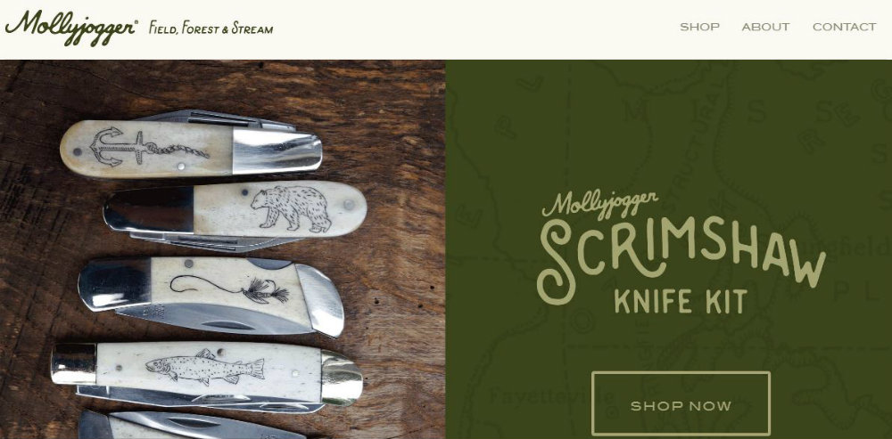
Ease of use is what Molly Jogger’s website is aiming for and it seems to work very well. You can browse through the site and easily find what you’re looking for.
18. Wolf Gang
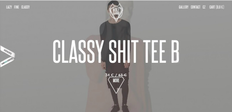
Some of the websites in this list use bright colors to get attention which is the opposite of what Wolf Gang has done with theirs. They have a heavy design using dark and somber colors which, in their case, catches the eye as much as those who use vibrant colors. An important factor in making eCommerce design stand out is to do what the others aren’t doing.
19. 100% Pure
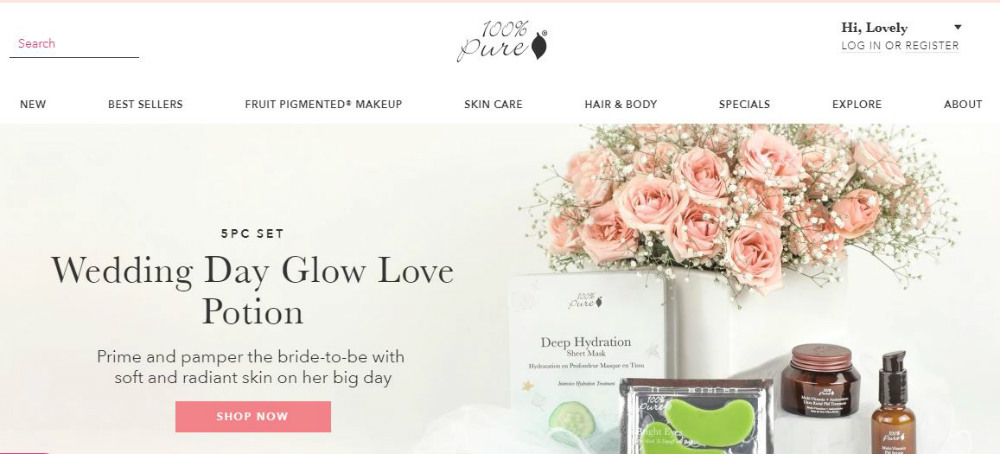
Creativity will set you out from the rest, but pure simplicity will make you stand out without putting too much work. The website for 100% Pure needs no fancy-schmancy design elements that are unnecessary in a company that sells purity.
20. Two Chimps Coffee
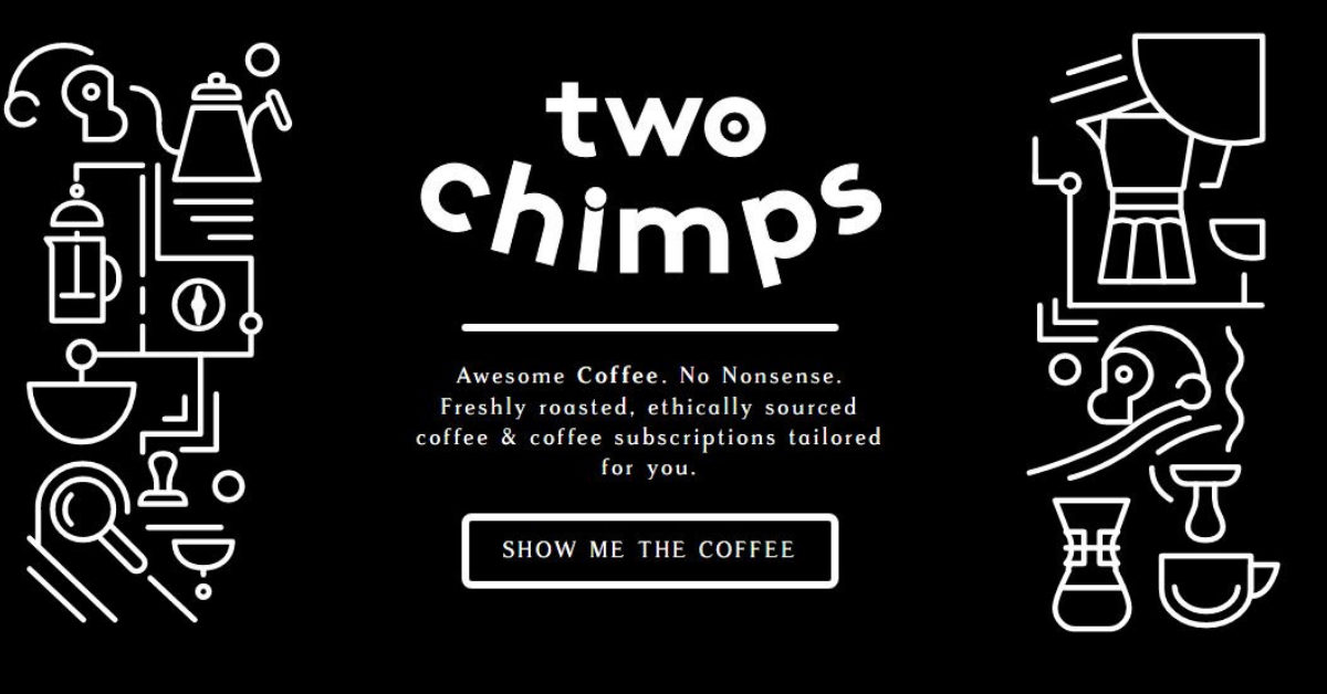
If engagement is what you’re looking for in a website, then Two Chimps Coffee is where you should get your design inspiration from. Before you leave the website, a pop-up window will appear and a call-to-action button with the words “Gimme Some” will entice you to buy from them.
Requesting a Web Design from Penji
Looking at these excellent designs will make any entrepreneurs and marketers long for a website that really makes the brand shine through. Luckily, our designers can create the most beautiful web designs best-suited for your industry and brand personality.
Here are three easy steps to order designs from us:
1. Create a Project
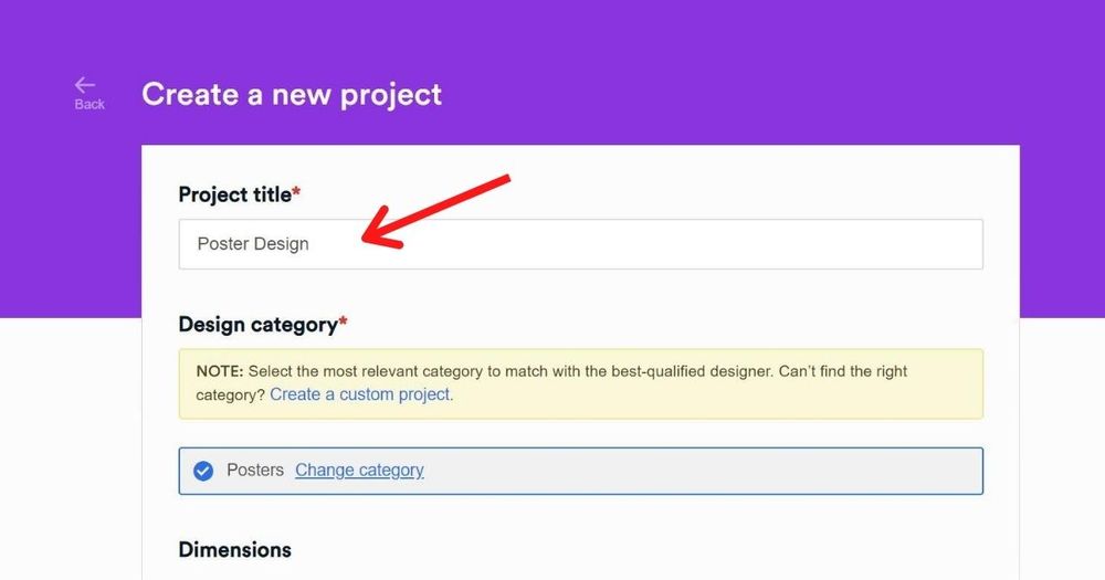
On the dashboard, click New Project. Type in the title of the project and choose a category. We create quite a handful of graphics, so feel free to browse! If the category you’re looking for isn’t listed, you can also choose “Custom Project.” Enter the description of the project and attach reference photos or images. Click Create Project. It will be assigned to a designer who will prepare a draft within 24-48 hours.
2. Review and Revise
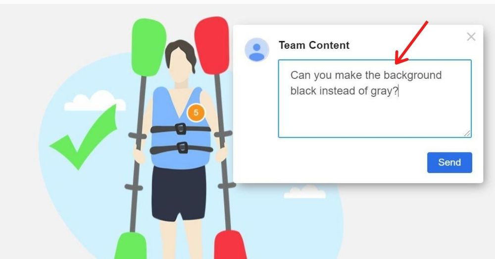
The designer will send you a draft, which you can view by clicking on the file in the chat thread. If you need anything revised, click on that part of the image and type in your comments or instructions. The designer will work on the revision and send you an updated version. The subscription comes with unlimited revisions, so don’t be shy!
3. Download
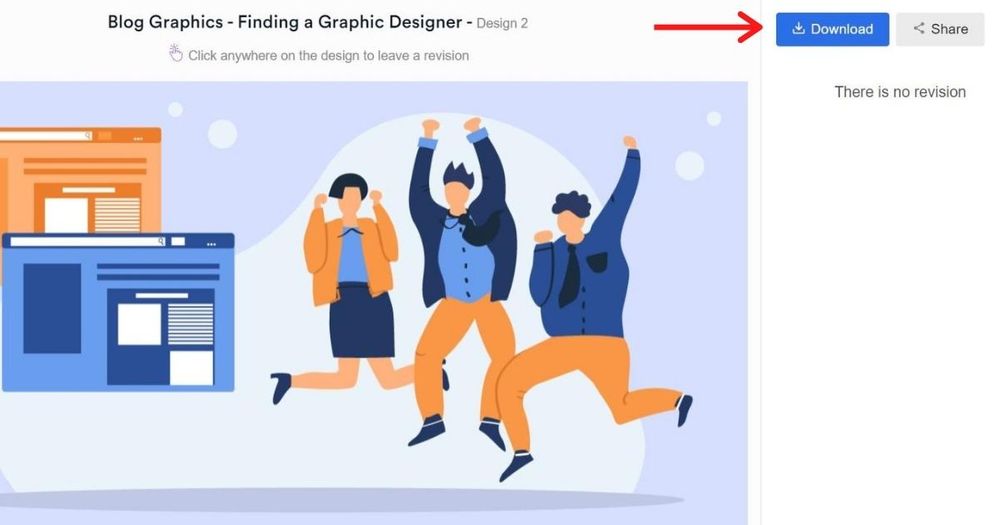
Once you’re happy with the design, click the “Download” button and it will automatically be saved to your computer.
Now that’s hassle-free website design right at your fingertips. Discover how we can help you grow your brand with our stunning designs! Sign up today and try any of our packages risk-free for 15 days.
About the author

Celeste Zosimo
Celeste is a former traditional animator and now an SEO content writer specializing in graphic design and marketing topics. When she's not writing or ranking her articles, she's being bossed around by her cat and two dogs.
Table of Contents
- 1. Not Another Bill
- 2. New Chapter
- 3. Hebe
- 4. PowerOnPowerOff
- 5. Simply Chocolate
- 6. Rebecca Atwood
- 7. Bon Bon Bon
- 8. Bliss
- 9. The Sill
- 10. The Parfait Stand
- 11. Crossrope
- 12. Mulberry
- 13. Skullcandy
- 14. Owl
- 15. Caroline Z Hurley
- 16. JeepPeople
- 17. Molly Jogger
- 18. Wolf Gang
- 19. 100% Pure
- 20. Two Chimps Coffee
- Requesting a Web Design from Penji


