Ecommerce apps have become a staple in today’s digital world. No wonder, many entrepreneurs are constantly scouring the internet for the best app development software and business website templates. In this article, we’ll look at the best examples to learn valuable lessons and take the guesswork out of online store design.
According to statistics, more than half of the total internet shopping traffic comes from mobile devices. It makes an eCommerce app truly an invaluable and crucial asset to any online business.
Don’t have time to design everything yourself? Delegate those time-consuming design tasks to a vetted Penji designer and get drafts back within 24 hrs. With unlimited designs for a flat rate per month, you’ll get all the graphics you need at an affordable price.
- Submit unlimited design projects
- Unlimited revisions
- Fast turnaround
- One flat monthly rate
- No complicated hiring, HR, or unresponsive freelancers to deal with
Watch our demo video today and see why thousands of colleges and universities depend on Penji for their everyday graphic design needs.
Essential Features of a Competitive Ecommerce App
It’s a no-brainer why many online ventures spend valuable resources to come up with an ecommerce app. These watch the attention and sustain the interest of their target market.
However, it’s important to identify the essential features of a competitive app. The features should set it apart from all the fluff that only aim to make an app unique but doesn’t really contribute to – or worse, complicates – user experience.
The first essential in any ecommerce platform, be it a website or an app, is good loading speed. With internet users’ attention span now being shorter than ever, you wouldn’t want to bore clients or make them wait for more than they should.
Another essential is a trouble-free registration process. Users normally wouldn’t push through if the registration requires too many steps. They’re shopping in the app for convenience and they wouldn’t want any unnecessary setbacks.
User experience is perhaps one of the most important essentials of a successful ecommerce app. Customers should be able to browse products without complication. An app should offer options without overwhelming users.
Ratings and reviews are also an important part of ecommerce. This provides social proof and humanizes the shopping experience by providing stories of actual buyers who have already purchased the product.
Top Ecommerce Apps of 2020
Here are 10 of the top ecommerce app ventures. Take note of these apps’ branding and design aesthetics as well as the features that make them well-loved by the online shopping community.
1. Amazon
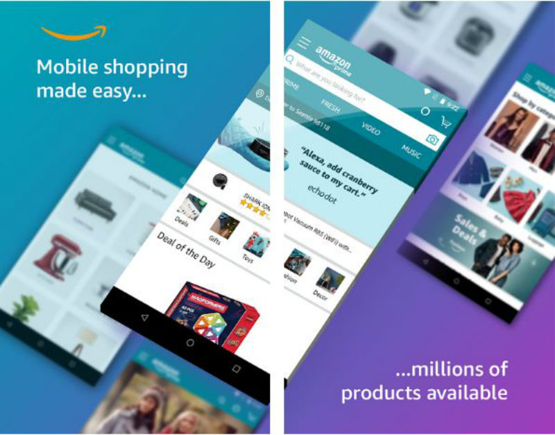
Claiming to offer the world’s biggest collection of goods including books, magazines, music, software and tangible goods, Amazon is undoubtedly a sought after app. One thing that makes this app competitive is its features that make shopping easier using voice and camera search.
2. Ebay
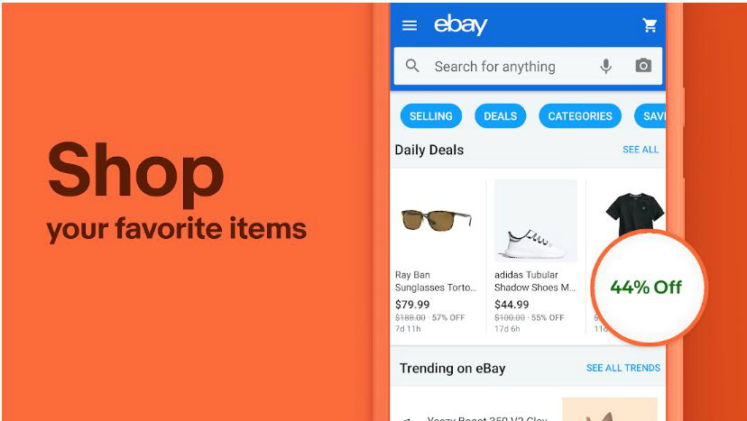
Perhaps what makes Ebay mobile app popular is its user-friendly features not just for shoppers but also for sellers. Unlike other ecommerce platforms that require documents and training for sellers, Ebay allows users to make a product listing in just minutes.
3. Groupon
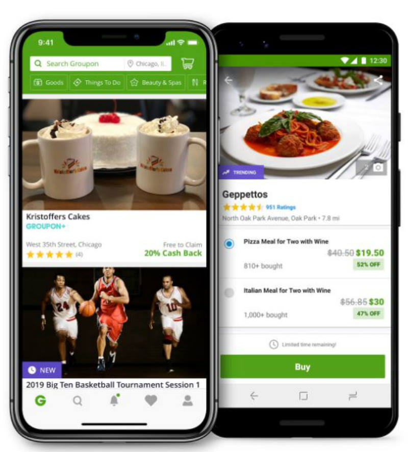
Known for providing discounted products and services by banking on collective bargaining power, Groupon is a favorite among deal-hunting netizens. The app provides a user-friendly dashboard that lets shoppers find deals they’re most interested in.
4. Wish
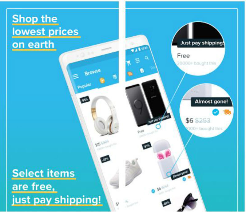
Wish is an ecommerce platform that facilitates the trade between sellers and shoppers. This venture has been listed as one of the leading platforms that offer counterfeit goods. Despite negative raps against Wish, it’s interesting to check out the user experience it offers that makes customers continue to use it.
5. Walmart

A favorite among anyone who doesn’t have the time to shop for household goods, Walmart app offers pickup option and next day delivery. It also has a feature that allows users to reorder the same goods they’ve bought before, making online shopping a breeze.
[in_content_ads gallery="apps" logo="off" title="Most apps fail in the app store" subtitle="Don’t be one of them. Get app UI design that increases downloads and makes users come back for more. " btntext="Sign up" btnlink="https://penji.co/pricing/?affiliate=J2O5AB8RAR3386837"]6. Ikea
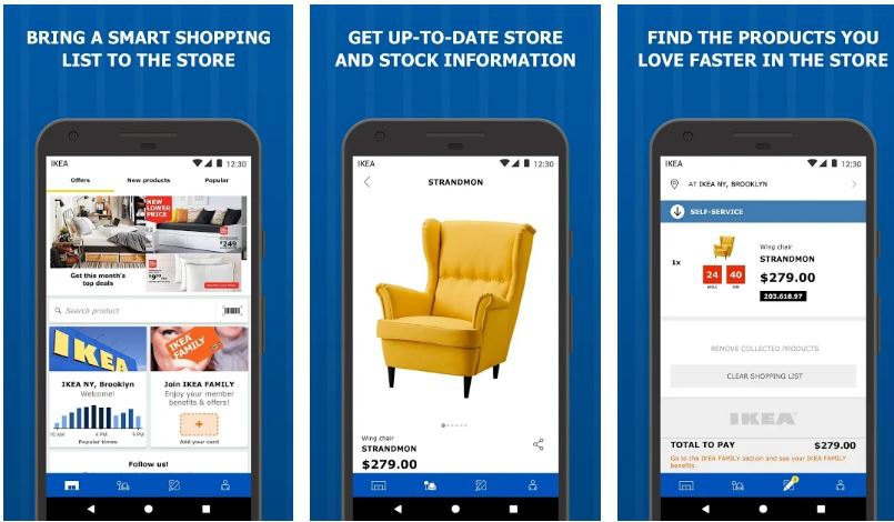
Shoppers looking for ready-to-assemble furniture are crazy over the Ikea app. Downloading the app allows one to browse categories and take note of items and stock information before actually visiting the store to purchase. This makes the app a supplementary tool to aid customers during the actual shopping experience on-site.
7. H&M
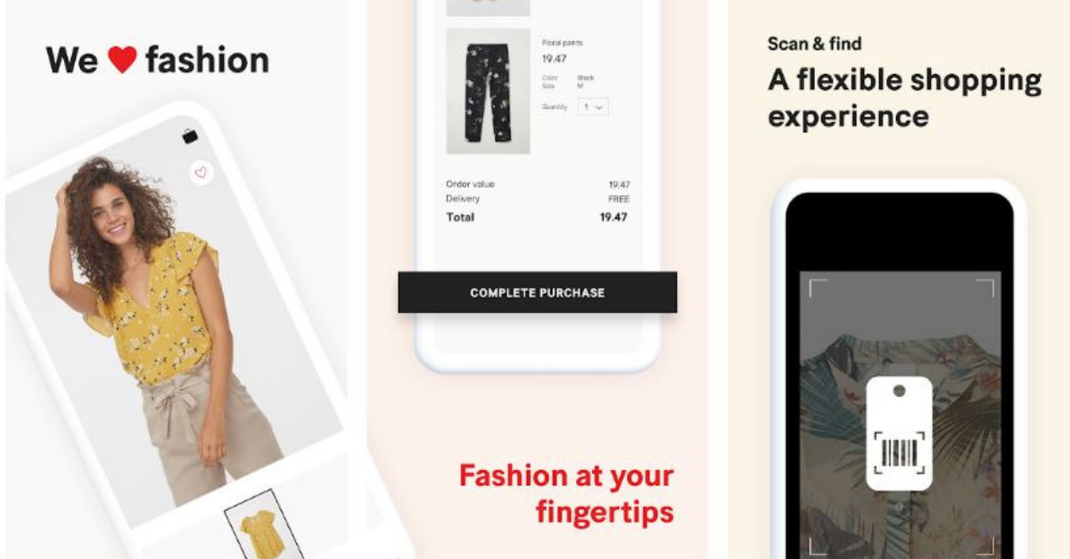
The Swedish multinational clothing-retail company is known to have a significant online presence. So it’s not surprising that its ecommerce app is on top of the game. With organized categories and filters for features like style, size, color, occasion, and concept, browsing through the app makes shopping a lot easier and less overwhelming.
8. Target
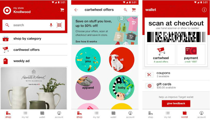
Being the eighth largest retail company in the US, Target knows that mobile shopping is a big part of a business’ success or failure today. The app’s wallet feature also offers convenience when shopping in-store.
9. Sephora
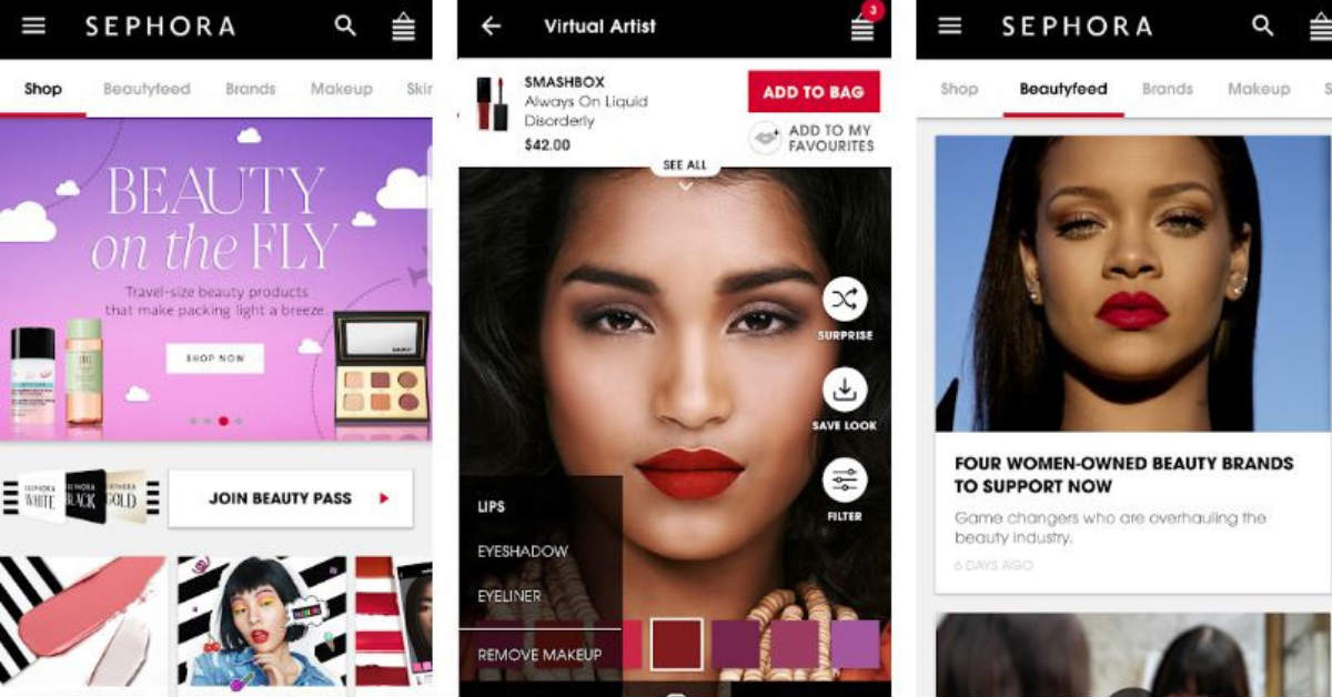
This Paris–based multinational personal care and beauty store chain is well-known for its online presence. A favorite app among makeup and beauty product junkies, the app offers a feature called Virtual Artist that allows users to try on hundreds of lip shades.
10. Etsy
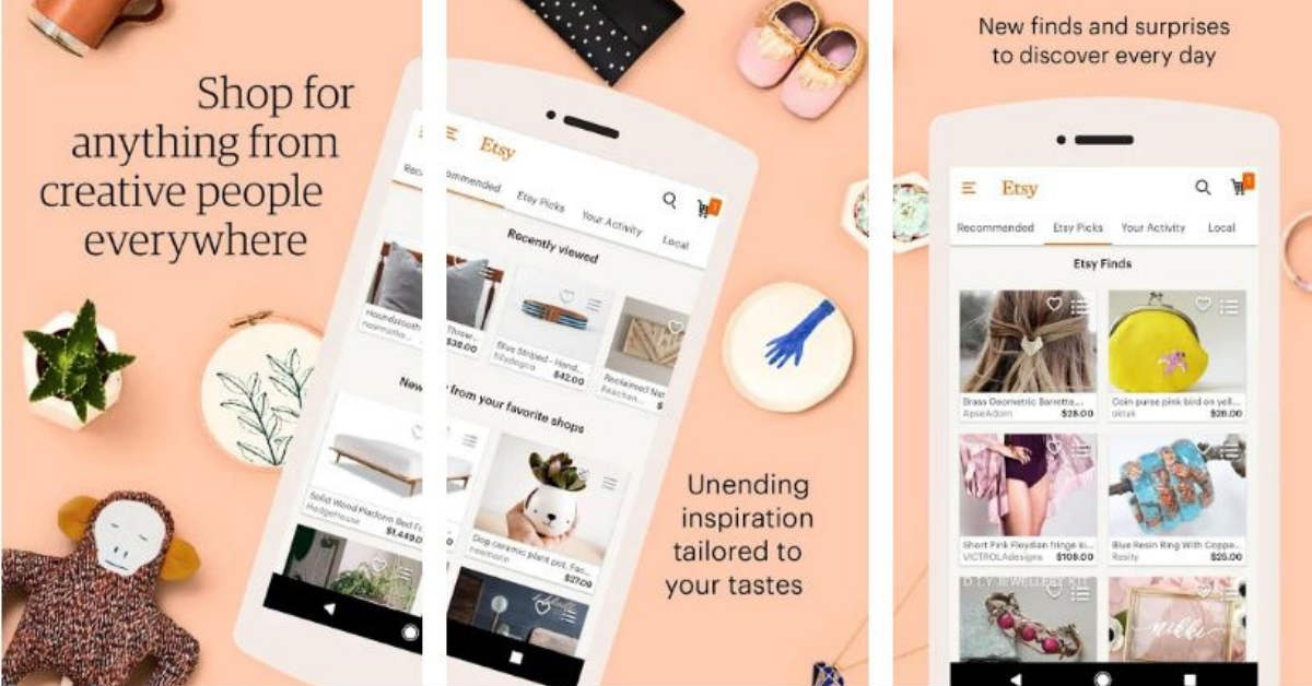
Perhaps one of the best things about Etsy is that it allows users to shop for handcrafted, vintage, custom, and unique items without having to rummage art fairs or flea markets. The app offers curated recommendations for individual tastes. It also provides a feature that allows shoppers to talk directly to sellers for any specific queries.
11. Mango
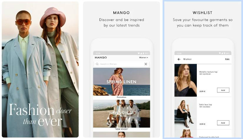
The eCommerce app of this Barcelona-based clothing design company efficiently lets the brand identity shine through. The layout and choice of images reflect minimalism and classic elegance with a modern twist. The app offers a shopping experience akin to stepping inside one of their physical stores. It features a barcode scanner that you can use when you’re shopping in an actual Mango store.
12. Bershka
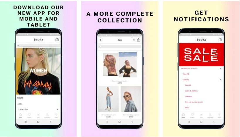
The eCommerce app of this Spanish apparel company looks minimalist but young and trendy at the same time. The products are efficiently organized, with sub-categories (e.g. skits, boots, blouses) to help shoppers navigate it easily. The app also allows users to access info on new product arrivals. This is a valuable marketing tactic, as it makes the users feel like they’re in on an exclusive club.
13. Warby Parker
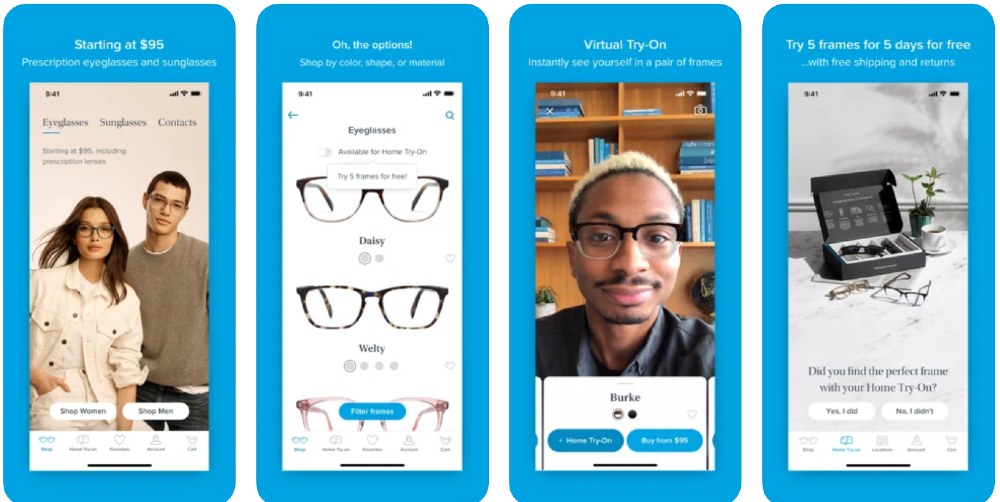
The Warby Parker eCommerce app is easy to navigate, thanks to its many pages. You can shop and access your account. Not only that, but you can try on glasses before you even buy them. That’s one of their neatest features so far. You can also find Warby Parker locations nearby. There’s also a separate page for the Cart, which you can click anytime when you need to add more or remove products.
14. Birchbox
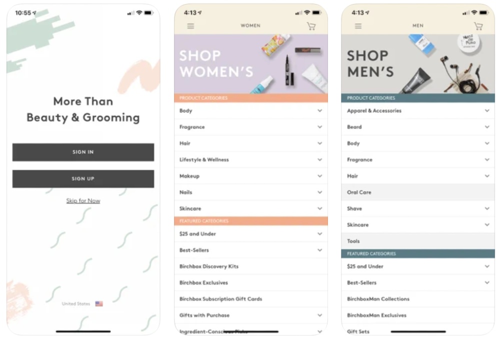
Unlike most eCommerce apps on this list, the Birchbox app doesn’t use a tab bar. It uses a hamburger button to hide the menu instead. Users can browse through different pages such as Discover, Subscribe, Women, and Men. As for viewing the products, it doesn’t use lines or boxes to separate each one, but it’s still organized and structured properly.
15. Bonobos
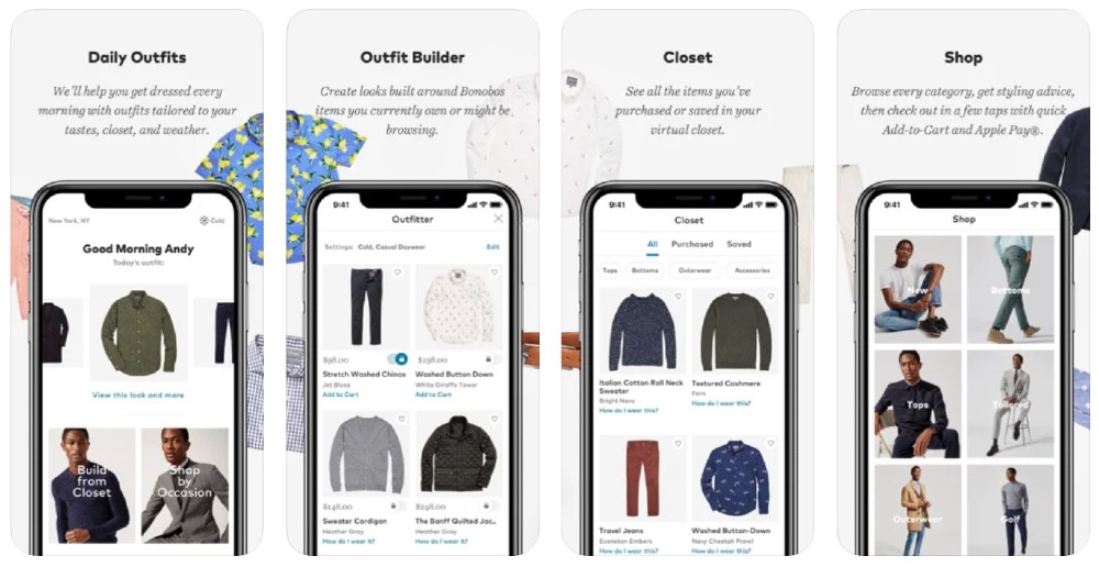
If you want your app to look simple and modern, you can look to Bonobos for inspiration. It’s not too overwhelming when you browse because the structure looks neat as well. They use different cards and pages to help the user navigate without difficulty. Plus, thanks to its all-white background, it gives an app a clean finish.
16. Farfetch
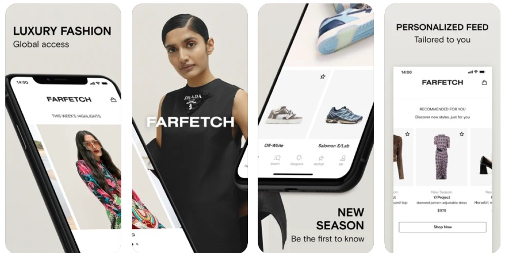
The Farfetch eCommerce app is a hub for all luxury items. Since most clothing brands would have their dedicated app, Farfetch helps make it easier to navigate the app by using a Designer page. Meanwhile, you can use the Shop page if you’re looking for generalized items and you haven’t decided what to buy yet.
17. Missguided
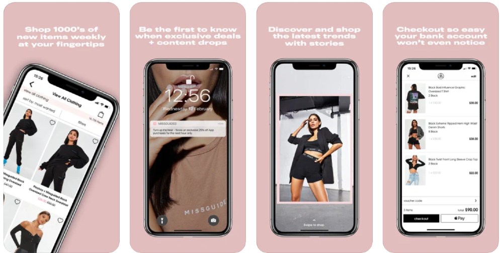
Get the latest from Missguided when you use their app. You can browse their threads on the Shop button or the “Swipe” page, where you can swipe left or right on clothes you like or not. One other thing to note about their app is their use of color, which is limited only to the brand’s colors.
18. Anthropologie
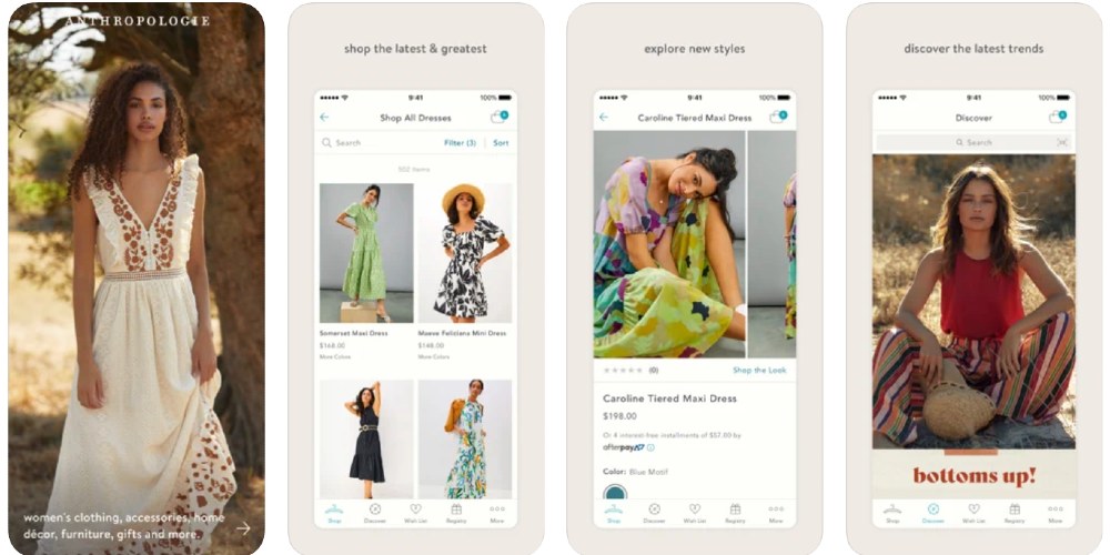
Anthropologie is known for its earthy tones, and those colors are reflected in their eCommerce app. Other than color consistency, their app looks organized, and you can browse their Shop, Discover, and Wish List easily. Plus, those who want to receive Anthropologie gifts for special occasions can create their Registry on the app, and they can share the link with their loved ones.
19. Redbubble
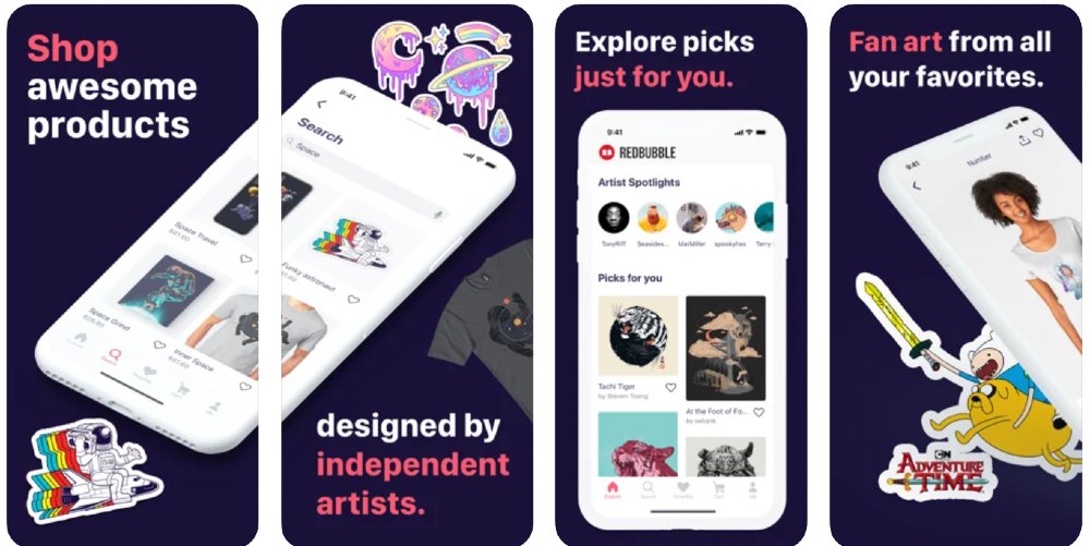
Whether you like fanart or are a fan of a series or movie franchise, you can browse on the Red Bubble app for cool art and merch. When you use the eCommerce app, you can browse art and see how it looks on shirts, mugs, caps, and other items right from the get-go. Plus, users can check out artists and their work on the homepage as well.
20. Adidas
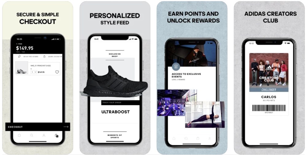
As one of the biggest shoe brands on the planet, it’s great they have a dedicated app so their customers can browse while on the go. Their tab bar only uses icons, which is a nice touch considering you don’t want too much clutter on your eCommerce app. Plus, their pages have different tab content as well, making the app organized for the user.
How to Request for an eCommerce App Design from Penji
Getting an eCommerce app design for your brand is made easy with Penji‘s straightforward design process. Here are the steps:
Create
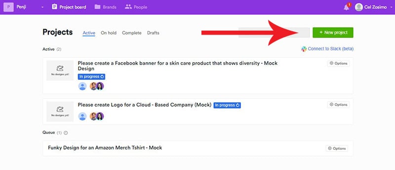
When you sign up for an account with us, you’ll have access to our dashboard. Log in to your account and click on the +New project button as seen below:
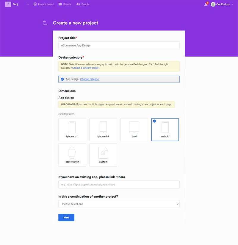
You’ll be taken to the panel below. Type in the project details and from the drop-down menu, select the category UX/UI, and choose App design. You can also click on Create a custom project if you want to request a design that isn’t on the list.
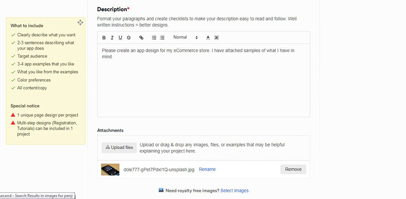
Type in the description of your project and add any details that you think will help with the design request. You can also upload files or send links that you think the designer can use as references. There is also an option for you to use royalty-free images.
Click on Next.
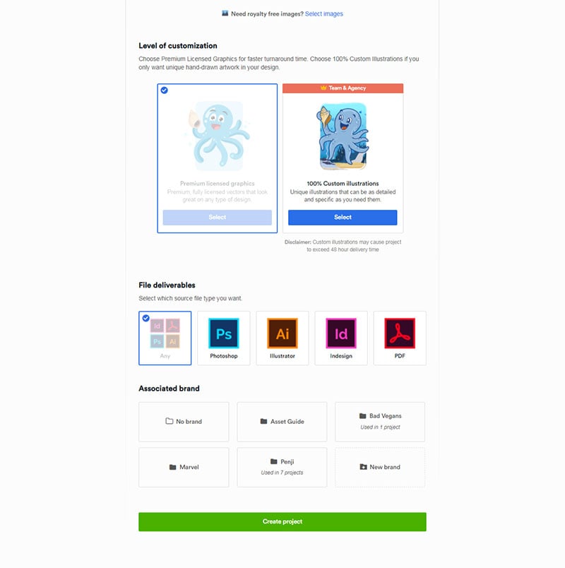
The page will extend downwards to ask more details from you. If you’re on our Team and Agency plans, you can request custom illustrations. This is also where you’ll set what file types you want the project to be done.
The Associated brand is our feature where you can store your brand assets, such as logos and other guidelines. You only need to click on that folder the next time you request for a design that needs your brand assets in them.
Click on the Create project tab.
Your project is now in progress and will be assigned automatically to the best designer for the job.
Revise
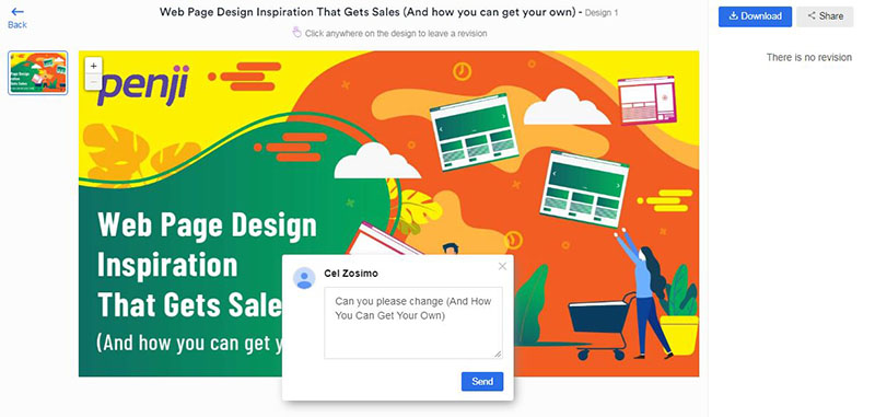
After 24 to 48 hours, your project is ready. Review it, and if you find anything that you think needs revision, click on the design to start the process. Drag your pointer to where you want the change and type in your comments. The designer will work on it within 12 to 24 hours.
Download
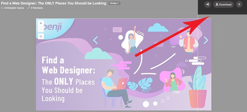
Once satisfied with the design, you can now download it. You get full ownership of the designs and can use it for whatever purpose you may have. The system stores your designs up to ninety days after you cancel your subscription.
Final Thoughts
The Penji team has helped numerous eCommerce businesses with their app, and we continue to provide quality designs every single time.
Worrying about the cost isn’t necessary because we made sure that our fees are reasonable and easy on the pocket. Our Team and Agency plans are available for $499 and $899 respectively. You can get your website and app design plus unlimited projects for your social media, and even outdoor advertising needs.
Do not miss the chance of getting the best designs from our pool of experts. See why more people are getting our services by checking out our works.
About the author

Carla Deña
Carla is a journalist and content writer who produces stories for both digital and legacy media. She is passionate about creativity, innovation, and helping small businesses explore solutions that drive growth and social impact.
Table of Contents
- Essential Features of a Competitive Ecommerce App
- Top Ecommerce Apps of 2020
- 1. Amazon
- 2. Ebay
- 3. Groupon
- 4. Wish
- 5. Walmart
- 6. Ikea
- 7. H&M
- 8. Target
- 9. Sephora
- 10. Etsy
- 11. Mango
- 12. Bershka
- 13. Warby Parker
- 14. Birchbox
- 15. Bonobos
- 16. Farfetch
- 17. Missguided
- 18. Anthropologie
- 19. Redbubble
- 20. Adidas
- How to Request for an eCommerce App Design from Penji
- Final Thoughts


