Finding ways on how you can create an effective eBook Design? Even if you are a non-designer, you can start doing one for yourself. Use the tips below and start getting leads and sales with your eBook design.
Launching an eBook can be tedious – from editing and publishing to marketing, there’s just so much to do. It’s therefore not surprising that many authors turn to Penji to take care of their eBook design. That way, they won’t have to worry about this key aspect of their work, and they can focus on other things that need their presence and attention.
Why is eBook Design Important?
Your eBook design is equally as important as your content. Why? Because naturally, people will gauge the overall look and feel of your eBook. This is going to influence if it’s worth their time.
Now, we understand that a lot of non-designers would like to create their own eBook. We have different reasons such as personal style and budget. Regardless if you want to hire an expert or do it yourself, your design must be visually appealing and must look professional. Remember, this could be your most effective lead magnet.
If you plan to create or design your own, here are a few tips from the experts.
Best eBook Design Tips for Beginners

What should you consider when designing an eBook?
Use the Right Tools
The good news is, there are a lot of free tools and software that can help you design your first eBook. Choose one which you have great knowledge on so it will be easier for you to do the layout. You can start by using Open Office or Microsoft Word. Others are more familiar with PowerPoint and Google Slides. Although, you have to take note that these programs have limited design features. Nevertheless, these will work for simple designs.
If you need a more professional-looking eBook cover design, however, getting help from the pros is imperative. Check out our portfolio to see the beautiful book cover designs we’ve done for previous clients.
Well-Thought-Out Cover Page
A cover page is extremely crucial for an eBook design. They say you shouldn’t judge the book by its cover, right? But let’s face it, most of us do.
There are different styles to choose from and you can easily get inspiration online. But as a rule of thumb, make sure that your title stands out. It doesn’t even matter if you use an actual image or a plain background. The right font type and contrast can already create an impact.
Play with Fonts
Make your entire eBook interesting by learning to match fonts. It doesn’t have to be the same all throughout. In fact, it can be a bore to read an eBook with just a single typeface. However, don’t overdo it because it will likely look cluttered.
We recommend that you use two fonts (one for H1, h2, and h3, and another for the body text). You can use the formatting styles feature to make your work easier. And stay away from too fancy ones as these can be a challenge to read.
Select Appropriate Colors
Colors are also a big factor when you do design, not just on eBooks but practically on anything. As much as possible, you need to choose a palette that can represent your core brand.
For non-designers or amateurs, you can start with monochromatic palettes. This is the easiest to create since you just need to adjust the tones and shades from a specific hue. When you are ready to take risks, then feel free to add more colors.
Break Text Blocks
Generally, eBooks are created to be reader-friendly. This is not the right venue to have long paragraphs similar to what we see from John Grisham or Sidney Sheldon books. That is why we encourage you to break huge text blocks. Here are some of the best techniques.
- Use drop caps (Think about the big ‘O’ in ‘Once upon a time’)
- Place quotes
- Add headers
- Insert small images
Similarly, you can convert some of your lengthy texts to bullets or graphs. Apart from breaking the text blocks, using graphs can make your eBook look more professional and credible.
Add Section or Chapter Page
You should also take the time to create your chapter pages. By this, we don’t mean simply writing ‘Chapter 1,2,3 etc’. For non-designers, you might want to add a bit of preview on the chapter page. Have a summary of what your readers are about to learn. Trust us, they will be eager to read the next pages.
Also, don’t forget to end your sections properly. A good technique is to add a full-page quote. Choose one that can be associated with your previous topics.
Know the Right Page Orientation
Which do you think is a better page orientation for eBooks? Would you use landscape, or is portrait better?
The answer is, it depends.
The trick is to identify your potential readers. If they are likely to use a computer or a laptop to read, then a landscape orientation seems like a logical idea. However, if you are targeting mobile users, then you can use portrait to make it easier to read.
Add a Recap
Towards the end of your eBook, always include a recap. What are the points that your readers must remember? Again, you can use the bullet format as this is easier to read. Plus, retention is also better.
A lot of eBook designers forget to add a recap but this is an essential part of your lead magnet. It’s like a cheat sheet for your readers which they can easily refer to every time.
Don’t Forget Your CTA
After creating an eBook design, you must never forget your call to action. What do you want your readers to do?
Say, for example, you’ve written about ‘How to Improve Your Online Sales’. At the end of your eBook, you can say, ‘Let me help you increase your online sales by 40%. Reach out to our experts and we will provide a personalized plan for your business.
Social Media Buttons
And lastly, you must include social media buttons where your readers can easily share your materials. It organically widens your audience and can potentially turn to actual customers.
Requesting an eBook Design from Penji
If designing an eBook cover sounds intimidating to you, don’t worry! We, at Penji, will be more than willing to craft the cover of your upcoming bestseller.
We offer high-quality designs and a fast turnaround. Best of all, you can have your eBook set up and ready in just three easy steps:
1. Create the Project

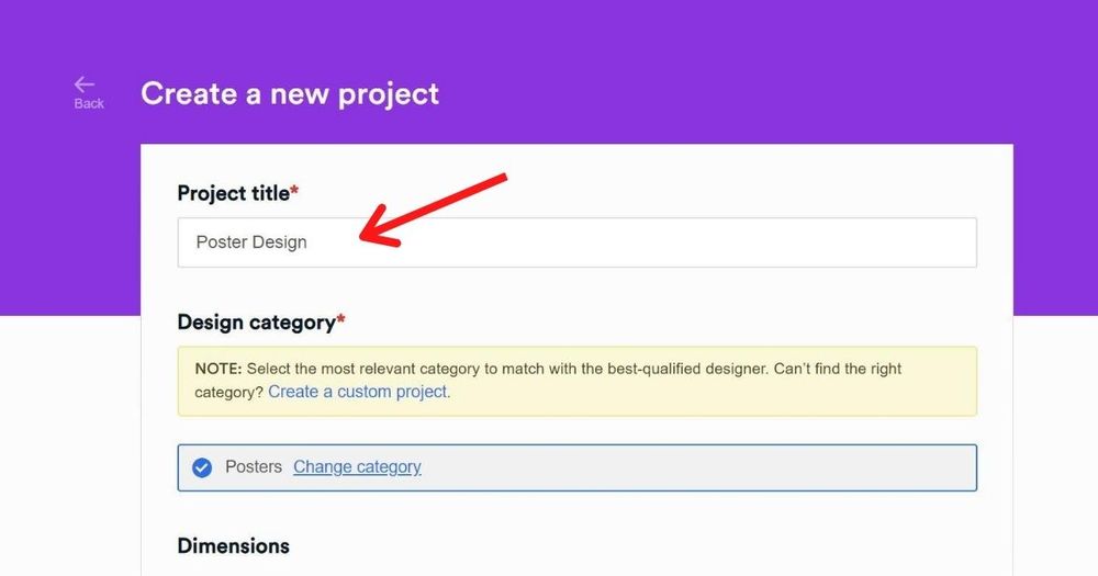
In the dashboard, click New Project. Then, type in the project title, the category, and the size that you want. In the description box, describe how you want the design to look. You can also include a preferred color scheme or royalty-free images that you want to appear on the graphic. Once done, click Create Project. It will be assigned to a designer well-versed in creating eBook covers.
PRO TIP: The designer should fully understand the eBook’s theme to know how to best design the cover. Make sure to provide a clear summary of the book as well as its theme, genre, and niche.
2. Review and Revise

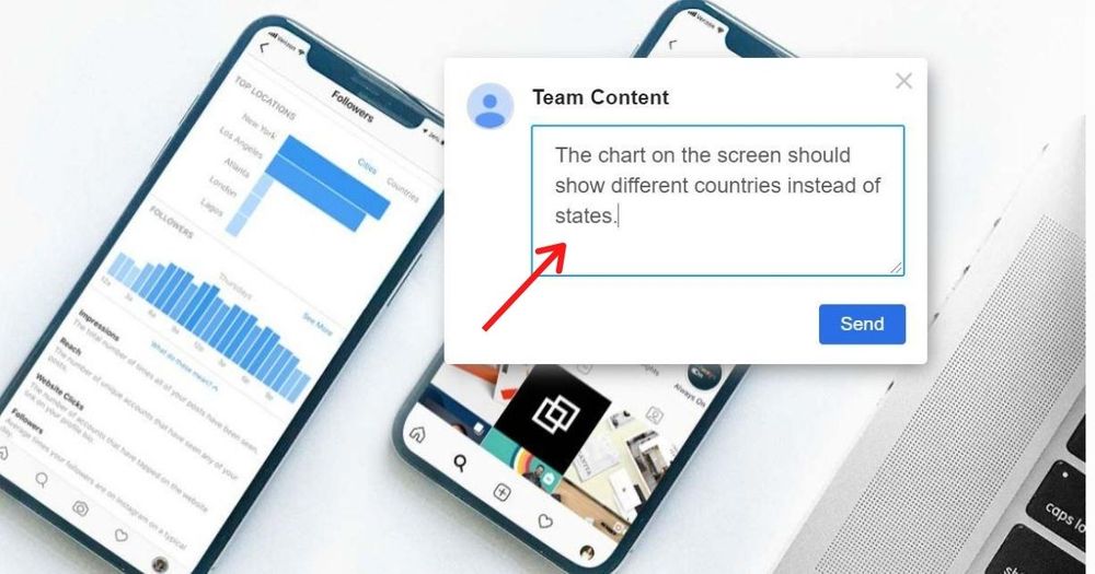
Within 24 to 48 hours, the designer will submit a draft of the design. You can view the draft by clicking on the file within the thread. If you want anything revised, just click the pointer on the part and type in your comments. The design will be returned to the designer for revision. The designer will keep on revising the graphic until you’re 100% satisfied with it.
3. Download

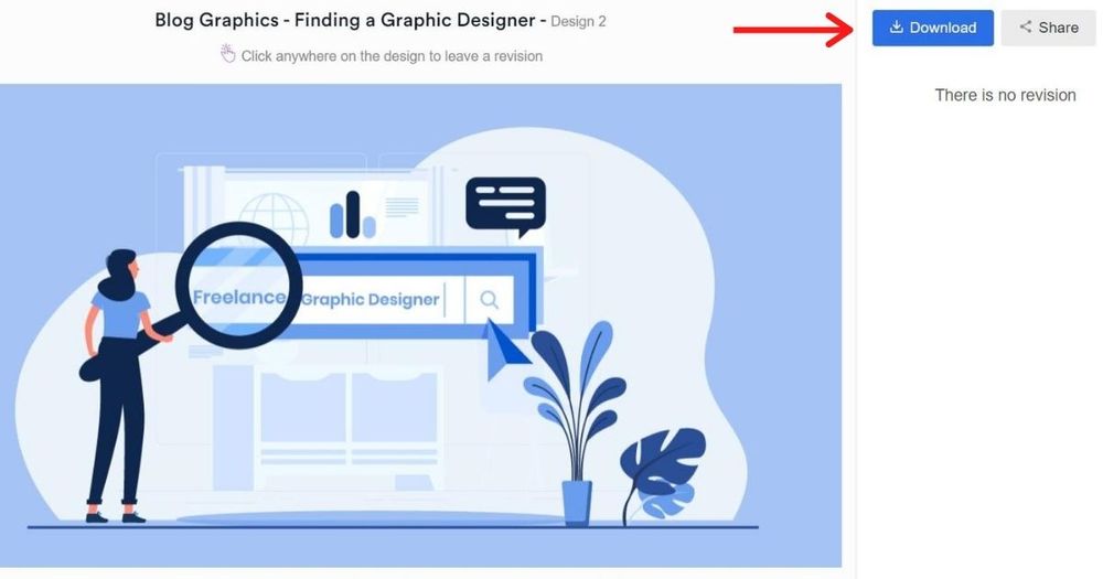
Once you’re happy with the design, click the “Download” button and it will automatically be saved to your computer.
Conclusion
Designing your own eBook is possible even if you are not a designer. But remember that this is a hit-or-miss type of strategy. So, it’s crucial to work with a service provider that has extensive experience in enticing different types of target market segments for various industries.
Sign up with Penji today and learn how we can help you grow your brand!
About the author

Barbara Anne Isla
BA Isla is a Content Writer and also an Events Host. She left the corporate world to do what she loves and to spend more time with her amazing kids. She hopes to bring valuable change to society with her words.


