
The competition is fierce in attracting more users on various platforms. For instance, thousands of businesses advertise on Meta (Facebook and Instagram) to drive more traffic and convert users into customers. However, it takes the right ad types and mediums to achieve their goals. One popular ad medium is a still image ad since it’s easier to create. Plus, you can create multiple design variations. And if you are sticking to image ads and need help getting started with this medium, here’s our quick guide to digital ad design!
What Are The Types of Digital Ads?
- Text-only digital ads
- Photo digital ads
- Animated ads
- Video ads
Some platforms allow a combination of ads by using the carousel ads feature.
How to Design Digital Ads?
1. Browse Ad Design Inspirations
There’s no actual standard on how to create digital ads. However, if you need to model your digital ads from an existing one, ensure that you don’t copy it exactly. It’s good to check digital ad design inspirations once in a while to see what the trend is in your niche or for the year. Plus, you’ll know how some design rules work. This way, you can create compelling digital ads.
2. Check Digital Ad Specs for Various Platforms
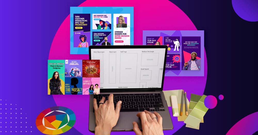
Before designing digital ads, you must know the specifications for various platforms. Meta, X (formerly Twitter), and Google have specific dimensions for still images or carousel ads. You can refer to the following images for the ad specs.
Most graphic design software apps have preloaded templates with dimensions in mind. However, if you are creating from scratch, use the ad specs guidelines to create your advertisements.
3. Use a Graphic Design Software
As mentioned above, you can use a graphic design software app to make digital ad designs. In fact, you can make digital ads in minutes using various templates. Since they’re templates, ensure you’re changing some elements that will make them unique to your brand.
Most graphic design software applications have intuitive and beginner-friendly tools to get you started in designing.
However, if you want to avoid any issues with templates, you can start from scratch. If you’ve tried that and still need help, hire a freelance graphic designer or outsource it to a graphic design service!
Simple Digital Ad Design Tips
1. Stick to Simple
Ads need to be compelling, not complex. Some brands use custom photography on their ads and layer it with a sentence or two of copy. For instance, you can use block letters to emphasize and make your copy stand out. Another way to keep it simple is through using text. Even though you don’t use images or illustrations, you can mix them up through various font weights or sizes. You can also combine fonts that match your visual.
2. Stay on Brand
Once you leave the comfort of your own website, it’s important that you stay consistent on branding. This means when you promote on social media or other platforms, you need to keep your brand intact. You should add your logo, use custom typography, and utilize brand colors. This way, your current customers can recognize you. Plus, your potential customers will remember your brand the next time they decide to visit your website.
3. Keep Your Audience in Mind
Your audience is the target of your ads. Thus, you should make ads that would entice them to look at it and take action. For instance, if your audience is a demographic of 20-to-30-year-olds, make it colorful. You can add graphics like images or illustrations.
Examples of Digital Ad Designs
1. Wilson
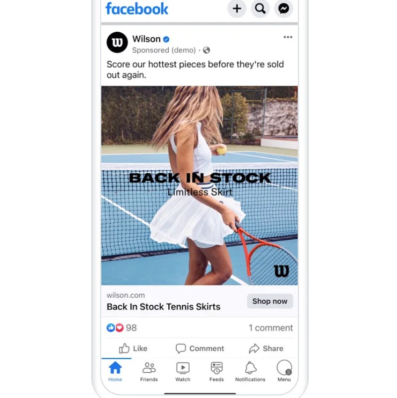
The sports brand used Facebook to reach more customers and convert users into customers. Here’s a simple yet effective ad design. It uses a picture of a woman on a tennis court with a short copy. Plus, the company didn’t forget to sprinkle its branding on the ad by adding its logo on the lower right.
2. HubSpot
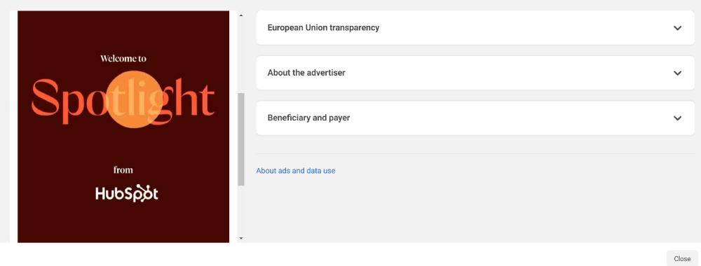
You can also use illustrations, icons, or graphs instead of images. HubSpot is well-known for creating custom images to publish on Facebook as posts or ads. Here’s an example of an ad promoting its AI features. HubSpot is also recognizable from its orange motif. However, it’s not evident here. Still, you can keep it on brand by not forgetting your logo on your ads and other collateral.
3. Casper
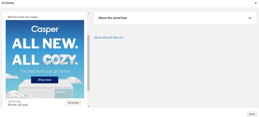
Here’s a cool ad design from Casper. Even in a still image, you can convey certain actions or feelings through fonts or movements. Casper does it by using a custom font to express softness and comfort. It shows threads even as clouds. It makes you feel at peace and want to sleep in a cozy bed.
4. Salesforce
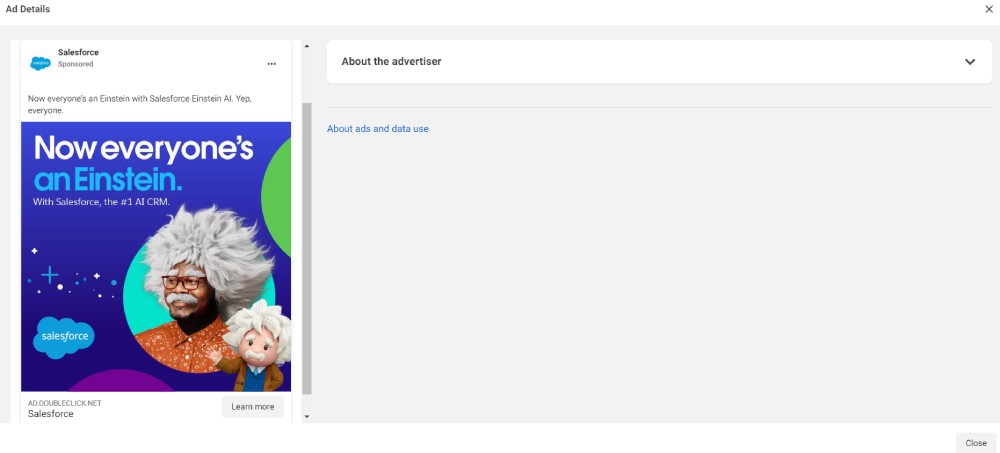
Here’s an example of a digital ad design that puts a spotlight on your custom characters or mascots. This is one of its ad creatives. Einstein, Salesforce’s character for its AI tool, is featured along with another man bearing the character’s wacky gray hair and mustache. It’s funny at first glance. At the same time, it’s relevant, and the copy establishes an identity once people use its AI.
5. HelloFresh
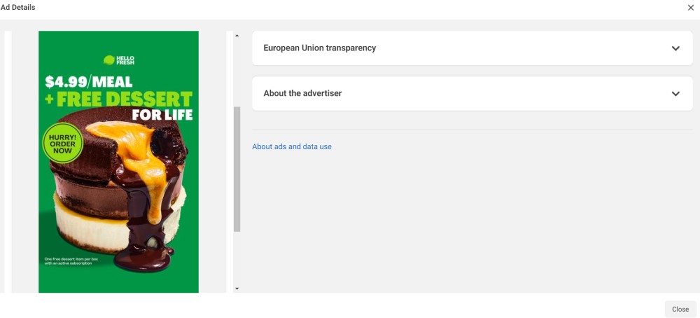
If you’re from the food industry and want to whet someone’s appetite even with one photo, check out this example from HelloFresh. People will drool when they see the dessert. Aside from the mouthwatering image, it uses great contrast. Additionally, it uses urgency to persuade ad viewers to purchase immediately!
Why Use Penji for Digital Ad Design?
Don’t let digital ad design take up the time you need to run your business. Instead of worrying about design rules, specs, and choosing the right templates, let Penji handle the brunt of the work of designing ads!
Penji has been the partner and go-to graphic design service for many businesses and agencies. They have entrusted Penji to make their ads and so much more! To date, Penji has delivered 1.25 million designs with a 98% satisfaction rate!
Get a sneak peek of what it’s like to request designs on Penji when you view a video demo here!
About the author

Katrina Pascual
Katrina is a content writer specializing in graphic design, marketing, social media, and technology. In her spare time, she writes monthly personal blogs to practice her craft.


