

TL;DR: As companies grow, their logos simplify. Heavy text and gradients are removed in favor of flat, minimalist icons. This shift ensures visibility everywhere, from a tiny app icon to a massive billboard.
Outdated visuals slow you down. A complicated logo fragments your identity, confuses buyers, and makes you look stuck in the past.
Your visual identity dictates your market success. The human brain processes images 60,000 times faster than text. A buyer looks at your profile and makes an immediate judgment. A complex icon makes their brain work harder. They look away.
Professional brand design services solve this problem. They strip away the clutter, leaving you with a clear, scalable symbol that commands attention.
How did we get here? Companies used to rely on printed signs with heavy shading and intricate typography. Now, they must communicate instantly on a tiny screen. This forces a massive design shift. The biggest companies in the world adapt. They simplify.
Why do successful companies change their logos?
Outdated logos signal outdated thinking. In fact, complicated graphics suggest a poor user experience, leading buyers to assume your company moves slowly.
For this reason, successful companies update their visuals to match modern consumer expectations: speed and trust. They don’t guess; instead, they reduce cognitive load.
Ultimately, a successful logo evolution achieves three specific goals:
- Fixes readability issues. For instance, tiny 16-pixel browser tabs require flat design, and drop shadows fail on mobile screens.
- Matches modern aesthetics. Flat design, for example, removes 3D bevels and adopts solid, high-contrast colors.
- Signals company values. Consequently, a clean visual identity shows you understand the current market and look ready for the future.
Designers call this shift flat design. Essentially, flat design guarantees perfect visibility on any digital screen. It removes friction. It builds immediate trust.
How did 10 iconic brands evolve their visual identities?
Major corporations don’t change their visuals by accident. They study the market and adapt. They hire experts. In short, they evolve. Design as a service gives growth teams the speed to execute these changes without the bloat of traditional agencies. To understand this evolution, let’s look at how ten global giants transformed their core visuals over five decades.
1. Nike
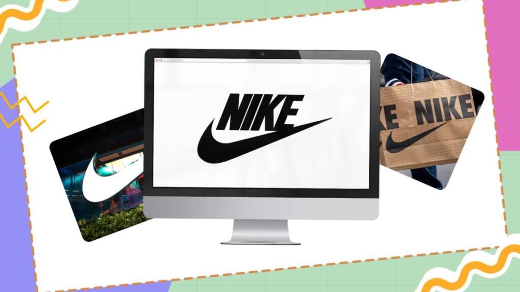
In 1971, Carolyn Davidson designed the Nike Swoosh for just $35. Initially, the original version placed a cursive “nike” over the Swoosh. By 1978, however, Nike updated the font to a bold Futura. Then, in 1995, Nike removed the text entirely. Today, the Swoosh stands alone. This evolution shows immense brand confidence; they command so much market authority they no longer need to spell out their name.
2. Apple

Similarly, Apple’s visual journey reflects its product philosophy. The company’s first visual identity in 1976 looked like a vintage drawing of Isaac Newton under an apple tree. Steve Jobs quickly realized this complex drawing failed to scale on computers and hired a brand designer to create the iconic bitten apple. Subsequently, Apple transitioned from rainbow stripes to a translucent design in the late 1990s. Today, Apple uses a flat, monochromatic apple that perfectly represents its premium, minimalist technology.
3. Levi
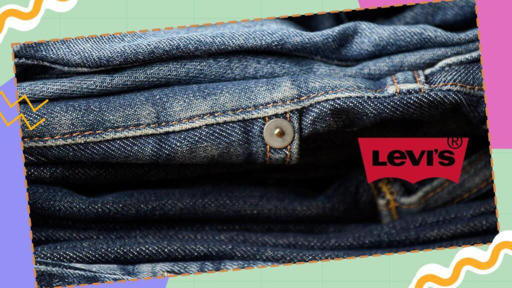
Levi’s also adapted its design to communicate a core message. Originally, the brand used a detailed illustration of two horses pulling jeans apart to signal durability. In 1967, Levi’s introduced the red batwing design. The red background mimics the stitching on their back pockets, while the clean white text provides maximum contrast. Levi’s still uses this shape today because it remains highly visible from a distance.
4. Walmart

Walmart provides another example of a strategic shift. At first, the company started with a rugged, heavy font. Later, in the 1980s, they used block letters with a star. In 2008, however, Walmart executed a massive rebrand. They switched to a friendly, rounded, lowercase font, changed their core color to a lighter blue, and introduced the yellow spark icon. Ultimately, this shift made the giant corporation feel more approachable.
5. Kodak
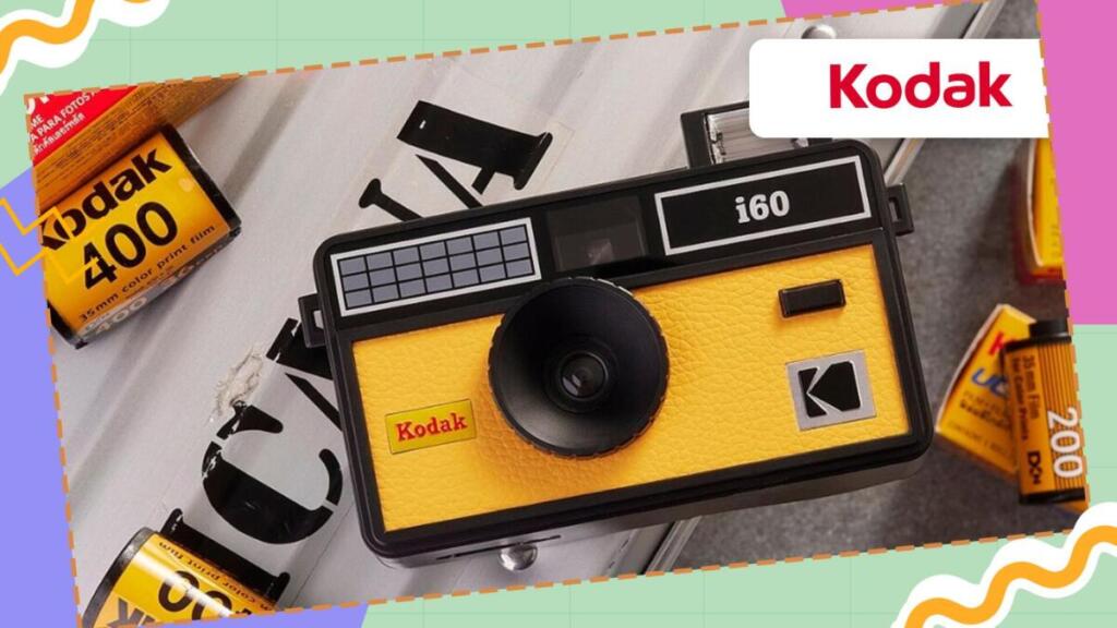
In contrast, Kodak’s evolution was driven by disruption. The company dominated photography for decades, using a bold yellow and red square with a “K” cut out in the 1970s. When digital photography disrupted their business, they had to react. As a result, in 2016, they went back to their roots, reviving the classic 1970s shape but updating the typography. This redesign perfectly balanced retro nostalgia with modern lines.
6. Starbucks
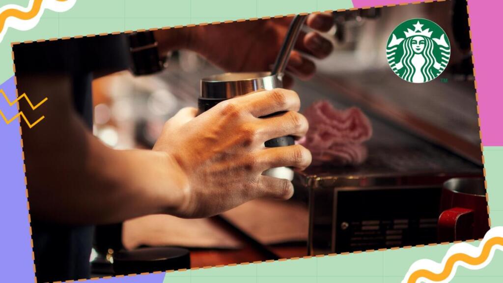
The original 1971 Starbucks emblem featured a brown, highly detailed siren that looked like a classic woodcut print. As Starbucks expanded globally, they simplified the siren and changed the color to an inviting green. Later, in 2011, Starbucks dropped the outer ring, deleted the text entirely, and enlarged the siren to make her the sole focus.
7. Pepsi
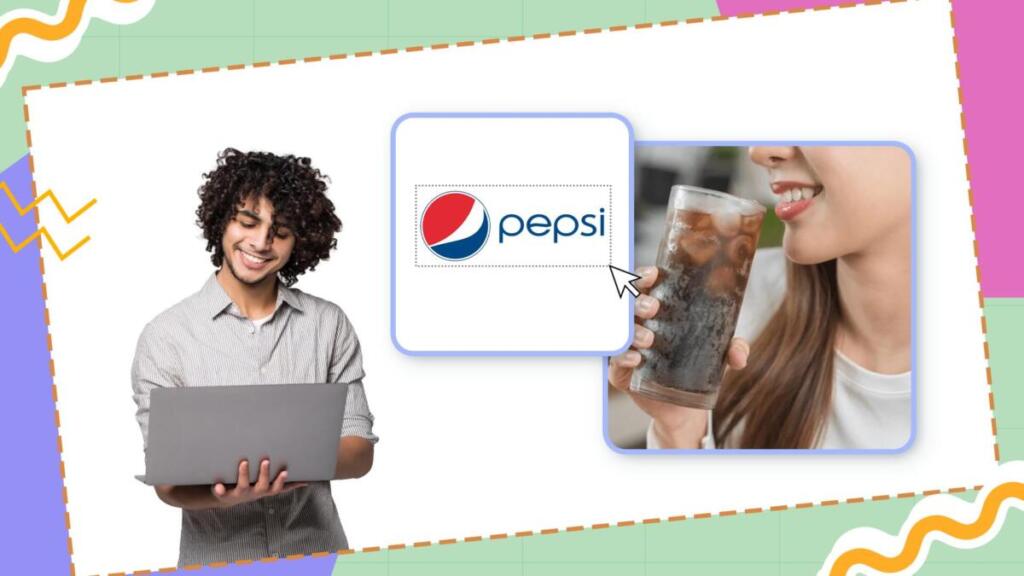
Unlike brands that stick to one core visual, Pepsi changes its identity constantly. They started with a complex red script before introducing the bottle cap in the 1950s. Over the decades, Pepsi flattened the cap into a 2D globe, constantly tweaking the geometric curves. Their most recent redesign puts the bold text back inside the globe for maximum impact.
8. McDonald’s
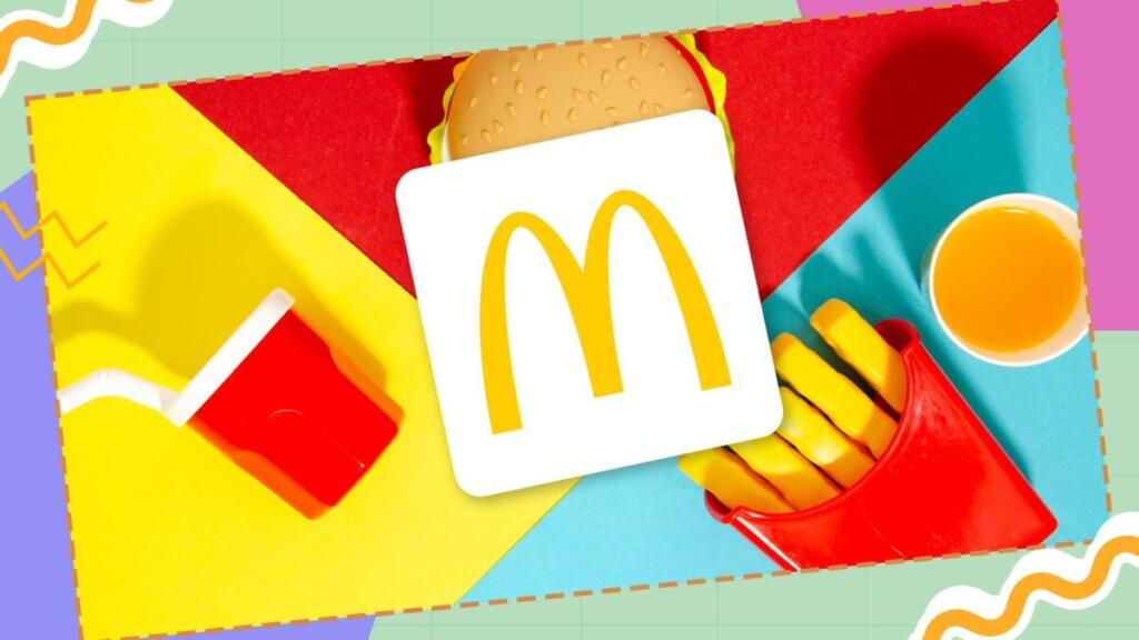
The golden arches are recognized worldwide, but they weren’t always so simple. Early versions included a slanted line cutting through them and featured heavy text. Over 50 years, McDonald’s methodically removed the extra lines and deleted the text. They isolated the pure yellow “M” on a red background—a masterclass in visual reduction.
9. Coca-Cola
Conversely, Coca-Cola focuses on heritage. While others changed shapes completely, Coca-Cola protected its Spencerian script. Although they placed the script inside hard geometric shapes in the 1970s, today Coca-Cola uses the script on its own. They removed the borders, which gives them total flexibility to place the text on any background.
10. Target

Target opened in 1962 with a literal bullseye featuring three red rings and three white rings. It was busy and hard to read from afar. Consequently, in 1968, they simplified it to one red dot surrounded by one red ring. Eventually, Target dropped the wordmark entirely. The single red ring is bold, scalable, and instant.
The lesson is clear. Look at your icon on your phone. Is it legible? If not, it needs work. Remove unnecessary elements. Ditch the drop shadows. Simplify your colors. Your identity must look the same on a billboard and a smartwatch.
Ready to future-proof your visual identity?

Clarity wins. Simplicity wins. But companies that refuse to adapt their visuals fade into the background. To keep your brand front and center, your visual identity must connect immediately with your audience. You have to remove the clutter. But your team needs fast, reliable execution to make this happen.
Don’t let outdated visuals slow you down. Hiring takes 3–6 months. Agencies are bloated and slow. Freelancers require constant management. Get the speed and quality you need today. Choose Penji for your brand design services and get high-quality, scalable design delivered in 24–48 hours.
Frequently Asked Questions
Companies usually think about changing their logo every five to ten years, but only if the current design doesn’t fit with business trends or the way the company is going.
A logo is just one part of a brand identity. A brand identity includes colors, fonts, images, and overall visual rules that are used on all platforms.
Depending on how complicated the design is and how experienced the designer is, prices can range from a few hundred dollars for simple designs to thousands for full branding packages.
Yes, a polished brand identity helps small businesses compete with bigger brands by giving them credibility and recognition.
A scalable logo looks good and has an effect on a small mobile icon or a big billboard. This is usually done with simple, clean design.
About the author

Je Ann Bacalso
Je Ann is a creative content writer who crafts engaging, SEO-friendly articles and web copy. With a passion for storytelling and a sharp eye for detail, she delivers clear, compelling content that connects with readers.


