

You’ve just spent hours designing your latest advert, paying meticulous attention to detail. The layout is finely crafted to your specs and ready to print. But you’re disheartened when you find the printed proof lacks the clarity and definition of the on-screen rendering.
The cause is likely a lack of preparation. Today, we will outline a plan to prepare images for printing to guarantee you’re consistently pleased with your result.
Calibrate your monitor
Calibrating your monitor is the first and most important step in making sure you know what the image actually looks like. This process includes balancing and correcting colors using a spectrometer and calibrating software.
This ensures an accurate representation of the colors, color saturation, monochrome tonality, contrast, and other characteristics of the images in your project. Be sure to recalibrate your screen regularly to maintain clarity. It’s generally recommended you do this monthly!
Adobe Photoshop and Lightshop are among the most popular programs for calibration, but there are various tools available.
Understand color management
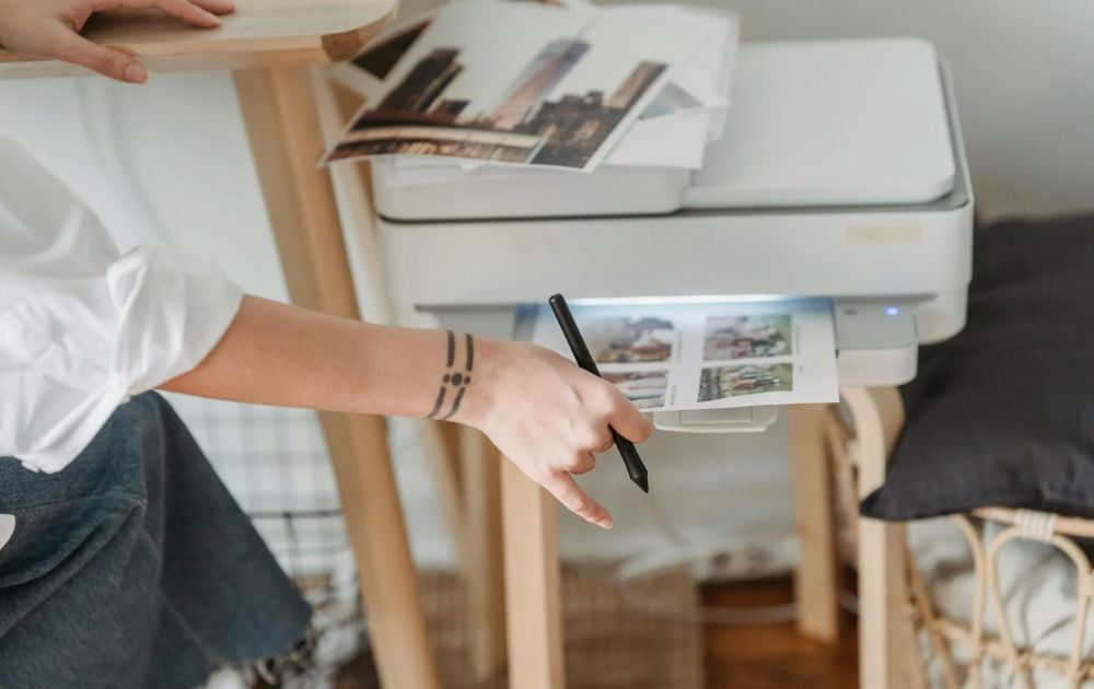
Image Credit: George Milton from Pexels
Knowledge of color management is imperative. Whether you’re a dedicated print shop or an at-home hobbyist, your work will greatly benefit from understanding the basics of color management.
Color management is a process where the color characteristics for every device in the imaging chain is known precisely and utilized in color reproduction.
[in_content_ads gallery=”logos” logo=”on” title=”Need graphic design help?” subtitle=”Try Penji’s Unlimited Graphic Design and get all your branding, digital, print, and UXUI designs done in one place.” btntext=”Learn More” btnlink=”https://penji.co”]
Soft proofing. You can get a soft proof of what the artwork will look like when printed on a specific printer. Prints can vary in appearance depending on the machine being used to produce it. The purpose of the printer profile is to set color standard perimeters.
This helps your printer produce the most faithful representation of what you see on your screen. Generally, the soft proof can give you the best possible estimate, and further evaluation will require a physical test print. This is called hard proofing.
Hard proofing. A hardcopy test print will allow you to make evaluations and adjustments. This is an essential step in producing quality work for customers, galleries, and art shows.
For further information, this video can provide in-depth instruction on soft proofing in Lightroom.
Sharpen the image
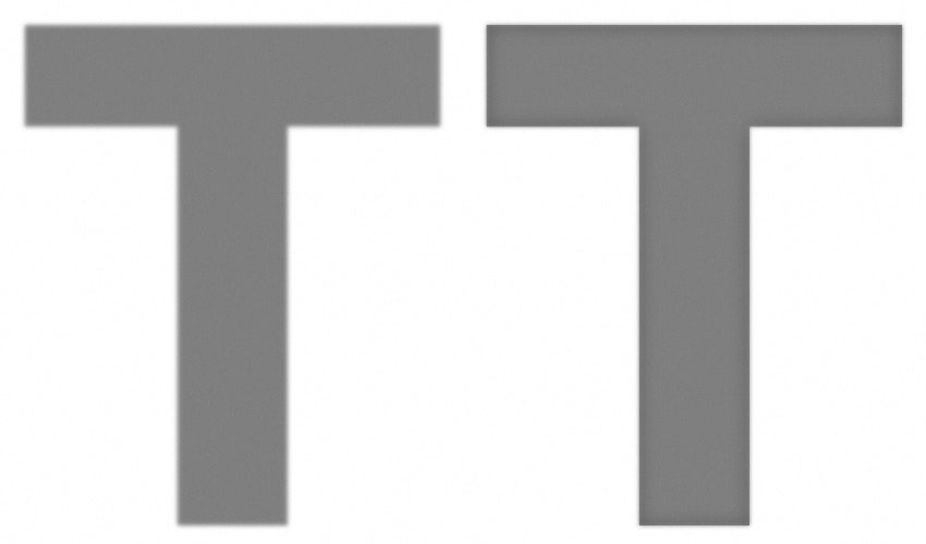
Sharpness is a combination of two factors: resolution and acutance.
Resolution refers to the size of an image. This is measured in pixels. The higher the resolution, the more pixels there will be. And the more pixels there are, the sharper the image can be. The human eye perceives edges with more contrast as being more defined.
Acutance refers to the contrast at an edge. This is a subjective measurement, and there is no unit to express it. Sharpness is about definition, and creating a greater distinction between two surfaces can create an illusion of sharpness.
It’s important to keep in mind which medium you are printing on when sharpening. Each medium will require different levels of sharpening to create the best possible result. Noise from over-sharpening will be more present on metal prints, while inkjet and canvas prints are more forgiving as they can better hide imperfections.
There are various ways and techniques for sharpening. Unsharp Masking on Photoshop is among the more popular methods, where you can manually mask in the areas you wish to sharpen.
Adjust luminance
Like sharpening, adjusting luminance will require a per-medium adjustment. If you are printing on aluminum or using lumachrome acrylic prints, be mindful of their ambient reflectivity and perceptual brightness. They will likely require little if any, brightness adjustment.
But inkjet printing will require more adjustments. This will help to reproduce the image as it’s seen on your screen.
Raster vs. Vector
A large format print is going to require a large image. This will help you avoid pixelation. Billboards, trade signs, and other large print ideas are going to require a vector image.
A vector image will automatically resize itself to fit a large space. Vector file types include .ai, .eps, .pdf, .svg.
Conversely, raster images have set sizes. So, when these images are resized, they become pixelated. Raster file types include .jpg, .png, .gif, and . tif.
Vector images are the safest files to use. Especially in the case of larger prints.
Looking for unlimited graphic designs for a flat, monthly rate? Check out Penji today.


