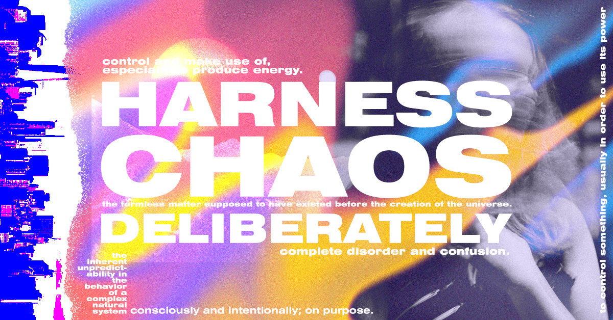
Tired of the stale minimalist trends of today’s graphic design conventions? Looking to stand out from the crowd with an exuberant and vibrant approach to branding?
Enter: Maximalism, the design style dedicated to expressiveness.
For decades, graphic design has been trending toward minimalism. But maximalism is the spirited alternative bustling beneath the surface. Businesses are beginning to lean into their creative impulses, straying from conventions and coloring outside of the lines.
Maximalist graphic design is all about stimulation, using an excess of ornamentation to convey a pure, unique message. This design style invites a creative use of color palettes, typefaces, and patterns.
Today, we will unpack 9 tips to create an effective maximalist graphic design.
Fearless Use of Color

Maximalist graphic design typically deploys a fierce approach to color. Designs express a willingness to be bold and daring. This means experimenting with clashing colors, vibrant tones, and saturated hues.
Maximalism doesn’t have too many rules when dealing with color – find inspiration in this! Feel empowered to incorporate those stripes of high-contrast hues, or reach for those rich, high-energy saturated tones.
Aggressive Repetition
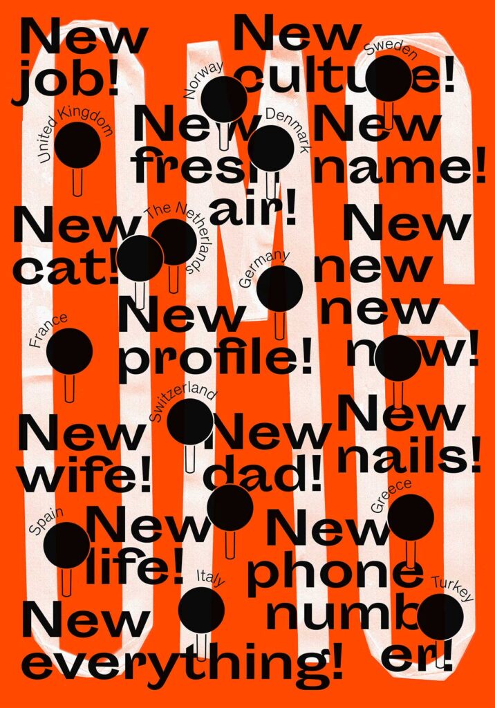
Maximalist graphic design relies on unconventional manners of creating a hierarchy. Outside of the more traditional route of thinking, where we rely on the size and weight of a particular font to convey the importance of its message. Using repetition with type can help get your point across in a new, interesting way.
This concept can also be applied to typographic decisions.
Avoid Empty Spaces
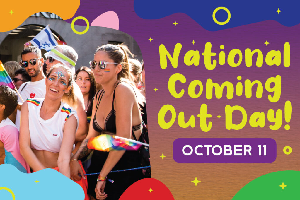
When working on a maximalist design, be sure to cover your canvas. Now is not the time to be reserved in your expression. While a tactful use of negative space can help your design pop, maximalism will challenge you to do more with, well, more.
Spare no detail and incorporate a broad use of ornamentation to push your viewer into stimulation overload. With maximalism, the collective design is greater than the individual bits. How you use these pieces together as a whole can make or break the experience.
Build Layers
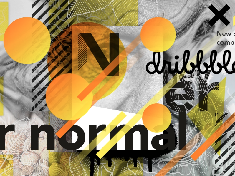
Another helpful tool in the maximalist’s repertoire is the ability to create well-layered designs. Laying images creates the sensation of density. To the minimalist, conventions suggest that a cluttered look misguides the eye, creates confusion, and ultimately limits audience engagement.
But a tasteful use of layered imagery can create just the correct amount of richness, leaving your viewers stimulated.
Collages
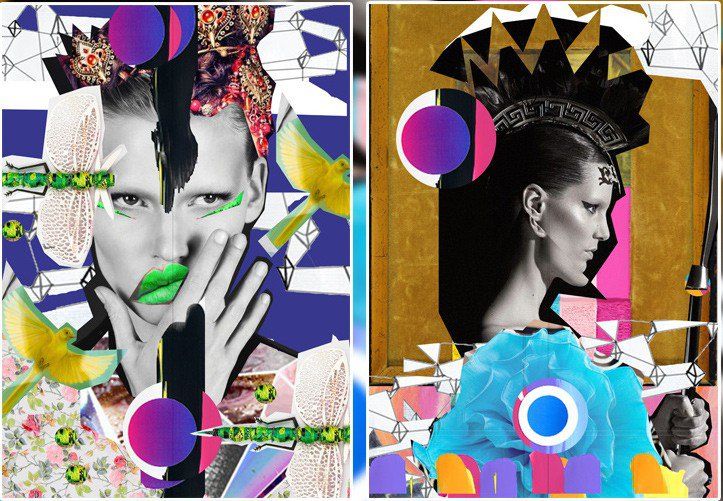
Looking for an effective strategy for layering? Collages are a fun and creative way to expressively build layers in graphic design. Here are a few examples of how our Penji designers have approached collage-based design work.
Lean into the Kitsch
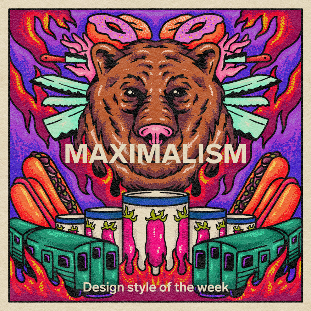
Maximalism asks us to challenge our own perception of standards. A successful maximalist design can exist outside of conventional design boundaries. One example of this is the use of elements typically regarded as tacky, gaudy, and kitsch.
Mix Design Styles
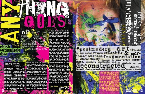
One of the benefits of maximalism design is its lack of rules. Don’t fret! This is cause for celebration because maximalism openly invites you to meld and mix a myriad of design styles together.
Recontextualizing well-established design trends can help create a fresh and unique feel. Try experimenting with conventions of different time periods, countries, and art movements. Keep it novel and innovative.
Harness Chaos Deliberately
When it comes to maximalist graphic design, it’s all about execution. Understanding how to properly wield these chaotic weapons will help you get the most out of your design.
When dealing with maximalist themes, you’re wading in messy waters. A lot of colors, a lot of text, and a lot of details vying for your attention. The goal then, and the job of a good designer, is to harness this chaos deliberately.


