

Maximalism is in. After decades of prominent art movements trending toward the clean, stripped-down, decluttered feel of minimalism, irreverent expressions are emerging.
Today, we will showcase typefaces with highly ornamental and deeply expressive qualities.
But, the best maximalist typefaces have a balance. You have to be graceful in your approach. Tactfully tacky, if you will. These 7 maximalist typefaces are excellent for designers looking for a smart approach to a maximalist design. Let’s dig in.
Mercer by Damelev
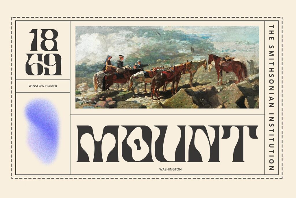
The twisted shape and subtle Blackletter influence lend themselves to Mercer’s modern, trendy charm. Developed by Damelev, this typeface offers designers an expressive flair, complete with a full English language and tons of alternative letters.
There are few typefaces that can weave an of old-thymeness with modern embellishment.
[in_content_ads gallery=”logos” logo=”on” title=”Need graphic design help?” subtitle=”Try Penji’s Unlimited Graphic Design and get all your branding, digital, print, and UXUI designs done in one place.” btntext=”Learn More” btnlink=”https://penji.co”]
Gemini by Barret Reid-Maroney
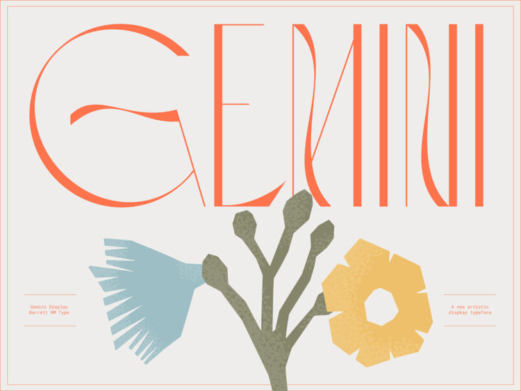
Barret Reit-Maroney is a favorite of ours at Penji. Known for its highly decorative stylizing, Reid-Maroney’s Gemini captures the essence of their work wonderfully.
It’s a set of two uppercase typefaces. They both possess a vertical, high-contrast, and delicate feel. Gemini Regular, the standard form, features more stroke variation with its letterforms, while Gemini Legacy offers minimal amounts of stroke variation. Both are excellent for use as display texts at medium-large sizes where legibility is not a major concern.
Cinderblock by Stefán Kjartansson
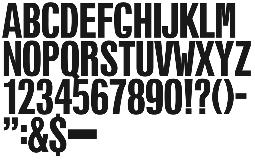
Okay, this entry is sort of maximalist in a minimalist kind of way. And I understand that that might sound annoyingly contradictive. But what typefaces like Cinderblock exist to teach us is that there’s more than one dichotomy when it comes to letterforms.
It isn’t necessary a thin, flat line with character-laden overindulgence on one end and plain, unadorned simplicity on the other.
Letters are a lot like people. People aren’t reduced to absolute polarities. There’s nuance. Some are generally quiet until they find themselves in the right setting. Some otherwise boney people have monsterous calves.
Cinderblock is like a bony person with a monstrous calf. Or— perhaps more palatable —Cinderblock is like Impact with nuance.
Lugon by Delipensil
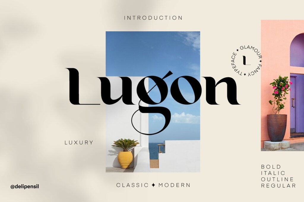
Lugon has a contemporary fanciness to it. It’s another high-contrast typeface– but it has loads of unique character. The grand, sweeping curves of its descenders— as exemplified by the G in Lugon— suggest glamour and grace, while other elements feel brutal and blunt.
This mixture creates a truly singular experience. But Lugon’s odd positioning between blocky and svelt can be harnessed.
It’s loud, distinct, and maximalist. Also, be sure to check out other work by Delipensil for similarly styled fonts.
Brulia Ink by That That Creative
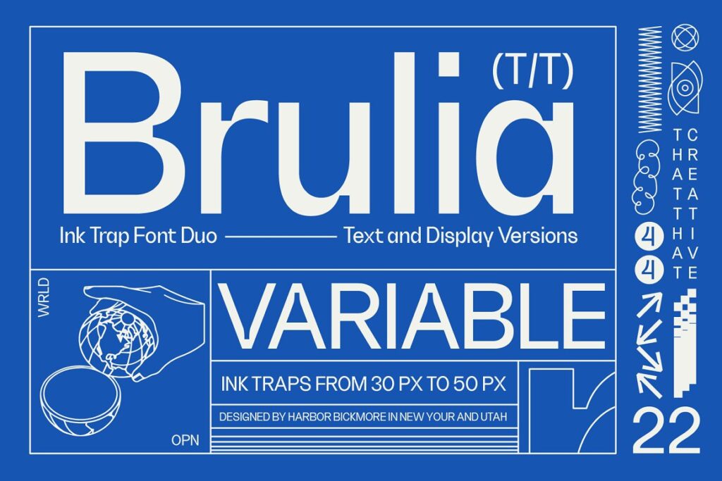
It feels like whenever you come across a typeface that’s being described as vintage, it’s some 60s-or-70s-inspired, wonky letterforms conjuring ideas of lava lamps and home radios. But Brulia’s identity could be similarly described— though in a much different way.
It has an 8-bit definition to it. But, it’s toned down enough to not distort its own message. It’s vaguely harkening back to the late-90s or early-2000s. But at the same time, it has a mid-century, swiss expression to it.
Brulia’s digital simplicity is not to be misunderstood. It’s low-contrast in most cases, except for its shoulders, where it deploys an awkward, geometric approach to its stroke variation.
Brulia comes with display and text variations. And the primary difference is that the display version takes more liberty with its characteristics, as legibility is not as much of a concern in larger-size situations.
Wetris by That that Creative
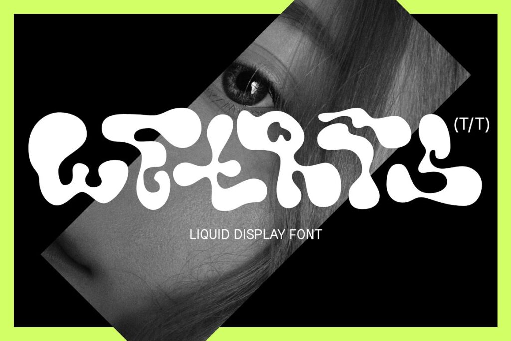
Wetris is classified by its developers as a “liquid display font.” Its name is the combination of its two most distinctive qualities.
It’s letterforms are developed in a modular grid system intended to fit the characters together in a block-like fashion, not unlike the game of Tetris. And since the characters look like their wet, what name is better suited for this typeface than Wetris.
Wetris is a submerging experience. There isn’t much here that’s suggestive of other, more conventional typefaces. But its highly distinct and truly unique approach to type development makes Wetris a worthwhile discovery. It isn’t the most versatile, however, and its legibility can be called into question in certain contexts. But, it can make for a great display font in larger sizes.
Canobis by Craft Supply Co.

Canobis is a psychedelia-inspired type. But we can’t totally decipher what the name-sake is though.
It’s a vertical typeface with distinct curves placed near the middle of its letterforms.
Canobis is a great option for that maximalist look when planning out package design, or even as a way to bolster your brand identity. Check out Craft Supply Co. for more inspiring work.
It’s important to be thorough when experimenting with fonts. But, be sure to avoid fonts that might poorly represent your brand. Knowing how to wield fonts, and properly mix them, is a valuable skill. Penji’s designers are prepared to take your next logo, website, or advertising design to new heights. Try Penji now!


