
Homepages are a defining feature of any website; their potential to impress your target market is limitless. Whether it’s supposed to be enticing and inviting or straight-to-the-point, a homepage needs to deliver.
The challenges appear once you start thinking of the variety of ways to design one. How can you know which style would work best for your brand? Here’s our complete breakdown of homepage design.
The 10-Second Rule

A homepage is a site’s first impression. It’s like the intro to a song, the first page of a novel, or the first episode of a series. Frankly, if it doesn’t hook your audience, it doesn’t matter if the rest is good. You may believe the rest of your website is stellar, and you may be right. But without an engaging homepage design, most of your audience won’t look any further.
You may be inclined to just prettify your homepage to the heavens. (I’m definitely guilty of this.) You may be surprised to learn that homepage design is more than just aesthetics. It’s about combining looks with everything else in your toolbox to keep the viewer’s attention.
Enter the 10-second rule. The 10-second rule is based on a study conducted by Chao Liu. And no, it doesn’t have to do with eating food off the floor (unfortunately).
What Liu detected was that homepages have a 10-second window to make a connection. If successful, this short period will subconsciously convince the reader to stay on the page. If unsuccessful, the user will click off just as soon as they came. Usually, it’s the latter; either the homepage is boring, inaccessible, overbearing, or simply not what the user is looking for. Your goal as the owner is to create one of the few homepages that people stay on.
So, in honor of the 10-second rule, I feel compelled to give you 10 useful tips on how to create a homepage. Not just any homepage, mind you, but a homepage that’ll produce lasting traffic.
[in_content_ads gallery=”logos” logo=”on” title=”Need graphic design help?” subtitle=”Try Penji’s Unlimited Graphic Design and get all your branding, digital, print, and UXUI designs done in one place.” btntext=”Learn More” btnlink=”https://penji.co”]
10. Communicate the Basics
Think of any website that you regularly visit. Did you take an extra long time examining every little piece of the homepage before deciding to stay? Did you initially plan on frequenting that website? Or did you simply click on a link, scan the homepage, and decide that this website was what you were looking for?
90% of people who first stumble upon your homepage are looking for something. Usually something specific. Either they got recommended your website by a friend, clicked on one of your ads, or Googled a keyword. Regardless, most first-time users are interacting with your homepage as a means to an end.
So, you want to make sure the user knows exactly what your website offers right away. Who you are and what you do should be the main talking point.
9. Think of The Visitor First and Foremost
The first thing you have to know about your potential audience is that humans are selfish. That may sound a little harsh, but it’s true. When visiting a homepage, people generally don’t care about your company or how it came to be. They care about what your website can provide them. Whether you’re selling things to them, providing a resource, or offering a service, people want to know the benefits.
Think of those persuasive essays you wrote in high school. The sole objective was to convince the reader of something important. That’s what your homepage’s objective is—to convince them, in short words or phrases, that they should look at the rest of your website.
Starting off, you want to gather information on what your visitors would like to see. Think of the kind of people your links or advertisements will attract. Perhaps you have people already following your brand on social media. Make sure to monitor their interests, needs, and behavior.
Furthermore, think about who you want your webpage to attract in the future. A homepage targeted at middle-aged women, for example, would look vastly different from one aimed at teenage boys. Your color scheme, layout, and imagery can greatly depend on your target demographic.
Now that you know who your potential visitors are, it’s time to cater to them. Refrain from talking about yourself as a brand or company. Remember, people only care about you when they know what you can provide them. Communicate what value your company holds. Be quick and simple. While catchphrases and puns can help, they’re not necessary. What’s truly important is readability.
Correct grammar and full sentences aren’t always necessary. In fact, it can sometimes take away from your homepage. Think about the way people interact with each other in the real world. They don’t use long-winded sentences with an expansive vocabulary. Not unless they’re being interviewed, or in the middle of a heated debate.
Generally, people appreciate relatable writing. Short, incomplete sentences are fine, so long as they’re understandable.
8. Decide Your Layout

Of course, designing a homepage isn’t only about the words you use. As the website owner, you must also structure your homepage in a way that’s both findable and learnable.
What does that mean, exactly?
- Findability describes how easy it is for users to find something on your site.
- Learnability is how quickly a user can figure out how to navigate a site.
UI design plays a massive role in achieving both learnability and findability. Here are some general guidelines to follow when creating the UI:
- Make sure the main pages of your website are listed directly on your homepage.
- Consider including a search bar so that users can easily get to whichever page they’re looking for.
- If you have a sale or other announcement you’d like to promote, put that at the forefront of your homepage.
The most important thing to remember is that originality isn’t always a benefit. As a new web designer you may feel the urge to make your UI unique and complex in order to stand out from the competition. Originality is great, but a completely foreign layout is bound to confuse people. So, my advice is to use it sparingly.
In the case of your homepage design, you could say it’s often preferable to be unoriginal. Unless your users have never visited a website before, they’ll have an easier time navigating a layout that follows the basic standards they’re used to.
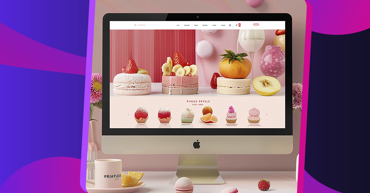
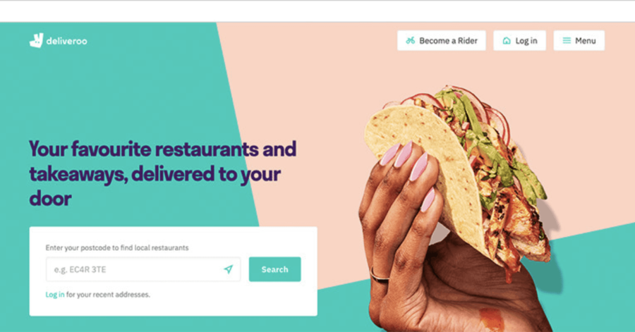
Here’s an example of what I’m talking about:
As much as I adore this layout personally, you gotta admit that it’ll be difficult for new users to navigate. Maybe this website’s goal is to confuse users, and by all means, more power to them.
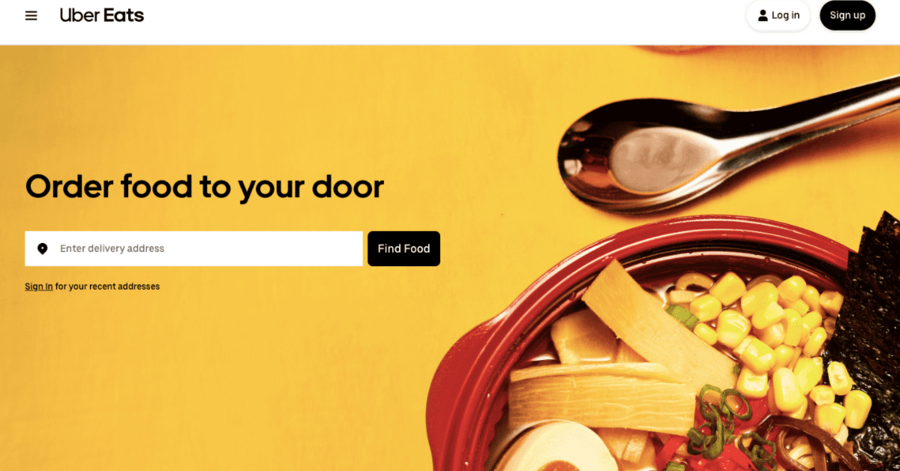
But if your goal is to provide findability and learnability, then it’s better to go with a layout like this:
7. Think of Your Typography
A homepage isn’t a homepage without some sort of text. It’s how an online page communicates to a visitor, and you’d be hard-pressed to find a functioning website without it.
When first creating a website, you may be inclined to use the fanciest fonts with the brightest colors. When I was a kid, I used to enjoy going on wix.com to create a homepage filled with every fancy cursive script available. Here’s the thing: nobody wants their website to look as if it was designed by a kid. If you go too overboard with the typography, that’s exactly what users will think.
Strategic typography is crucial to keeping people on your homepage. Not only does it provide users with information, but it’s an extension of your entire brand. In general, it’s best to use a font that’s simple and/or has varying weights. Arial is an excellent example of this. Not only is it a safe, well-known font to use, but it also comes in Arial Bold and Arial Black.
Now you may be wondering, “what if I don’t want to be safe?” Perhaps you want your website’s typography to be complex or unique while still looking professional. Well, I’ve got some good news for you: that’s totally possible. It will, however, require a lot more strategy.
My advice is to choose two or three fonts that you can mix and match throughout your entire website. If you would like a more abstract or bold font, use it for headings and pair it with a more subdued one. Overall, it’s all about creating a hierarchy and connecting elements that complement each other.
I’d recommend reading this article on the technicalities of pairing fonts.
6. Think of Your Imagery
Imagery is crucial when designing a homepage. Just like typography, a homepage is not a homepage without any visuals. Imagery impacts the user’s overall sense and expectations of your website. It’s like the cover art on a best-selling novel; it can be just as important as the title itself.
I’m willing to bet that most humans’ eyes are drawn more to visuals than words. The reason we have written words at all is because we love to communicate through drawings. So to set the tone of your website, you must have images that correspond to whichever feeling you would like to invoke.
Be sure that each image is of high quality. It’s also wise to optimize images in a way that makes them easy to load. Online users have very little patience and will leave if images take too long to show up.
5. Think of Composition
In the case of homepage design, composition refers to the seamless combination of both imagery and typography. In short, you want to make sure that your chosen typography fits with the chosen pictures. This is quite a tricky thing to balance, especially since composition is a bit subjective.
In general, you’ll want the composition to incentivize people to interact somehow. Your homepage should be designed to make people scroll down, interact with the menu bar, or click on certain links.
Pay attention to the purpose of these homepage features. Imagery and text should share corresponding purposes. For example, many websites use imagery to tell a story. The corresponding typography helps to convey a point while moving the story along.
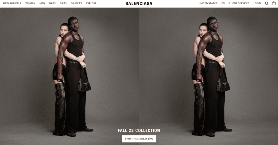
Luxury brands do a very great job of this. When offering products on their homepage, they display high-quality images, with text to detail what the viewer is looking at.
4. Think of Color
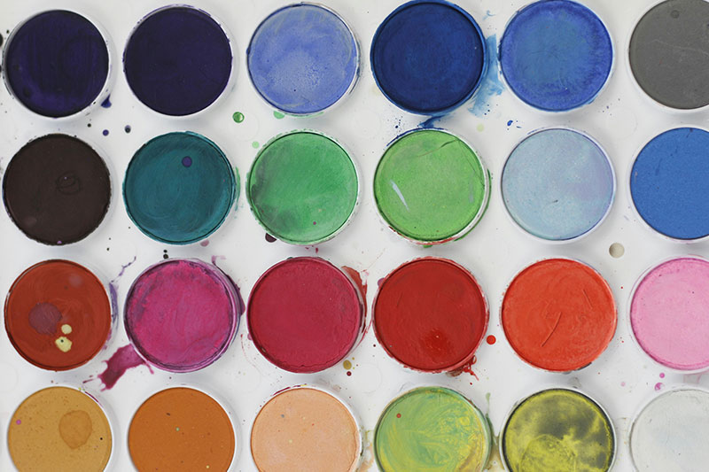
Yes, even color is a factor worth talking about. First of all, color plays a role in ensuring your typography is readable. Yellow text with a white background, for example, is a no-go. The same goes for black text on a navy blue background. Not having enough contrast is a common but detrimental mistake when it comes to homepage design. Having to squint to read the text is an immediate deal-breaker for most users.
Of course, not everything is about function. Color scheme plays a major role in creating an appealing aesthetic. Some color combos will attract the human eye, while others will cause people to internally shrivel up. There’s a reason why you won’t see many websites comprised of green text and an orange background. (Yuck!)
While clashing colors can work to catch a viewer’s eye, it’s best to use a bit of color theory when designing your homepage. Thanks to the internet, there are plenty of resources out there to help you get a handle on it.
3. Consider the Users’ Platform

People will not only see your website on a regular desktop. In many cases, you’ll get visitors who are viewing your homepage from a mobile device. People have iPhones, tablets, consoles, and any number of other smart devices. It’s up to you to decide if you want to make your site optimized for these products. (The answer is yes. You do.)
When considering the platform, remember that many mobile devices are smaller than your average laptop. Smartphones and tablets have varying resolutions. Something that looks great on your desktop may be sloppy or hard to read on someone’s Samsung.
This is why many websites have an alternative mobile layout. If you choose to implement this, make sure to give people the option to switch to your regular homepage. You can also format your imagery, typography, and composition so that it looks great on both desktop and mobile. While this is a challenge, it has been done.
Regardless of the route you choose, it is essential to keep your mobile users in mind.
2. Add a Call to Action
Of course, every homepage needs at least one call to action. Look at your homepage as an extended advertisement. When someone visits your site, your main job is to hook them in with all the factors mentioned above.
Once the persuasions are over, your next goal is to lead users exactly where you want them, usually with a highlighted link. You’ll see this a lot on ecommerce websites. They’ll list popular categories on their homepage with a bold “Shop Now” button.
1. When in Doubt, Hire a Professional
Think you don’t have what it takes to design a homepage? Well, there’s no need to worry. That’s what professionals are here for.
Now, you could go through the tedious process of putting up a job ad, conducting interviews, and negotiating terms. But if you need a professional homepage fast, you could simply work with Penji. With hundreds of designers from around the world, we offer graphic design services including websites, mobile layouts, and much more.
If you have other graphic design projects that need work, we can handle that as well. At a fixed monthly rate, you can ask for as many designs as you please. That means all imagery, typography, and other parts of your homepage can be covered.
Homepage design can be a difficult thing to master. But with the right amount of passion and strategy, your brand will have a stellar homepage and no time.


