The Christmas spirit always gets us extra Santa-mental. And boy, is Christmas fast approaching. Oh, deer! It’s time to revisit our go-to Christmas websites to get our daily dose of Christmas fun. If you need help with yours, subscribe to Penji to get unlimited website designs, illustrations, and more!
But wait — there’s MYRRH. We’ll throw in some fun Christmas puns while we’re at it. Without further ado, here are the top well-designed Christmas websites that stand out. Make sure to give them a go or YULE be sorry.
Ho-ho-hold a second there! We have an extra special Christmas gift just for you! We’re giving away FREE Christmas graphics that you could use on your website. These graphics will surely make your website look even more festive! Download these graphics here to celebrate the most wonderful time of the year!
1. Baudville
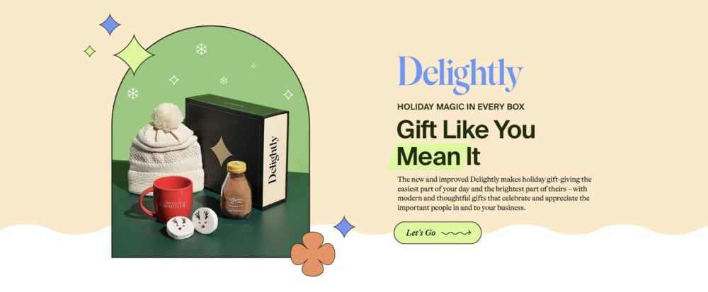
Baudville parades its website in soft colors that are easy on the eyes. It’s a company that offers assorted gift ideas for employees, making it easier for business owners to celebrate events and occasions. The overall Christmas-themed design is impressive, with the proper hierarchy of text. The layout presents the heading bearing the biggest font down to the description of the gift items in a brief paragraph. Even though the copy is relatively longer, combining different font style pairings makes it legible.
2. Apple

Apple has been a quintessential brand for writing the best and most persuasive copy ever. The brand also banks on simplicity and sophistication, which shows in its copywriting. Apple delivers the message to their target audience with only three sentences containing punchy copy. Apple then showcases the different product categories so customers can quickly choose one. This makes the user experience topnotch, keeping the shopping time brief and straightforward.
3. Hydroflask
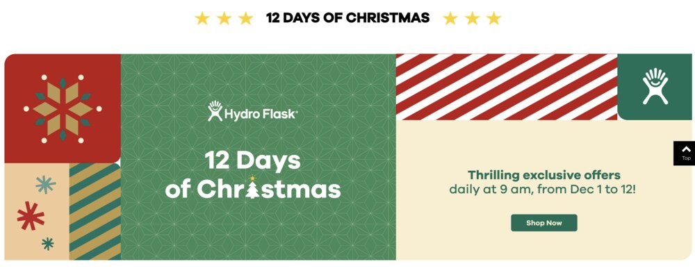
A limited-time offer is another way you can build excitement while sprucing up your website for the holidays. Hydroflask writes, “12 DAYS OF CHRISTMAS” to indicate their daily offers starting at 9 AM from December 1 to 12. This marketing tactic is a way to grab attention and have customers return to their website to check the daily exclusive offers.
Hydroflask’s website design also looks festive, donning all Christmas colors. The different patterns across the homepage also give this website a lively and energetic tone.
4. J.Crew
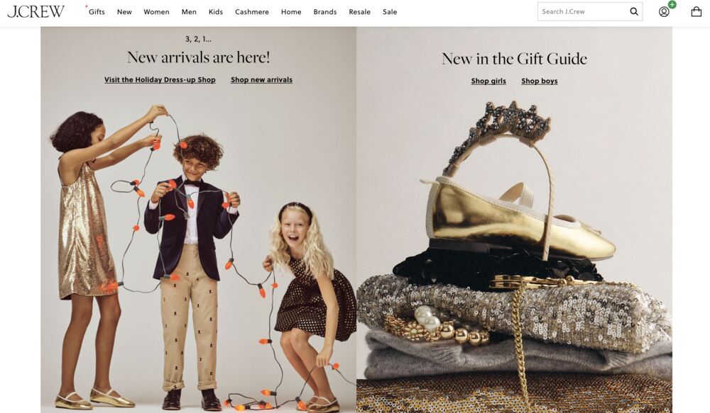
J.Crew took a different approach to their Christmas-themed website. By integrating real people wearing their products, customers can see how they will fit them. Although they won’t be able to virtually try them on like other augmented reality clothing retail websites, they’ll still be able to imagine how the clothes would look. The company also chose the color gold to symbolize the Christmas festivities. They choose gold kids’ dresses, pants, gold shoes, belt, accessories, and a golden headband.
5. Target
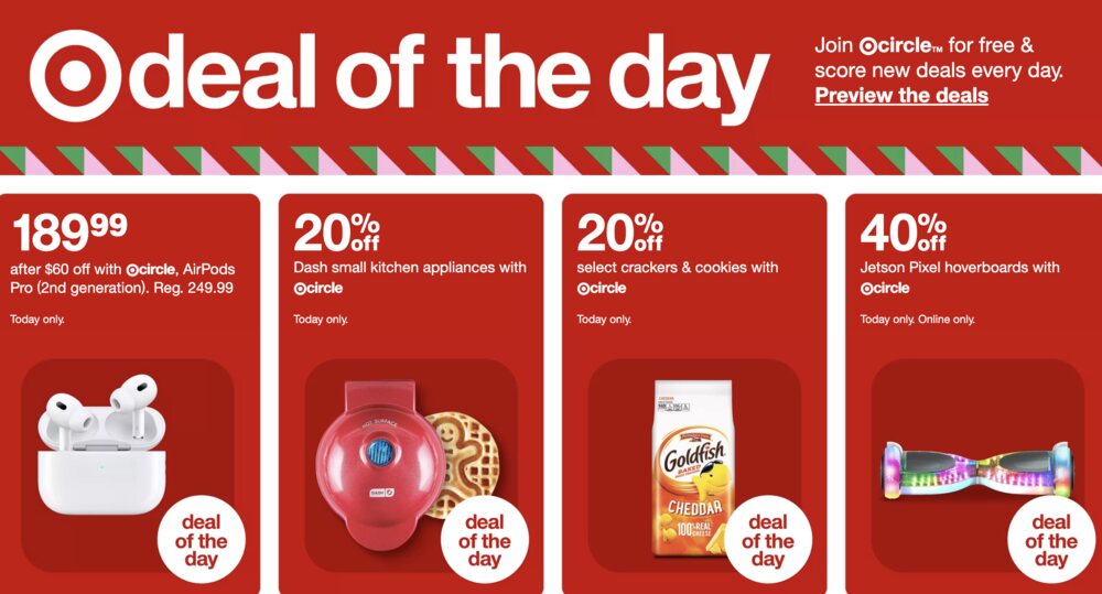
Target has one of the best Christmas websites with a clean layout. The homepage looks playful and bright, just in time for the Christmas holidays. Target’s red color palette also aligns with the season’s color.
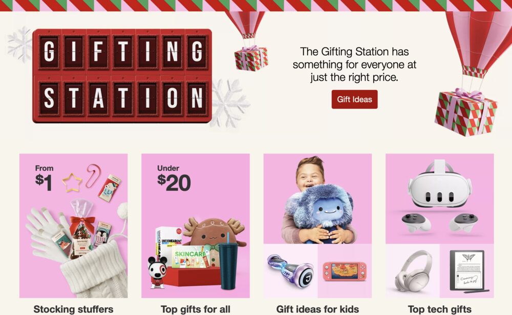
As you can see, Target has a web page that shines with a bright red color with a big heading that says “deal of the day.” It’s then complemented with product images, price, and the discount percentage for each product. Displaying how much you’re slashing off the price is a good Christmas advertising strategy, as everyone is scrambling to get the best deals as gifts for friends and family.
6. Starbucks
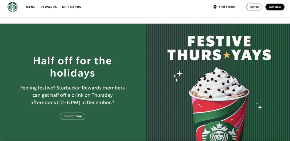
What better way to celebrate the spirit of giving than offering discounted drinks to your regular customers? Starbucks is about giving back to their regular patrons by letting them order drinks at half the price every Thursday afternoon in December. Choosing a particular day and time could be a good marketing strategy to increase sales during relatively slow days.
Starbucks only offers this promo to Starbucks Rewards members. With a call to action on its homepage, this will encourage Starbucks fans to sign up. Paired with a nice, enticing image of the drink, Starbucks hit the nail on the head with this year’s holiday-themed website.
7. Sephora
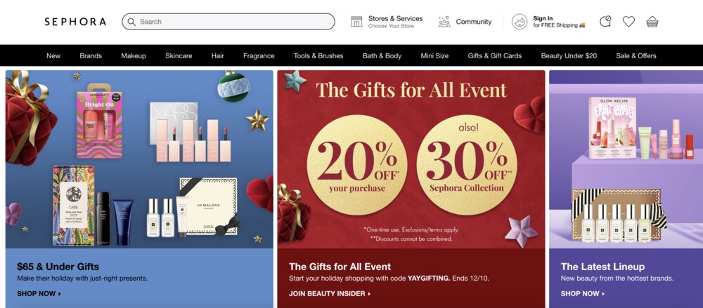
Sephora’s cotton candy colors on its website exemplify how branding consistency is crucial. This brand’s target audience demographics are between 24 and 36, so choosing these fun and vivid solid colors is apt. Sephora laid out their Christmas promos strategically by making the discount rates the most prominent on a fiery red background. These promos are then paired with the products’ images in a grid with different colors. Overall, Sephora’s Christmas website shows how structure coupled with copywriting works in online advertising!
8. Elf Yourself
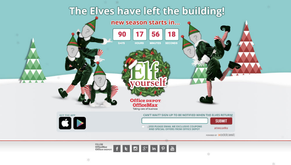
Anyone who has tried Elf Yourself SNOWS the drill. It’s an American interactive platform that allows users to upload images of themselves and put them on dancing elves. Since its inception, there have been over 1.5 billion elves created that entertained everybody all across the world.
No-fluff Christmas websites like this one have all the traditional Christmas colors and elements such as wreaths, Christmas trees, and of course, the elves. On the main page, five elves with blank faces will welcome users. They will have the option of uploading up to five photos of the dancing elves.
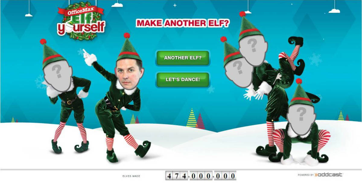
Once the photos are uploaded, the elves then dance to different songs and themes. The users will have the option to post the video or save it for kicks. Since Elf Yoursel’s origin as an advertising campaign in 2006, it has become a hugely successful website to date. So if you want to take an ELFie, put the photo to good use and “Elf Yourself.”
Use Penji to Create Your Christmas Website
The Penji team is one of the best designers offering affordable plans. Plus, they have an easy-to-use platform where you can request your projects. It will only take you three simple steps to get your ideal Christmas website design. Here’s how.
Sign Up and Request a Project
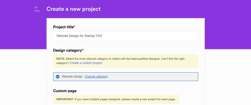
First, you need to sign up with them to have your own access to the app. Once you are already in the app, you will find a New Project button. Yes, it’s that straightforward.
After clicking the button, you will be taken to a different page where you have to indicate the specifications of your request. Be as detailed as you can. There are guide questions and a checklist that could help you, so you don’t have to worry.
Send the request and wait for a designer to reach out to you. If they have questions, they will just send it using the same project thread.
Wait for the Initial Draft and Submit for Revision
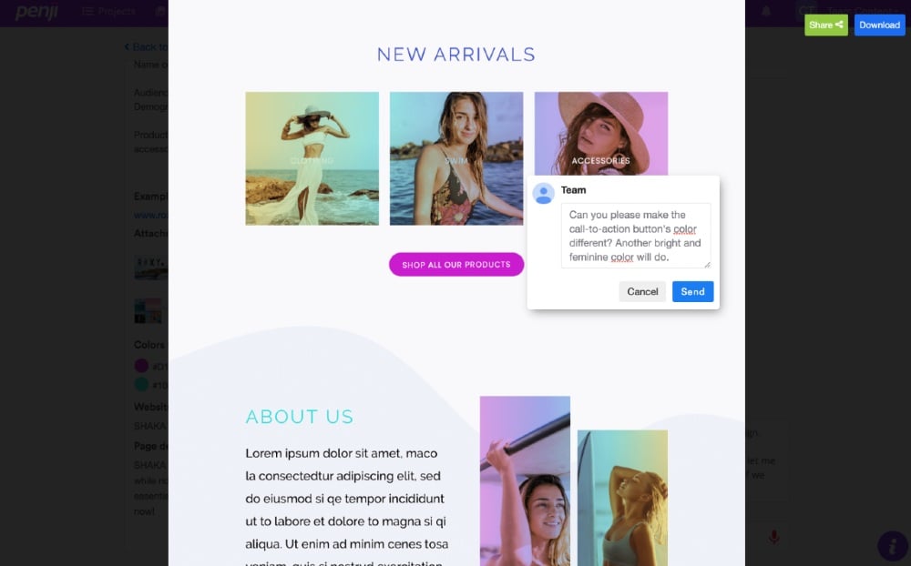
Within 24 – 48 hours, you will receive the first draft from your designer. Check if there are details that need to be changed. Click the details from the image where revision has to be made and a comment box will pop up. Type your feedback and send it.
Download and Publish Your Website
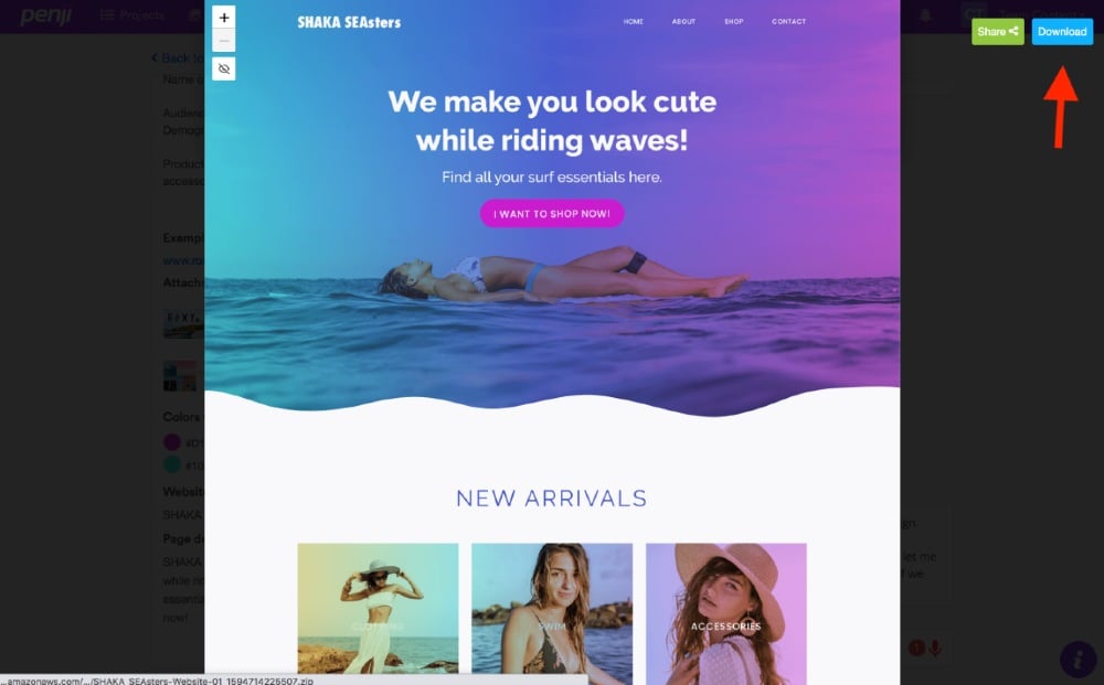
Are you happy with the design? If yes, you can now get the source files from the app (you don’t have to request this from the designer), and start publishing your website.
No hassle and extremely easy. That’s what you can enjoy if you hire the services of Penji. Check out their design offers right now.
Wrap Up
Indeed, Christmas is the most WINE-derful time of the year. Kids and adults alike can enjoy these well-designed Christmas websites before the big celebration. If you do forget to give these Christmas sites a visit this year, YULE miss out big time. And I hate to be the one to tell you — I told you SNOW.
Oh, wait, before you forget, subscribe to one of Penji’s plans now to get those Christmas visuals started! Use this promo code GETPENJI25 to get 25 percent off!


