Burgers are part of mainstream American culture. You’ll see burger joints on almost every corner of the street because who wouldn’t love a juicy and savory burger? So if you’re thinking of joining the bandwagon and getting a slice of the pie in this industry, you’re on the right path.
However, since this industry is competitive, you’ll have to think of ways to make your business reel in consumers. Aside from making delicious burgers, make sure your branding and marketing assets are on point. And this is why you need to check out these 15 burger logo ideas before creating your own.
1. Mister Burger
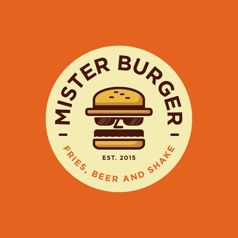
Most burger logo designs will have the burger icon integrated into it somehow. This is to show consumers what your primary offering is. This particular example, Mister Burger, incorporates the burger icon and makes it relevant to the restaurant’s name. It transforms the burger patty into a man with sunglasses and a mustache. The top burger also looks like a fedora hat, which gives the entire design a nice twist.
2. Burger Joint
This burger logo example of Burger Joint is simple yet captivating. The overall ensemble has a vintage feel, making the logo design timeless. The font selection with the washed style fits to the flat illustration burger design. Plus, the burger icon in yellow also balances the text and gives the logo design symmetry.
3. Vegan Burger
If you’re catering to vegans or vegetarians, making your burger logo design look the part doesn’t hurt. This way, vegan passersby will instantly know that you’re offering vegan burgers from your restaurant signage. Since the color green represents something fresh and organic, take a leaf out of this vegan burger logo design. The dominant color is green, and the text has an incredible color combination of green and purple.
4. Burger Zone
Burger Zone has one of the most welcoming burger logo ideas. Unless you’re serving gourmet burgers, burger joints mostly have casual and fun branding. In this example, the overall design has a playful appeal by showing a burger with a face and a hat. This logo design is excellent if you’re catering to all demographic types.
5. Burger Delicious Taste
This particular example is a traditional burger logo idea enclosed in an emblem. The burger illustration sits on top of everything, the most prominent element in vibrant colors. Everything else is in black, making the burger illustration pop out even more. This logo design is versatile for all your other branding and marketing needs due to its uncomplicated structure.
6. Burger Mania
Here is another simple burger logo design that works because of the clean layout component. It shows a flat illustration of a burger and sans serif text that complements the image. To give it a more interesting appeal, the white text breaks the monotony of the yellow colors of the burger and the word “Mania.” Overall, this design offers a clean layout that makes this logo scalable even when stretched or reduced in size.
7. Sherwood Gourmet
If you’re serving gourmet burgers, think of burger logo ideas that would appeal to your target audience. In this case, you can see that the design is simple with a touch of elegance and friendliness. The logo doesn’t intimidate consumers because, after all, burgers are still for everyone. The serif font exudes a traditional branding suitable for the burger gourmet restaurant.
8. House of Burgers
House of Burgers puts a unique twist on its typography logo. They choose a bold sans serif typeface to make the text stand out and readable, even on small branding and marketing collaterals. However, they replace it with the burger illustration instead of the letter G. The color red also gives the logo design a lively feel and breaks the mundane black color.
9. Bem Bom
Burger logo ideas that rely on typography alone will suffice. However, pairing captivating typography with icons that pack a punch will undeniably transform your logo design into something memorable. In this example, Bem Bom replaces the patty with the text name that fits in between the burger buns. Overall, this burger logo perfects design cohesion that makes the logo tasty.
10. Burger (Knife and Fork)
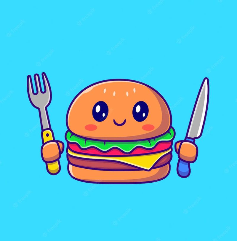
Here’s another lighthearted burger logo template from Freepik. It’s a straightforward design donning a burger that seemingly looks like a hungry diner. It has a happy face with hands holding a knife and fork, ready to munch on the juicy and flavorful patty. The logo design exudes a welcoming appeal that invites hungry burger lovers.
11. Burger House
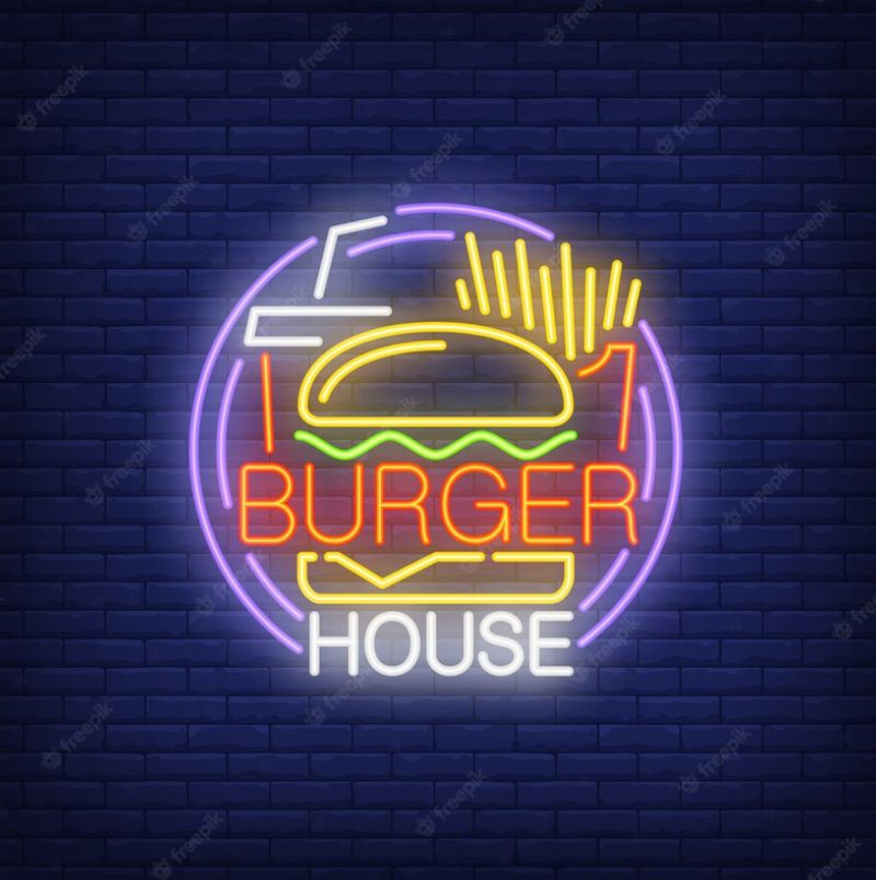
Burger House’s logo is a straightforward design that tells consumers what they will enjoy when eating in their place. Burgers are typically paired with fries and either soda or milkshake. And in this particular example, the logo puts all these elements into one cohesive design, showcasing the burger front and center. The word “Burger” is also sprawled across the design as the patty, giving it a tremendous visual interest.
12. Switchback Sandwiches
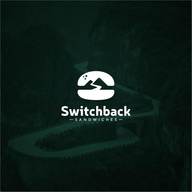
Here’s another exciting burger logo idea from Switchback Sandwiches. It relies on negative space for the burger icon. In between, the buns looks like two hands, with one handing out the burger to the consumer. Regardless of the significance, this burger icon emanates a unique vibe compared to the other burger icons on this list.
13. Premium Quality Burger
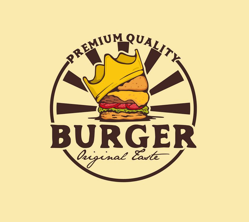
Check out this eye-catching burger logo design from 99designs. It indicates “Premium Quality” on top of the emblem. To make the design relevant, a crown sits on top of the burger illustration to show that it’s the best when it comes to quality. The six rays in the background are also a captivating design component.
14. Carnivale
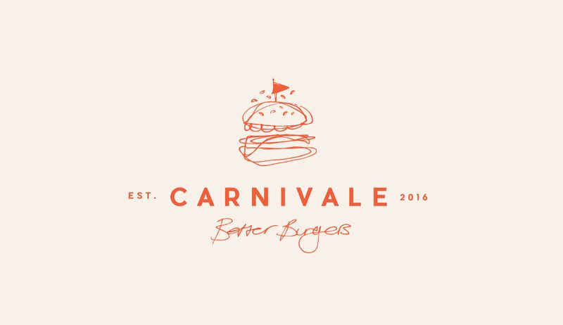
This is a stunning pencil-style illustration from Carnivale. The logo design is simple; however, the hand-drawn style takes the win for this example. The burger is then topped with a toothpick and a red flag, which ties the design cohesively. The simple sans serif font is an excellent design element that complements the pencil-style burger image.
15. Patty&Bun
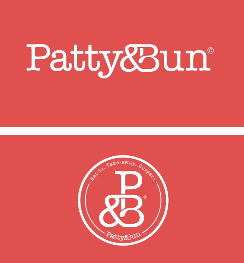
This Patty&Bun burger logo design is a pure typographical masterpiece. The font style is simple with a traditional appeal. The ampersand in between the two words also connects it beautifully, making this logo versatile for all uses. The design is scalable without compromising quality, whether you use this logo for your website, business card, or social channels. The brand also creates an emblem-type logo with only the initial letters, which can stand alone on any branding asset.
Benefits of Hiring Professional Designers for Your Burger Logo Design
Logos showcase the identity, credibility, and reputation of your brand. Your company logo is one of the essential branding assets that increases brand recognition. And creating a logo that’s uniquely yours is an uphill battle. That’s why most brands hire professional logo designers because of these four benefits:
Cost-efficient
Some business owners would beg to differ that hiring professional logo designers is more cost-efficient. Yes, you can get a burger logo design from Fiverr for $5. However, a five-dollar logo won’t get your brand anywhere. Remember that you get what you pay for, and a logo must be memorable, scalable, relevant, timeless, and simple to stand out.
Moreover, logo creation entails brand and market research, which only professional logo designers do. Although hiring professionals might come with a steep fee, you can look for other options. For instance, you can subscribe to an on-demand graphic design service like Penji. It’s a service that provides unlimited designs at affordable, fixed monthly rates. Check out Penji’s demo video and see how this service works.
Fast turnaround
The logo creation process won’t start without brand and market research. Most professional designers have an efficient system that works. For example, Penji offers clients a bespoke design platform where you can submit the design brief, communicate with designers, request revisions, and download source files. It only takes 24 to 48 hours from submitting your design brief to getting your first draft.
Free revisions

Depending on the type of service you choose, free revisions should be one of the inclusions in your chosen provider. You have to make this clear to your designer before starting the project. Some design services also offer unlimited revisions at no cost.
You don’t have to worry about not getting the design drafts right the first time. For example, Penji lets you write your revision notes on the platform. Plus, you can request as many revisions until you’re 100 percent happy with the design.
Quality results
The most crucial benefit of hiring professional logo designers is getting quality results. Yes, you can find burger logo ideas online these days. However, it’s a mission to find one that speaks your branding. Getting experts to work with you and their team is a luxury business owners will appreciate.
Additionally, you’ll get quality designs that aren’t copied online or from your competitors. If anything, your company logo will be better than the rest of the competition due to extensive research, trial and error, good communication, and the designer’s expertise.
Conclusion
These burger logo ideas should give you a perspective on how a logo should look in this niche. Ensure that you’re not only sticking to logo design trends but also integrating your brand’s story and personality. And if you’re ready to work on your company logo, hire only the best. Subscribe to Penji now and try the efficient design process for 15 days risk-free!
About the author
Table of Contents
- 1. Mister Burger
- 2. Burger Joint
- 3. Vegan Burger
- 4. Burger Zone
- 5. Burger Delicious Taste
- 6. Burger Mania
- 7. Sherwood Gourmet
- 8. House of Burgers
- 9. Bem Bom
- 10. Burger (Knife and Fork)
- 11. Burger House
- 12. Switchback Sandwiches
- 13. Premium Quality Burger
- 14. Carnivale
- 15. Patty&Bun
- Benefits of Hiring Professional Designers for Your Burger Logo Design
- Cost-efficient
- Fast turnaround
- Free revisions
- Quality results
- Conclusion


